Search This Blog

Monday, December 23, 2013

Guest(s)

Guest   oil on canvas   8 s 24 x .75
make our lives worthwhile.  Calm.  Sweet.  The same feeling that painting provides for me, actually.  Love that knows no boundaries.  For those who grace our table and for those not present this year for whom our love crosses many many miles.....California, Louisiana and North Carolina. 

May you live each day in the merriest of ways.  (from a card sent to us by the Laakso family)

Friday, December 13, 2013

Bus Stop

Bus Stop   watercolor   27 x 19
"Bus Stop" was painted in class from a model who happened to be the daughter of one of the participating artists...I provided the fur coat for the session.  The pose, the glance, the hands encased in a muff-like position came from my own experiences in waiting for the bus on a cold, possibly rainy, winter's day.  I have always enjoyed this painting, despite its many drips and raw passages for the simple reason that it conveys my message without being over-painted.  And that, to which all watercolorists will attest, is the supreme hazard and downfall of many a painting.  Restraint.  Simplicity. Sometimes we need to be reminded of our goals.  Reminded.  And re-reminded.

Thursday, December 5, 2013

Christmas Chaos


Three Ornaments   watercolor   6 x 9
is part and parcel of my life at this time of year...in almost everyone's life, probably.  Boxes of ornaments emerge from the attic and wrapping paper rolls surround shopping bags and strings of lights that always seem to be tangled.  Eventually, the chaos gives way to some sort of holiday order, designed to brighten our lives, and those of our guests, during this dark season.  "Three Ornaments" was painted as an after-Christmas exercise before these vintage glass balls were put away.  I like this painting as I feel that it was successful in portraying the translucent feel of the ornaments.  I resisted the desire to over-describe and over-paint.  This was painted on a sheet of Indian Village handmade paper that I had on hand.  It was made in India.  I haven't seen it around in a while and not sure if it is still manufactured.  It is heavy and has a distinct laid texture.  It is virtually impossible to push the paint around which is per usual on Strathmore or Arches.  The paint has settled into the grooves of the paper quite unevenly which, I think, adds to its charm.

Seeing the light reflected off of these hard surfaces gives me such pleasure....so much pleasure, in fact, that I am willing to deal with the chaos.

Thursday, November 21, 2013

Drawing Animals

Fawn...a sketchbook drawing
was the subject for our drawing class.  Animals are adorable.  They capture our interest.  But drawing them is just as difficult as drawing the human figure.....I believe that one has to truly understand the skeletal and muscular structure in order for the drawing to convince.  Using photos is inevitable unless, of course, the animal is asleep or innate for a long period of time.  We have to learn how to fill in the gaps....the legs that are not shown in entirety in the photo.  We also need to understand how to use the photo only as a reference and to alter the composition to the benefit the work, thereby avoiding the collision of body parts that makes a drawing visually confusing.  In this case, I used a photo that was cut off at the bottom.  My solution was to complete the work with strong, yet vague, line work.  In this case, I believe it works as the story is at the top, in the forward bend of the neck.  Details must be deferred until the end, as tempting as it is to focus on the spots.  In fact, class time was coming to an end even before I had a chance to consider the spots, so I brushed across the fawn's back with my kneaded eraser in the direction of the lay of the fur.  That would have to do.  Drawing allows for many discoveries and leads to even more questions.  Subject matter is always, for me, much deeper than the time spent in the primary consideration.  Everything takes longer than we expect.  Everything provides a possibility for more study.  Anything worthwhile deserves careful consideration as well as devotion.

I would like to carry this one further.....into a painting.

Monday, November 18, 2013

All That Glistens

All That Glistens   oil on burlap on canvas with gold leaf   24 x 18 x 1.5
was an experiment that, I think, turned out well.  I started out my fraying the edges of a piece of burlap that was roughly the same size as the canvas.  It was then glued down and rolled repeatedly.  Many many layers of gesso were painted on in order to allow the surface to receive paint, as well as to slightly (yes, slightly) smooth the very rough surface.  After painting the tree to my satisfaction, I realized that the image, although interesting, lacked a certain punch that I like.  The gold leaf circle was then applied.  That was very exciting and surprising, as the surface prevented a smooth application allowing for many small absences of the gold.  That pleased me so very much.  A happy accident!  Succinct and messy at the same time. All That Glistens is included in the holiday exhibition at Group Ten Gallery in Kent.

Monday, November 11, 2013

Unruly Things

Strings   oil on canvas   30 x 40 x 1.5
tickle my fancy.  It is also the name of my son's San Francisco-based band.  Unruly adds spice and character to our oh-so-smooth-and-perfect-wrinklefree existence.  The disobedient strand of hair.  The out-of-sync beat that catches our ears.  The desire to step out of the normal.  Check out Unruly Things at: Unruly Things

I was blessed with three wonderful sons who all possess the artist's soul.  Strings has been accepted into Kaleidoscope 2013, an exhibition near and dear to my heart, here in Akron, Ohio.

Strings that connect.  Strings that weave.
Heartstrings.  The jazz of life.

Thursday, October 31, 2013

Model relationships

Deb   charcoal and pastel on toned paper   16 x 11
There is an unspoken communication between the artist and her model....a relationship, if you will.  A give-and-take.  And the artist is on the receiving end...we work with what we are given.  Some models seem to be emotionally closed off.  Some  seem "above" the give-and-take that leads to openness. Needless to say, portraits resulting from the above mentioned situations rarely provide great work from me.  I relish an honesty and an openness that allows for both the model and artist to reveal themselves without ego getting in the way.

I was pleased to spend time during my gallery "watch" sketching Deb.  She has an upbeat attitude that spills over.  Quite simply, I am inspired by her being.  This work was rendered on toned paper with charcoal pencil.  The pink pastel was worked horizontally through after the session was over.  I think the work benefits from this high voltage pink, which is her favorite color.  Thank you, Deb, for the sharing of yourself.

Saturday, October 26, 2013

Posse

Posse   oil on canvas   20 x 20 x 1.5
The thrill for me is figurative painting.  Despite the fact that less personal (?) subject matter such as landscape and still life are more frequent sellers, I will stick to my guns...no pun intended.  My quest, most recently, is to explore archetypal moments, those scenes and memories that transcend generational gaps.  This, of course, is subjective..  As the mother of three sons, I just couldn't resist revisiting and reviving this vintage photograph of my husband, his brother and an unknown friend.  Little boys are superheroes.  They are policemen...and firefighters...and ghost-busters.  Wielding pretend swords, badges, karate chops and ghost-busting juice gives them power and helps them to feel not-so-small. This is my take on an age-old scenario from the life of little boys....posse.

Monday, October 21, 2013

Spooky is as spooky does.............

Skeleton   sketchbook drawing
Skeletons are intricate and complex.  Yet I am attracted to the drawing of them since I do so many paintings of the human figure.  It is helpful to understand what lies beneath the surface.  Although I am not a memorizer of bones or muscles, and never have been, I can only hope that the structure of the human form finds its way into my brain by osmosis.  Lucky for me, Judy Adkins, the art teacher whose wonderful classroom I borrow for my class, has one constantly hanging around.  Our assignment was "pot luck", as we used our view finders (standard rectangle) to scope out subjects for drawing.  We are working on composition and creating 4-5 major shapes in the work that fit together in an exciting combination.  Believe me, there is enough subject matter in this room for a lifetime of drawings!  We all worked quickly and quietly....the time passed so fast I couldn't believe it!  Although I could easily have spent 2-3 more hours refining all the shapes and honing details, I am pleased that this drawing  still retains the original energy that excited me from the first.  I will, in this case, let sleeping dogs lie.

Or would that be sleeping skeletons?

Thursday, October 17, 2013

Life is just a chair of bowlies....

Cherry Branch   oil on canvas   4 x 12 x 1.5
is quote from Mary Engelbreit and was seen on many of her greeting cards and like paper products some years past.  This quote always tickled my silly bone and reminded me not to take anything too seriously and to relish the unforeseen turn of events that peppers our lives.  Most of my work involves the creation of an idea, followed by sketches and the complex painting process of create and destroy, making the project last quite a while, sometimes a long long while, until resolution is reached....the point at which my personal sense of visual aesthetic is pleased.  But I try to sandwich light quick projects in-between...they take the edge off and fill my need for spontaneity.  While trimming a weeping cherry tree a few weeks ago, I was taken by the lush fruits that even this small tree was able to bring forth.  The work was painted from a clipped branch placed in view of my easel and worked on in, I believe, only two sessions, while I tried to capture its elegance before too much withering occurred.  I like it very much and feel that for a small work, it contains enough complexity to tease my intellect.  So be it.

Life really is just a chair of bowlies.

Monday, October 14, 2013

Free Time

Sheri   conte crayon and pastel on paper   18 x 14
One of the responsibilities in a cooperative gallery is, of course, gallery sitting.  My shift is usually a 5-hour period on Saturday afternoons.  While I have never in my life suffered from want of things to do....it seems that each day I have more to do than is humanly possible....and I realize, more than ever, that this is my choice.  Mostly I read, I sketch, I organize during this time slot.  A few weeks ago, I asked artists in my classes if they would mind sitting for a few hours at the gallery so that I could practice my portrait skills.  While I am mostly a figurative artist, where facial features defer to an overall gesture, it never hurts to hone these skills.  Likewise with painting flowers.  Sherri was a willing participant.  This portrait was rendered in conte crayon on a heavy watercolor paper.  After the session at the gallery, I used a photograph to work on the piece at home.  I liked the original very much at the end of the life session.  During the studio session at home, the work was fine-tuned.  A pastel block was added for color.  Always for me, the life work seems more honest, more energetic.  Fine tuning later enhances the likeness but, in doing so, renders the work more staid, more static, with the addition of more pigment.  Which do I prefer?  I really don't know......maybe a work somewhere in the middle would please me more.  Sherri was pleased.  What more can I ask for?

Monday, October 7, 2013

Bride...searching for the unconventional

Bride (J)   oil on canvas   48 x 24 x 1.5
J. is an unconventional bride.  We recently celebrated her marriage to a dear dear friend.  She has great spirit and a no-nonsense attitude about her.  I snapped a photo of her at her bridal shower.  This work is the result.  I guess it is a tribute to the unconventional in all of us.

Wednesday, October 2, 2013

Fright Week (month)

Shocking   mixed media on paper   34.5 x 22
"Shocking" is a mixed media work on paper that I enjoy so much during October, fright month for me.  For the past several years I have set up my own film festival at home during which I enjoy thrillers (especially the psychological ones), mysteries and a few flicks of the horror genre.  I am certainly old enough to recall films wound on large disks and stored in metal canisters...the kind we watched in school that would inevitably break, spin around incontrollably and cause interruptions in the story, chaos in the classroom and anxiety on the part of the instructor.  Those little sprocket holes on the edges of the film were the inspiration for this border design which was carved on a linoleum plate and printed onto the paper.  I shot photos of some family members and friends and had ever-so-much-fun arranging and drawing them on the paper.  One of my favorites is Cheryl, on the very bottom.  She was at that time our town postmistress. I am in the upper right with hands completely covering my eyes.  Too frightening to look.  Shocking.  Such fun.

Wednesday, September 25, 2013

Large::Small; Horizontal::Vertical ON WORKING METHODS

Petite Zinnias  oil on canvas   12 x 4 x 1.5
For quite a while now, I have intended to write about my working methods...not that they are good for anyone else but me, but I have a desire to share them in the hopes that others just might them useful.  Making art is ongoing.  Working on one project at a time forces that project into preciousness and can lead to focusing on the finish rather than the process.  (It's like putting all of your eggs in one basket) There are usually 3 or more paintings in my rotation.  There may be days between passes on a particular work.  I find that this method allows me a consideration of each that is not possible in a more finish-driven environment.  Some paintings lag behind others, and usually rightfully so....they have further to go in their resolution.  Some works are taken out of the rotation temporarily until I feel a renewed interest. Oils need to be rubbed with medium before starting in days later.  Watercolors sprayed lightly in order to avoid the tightness that results from working on dry paper.  It is indeed difficult to enter into the rhythm of a work at a later date, but I believe that the benefits of consideration are well worth this difficulty.

Likewise, I like to vary the format of a work....horizontal one work and vertical another.  Standard rectangles seem boring to me for the most part.  And then there is scale.  Working on a large project with large brushes and big sweeping strokes might then be followed with a smaller, tighter work.  Oil paintings are countered with watercolors and drawings.  All of this variation keeps me interested.  It keeps me feeling enthusiastic about the problems to solve.  To some, I might be dancing all over the boards.  But to me, the novelty of this way of working keeps me fresh, alive, interested.

What's up for today?  Tackling a square work...........life is good.


Thursday, September 19, 2013

The Crayola Girls

The Crayola Girls   oil on canvas   40 x 30 x 1.25

has been included in the second annual Akron Art Prize exhibition and competition.  I am thrilled to have my work included in this group of over 100 artists of amazing ability and variety.  The works are exhibited at several locations in Akron:


- Summit Artspace (140 E. Market Street) - this is where you will find The Crayola Girls

- Zeber Martell (43 Furnace Street)

- Akron Glass Works (106 N. Main Street)

- We Gallery (20 N. Hight Street)

There is a mixer at Summit Artspace this Friday, September 27 from 5:30-7:30 pm  where the housed exhibit can be seen.  Other galleries and exhibitions will be opening, including one at The Box featuring work by friend and colleague
 Ted Lawson.  There will be wine, light refreshments and good company.  Hope to see you there.

Of course, this is a vote-for-me kind of exhibition that seems to be today's rage.  I have a difficult time with all of this me-me-me stuff.  After all, each and every artist wishes to be the winner.  Honestly, I have the same wish.  But I am truly content to be among this very fine group.

"The Crayola Girls" was inspired by a vintage photograph of my Grandma Daisy, her mother and her sister.  The photographs at that time (early 20th century) were grim, grim, grim.  Dark clothing....no smiles...all about serious.  My goal in this work was to add a bit of impish joy to the feel...to break the surface a bit.  I am pleased with the result.

Sunday, September 15, 2013

Someone moved the finish line!


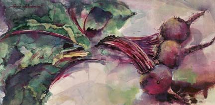
Actually, there is no finish line, no line of demarcation that signals the end of the race, the end of the painting.  Woe is me.  We artists always sense that the finish is near but that is as far as it goes.  We always think that one more correction, one more interesting passage might just take the work to outstanding.  With watercolor, especially, one of the major fears is to take that work a step too far, creating murkiness and destroying the complex patterns of transparency that one has taken so much time and effort to create.  And yes, we all know that adding just one more passage can set up an entire series of needed changes in order to bring the rest of the work "up" to the change. Yes, woe is me.  I actually know of a very fine regional artist, an older gentleman, who is notorious for adding a stroke of two decades after the first ones were laid in.  That enables him to enter exhibits where there is an age limit on the work.  But I think that there is more than trickery at hand here.  Sometimes, we just don't know when the work is done....I try my best to take completion very seriously, as, more often than not, I am displeased when I take my hand to a work at a later date, with a completely different palette and a completely changed frame of mind and emotional status.  "Strings" hung on my wall for over a year and a half.  Nagging thoughts of violet entered my brain at every glance.  After the year's drying time, I procrastinated on the varnishing time and time again.....I suppose I was building up bravery.  A couple of weeks ago, I let 'er rip.  In a sudden decision I pulled the work down and applied the violet before my left brain had time to disagree.  These photos record the change.  I am completely satisfied. 

I believe that I have crossed the finish line..........not in record time however.

Wednesday, September 11, 2013

Hey Kids....Let's have a show!

Boston Beat   oil/canvas   40 x 30 x 1.5
Spanky of "Our Gang" fame was never short on enthusiasm!  "Our Gang" of artists at Group Ten Gallery in Kent, Ohio shares these jazzed-up feelings.

What:  Grand Opening  Group Ten Gallery

When:  Friday, September 13, 5-9 pm

Where:  138 Burbick Way (in Acorn Alley)

Please visit website or call 330.678.7890 for further information.

Monday, September 2, 2013

Brown....

Julie   conte crayon and pastel on toned paper   17.5 x 10
has always been my least favorite color.  This time of year, even though summer still reigns, we are seeing bits of the yellow and orange that precede the brown.  I think that I have been over-browned.  Our old farmhouse had exposed beams of brown.  All woodwork in the living area was painted brown, including wainscoting. It took us over 20 years to work up the courage to paint over all of the brown.  The lightness that exudes from the Scandinavian palette we selected has definitely put us all in better moods.

However.....there is one exception that keeps brown in my vocabulary.  Portraits that result from the use of the great variety of earthtones are among my favorites.  The warmth of these tones softens a face and warms the soul.  (Those same works rendering in black charcoal lack that warmth but make up for it, in my opinion, by their great power) Ochre.  Umber.  Sienna.  Yes.

Friday, August 30, 2013

Watercolor Sketches...

Island on Lake Panache

Sunflowers...Lake Panache

Canoe on Lake Panache
represent freedom to me.  Plans are discarded along with lofty goals.  No thoughts about exhibition entries or saleability.  Limited supplies.  Paint what you see.  Whew!  These sketches, all done on the spot were painted on a 7 x 10 watercolor block.  There were others.  These are the three more successful ones.  It actually took a day or two to find my "watercolor feet" again....to come to terms with the illusion of control and to avoid over-rendering.

They don't have to be perfect.  After all....they are just sketches.

Monday, August 26, 2013

Readers...

Ann Reading
make excellent models for sketching studies.  They are engaged in their own very private activity which, I find, allows for a relaxing and honest pose.  They move.  They fidget from time to time.  But I have found that they alternate between two and three positions repeatedly.  So the artist can reply by moving between a like number of sketches.  (two or three for the price of one!)  In this case, Ann is reading from her Kindle while stretched out in the bottom of a boat on a sunny afternoon.

Two people enjoying a grand afternoon.  What could be better?

Thursday, August 22, 2013

Sketching...

K. reading and N. playing
is a wonderful way to spend time while you are seated on a dock...on the water...in the sunshine...on an island...in Ontario.  My travel suitcase of art supplies (which is always the first thing packed) includes:  a sketchbook and a variety of pencils; a kneaded eraser; a blending stump; a travel watercolor set with pan colors; some small brushes; a watercolor block 7 x 10; some toweling; and a cup for water.  Nothing grand....after all it is vacation.  My aims are not lofty...just capturing a moment or two of joy when family and friends congregate.  I spent each afternoon in creative contemplation and about half of the sketches and small paintings seemed successful.  My husband enjoys the overlapping of images on a single page, so I will try to do more of that next time.  This page features my daughter-in-law K. who is engrossed in a fine read and my son N. whose spare time always includes making music.  There is a harmonica around his neck and a tambourine under his left foot. 

Our hosts seemed always concerned that we were enjoying ourselves....as would as well.  Not to worry.  Time flies when you're having fun.

Friday, August 9, 2013

Ebb and Flow

Ebb and Flow   oil on canvas   12 x 36 x .75

Painting the incoming surf of the ocean is quite a challenge.  The still life is, well, still.  Models are still for short periods of time...with perhaps a twitch or two, or a relaxation of a limb or two, for the most part.  And, despite the movement of the sun and the interference of clouds, landscapes are generally given to status.  However, the ocean never rests.  Capturing this movement, to me, requires a study of the large rhythm involved, and as much understanding as possible, of an up-and-over movement....similar perhaps to the rise and fall of the folds of a quilt, but far less material.  I was inspired by the rowing paintings of Thomas Eakins, as well as an ocean work by my hero Alex Kanevsky.  This work was painted in a day.  Sure....I was tempted to have another pass, but knew full well that subsequent strokes would only solidify shapes, turning them into cement.  I have held off now for over two weeks and the obsession is now past.  Contemplation is good.

The ocean never sleeps.

Thursday, August 8, 2013

Cooperative. Cooperation. Cooperate

It takes a fair amount of cooperation to build a drip castle....the movements of two or more individuals timed in a rhythmic way in order to avoid collisions.  The more beautiful the rhythms, the more creative the endeavors.  Same with driving, same with cooking......AND with creating an artist cooperative with 9 other artists! I read somewhere that musicians are terrific cooperators, as they are used to being one part of several in the grand orchestration.  Visual artists not so much, as their work is primarily solitary.  But we are putting our best collective feet forward and have been slowly ironing out the kinks.   Our gallery:  Group Ten.  Location:  138 Burbick Way in Kent, Ohio.  Hours:  Thursday-Sat noon to 5.  (this is temporary).  Grand opening:  September 13....mark your calendars!  Details to follow.  My fellow cooperators:  Ben Bassham; Debrah Butler; Jeff Fauser; Judy Gaiser; Fran Lehnert; Thompson Lehnert; Jance Lentz; Geoff Mowery; and John Smolko.

A collaborative effort to be sure.

Monday, July 29, 2013

S and K

S and K   oil/canvas   30 x 40 x 1.5
Some images become iconic to me...those scenes that repeat themselves throughout one's life so much that they become embedded in our memory banks.  I am lucky to have so many beautiful ones.  The boys in the photo that inspired this work are now adults...both almost 30 and one to be married within the month.  The bodies have been replaced by other children but the same scene was repeated at this year's beach vacation...the castle builders now Jaidyn and Logan, children of our niece Katie.  In this case, the image becomes more than a singular painting...the work represents, to me, the impact of important familial traditions.  In my work to come, I hope to visit other such scenes/memories...they are the stuff of impact...that which makes my life worthwhile.

In the canvas, the figures were sketched in different positions than the reference photo provided.  I wanted the two figures to work as one in their singular endeavor.  The forms became pretzel-like, in a singular shape that includes the somewhat tangled arms and legs.  The figure on the right became slightly larger to create more interest.  The drip castle is indeed the tie that binds, but has become less consequential...a supporting prop.

Tuesday, July 23, 2013

A Tale of Two Horses

Two Horses   oil/canvas   18 x 24 x 1.5
This painting took months and months to complete....I just couldn't be satisfied.  The split rail fence behind the horses was in...then out....then in in parts....then out again.  Likewise with the detail and full rendering of the horizontal horse.  All that detail was just too much for me and took away the power of the image.  This represents a final (yeah, sure) effort at pleasing my aesthetics.  The horizontal horse has become a two-dimensional shape.  The white horse carries enough detail for my liking.  The dark violet horizontal band carries some semblance of a fence.  The swishing tails were just too easy to over-render.....so I gave them supporting roles only.   I am not sure this is what I intended....but this is where I ended up.  I am liking it more all the time.

Let me know what you think.....................

Friday, July 19, 2013

Surprise!


On Thursday night my husband surprised me....and I wasn't quite certain I was up for it.  With evenings still in the mid-eighties, we were usually found in front of fans either reading or slowing down from the day by watching totally mindless television.  I was in the process of the wind-down, when he suggested a visit to Ohio Music Shop in Kent for open mic night.  Each musician played three songs while we listened, enjoyed and sketched in theater-style seating in an air-conditioned environment.  What a rare treat!  My usual sketchbook was not in my bag, so I made do with this small notepad.  The parts of the faces not visible were behind the microphone...no matter.  All in all, a perfect evening...fine music, sketching and cold beverages.

Tuesday, July 16, 2013

Lemonade...

Lemonade   watercolor   13.5 x 18
Who wouldn't like some?  Especially here in northeast Ohio where the temperature is hovering at 90 degrees in the shade.  This watercolor was done in class from items that were put together by artists in the class.  I have since stopped the "everybody bring something" method of setting up a still life as the resultant composition usually contained too many elements for my liking.  But this one worked out well for a couple of reasons.  I tend to like an opposing color temperature as an underlying wash.  This is more difficult to do with watercolor.  And I also like mixing the organic and geometric shapes that create balance....a great yin-yang combo. 

The difficult part, as I recall was keeping the lemonade fresh with ice cubes.....we were all melting.

Friday, July 12, 2013

Yes...the garden

Radishes   watercolor/gouache   9 x 12
"Radishes" is a watercolor and gouache painting.  The paper was first coated with permanent white gouache, mixed to the consistency of cream, and allowed to dry.  This method allows for more flexibility in moving colors around and also provides a bit of opacity where intended without the mud that sometimes occurs when layering watercolor pigments.  I have always used it as a counterpoint in the work, i.e. juxtaposing it with transparent passages for that point::counterpoint effect.  In this case, the opaques are mostly in the background, but ease their way into the bunch on the leaves in the upper left.

The only time I have relished (no pun intended) radishes was in a brewery in Mill Valley  where they were served as an hors d'oeuvre, sliced ever-so-thinly and served with a pat of creamy butter at room temperature.  They are always delicious when painted.

Tuesday, July 9, 2013

Oh....the Garden

Beets   watercolor/gouache   10.5 x 21
We love beets at our house.  My husband's family is of Pennsylvania Dutch origin, so one of our favorites is Red Beet Eggs, or pickled beets and eggs.  We love them roasted, glazed, sliced, chilled in salads.  The leaves can also be prepared as a wilted lettuce dish.  The garden is coming in now...it is a glory to behold.  Graceful leaves and branches....colorful produce on the vine.  Painting produce is one of my favorite things this time of year.

Eat your veggies.....but paint them first.

Tuesday, June 25, 2013

Infusion

Infusion   watercolor/gouache   19 x 27
is the process I feel when I dip my feet into the ocean...an exchange between my body's chemistry and the salt water of the great mighty.  Having just returned from a wonderful vacation at the shore with nuclear and extended family, I was reminded of this painting done many years previously of my friend Jo.  Between us, we raised 6 wonderful and energetic sons.  We had more to do than time allowed.  The annual trips to the seashore provided such a great relief from the worries, the cares and the work load.  The ocean is a healing balm. 

Friday, June 21, 2013

Quick Draw Makes Me Sweat

Clock Tower   oil/canvas   12 x 9?
Artists are notorious for their personal senses of time.  I am no exception.  I believe that in order to be truly creative, one must be unaware of the clock.  That being said, you will understand why quick draw, a timed 2-hour painting done on the green in Hudson, makes me sweat.  My work usually relies on several layers, much contemplation and much alteration, involving create and destroy processes.  None of that is possible at this event.  So I am immersed into "alla prima" painting, from the first......The canvas was pre-toned with an acid green color, a warm yellow-green that fits well, I think with outdoor painting.  I found a location well ahead of the event and plotted.  I will say that this work was more successful that the ones done in years past.  I painted what I saw and tried to avoid re-painting any passages, which always ends up muddy and indistinct.  I did a slight bit of destroy, by softening unimportant edges with my fan brush and a bit of medium.  I softened all of these geometric shapes with a bit of organic leaf-play.  At the end, I wiped through to the the pre-toned canvas in some places to offer up some cohesion.  This work was auctioned at the end of the event.

What would I change given another session?  I would probably correct some of the incorrect shapes, and, perhaps, take some steps toward a more harmonious color palette.  But then there is something to be said for painting on the spot.  Maybe I will try it again..................at next year's event.

Tuesday, June 18, 2013

Plein Air Painting is not for Sissies

Allium   oil/canvas   14 x 11 x .5
I enjoy my creature comforts.  Painting outdoors requires lots of lugging, much time setting up and taking down, as well as repeated interruptions.  The interruptions are well-intended and kind (why, I couldn't draw a stick figure!  X 12 times/day), but interruptions nonetheless. Staying hydrated is a problem due to lack of restroom facilities, which would require a packing up all over again.   And all of that green....green....green...I am happiest when I can pair organic shapes with geometric, so I often try to include a bit of the man-made along with the wide varieties of plantings.  This is, after all, an event that is in cooperation with the home and garden tour.  Most of the attendees have vast knowledge of plants.  My focus in this work is the planting of allium which are large airy spherical violet blooms from a plant related to chives and onions.  This was my first painting of the event and, perhaps, the one I am most satisfied with.  It was worked with a limited palette and contains both kinds of shapes.

Allium can be seen at Hudson Fine Art and Framing.

Back to the studio....no bugs....few interruptions....and a glass of water whenever I choose.  O.K., then.  Call me a sissy....I can live with that.

Wednesday, June 12, 2013

Cob

Cob   watercolor on Yupo   3.75 x 12
Cropping as a tool is precarious surgery in my opinion.  I much prefer the in-depth consideration of the composition of a planned painting.  Composition is crucial for providing a focal area and other passages which should support the focal area.  Ideally.  For some reason, I put cropping as a tool in the same category as other "tricks":  using masking fluid; spattering; sponging, etc..  None of these processes will breathe life into an ailing composition....supposedly "saving the day".  I believe that there is practically no such thing as a perfect painting (well maybe one now and then).  I also believe that all paintings have strong passages and others that aren't so much.  I guess much like being a human being.  My aim is to accept the painting as a whole with its all its imperfections.  From time to time, I sort through unsold work and destroy weaker works whose appeal, after some time in catalog, are less than satisfactory.  "Cob" is a small part of a much larger work done several summers ago on Yupo paper.  Yupo produces so much texture on the surface that texture becomes the thing, the key ingredient.  Although working on Yupo provides many chills and thrills, the look of it is too much for my own personal aesthetic.  I did, however, like the cob.  I wiped out all of the painted areas around the cob (which is only possible on Yupo) and framed it in a small and long horizontal.  I think that this might be my first acceptable cropped painting.

Never say never.

Friday, June 7, 2013

And speaking of Boston...

Uncommon   oil/canvas   20 x 60 x 1.5
Uncommon is a work that celebrates the row houses of Beacon Street that edge Boston Common.  There is something very appealing to me about this accordion-like expanse of brick and windows...each building individually unique, but functioning as part of an aesthetically pleasing whole.  Perhaps a metaphor for the vast expanse of heterogeneous individuals known as urban-dwellers.  There is also the feel of the little Christmas villages that are part and parcel of holiday setups.  Twinkling lights in the windows.  Hustle and Bustle.  Peace at the same time.  My goal was to paint this scene without the tedium of overly-described windows and doors.  It had to function as one form for me.  As in any painting with this much detail, there are parts that I adore and some parts that merely exist....I have come to be satisfied with that.  Perhaps that is similar to the momentary glance that one takes as she observes the scene.  I think it is done.  Will get back to you on that...

Monday, June 3, 2013

The Boston Marathon

To Run The Boston   watercolor   20 x 13.5
is the premiere marathon for runners around the world.  For those who have finished it, the race becomes a benchmark of integrity and endurance for the rest of their lives....such as Bob, one such artist and runner in one of my classes, who always speaks glowingly of his multiple experiences in the race.  We were privileged to experience the race in 2011 when our son competed.  Our class assignment:  the cityscape.  Artists in my classes vote on subject matter.  The cityscape does not appeal to me as a genre.  I am not sure why, but I guess it has to do with the amount of information on the page...too much for me.  My reference photo was taken in 2011 and features two runners from Nigeria.  While the initial lay-in contained many beautiful spontaneous strokes, I was not content.  Too many pieces/parts.  My process involves the laying in of subsequent washes and a push::pull that allows some elements to shine, while pushing others into roles as supporting actors.  This is my final answer.

I am pleased that I attempted a work that I wouldn't have otherwise considered.  I was spurred on by the integrity of these African runners.  Ahh.....it's about meeting of the challenge.....courage.

Thursday, May 30, 2013

Repose

Repose   oil/canvas   8 x 24 x 1.5
is sometimes welcome.  Sometimes it is forced upon us.  The model in this work was languishing in the heat of summer.  But this week I felt great empathy for this pose....too much gardening...too much exercise...too much disregard for the limitations of my body.  BACK PAIN.  Forced repose.  Forced time away from the easel.  Luckily, my son is a physical therapist who has helped me out with suggested exercises and many many admonitions.  Can't wait to be vertical again.

I have always loved the loose expressiveness of this work.  Loose.  Yes.

Monday, May 20, 2013

Boston Couple

Boston Couple   watercolor/mixed on paper   13 x 18
Boston Couple was painted, in all seriousness, as a not-serious bit of play.  I needed a topic for class and pulled up some reference photos taken in Boston on the Common.  A brilliant May morning.  I was not inspired by the work and that is probably why I was able to experiment with the forms...nothing there was sacred to me.  No connection.  In fact, I was annoyed that this fellow was spending this glorious day on the phone.  (personal gripe)  My original plan was a not-so-solid description with the figures blending into the ground.  When that process became less than desirable, I changed the game plan.  The figure was then worked back and forth in a figure 8 pattern as a singular shape.  Details were muffled and then muffled again.  The background was subsequently painted in opaque gouache. I have to say that this work pleases me somewhat, despite the lack of personal connection.  Perhaps that is why I felt free enough to experiment.  The preciousness is gone.  That pleases me.

Wednesday, May 15, 2013

This....wait a minute...no that

Simple Stool   oil/canvas   48 x 24 x 1.5
The idea for this simple stool work was threefold:  to paint the well worn and well used stool that has graced my studio for years; to complete a series of three such chair works (two just seemed wrong); and to pair this unremarkable piece of furniture with some lovely vintage wallpaper scraps, the painting of which I had intended to distress to the point of revealing underlying coats of paint.  I was inspired by a book called Sweat Shop Paris given to me by my son.  Juxtaposing the highly finished with the simple and humble....yes.  As the work progressed, I soon realized that the pattern of the sunlight into the space was upstaging the wallpaper....and rightfully so.  It was this simple stream of light that coaxed this painting into being.  Ah, yes.  Nature's beauty creating more powerful beauty than the manufactured wallpaper.  I was both surprised and delighted.

Am I sorry that I missed this design pattern earlier on?  Not really.  For me, the process is everything.  And I do retain the right to change my mind.

Saturday, May 11, 2013

Happy Mother's Day

LB and E   oil/canvas   24 x 18 x 1.5
LB is my daughter-in-law.  E is our new grandson.  As I see my own history being repeated, I am awed by the intensity of mother love.  I have learned so much from this beautiful young woman...she is confident, yet soft spoken.  Hard working yet always seems to have time.  States considerate opinions without bulldozing.  E is a lucky boy.  I am a lucky woman.

This painting was done from photos taken when E was just days old.  It practically painted itself.  My commitment to the work could only be outdone by my love.

Paint what you love.

Wednesday, May 8, 2013

Are you in or are you out?

Who Holds the Key?   watercolor/mixed on paper   9.5 x 14
Making something out of nothing is all about design.  Given:  a random bunch of keys and locks.  They were arranged in a circular fashion before me.  I used a sketch to help determine lights and darks, and to illuminate the focal area which is the large lock on the bottom left.  My challenge was to paint brass and steel convincingly, as well as to adhere to the value and rhythm plan of the sketch.  I also wanted to provide a hard, scratchy feel that opening locks seems to give.  Some specks of gold leaf were added to the lock on the right that was in danger of disappearing.  Although I might approach this problem differently given a second go-round, I am satisfied with the feel of the work.

Locks and keys provide a barrier.  In or Out.  Something precious.  Something to hoard?  Keeping out others.  Pretty profound for a small bunch of tooled metal scraps. 

Sunday, May 5, 2013

Tanner Redux

Tanner   watercolor   12.5 x 9
Our painting class so enjoyed Tanner in the fall that we invited him to be our model again this spring for two weeks...the first familiarizing and drawing; the second painting.  I am always so amazed at the "multiple looks" that every person conveys.  In this case, it hit me like a brick.  As a high school senior, Tanner's look has changed and he has visibly matured in the past several months.  His haircut different...more sophisticated.  And he posed wearing a bright yellow raincoat...fodder for any visual artist.  My painting was begun from life and completed with the aid of a photograph taken during the session.  Two sessions are always tricky...the skew of the head was somewhat different in the photo.  After the session, Tanner provided his own personal responses to each work...and showed himself to be incredibly observant and sensitive.  Congratulations on your graduation, Tanner!!! 

Tanner is off to Columbus College of Art and Design in the fall.

Wednesday, May 1, 2013

Tools of the Trade

Tools of the Trade   Watercolor   8.25 x 11.5
Each painting session, I must come up with subject matter for the very first class where participating artists arrive with painting materials only.  I used fruit for many years.  I knew I had to come up with something else when artists began calling this the "apple lesson". This session, we used objects from our supplies.  As I am a student of design principles, these brushes became three distinct yet overlapping lines.  And what better to counter the geometric line that an organic circle?  The "background" paint was laid in spirally.  Not only does this help to soften these strong lines, but it also prevents the ends of the brushes from commanding as much attention as the brush ends.  No fancy set-ups.  No meticulously calculated lighting.  I love the challenge of creating a subject from what you have.

I also love creating a dinner with on-hand ingredients.  Making do.  I think it's a great way to live.

Friday, April 26, 2013

Pensees

Pensees   watercolor   10 x 6
Painting flowers is not for the timid.  I have often felt that they are the most difficult subject on the face of the earth.  Complexity and detail abound.  It has literally taken me years to understand (from time to time) how to take in all of this complexity and reduce it to a more understandable version of what is before me.  Pansies are tender and bendable.  They love cool and moisture.  Thus is the challenge for a painter like me who loves the bold and sculptural.  In earlier watercolor days, I like to ignore its boundaries and press it into an all-encompassing duty....making a watercolor painting that would stand up to the strength of a pastel, an oil.  But that was ignoring its finest quality which is also its limitation...the quiet, the sublime, the delicately layered.  This painting is small and achieves just what I had hoped...the nature of these tender flowers.

Pensees is a French word for thoughts...and for pansies.

Sunday, April 14, 2013

Empty Nest

Empty Nest   Watercolor   10 x 10
is a term that usually refers to that stage of life when the children have gone their own ways and parents are left with a nest that that is quieter, less active and just different than it was in previous decades.  Yet, I would offer the notion that each nest, empty or full, is full of all kinds of possibility, all kinds of beauty.  Feathers, leaves and small bits of string remain.....even bits of dirt.  I guess it is up to each of us how we choose to feather our own nests...empty or full.