Search This Blog

Tuesday, February 28, 2012

The Blues...the opaque and the transparent qualities of blue hues...Dirndl

Dirndl   Watercolor   20.5 x 13
"Dirndl" was painted from a model who posed in our Monday evening watercolor class.  The model was particularly delighted to pose in her dirndl skirt and vest, as she had lived in Europe for many years and felt nostalgic and emotional about her experiences.  (She performed with the circus!)  My painting was finished at home with the aid of a reference photo.  The bodice area along with the pure white puffy sleeves became sacrosanct.....it has untouched and unrefined areas....everything else was worked around it in a spiraling fashion.  As per usual, I had the most difficulty in the other not-as-important areas.  The bottom of the skirt became much too important.  Hard edges on both the top of the head and the bottom of the boots confined the figure and felt very uncomfortable to me.....I try to avoid these situations entirely.  I finally decided to wash down the bottom half of the work.  In my basement laundry tub, I let a stream of water run down the painting and I carefully avoided the bodice area.  No scrubbing which dulls whites.  Just a lifting off of some of the pigment.  When dry, I decided to rework the bottom with a different blue.  I switched from French Ultramarine, which is opaque, to Pthalo Turquoise which is much more transparent.  The transparency of a particular color is determined by the size of the particles....the smaller the more transparent/the larger the more opaque.  The combination of the Pthalo with yellows also yielded a much more satisfactory green.  Yes!  The work was finished to my satisfaction.

I have never been a book-learner.  I like to rely on my own intuitive way of working.  Reading about the properties of pigments just doesn't take.  I must find out for myself.  A hard lesson to learn sometimes.  Knowing a color's properties can definitely help in the working of a painting.  The switch-over to a more transparent blue made all the difference.  Another lesson learned.

Thursday, February 23, 2012

Many looks...capturing one look out of many...Jessica

Jessica   Charcoal/Watercolor   14 x 10
After years of sketching and contemplating the human visage, I have come to realize that there is no one "image" that captures an individual.  Consider, for a moment, the variety of faces that greet you each morning as you look in your above-the-sink-mirror................some of them are pretty scary.  Right?  Over the years, I have had the opportunity to draw and paint various models several times each.  And each time I feel that I have a grasp on a bit of truth.  It takes years and years of contemplating family members in order to completely understand that brow bone, that nose bump, that one-sided smile.  And so I have ceased to be disappointed in that notion of likeness-perfection that can only exist in a split second.  I have painted Jessica four times in the past several months....each one is different.  This particular drawing has perhaps less of a likeness than the other attempts.  Yet, I like it.  Charcoal on 90# hot press watercolor paper.  The background was washed in at home.  Experimentation.  Excitement.  A bit of truth.  Mine or hers?

Monday, February 20, 2012

The Leap into the Unknown....a work with gold leaf...Paisley Shawl

Paisley Shawl   Watercolor/Mixed with Gold Leaf   28 x 20
My New Year's art resolution for 2011 was to finish each work to the best of my ability....to consider all possibilities.  My goal was to eliminate those "just fine" works and to push them into works that excite me.  Very often, that takes a work into a mixing of mediums.  "Paisley Shawl" was a "just fine" watercolor.  The work was executed according to my sketch, my plan.  It became rather dark even though, design-wise, it was in most ways what I had intended.  It still sat in my studio over the holidays almost begging for a makeover.  I used gouache to lighten and opacify (my own word) the background.  At that point, it started to look a bit iconic, so I went with that idea.   Imitation gold leaf was applied in a horizontal strip and in bits and pieces down the shawl.  I became so excited I could hardly contain myself.  After all, isn't this what art is?  A shaking up that challenges the static  technical application that becomes part of the artistic rhythm when one has painted so many paintings. 

"Paisley Shawl" became more dynamic, more interesting and more modern in my opinion.  Oh, the stimulation!

Wednesday, February 15, 2012

Fish?...considering a subject that is back-lit...Respite

Respite   Watercolor   8 x 17
Yes, fish.  I have never liked fish, to be honest.  I have tried introducing it into our menus several times over the years, but everyone always seemed so disappointed.  But the givens are:  we needed to drop a few holiday pounds; we needed to engage in a healthier diet; and I am currently trying to mix things up as far as experiencing the new and disengaging former prejudices.  OK, then.  Fish.  Our watercolor assignment was a winter landscape.  At that time, we had absolutely no snow, and none on the horizon.  I selected an image from my files of a woodpecker that was back-lit...certainly a subject that I would usually shun.  It became a bit of a challenge as the hard edges were overwhelming and I was quick to soften them.  The bird itself was rendered a bit more brightly than in my soft grayed reference photo.  Also, the notion of just "too much white" came into play as I softened and dropped in reflective snow colors....green and pink.  It is quite the challenge to imply snow without so very much white.  The resultant painting looks a bit like Asian silk, certainly not an effect that I sought, that resulted nonetheless.  A new taste.  A new experience.  Back-lit.  Palatable.

Monday, February 13, 2012

Respect Yo-Self...avoiding a group mind-set...Chameleon...a self-portrait

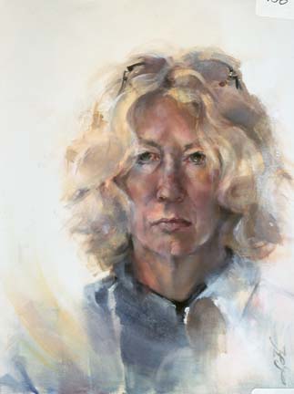
Chameleon   Oil/Canvas   20 x 16
Learning to respect yourself is, I believe, a lifelong process.  So is finding your own voice in the creation of visual art.  The big....very big...journey.  Eventually, the artist must feel secure enough in her/his own decision-making to ignore external criticism.  Competition in the form of art exhibitions is inherently a L-brain ritual....separating the work into categories:  the top winner, the peripheral winners, the accepted and the not-accepted.  All of this categorizing runs counter to the R-brain function of art-making where the pleasure is in the process, in the doing of the thing.  So, it has become my opinion that one should only enter competitions if the ego is strong enough to handle rejection.  In the circles of art groups, whether local, regional or national, the jurying is undertaken by those of like minds, with like-minded art.  The true art maverick may just have a harder time getting into the competition.  In some ways, the work in the group has been homogenized into a group mind-set that determines their own particular notion of quality art.  But we R-brainers know deep inside that art that is totally personal often cannot keep pace with that group mind set.  A contradiction to be sure.  The prize in art making is internal.  Nothing should stand in the way of it....it is just too sacred.

Chameleon was painted many years ago as a small, very small, step in self-respect.  After a lifetime of being called a paleface, I painted this work in front of my studio window during a raging snowstorm....I guess just to prove that I did, in fact, have color.  It's all a matter of opinion.

Thursday, February 9, 2012

Little Ditty...getting your brushes moving...

Juicy   Watercolor   8.5 x 5
Winter sessions of painting classes have begun.  The first class is always a challenge as assignments have not yet been made.  There are always new artists who don't quite know what to expect and sometimes arrive at that class without materials.  So the goal for lesson #1 is a simple ditty with shared materials and shared experiences.  This time I brought a bag of oranges.  Each artist was then free to cut the fruit and arrange it in a way that was pleasing.  And....we painted.  No instruction, no warnings.  Just mucking around.  Truly, there is no better way to learn to paint.  The lessons must come over time...and a few at a time.  I painted with orange and its complement blue.  The arrangement of soft and hard edges (lost and found) create a rhythm (hopefully) around the subject matter.  I don't move my brush quite as freely at the focal area in order to retain whites and a bit of crisp detail.  As always, there is a bit of a thrill as colors run into each other to become happy accidents.  No high expectations.  Just play.  A Little Ditty.

Monday, February 6, 2012

Go Figure...seeing the universal in the specific...

Fragile Patterns   Charcoal/Mixed   19 x 12.5
Figurative and portrait paintings seem to be a hard sell...at least for me.  Buyers and collectors seem to be reluctant to hang an unrecognizable visage in their living space.  I have also heard many folks who seem to be too modest to hang a picture of themselves as if it were boastful.  I have a very difficult time with this notion as I see all of mankind in a gesture, a scenario or even the placement of hands.  I relate to something in each model...something that echos a bit of my self and my longings.  I guess that I wish to relate to a bit of what the model is feeling or revealing through body language.  That is the reason why I continue to paint people and why I continue to learn about myself through them.

For me, the experience is tender.  It is pure.

Go figure.