
Sunday, December 23, 2018
Tuesday, November 13, 2018
Bat Marian
 |
| Bat Marian watercolor 13.5 x 10 |
Thinking sculpturally is a great advantage here where a knowledge of how a light source affects the landscape of a face helps it to read three-dimensionally. Without this knowledge, which I like to call "understanding the nature of things", any work from life without a particular light source can become flattened. Likewise working with a photo source.
Marian's mask was cast from metal....quite unusual. I am pleased with this work. I feel that it captures many of the effects which I constantly pursue.
Saturday, October 27, 2018
Harvest Chair
 |
| Harvest Chair watercolor 20 x 13 |
I am somewhat satisfied.
Tuesday, October 2, 2018
Birdman - L
 |
| Birdman - L oil/canvas 14 x 11 |
My recollection of the model was his discomfort from the overheating that it caused...imagine a hot summer day wearing a bird costume.....and more difficult yet....imagine dancing in it!
Saturday, September 15, 2018
Nightshade
 |
| Nightshade conte crayon 19.5 x 12.5 |
The costume for this young dancer is that of a nightshade, a dark dancer that is a kind of minion for the queen, as I was told...a nightshade plant being that which is poisonous.
Darks. Lights. Makes for a good drawing.
Friday, September 7, 2018
Tutu
 |
| Tutu watercolor pencil and walnut ink 19.75 x 12 |
I started with a half-sheet of Strathmore Aquarius II watercolor paper. This sheet has many uses in that it is partially synthetic, thin and will not buckle. During the entire 2 1/2 session, I used Derwent watercolor sketching pencils in light wash, medium and dark, alternating drawing with broad washes of water during the breaks. At home, some washes of walnut ink completed the work. For me, the challenge involved the pushing and pulling of strokes to reveal what is more important to the pose; and, conversely the less important. For this reason, I have always had such a difficulty with chairs and stools, as I realize the importance of having a support for the pose, yet despise the weight given to it.
This model wore the traditional tutu, hence the title. I am pleased.
Saturday, August 25, 2018
Tiny Dancer
 |
| Little Mermaid charcoal, conte and gold leaf on toned paper 21.5 x 14 |
"Little Mermaid" was drawn in charcoal and conte crayon on a toned paper. Gold leaf pieces were added later. I had actually hoped for more covering on its application, but due to the fact that the adhesive was mostly dried up, and the high humidity, a more mottled effect was the result. But I am happy.
This pose, subtle yet powerful, is, I believe the result of a strong core and a slight curving of the small of the back. I appreciate the strength and willpower of this young dancer!
Saturday, August 18, 2018
The Beach

But what the beach does provide is the sense of playful painting, of painting without consequences. I usually bring only a watercolor block and some pan colors, all in a small format.
These are my more successful results from this year's bunch. There were others...not so successful.
But who cares? I am on vacation.

Wednesday, August 1, 2018
Winter Mime
 |
| Winter Mime oil 48 x 30 x 1.5 |
The place: The Short North; High Street; Columbus, Ohio
The temperature: hovering around 1 degree F
As we exited a trendy restaurant where we had supped with our son and family, we turned right to head to our car, while they turned left. Just ahead of us, performing in the frigid conditions, was a mime, an extraordinary mime. He nodded in agreement at my request to photograph, while we were both amused and amazed at his skill.
This work is just one of what I hope will become a series dedicated to these wordless actors created from the many reference photos taken that day.
BTW....would anyone know who this is?
Thursday, July 26, 2018
Mary Jo
 |
| Mary Jo oil on canvas 20 x 16 x 1.5 |
I am pleased with the degree of rendering and completeness as well as the color palette. I feel that it is a good likeness. This image was sent to her upon completion and she replied that it had the look of a watercolor.
I am also very very pleased when a work has the feel of both of these disparate mediums....as I feel that each one informs the other. I am thrilled by the possibilities of each.
Friday, July 20, 2018
Honeydew
 |
| Honeydew oil on canvas 9 x 12 x .5 |
The seed problem was handled to my satisfaction, and the color harmony pleased me as well.
Tuesday, July 3, 2018
Rest Notes


There is the music score...and then there are the spaces between the notes, the counter spaces, that define the piece every bit as much. That which is played...and that which is not.
We were recently treated to a visit from our California dear ones. As we wanted to make this visit extra special, we participated in so many varied activities. Our grandson is only six, so we also varied the tempo of our daily doings to include some rest time....mostly to watch shows or movies. To me, this down time is invaluable. I enjoyed this down time by opening my book and observing my loved ones as they relax....a pleasure. As we don't see them as often, my sketchbook acts as a bit of a diary, a photo album, of this special time.
Truly my pleasure.
Tuesday, June 12, 2018
Gouache Redux
 |
| OH-585 S watercolor and gouache 8 x 21 |
This method provided the perfect atmosphere for a scene spotted on a beautiful spring day on OH 585-S while on a road trip to Wooster.
The brighter blue passages tickle my fancy. I am pleased.
Saturday, June 2, 2018
The Red Bucket...Switching it Up
 |
| The Red Bucket watercolor on Khadi 15 x 29 |
What happens when we switch it up? I like to say that changing one of your variables (paper, paint or brushes) is like the adjustments one must make while driving in various weather conditions...somehow we learn to maneuver around, hopefully with ease. "The Red Bucket" is now my 4th or 5th painting on Khadi paper, a handmade, mouldmade, acid free paper from India that is said to be made from recycled tee shirts. At this time, I think that I am able to generalize the directions of works painted on Khadi: 1) the paint cannot be pushed around quite as readily, as it quickly sinks into the fibers 2) as a result of #1, the objects have harder edges than most of my work 3) the colors are stonger....I find that I am applying more layers than usual 4) the paint can be lifted, somewhat, but with greater and greater difficulty 5) the texture and vibrancy of these works is what make them stand out. A completely different experience....fun to be had! Rum raisin.
Tuesday, May 15, 2018

Monday, May 7, 2018

Thursday, April 19, 2018
John A......taking the scenic route
 |
| John A. watercolor/gouache 20 x 12 |
John posed for our watercolor class a few sessions ago. It was attacked quickly, yet lightly. Upon review, I discovered that the front arm took too much attention away from the face, so I began moving pieces and parts, blocks of color around. As you can see, I am no slave to reality, and quite enjoy shifting focus and values to further my goal. Background areas were painted, then washed off in my laundry tub to soften and blend. (Note: washed off, letting only water hit the surface....not scrubbed off) Eventually, I brushed and squeezed on a blue gouache mix left over from another project. My heart went pitter pat. I realized that I had come as close as possible to the version that pleased me. Granted, I never start out to take the long way around to anything(the scenic route), but meandering can be beautiful as well as teaching us a few things along the way.
I am pleased.
Wednesday, April 11, 2018
Pink Tulips
 |
| Pink Tulips watercolor on Khadi 13 x 13 |
The end result is a far cry from my original idea....a bit more formal than my usual, but more becoming, I think, to the lush pink tulips. I had been wanting to try this layering of washes for years. This painting provided the opportunity to give it a try. This is a technique used by watercolor artist Catherine Anderson whose work I explored many years ago. Nothing ventured. Nothing gained.
Friday, March 30, 2018
Bunny Girl
 |
| Bunny Girl Watercolor 13 x 8 |
For me, "Bunny Girl" has a lovely effortless quality.
I yearn to retrieve the child artist within.
At times.
Monday, March 19, 2018
Me, Myself and I
 |
| Me, Myself and I watercolor 15 x 12.5 |
I am reminded of the words of Kirk Mangus who often thought about aesthetic judgment. He said, "Beauty is a figment of the imagination. It is also completely controlled by prejudices.". Soetsu Yanagi, a potter and founder of mingei, the Japanese folk craft movement, expressed similar ideas born from the philosophy of Zen writes:
A true artist is not one who chooses beauty in order to eliminate ugliness, he is not one who dwells in a world that distinguishes between the beautiful and the ugly, but rather he is one who has entered the realm where strife between the two cannot exist.
That is where I dwell...where I choose to dwell. For me, beauty lies in the process of the work itself, how we choose to spend our hours, our days.
Friday, March 9, 2018
Haystacks...and furrows
 |
| Haystacks oil on canvas 8 x 24 x .5 |
The quest in this work was the relationship between the haystacks themselves...and the furrows...a play between the cool and the warm.
While a completed snow-covered scene can be beautiful, it can tend towards sweetness and become a bit Hallmark-y. The rural Pennsylvania scenes that feature both dead grasses along with pockets and dustings of snow a la Andrew Wyeth convey great power and mystery to me. As an Ohioan, I will attest to the fact that most of the winter scenes depict these two polar opposites. One of my current reads is The Poetics of Space by Gaston Bachelard, a French philosopher. I am currently in my second go-through in order to absorb his thoughts that I have chosen to underline. He speaks of the poet's mind which is
touched by the attraction of opposites, which lends dynamism to the great archetypes.
This canvas was toned with orange, which became the base for the furrow. The process continued slowly, as I tippy-toed toward the amount of snow coverage that satisfied my visual. In the earlier stages, the diagonal furrows were more dominant....which lead them into distraction. I did not anticipate just how much energy this problem would require. I am also reminded of a similar horizontal landscape by the late Jack Richard.....it remains in my mind to this day....it was spot on.
Most of the bales we see today are machine-made and coiled. These stacks are the work of the Amish.
Friday, February 16, 2018
Weight...
 |
| Weight oil on canvas 48 x 36 x 1.5 |
My current read is Supernormal by Meg Jay. As it turns out, the most accurate predictor of those with grit, with determination and resilience, is LOVE... loving relationship(s) is what truly turns the tide...gets us over the hump. My own personal hero is LeBron James, also an Akron-ite.
This painting was 90% complete in the winter of 2016-17. It was then propped against the wall and approached again this winter. After years of trying to get portrait-perfect faces, I have been experimenting, for several years now, with subduing the faces, in order to defer to the figure, or figures, in their gestural entities, for the purpose of more accurate story-telling.
Saturday, February 3, 2018
Winter is Long in Canada
 |
| Winter is Long in Canada oil 20 x 16 x 1.5 |
Our Canadian model was apt and professional. I thoroughly enjoyed making this work "my own". I am hoping to find more time for live work this coming year.
Monday, January 29, 2018
Ode to Peppermint...
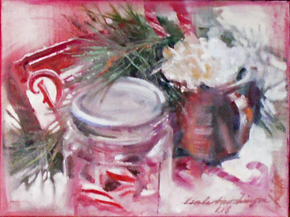 |
| Ode to Peppermint oil 9 x 12 x .5 |
Actually, the most difficult passages were the pine branches....they are, at the same time, quite delicate, yet strong, and very very complicated. Each stroke was just too strong, until I pulled out my rigger brush and thinned the paint substantially.
A final passage was required to strengthen the reds and whites, especially at the intersections of the two. I am happy, as this small scene captures what I felt during this very special season.
Tuesday, January 23, 2018
Back in the Saddle Again
 |
| Tea and Oranges oil 12 x 9 x .5 |
Enter the forgotten studio....the paint hardened on the palette....the tidied piles of creativity that lack the doing....this is scary stuff....approaching the blank canvas or paper for the first time in a while, which I liken to any activity that has gone dormant.
I find that simple still lifes are the first step I need to take to find my strokes again....simple compositions that take little thought and household items at the ready. The subjects for the still life are quite forgiving as regards draftsmanship.....who cares if the mug is a bit too wide?....the orange a bit smaller?
This simple painting is my first exercise of the New Year 2018. Happy New Year!
Subscribe to:
Posts (Atom)