Search This Blog

Friday, September 16, 2011

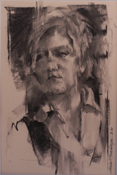
Ah....Middle Age...a profile...

Middle Age   oil/canvas   16 x 8 x 1.5
In our youth- and diet-oriented culture, we seem to cringe at the the notion of middle age.  My work was painted from a detailed sketch made during a live model situation.  There were those who really didn't want to participate, as this gentleman's body veered quite a ways from  the beautiful norm that we admire.  As I have never appreciated or enjoyed the notion of physical perfection, nor likewise the notion of ugliness in order to make a statement, I thoroughly appreciated the opportunity before me.  (I much enjoy the French term jolie-laide, which incorporates a bit of both)  Middle age...the period where gravity takes its toll, where backs laden with fatigue become curved...where support is welcome...where plumpness becomes the norm.  Yes.  I relished the opportunity to reduce this drawing to a few simple shapes and lines that would tell the story of middle age.

P.S.  A simple look around the studio revealed similar bodies, even among those who scoffed.  Life is interesting.

Wednesday, September 14, 2011

Bold versus Sublime...

Pumpkin with Twisty Stem   Watercolor
I would have to say that I prefer bold paintings....those that pull you in from across the room and beckon you to come closer.  But I also believe that we need to learn to play all of the notes:  loud and soft; quick and slow; rhythmic and not-so.  These are the tools that allow us to solve all (or almost all) visual problems.  It seems to me that great musicians are masters of all kinds of notes that lead us into varying moods and feelings....they need to be able to manipulate their listeners.  Same with great actors.  And so, from time to time, I present myself with a painting problem that requires a more sublime presentation.

"Pumpkin with a Twisty Stem" was begun as a watercolor monoprint.  I painted tender strokes onto a piece of plexiglass then transferred it by pressing onto a sheet of hot press watercolor paper.  I continued to coax the image into being.  The sublime is more easily accomplished with this versatile medium.  I am pleased with these results.

Monday, September 12, 2011

Torrit Gray...in praise of neutrals

I am in love.  With Torrit Gray.  No, not a guy... a paint from Gamblin.

I am a value painter.  But I do appreciate neutrals a great deal, especially when laid next to pures and sparkling brights.  I have always mixed my own grays.  It is usually quite an ordeal, searching for a particular neutral nuance, while adding and adding and subtracting with my palette knife.  This summer I found in my color box a promotional tube of Torrit Gray from Gamblin.  I have absolutely no idea where it came from.  But I now hail its unexpected arrival.  Because it is such a beautiful gray, in my opinion, I found myself simply mixing the pure hue of my choice to get it to lean in a particular direction.  The tube says " In honor of Earth Day, we make this oil color from recycled pigments collected by our air filtration system".  Wow.

There is a special link on the Gamblin site that explains this pigment and its making.  I found it fascinating.

Torrit Gray is quite a guy.

Here’s the secret of being a great colorist: it doesn’t matter how well you combine the bright, obvious colors, it’s the so-called dull, closely related shades - gray-greens, pewters, tans, muted browns, umbers, ochres, stormy blues and charcoals - that determines whether you have an eye for color.

Dorothy Shinn, April 14, 2005 review of Yves Saint-Laurent, Akron Beacon Journal

Friday, September 2, 2011

Hanging Around...

Boston Beat   oil/canvas  40 x 30 x 1.5
is a term that implies a bit of laziness, without particular goals.  Hanging around was something we did as teenagers.....waiting for some excitement to stir us.  There are paintings that hang around in my studio.  "Boston Beat" was one such work.  I trusted my intuition as it resided there against the wall.  I was not ready to hang it, to wire it, to consider it finished.  It was just fine....all the pieces were in their places.  The forms interrelated to my satisfaction.  The color pleasing.  Still....I found it a bit boring.  Too much reality.  Values that, to my irritation, whispered.  Not to mention that dreaded green triangle in the upper left.  Painting is a process that requires continued learning and questioning.  I love work that has an immediate impact with its shapes and values.  There was only one thing left to do............surgery.  What it needed took its time to infiltrate my brain.  I am happier.

Resolution is always sweet.  Sometimes attainable.  Sometimes not.

Wednesday, August 31, 2011

Re-Do...

Onionskin   Watercolor/Gouache   20.5 x 13
I decided fairly early on in my art career that re-do's were a waste of time.  Sometimes we think that if we re-paint our subject, we will certainly do better.  Usually, for me, I find that some passages are improved and others, which were previously satisfactory, are left wanting on the second trip around.  Re-Do's also interfere with commitment.  Morayo is the younger sister of my son's friend Bandele.  She is a prickly girl.  She modeled many years ago during a hot summer for my colleagues Jack Liberman and Judy Carducci.....and me.....when we painted in an upstairs garret room of The Italian American Center in Akron. Her pose, with delicately placed fingertips and a flower, is at odds with her personality.  Her life had not been easy.  The first time I painted her, I was dissatisfied to the point of torture.  A second painting yielded approximately the same results.  Now, many years later, I look back on this work and realize that she is there.  I see both Morayo and her her brother.  I see who she is on the inside.

Onionskins......layer upon layer.  Sometimes it takes a while to get to the inside.

Monday, August 29, 2011

A painting is never finished....

Girls Named Susan   oil/canvas   8 x 8
  It simply stops in interesting places.
                                                         Phil Gardner

I know artists on both ends of this spectrum....those whose goal is a signature and a frame, being more stimulated by the product than the process ; as well as those who add a brush stroke now and again for decades.....really.  I guess I am somewhere in the middle.  I really like to keep a painting leaning against my studio wall for a while, usually upside-down, being somewhat certain that I have resolved most major issues.  The release of the work just happens....either sooner or later.  That doesn't seem to matter.  It is deeply disconcerting to find awkward passages in those works that have "passed over".  Usually, for me, it happens more often in small works, those little paintings that I would like to think are so casual that they fill in the gaps; those little paintings that are taken a bit less seriously; those that I haven't pondered about in excess.  And yet, "Girls Named Susan" hung on my studio wall for less than a week when I realized that it could me made stronger and more exciting by adding some violet passages.  I succumbed.  Removed from the frame, it was.  Back on the easel.  I am happier.

I think it is a mistake to constantly correct paintings....that goes nowhere.  The best tack for me is to internalize the lesson learned and apply it to future works.  I am, at this point, wise enough to understand that perfectionism is rarely the solution for me.  I adore the happy accidents along the way that provide a searching, a discovery.  And so.................I really do try to honor the release of a work into completion.

Almost always.  Never say never.

Tuesday, August 23, 2011

Game On...

Saturday Morning Mancala...a sketch
Competitive gaming on a large scale makes me nervous.  Too much tension.  Too much noise. Too many egos on the line.  But I am always up for board games at home.  I look at these games as mental exercise...they keep the brain moving forward and back, side to side, and help us to discover all kinds of possibilities.  I was fortunate to marry into a family of gamers.  And, as a result, we enjoy Euchre, Oh Hell, Dominoes, Phase 10, Scrabble, Pictionary, Quiddler, Rapidough, Sequence, Jenga and Mancala.  Mancala is our summer game of choice and is permanently set up on the patio for short breaks during the day, or for enjoyment before dinner.  As is the case with all endeavors, what seems simple is actually complex.  The more one plays, the more one is able to see connections that are not initially visible.  "Saturday Morning Mancala" is a small drawing done on a visit to our son's apartment.  He and my husband were playing on the balcony while I peered through the sliding door, trying to capture his head as it pivoted during the game.  It is a small imperfect drawing that gave and still gives me pleasure and sweet memory.

Friday, August 19, 2011

Rediscovery...

This week I have been getting some work ready for an exhibit which requires fetching, cleaning and, sometimes, framing.  In doing so, I come across works that had been put aside.  "Amanda" is such a work, a charcoal drawing which gave me pause.  In fact, I pulled it out twice.  Mostly, in pulling out past works, I focus and fixate on weak passages....those passages that haven't been considered.....well....well enough in my opinion.  In this case, I was pleasantly surprised.  Because I have been painting all summer, the strength of the drawing and its values pleased me.  I loved the quick and spontaneous way the charcoal stick had moved around the paper.  The color of mid-tone paper was satisfying.  I enjoyed the rendering of the short and choppy hairstyle.  I remember being disappointed at its completion that the likeness wasn't right-on.  In the rediscovery, I had completely forgiven myself for this shortcoming and was thrilled with its essence.

Time heals.  Rediscovery.


Amanda   Charcoal/Paper   16.5 x 11

Wednesday, August 17, 2011

Glory Be to Limoncello!...

August Limoncello   oil/canvas   20 x 10 x 1.5
Soothing essence of lemon.  My first encounter with Limoncello was the lemonade beverage offered by The Olive Garden.  Heaven.  A bit too sweet but I replicated this beverage at home.  Limoncello desserts followed.  But still I was in quest of a simpler way to drink it.  My friend and colleague Judy Carducci sips hers on warm European evenings at the end of the art day.  She keeps hers in the freezer where it takes on a freezy syrupy quality.  This summer my usual gin and tonic was replaced by a limoncello and tonic served over crushed ice.  Fabulous.  Quenching.  The perfect refresher at the end of a hot summer day.  Piquant.  New.

"August Limoncello" is the painted ode.


Thursday, August 11, 2011

Flowers have an expression...

Sun Queen   oil/canvas   20 x 16 x .5
of countenance as much as men and animals.  Some seem to smile; some have a sad expression; some are pensive and diffident; others again are plain, honest and upright, like the broad-faced sunflower and the hollyhock.                        
   Henry Ward Beecher

Painting with the season seems to suit me.  One of my challenges this summer is to incorporate a bolder color scheme into my work....just to push my comfort zone.  I am a unadulterated neutral-lover.  Loud colors scare me.  This morning while leafing through a fashion magazine, I came across a multi-paged article on bold color-blocked garments.  I shuddered.  "Sun Queen" is fresh off the easel.  I am not certain I am satisfied yet.  But the colors are bolder than I can recall using before.  The power of the sunflower seems to demand it.

Monday, August 8, 2011

essence...

Virginia Foothills   oil/canvas   20 x 10 x 1.5
is a wonderful word.  To me, it implies the distilling of something into its most flavorful, fragrant or visual parts.  A boiling down.

The Place:  Carter Mountain in Virginia
The Time:  a muggy day in May

My husband and I accompanied our son Seth and his friend Louise on an upwards hike up the mountain.  I was promised a natural fruit slushy of my choice at the top.  Well.....both Seth and Louise are marathon runners.  They trudged upwards effortlessly.  I enjoyed the exercise but was happy to wearing my sweat band......I was sweating like a.....well.....perspiring to some degree.
The fruit slushy was fabulous.  We took many photos.  The trip down was easier.  The day was amazing.

The patchwork patterning of the orchards was intriguing.

Essence.


Thursday, August 4, 2011

Balancing Act...

Mary in Polka Dots   oil/canvas   30 x 24 x .5
Yes, indeed it is.  For almost everyone.  Finding that median in the land of polar opposites.  Work:Play.  Self:Others.  Visual balance is important in my work....and I have noticed that most people are highly sensitive to balance and can tell when, in any situation, it needs to be improved.  Being off-balance is disconcerting.  (There are cases, when asymmetry is very exciting and helps to tell the story.  In that case, imbalance is intended and purposeful).  Mary was a tall and lanky young model.  And then she did that pretzel thing with her legs wrapped around the rungs of the stool.  First of all, painting the human figure on a standard size canvas is difficult at best.  If the standing figure is painted in its entirety, the proportions of the surface are wrong to me, leaving far too much negative space.  O.K.  In this case, the lankiness was offset and balanced by some emphasis on the horizontals.  In the working of these horizontals, the relationships of shoulder/shoulder; hand/hand; knee/knee and boot;boot became even more important.  In this particular scenario, the stool had to be included as it was inseparable from the legs.  The horizontal rungs also helped to balance this extremely vertical situation.

I have watched people straighten a barely-crooked painting on a wall as they walk by.  I believe that a need for balance is deeply engrained in our physiology.

Tuesday, August 2, 2011

I am not a traditional realist...

Tomato Basket   oil/canvas   16 x 20 x 1.5
There, I said it.  Acceptance of my artistic direction.  Said with a sense of loss.  And also with a sense of relief.  I so admire traditional realism.  But after years of wiping out chairs upon which the models rest, I am ready to face my own direction with fortitude.  I have tried painting the barn behind the horse, the curtain behind the still life and the trees behind the model.  My sense of aesthetics has urged me to wipe them all out.  Yes, a light source matters to some degree.  It helps to describe my realistic forms, to ward them away from flatness.  But the design approach of dark and light patterns is where my thrill is....those patterns that exist and move and relate without regard to the subject matter.

"Tomato Basket" took quite a while to paint,  I remember being confused by my own desires being in conflict with the window behind the basket.  The tomatoes literally rotted while I figured it all out.

I am what I am and that's all that I am........Popeye

Thursday, July 28, 2011

Dorothy...

Unsung Dorothy   oil/canvas   20 x 16 x 1.5
Gale just might be the most famous Dorothy ever...the I-wish-I-were-in-Kansas-ruby-slippers Dorothy.  And then there is that darling skater with the darling haircut....Dorothy Hamill.  But there are so many unsung Dorothys out there...participating in the daily grind and running offices at art centers on a volunteer basis.  These are the real Dorothys.  We were fortunate to have Dorothy pose for our class at the art center....3 hours.  I need about three times that amount of time in front of the model, at the very least, to reach completion.  If I'm lucky.  The next week she was unavailable.  I was lucky to have remembered my camera.  When investing time and energy in work from a model, it is always good to have a camera handy for finishing the work if schedules go south....illnesses, vacations, and a million other activities can easily shortchange our best efforts.  We work on a 20-minutes-on/5-minute-off session.  My favorite time to shoot the photo is 5 minutes or so into the SECOND session.  By this time, the model has found the pose.  Also more relaxed from the break.  Not too stiff from finding the pose again.

The world turns thanks to the efforts of all the unsung Dorothys.

Wednesday, July 27, 2011

and it's HOT HOT HOT...

Red Gold   oil/canvas   6 x 6 x 1.5
here in Northeast Ohio.  Our old 150-year-old dwelling has no air conditioning so the fans are at full tilt and begging for mercy.  The good news is that the heat and humidity have been superb growing conditions for the garden.  The first tomatoes are off the vine this week.  Yum.

All forms present their own particular problems in painting.  Circles.  Circles.  Circles.  Without hard and soft edges, the forms become too self-enclosed for me, preventing the movement around the painting.  I have learned this over the years with repeated efforts at painting pumpkins.  I love to play off these circles with line...the vines...and with texture...the leaves and the small buds at the tops.  For me, these considerations have improved my tomato painting efforts.

Add balsamic vinegar, soft mozzarella, salt or mayonnaise.  Life is good.

Tuesday, July 19, 2011

Brush your teeth and paint some flowers...

For the Love of Geranium   oil/canvas board   8 x 8
are among those structured disciplines that reside somewhere in my head.  Have to do them.  Not always a pleasure.  I feel that floral painting is one of the most difficult endeavors possible.  The form of just one bloom is highly complex.  Add another.  And yet another.  And consider the relationships between them.  Yikes!  I decided to paint the geraniums on my patio.  They are, in my opinion, right up there with lilacs when it comes to complexity.  They are made up of a myriad of pieces-parts, all in various stages of ebb and flow.  And so, I knew that the simple shapes of the blooms might best tell the story.  Seeing and interpreting their parts was amazingly confusing.  Their colors are also complex....being somewhat florescent and a merging of more than one hue.  And now, two days later, my studio is littered with pieces of geranium parts and leaves.  I feel as if I have done battle.

"For the Love of Geranium" is the result.

Friday, July 15, 2011

Daily Painting...or painting daily?

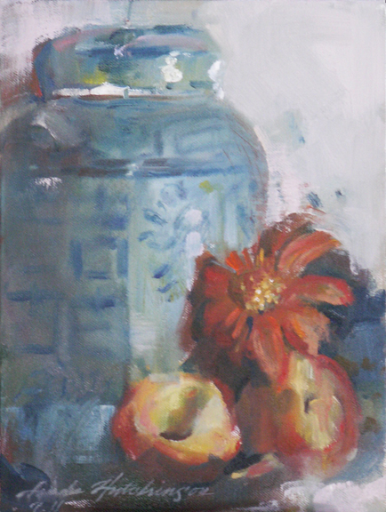
Ginger Jar with Peaches   oil/canvas   12 x 9 x 1.25
Yes, I paint every day....or nearly.  But the current daily painter movement is comprised of artists who actually finish a painting in a day.  How DO they do it?  I linger over my coffee and my meals.  I even linger over many decisions.  And, I just love the look of paint over paint.  That can only occur when the paint has some time to dry.  I consider and reconsider.  To give myself a break from the larger painting problems in my work area, I have decided to paint a few smaller still life works that will be color-driven and a bit mindless.  The shift will accommodate attention and practice in other arenas....brushwork, the difficulty of painting flowers and design to name a few.

"Ginger Jar with Peaches" is a smaller 12 x 9 painting.  A 2-day painting.  The best I can do.

How do they do it?

Wednesday, July 13, 2011

Express Yourself...

Grande Dame   oil/canvas   30 x 40 x 1.5
I am the happiest when my work reflects who I am....my own personal recipe of design expressed through paint.  In the past, I have painted what is in front of me, especially en plein air, using local color, hard edges and pretty much what would be seen from a photograph.  The result has been a great dissatisfaction and uneasiness.  "Grande Dame" was originally painted from photos taken from a Victorian home.  Its title was "Gabled".  Despite the fact that it was, in my opinion, a respectable work, it didn't thrill me.  It did not represent my own ideas, my own interpretation.  After a year had passed and it was time for varnishing, I decided that I just couldn't preserve it as it was.  I couldn't wait for the initial destruction.  It sat in my studio for a very long time.  By then I had deleted all photo references.  It took four sessions of discovery and interpretation.  It was rechristened "Grande Dame".

While I am certain that there are those who prefer the first version, I owe it to myself to be myself.  Not painting to an audience.  

I felt as if I had come home.  At long last.

Monday, July 11, 2011

Surprise!

Jardiniere   watercolor/mixed   20.5 x 12
is a wonderful expression....and most often conjures up a birthday party.  Most recently, my work "Jardiniere" was the subject of surprise for me.  This painting, a watercolor, was begun in class from a model who posed as a gardener.  I continued the work at home, filling in the spaces with an imaginary garden.  Soon, I was overwhelmed with a sameness of color and a busy-ness that had taken over.  It looked like most of my other garden paintings droned into sameness.  I yearned to simplify the background and, thus, shift all of the attention to the gardener whose work is unending.  I am quite a fan of the teachings of Robert Henri who believed that the evolution of a work depending on the altering of passages that seem wrong.  As the work progressed, I found myself using gouache as well as printer's ink which was applied to a plate and pressed onto the surface.  Colors were urged into excitement.  The journey became totally unpredictable.

Surprise!  Immediately afterwards, I was very confused as to the amount of affection I felt for this work.  Now, several weeks later, I find myself liking it.

SURPRISE!

Thursday, June 30, 2011

The ideas that won't go away...a carousel and its implications...The Letting Go

are the ones to which we need pay attention.  The notion of a calliope has long been one of those ideas for me.  Many times observed.  Many times photographed.  During a recent trip to Boston we happened upon a calliope filled with children, some smiling and some hesitant, on a brisk sunny morning.  I stood at the edge and kept snapping photos, one after the other.  "The Letting Go" is the resultant painting, one I have been thinking about for years and years.  My attraction is definitely not nostalgic....although I have seen some delightful paintings that exude this quality.  My idea has more to do with leaving the "round and round", about becoming fearless, and about letting go of past hurts and hurtful relationships.  A spinning away from the expected and the predictable. The painting was created from many references including my own hand.  The most difficult part to resolve was the value one....I was shooting for a light-filled canvas.  Yet, I am value painter and needed to  include powerful darks....that is who I am.  I feel that I came to a useable compromise.

Last night on "So You Think You Can Dance", one of the beautiful choreographies was conceived from this same concept.  Interesting!  Synchronicity.

The Letting Go

Tuesday, June 28, 2011

The Beauty of Simple Shapes...

Eleanor...a sketch
I'm afraid that I am a newbie when it comes to appreciating the beauty of simple shapes.  Other concerns...many other concerns...have been much more apparent in my artistic studies.  Simple shapes are often masked in the background....more subtle...as we work our forms into visual presence.  It is true, however, that a painting is more successful from the get-go if the 4-5 simple shapes in the composition are also beautiful and stimulating in their interlocking jigsaw-puzzle-like nature.  In fact, in class we have been analyzing these shapes using tracing paper on top of famous paintings, as well as on our own.  I am beginning to appreciate these shapes from the beginning of a sketch rather than as an afterthought.

"Eleanor" is a sketch of my mother-in-law done on the deck of our vacation rental at the end of the day when light was waning.   I don't need any other detail to tell me that it is indeed her.  It is her shape, her posture, her figure.

Monday, June 27, 2011

Flexibility...

Lemonade   watercolor   13.5 x 18
is a characteristic that keeps us fresh and new.  It keeps the doldrums away, for the most part.  It helps up to solve new problems in a new way.  It prompts us to reuse, deconstruct and reconstruct.  I believe that it is a key ingredient for happiness.  When we first started visiting Charlottesville, Virginia a few years back we wandered into a spacious gallery called Sage Moon.  Great ambiance.  Several rooms.  Artwork by professionals and school children alike.  A cultural mecca.  Owner Morgan MacKenzie-Perkins, a dynamo to be certain, had to close this gallery due to the economy's downturn.  She picked up the pieces and found a new way to operate.  The works she features are shown in various local locations, including Siips Wine Bar.  Although she regrets this turn of events, she has certainly made the most of a bad situation.  Thanks to Morgan, many artists are still being shown in this wonderfully cultural community.

Lemonade from lemons.  Fresh at that.

Friday, June 24, 2011

Constant Change...

Slice   watercolor on paper   2.5 x 7.5
is difficult for painters to capture.  We deal with a frozen moment situation.  Claude Monet solved his curiosity with haystacks by painting an entire series.  Contemporary kinetic sculptors such as Janet Echelman and Anne Lilly create works whose movement IS the art.  Gazing at the face of a loved one provides multitudinous "looks" in the course of a day.  Which one to choose for the frozen moment?  Likewise with the ocean.  Colors, texture and direction change many times during the course of the day.  During our shore vacation, I painted only 2 very small watercolors of the ocean.  There could have been dozens.  Yet each one allows me to feel the infinite.

Thursday, June 23, 2011

Give More Stickers

Recently I had the most wonderful experience of coloring with a lovely 3-year-old girl named Jaidyn on an extended family vacation to the shore.  She was armed with a lovely set of Crayola Twistables that I also carry in my drawing toolbox.  As we colored and scribbled, we chatted about the yuckiness of boo-boos and the deliciousness of milk.  About every 5 minutes, she awarded my sketchbook with a sticker.  As you can see, I was rewarded with many stickers....which definitely felt great. 
                    Picasso said: Every child is an artist.  The problem is how to remain an artist once                                                we grow up.

Jaidyn's approach was one of play....non-judgmental and honest.  Naive.  It put things into perspective for me...at least for a short while.

          Give more stickers.  Receive more stickers.  And dip some Oreos while you're at it.

Wednesday, June 8, 2011

Home...

Boston Beat   oil/canvas   40 x 30 x 1.5
is where the heart is.  Certainly true.  I am a notorious homebody.  Home is where I work, where I relax, where I cook and garden and where I worry.  Thomas Moore expounds upon the great soulfulness of home in The Re-Enchantment of Everyday Life.  Still, travel opens up great windows of awareness.  To travel is to experience new sounds, smells and flavors, as well as sights.  A spring trip to Boston was like a jolt of adrenaline.  Two new paintings are the result.  A pair of street musicians in Boston Commons in the early spring light was a momentous experience.  I envied their musicality, their spontaneity and their seeming unawareness of onlookers.  "Boston Beat" is the result.

Tuesday, June 7, 2011

Nesting...

Hand Woven   watercolor/gouache   11.75 x 10
is a fairly common sight this time of year, especially if you are an observant nature-lover.  My husband knows where every feathered nest is in our yard.  We wait on the trimming until the first brood has flown.  We painted nests in class.  Almost every artist was able to bring in an abandoned nest.  There they were in all their glory...feathers, strings, fishing line, small bits of paper and even some Chinese money plants woven in.  They are an art form unto themselves.  The challenge was to create an entire composition around the nest....where the dark brownness of the nest did not overwhelm value-wise to create a "hole" in the picture.  We had some amazing results!  Each one different.  Each beguiling.  The results were as glorious as the nests themselves.

Friday, June 3, 2011

Organic...

Organic Carrots   watercolor   10 x 17
is a word we've been hearing a lot lately.  Organic signifies no pesticides.  No chemicals to ingest.  No  plastic bags.  Just like anything else, there are arguments on either side.  Organic foods cost much more.  The produce is usually smaller.  It doesn't last as long.  More trips to the market.  But, gee, it is always so beautiful.  Where else can you get carrots with the tops still on them?  Much more beautiful to paint!  Carrots in a plastic bag yield no measurable aesthetic qualities.  I will be honest....just about the only time I spring for organic is for painting....then we eat it up quickly.  A good plan.  Organic markets please the eye as well as the palate.

Thursday, June 2, 2011

Postcard Art....

Man on Floatie....a postcard painting
is a fun vacation thing to do.  My work does not rely on the outer environment so traveling doesn't necessarily involve big plans for plein air painting.  Some artists I know love to make travel journals that involves art-making each day designed around a place and time.  Not me.  I actually relish the break from the intensity of studio work.  I pack a small wicker suitcase with:  drawing materials, a small set of pan watercolors, a couple of brushes, and some postcards.  I find traveling with oils too cumbersome.  I like to travel lightly.  Painting small cards and actually putting them in the mail is a fun thing to do.  I enjoy the look of a handmade postcard after it has traveled across the country.  Most folks enjoy receiving them as well.  And, well, the others are happy to give them back to me.  One of my favorites was done quite a few years back around the pool of beach-side condominiums.  The patriarch of a large family spent the afternoon in a floatie-of-sorts.  And I spent the afternoon painting him.  I really don't think he knew what I was doing.  It took so very long, as I recall, as I had to wait for his floatie to spiral around toward me repeatedly....each time gaining only a couple of strokes.

If he only knew.

Tuesday, May 31, 2011

Inside Out...

Derby Pam   Watercolor   9 x 13.75
Part of my painting and drawing process involves working from the inside out.  For me, this makes sense.  The block-in is extremely light.  Not committing to hard edges until the necessary tipping point allows for greater flexibility and malleability during the rendering.  Especially necessary for portraits, as every facial feature relates to every other facial feature, including muscles, tendons, bones and the obvious eyes-nose-mouth.  The artists in my class requested a painting demonstration.  I rarely comply, but a class vote put me in the minority.  Painting and talking is just too hard.  I much prefer the tunnel-vision-focus where I can achieve the state of mushin.  Pam was a willing model.  The painting was finished  from a photograph in four passes, top to bottom, although I will confess to leaving it on my table and noodling over it throughout the weekend.  I shot photos of the progression which should be available by tomorrow.  Whew!!!!

Monday, May 30, 2011

Memorial...

Rockamelon   oil/canvas   8 x 16 x 1.5
Day is a time to visit grave sites and to remember those who are no longer with us.  It is also a time to remember those delicious picnic food flavors!  Happy burger-potato salad-baked beans-watermelon day!

Friday, May 27, 2011

The Beginning. The BEGINNING is EVERYTHING

of any work is all-important.  The energy, the strokes and fervor with which pigment is applied sets the pace for the entire work.  Many of the artists that come to my classes state that they want to learn to paint and draw more loosely.  Loose is scary.  It is out of control.  Loose strokes cannot be added to a tight painting for any effect other than that of an afterthought.  The goal is:  loose to control; big brushes to smaller; thin paint to thicker paint.  The beginning is everything.

I have been reading a book entitled Blue Nude by Elizabeth Rosner, recommended by a fellow artist.  Interesting to be sure.  The author is definitely familiar with art processes...and feelings.  I see myself on nearly every page.  At one point, the blocked artist named Danzig states:    Begin again.  How many times had he said it?  The phrase was half encouragement, half admonishment, the constant reminder to his students that the beginning was all that mattered and, at the same time, the very thing that had to be executed with abandon.  Perfect and irrelevant.

I couldn't agree more.

Wednesday, May 25, 2011

Handmade...

Mexican Glass   watercolor/gouache   19 x 11
I appreciate all things handmade and have actually found myself "rescuing" such things from thrift stores.....(no, I am not a hoarder).  They are sacred.  Because they are so often handmade, I seem to love all things Mexican...the glass, the jewelry and the frames.  The glass is full of bubbles and the glassware sometimes a bit lopsided.  The framing is my absolute favorite, but a bit difficult to work with as the metric system is used for assembly.  Fitting them with glass is tricky.


"Mexican Glass" was painted in the summer...I remember it well.  Along with the Mexican blanket flowers from our garden.  Hot.  Cool.

Tuesday, May 24, 2011

The Case for Original Art...

Precarious Stack of Vintage Bowls   Watercolor   12.5 x 9
Just last week my son was searching for some white glazed pots for his indoor plants.  His trips to some Mom and Pop plant stores yielded much better results than a trip to Lowe's.  Large discount houses cater to the lowest common denominator with more generic products.  The same with art prints which have been killed with correctness.  Of course, we all need those deep discounts in some arenas of our lives.  But, for me, what we choose to put on our walls defines us personally....our senses of visual aesthetics.  No generic here, please.  Original art is one of a kind.  It has a personality and character all its own.  It speaks of the artist's hand who created it.  Lively.  Nurturing.  Lovely.  The more I am able to celebrate my own uniqueness, my own oneness, the less I am able to tolerate generic artwork.

So, OK.  Buy generic toilet paper....bars of soap in bulk.  But engage in the liveliness of original art and the artists who choose to spend their lives in wonder.  Participate.  Oh, yeah.

Monday, May 23, 2011

Measure Twice, Cut Once...

Blueberries and Lilacs   watercolor   9.75 x 14
O.K.  I have to keep repeating this mantra.  Preparation is a key ingredient to the success of a painting.  But I don't think that I am unlike most artists who want to jump ahead to the fun stuff, the painting.  Impulsiveness.  At the Mentor watercolor workshop, we spent the first hour drawing our still life set-ups.  My goals were the following:  to familiarize myself with the subject matter; to understand the underlying rhythms of dark and light values that lead the eye through the painting; and to be able to merge similarly valued shapes for the sake of simplification.  And yet, I wanted to retain the enthusiasm for the painting.  (I didn't want to spend it all on the drawing.)  I believe the preparation paid off.  I used the drawing as a road map to guide my painting and used the actual objects for color and detail references.  I think it made for a better painting, at least one that eliminated meandering, making all strokes more crucial and significant.

Let this be a lesson to me, to us.

Wednesday, May 18, 2011

Blue....

Blue   charcoal/pastel   14.5 x 10
is forever connected in my mind to N.Y.P.D. Blue.  A cop show with no equal.  I guess the notion of justice is so appealing...especially these days with the lay-offs of these much needed public workers, and the line between right and wrong frazzled and wavering.  Double standards.  Monied payoffs.  The shrinking of the middle class.  Manipulation and trickery for a dollar.  So when our artwalk model showed up, a retired policeman, all of my cop-thoughts came into play.  Our model took great care with his appearance...a stingy-brim hat (which was new to me), a striped 40's styled tie and an earring.  Along the Frank Sinatra-lines.  Terrific.  Three hours never passed so quickly.  Thank you, Al.

Justice has been served.  "Blue" is my response.

Tuesday, May 17, 2011

There is simply no substitute...

Bundled (Mo)   Watercolor   14 x 10
for drawing from life.  It is in this life situation that we are able to understand the forms, the roundness, the hills and valleys of the human face.  And, when practicing, the best way is to use pencils or charcoal....values will teach these subtleties more easily without the added complications of color.  I have seen seasoned artists freeze up when faced with portrait-drawing.  It is here that small errors in scale and measurement show up.  And, when we freeze up, we tend to see the human face as we did when we were children....two eyes, a nose and a mouth....and perhaps a  couple of ears and some hair.  Getting the eyes "just right" will help, but is not the true foundation of drawing the human head.  In actuality, the simple planes of the head tell the true story.  It is indeed an overwhelming task.  It is easy to practice on yourself in the mirror....perhaps limiting yourself to just one quadrant of the face.  That success will urge you onward.  My friend Mo does a self-portrait each day, both to improve her skills and to understand herself maneuvering through life.  Her set-up is stationary in her bathroom.  Her drawings are done in an old copy of The Gulag Archipelago.....one page a day.  Whatever medium spins her fan at a given moment.  What a wonderful way to learn.  Let that be a lesson to us.

Friday, May 13, 2011

Themes...

Dappled 2   oil on canvas   40 x 30 x 1.5
I believe that it is the path of the serious artist to paint those things, those ideas, that are important to her...those remnants that when left behind, will help to decipher the life of said artist.  I did not set about painting with any themes in mind., but I did follow my interest and paid attention to my intuition.  After several years, I realized  that one of my interests is "things dappled", things wabi-sabi, those things of pied beauty.  I am certain that what lies beneath this whole spotted and imperfect notion, is a distrust of black and white thinking as well as a personal dislike for the purebred, the pedigreed.

Thus, one of my themes is "things dappled".  I hope to continue all this vein for some time to come. "Dappled" and "Dappled 2" have been included in the Artists Archives of the Western Reserve annual May exhibition.

Glory be to God for dappled things--
For skies of couple-colour as a brinded cow;
For rose-moles all in stipple upon trout that swim;
Fresh-firecoal chestnut-falls; finches' wings;
Landscape plotted and pieced--fold, fallow, and plough;
And all trades, their gear and tackle and trim.

All things counter, original, spare, strange;
Whatever is fickle, freckled (who knows how?)
With swift, slow; sweet, sour; adazzle, dim;
He fathers-forth whose beauty is past change:
Praise Him."
Gerard Manley Hopkins (The Poems of Gerard Manley Hopkins)

P.S. I was a little freckle-faced girl.

Monday, May 9, 2011

Drawing as Finished Art...

Power Tie   charcoal/pastel   17 x 8.75
Drawings are useful as painting preparation and help to resolve design problems early on.  But drawings are also quite powerful as finished art.  Without the complexity of color issues, they are able to get to the point quite quickly.  I also enjoy the play of the charcoal across the paper which certainly is easier than with paint!  Drawings are value-driven.  "Power Tie" was drawn from a model.  Because I saw the major shapes as light, I tried to used the darks to rhythmically move the eye throughout the drawing.  Thanks to my friend Ann who always has a plethora of pastel sticks on hand, I added the red of the tie at the very end.

Thursday, May 5, 2011

Fine or Chunky?...

Silverplate Pot   watercolor/charcoal   9.5 x 10
Discovering yourself in your art is very exciting.  It defines who we are personally and helps us celebrate our own uniqueness, oneness.  I love all things chunky - salsa, spaghetti sauce, applesauce, jewelry and orange juice with pulp.  Mugs, not teacups.  I prefer large brushes and chunks of charcoal...never pencils.  The first week of watercolor class is always a bit problematic in that no one is really prepared for an assignment.  I asked each artist to grab something in the well-stocked trove of still life objects at the art center.  I grabbed a tarnished silver plate teapot.  I don't question my motivations....I just go with my first inclination.  It was indeed a challenge with all of that tarnished goldeny-violety-blacky reflectiveness....and some dents as well.  It was only when I finished the work at home that my self-definition revived itself.  The beauty of this pot was in the embossing on the handle and on the spout.  But when I picked up a small paintbrush, I felt disappointment...a "why bother" kind of feeling.  It was just short of revolting.  I always want to finish off a class project using only watercolor because, after all, it is a watercolor class.  But I had to be true to myself.  The pot was finished with chunky charcoal lines which pleased me greatly.  The overall feel is always more important than the detail to me.

I was reminded of who am am.

Wednesday, May 4, 2011

Feelings...

Awakening   watercolor   19 x 9.5
are entwined within my every brushstroke.  Tension shows.  Neurotic behavior reveals itself.  Confidence uplifts and frees.  For me, painting and feelings are inseparable.  Painting is, quite frankly, where my inner world resides.  It is rare to commune with an individual whose ego does not get in the way of the communion.  I have never enjoyed painting landscapes that much.  Part of the reason, I'm sure, has to do with a reality-based color palette that is all over the wheel, and whose disparate nature fragments the power of the work.  But artists in my classes enjoy the painting of the outdoor scape.  And so I deal with it.  For me, a limited palette is a must.  Colors were pushed.  The blue-violet of the sky was brought down to the middle ground.  And the grass green was pushed up into the sky.  The large tree was not solidified.  My response to an early spring landscape:  before the first mowing.

Whether inspiration is based on what one sees or on ideas, the artist's job is to react emotionally to what inspires him.  Be less demanding of the source of your inspiration and give more guts to the representation of your visions and ideas. 
Alex Powers

Friday, April 29, 2011

Baaaa.....d to the bone...

Reverence   oil on canvas   30 x 40 x .75
This month I have been painting a sheep.  Yes, a sheep.  Massive.  A gentle giant.  Painting animals makes me feel serene and complete.  It helps me to understand just where we fit into the grand scheme....that we are a small part of the world in which we live.  My goals were to render the wool in a general way and to merge the sheep shape into the surrounding ground.  The gestalt.  The overall sheep feel.  I felt reverence as I painted.  Respect.  Admiration.

The highest purpose is to have no purpose at all.  This puts one in accord with nature in her manner of operation......John Cage

One who lives in accordance with nature does not go against the way of things.  He moves in marmony with the present moment always knowing the truth of just what to do......Lao Tzu (Tao de Ching)

Thursday, April 28, 2011

Workshop Work...

Fedora and Stripes   charcoal/paper   20.5 x 13
It has taken me quite a while to accept the fact that my workshop work is not usually my best.  Not only is it difficult to focus clearly in a workshop setting, the concerns of having enough coffee and the volume level of music tend to disrupt and get in the way.  My top concern is that the participants have a successful experience.  As a result, my own workshop drawings are often discarded.  The work of the participants must be the priority and, I must say, I have been so greatly pleased in this regard.  The fact that what I am trying to communicate visually is getting through to participants is unbelievably rewarding!  And, the fact that my own work seems to be sub-par during this same time period is disappointing but no longer a surprise.  As I culled through the work from the expressive drawing human figure work, I decided that one drawing was worth some extra work.  It was on good paper.  "Fedora and Stripes" is the finished drawing.  Thanks to Leta for being such a great model.

Wednesday, April 27, 2011

Handed-ness Matters...

Paint Dancer Detail
no....not left or right.  I am referring to how we strike or caress the painting surface with our tools.  I believe that those of us with heavy hands need to learn how to caress the surface in appropriate passages.  And, likewise, those of us with a more timid approach, must learn to bravely become heavy handed and bolder when the work requires it.  I guess it seems similar to learning to play the piano....or any instrument for that matter.  Fortissimo.  Pianissimo.  Over the years I have found that, in general, it is more beneficial for me to lighten up my touch.  ( I am a natural heavy-hander).  A lighter touch provides more glide.  An energy that allows for more curve, more swerve.  When I recently experimented with gold leafing, I was so very surprised at the light touch required, with a soft brush using circular movement, to actually adhere the leaf to the adhesive.  (In my mind, there was a burnishing, a pounding effect....wrong)  A light touch allows for more free play and more movement.  To and fro.  Ebb and flow.  Push and pull.   All good.

Tuesday, April 26, 2011

The King Midas Touch...

Gerbera   watercolor/mixed on paper   9.5 x 12.5
Gold has a history of desirability, representing wealth and status.  As we define ourselves as artists, we gradually sort through what is us and what is not.  For the most part, I have rejected this notion of gold-status.  I do not like gold jewelry....or gold frames.  I much prefer the weathered look of worn materials of an everyday nature...flaking paint, rusted iron and speckled stained materials.  Me.  Years ago, however, when studying calligraphy, I often admired the gold leafing on ages-old manuscripts and holy books.  The reflective quality was beyond compare, even after hundreds of years.  In my art cabinet is a kit containing all the things needed in order to gold leaf.  It sat unused for so many years....simply because I did not want to read the lengthy instruction manual.  I am a doer...not a reader.  A few weeks ago a painting of a gerbera daisy just seemed lackluster, for want of a better word.  I pulled out the kit and read the instructions.  Yes, read.  It really wasn't so difficult.  I loved the addition of this material onto the painting.

Never say never.

Monday, April 25, 2011

Eggs..

Chinoiserie Eggs  watercolor   12.5 x 9
are always a challenge to paint....white, elliptical and fairly reflective.  I usually try to put eggs into a composition with patterning in order to highlight, by contrast, these qualities.  "Chinoiserie Eggs" came into being fairly easily and, I have to say, I enjoyed the rendering of the blue design.  As always, the most difficult part became the opaque darks surrounding the pot itself.  Selective light washes were painted over most of the egg surfaces in order to really eliminate the "too much white stuff" quality that undermines so many watercolors.  Dirty water washes are often a great addition, I find, as the pigments swimming around in the wash water make for harmonious neutral glazes.

Making egg salad from the set up is just gravy.

Friday, April 22, 2011

How to paint water...

Narrow Bridge   oil/canvas  36 x 24 x 1.5
is a concern for most artists as water reflects what surrounds it for the most part.  Frozen water.  Moving water.  Stagnant water.  Each creates its own problems to solve.  Here in America we don't often worry about a source for water.  Solidarites International is one organization making an effort to provide clean water for folks around the world.  Artist Clement Beauvais has illustrated this need on a vimeo film clip by drawing with water and dropping in ink on the surface.  Fellow artist Tom Auld has forwarded this clip to me....he was intrigued by the drop-in of pigment....one of the beautiful qualities of a water medium.  The film is both beautiful and haunting.

Matt Damon and Gary White have founded water.org here in this country.  Donations are accepted to help to provide enough clean water for a year for an individual.  It is estimated that 3.6 million people, including 1.5 million children under the age of 5, die each year from consuming water that is undrinkable.

Let water be the link for solving this global problem.  Donate.  Paint water.

Monday, April 11, 2011

Emily Dickinson wrote....I dwell in Possibilty--

I dwell in Possibility--
A fairer House than Prose--
More numerous of Windows--
Superior--for Doors--

Of Chambers as the Cedars--
Impregnable of Eye--
And for an Everlasting Roof
The Gambrels of the Sky--

Of Visitors--the fairest--
For Occupation--This--
The spreading wide my narrow Hands
To gather Paradise-- 


Oh, the possibilities.  Members of the Women's Art League in Akron spent Saturday morning creating pear possibilities.  This slide show shows but a few.  Juicy.  New.  Individual.

Friday, April 8, 2011

Life and Art...

Fourteen   pastel/paper   23.5 x 17
I become elated when art intertwines with everyday life and becomes a bit disengaged from the elite sector.  That is one of the reasons why I love street art so much.  And, let's face it, artists spring from that part of life that is all about the essential, the important, the work that creates, often counter to the destructiveness that surrounds us daily.  And all without regard to pesos.  (of course, pesos do help) Art elevates.  Art enchants.  Art saves.  And so I am particularly delighted to have my work shown at Clip Art Salon and Gallery over the next several months.  Owner Denise Pepe has shown local artists for years in her salon.  She has given many artists a great start, myself included.

Clip Art Salon and Gallery
1165 E. Tallmadge Avenue
Akron, Ohio 44310

Stop by for a color or a cut.  Stop by to become elevated.

Wednesday, March 30, 2011

Discipline is Freedom...

One in Every Crowd   oil/canvas   8 x 24 x .75
said Garth Fagan, the Tony award-winning choreographer of "The Lion King".  "Study the rules before you break them".  Quotes of this nature abound.  Probably because they are so true.  When you study your craft so very much that its nuances become part of your nature, it is then that you can begin to play....true play from which creativity springs forth.  Yes.

A few weeks ago, the program at my local art club was about breaking the rules.  I was unable to attend that evening.  Sometimes, in breaking the rules, we are more able to completely say what it is that is felt.  "One in Every Crowd" is a case in point.  A painting about chicks, sweet chicks.  And also a painting about following the crowd, or not.  I chose to paint my independent chick a different color and to put him facing a different direction than the others.  These changes made the painting more interesting to me, and also made the painting more interesting and challenging to paint.

Tuesday, March 29, 2011

Alice...

Applause   watercolor   9.25 x 13.25
(of the Wonderland tale) would love stepping into Heavenly Cupcakes in Kent!  Pink and Green everywhere.  Antiques.  Bold stripey wallpaper.  Games.  Tables.  Sparklies.  and now.....cupcake paintings.  Artists in both of my classes have contributed to this wonderful exhibit of cupcake art:  Sheri Linzey of Kent; Norma Ott of Cuyahoga Falls; Jackie Roberts of Sagamore Hills; Carol Weigand of Rootstown; Delores Zink of Kent; and myself.

Check it out.  And, btw, Alice said to bring your sweet tooth along.

Friday, March 25, 2011

Change of Pace...

Country Eggs   oil on canvas   6 x 6 x 1.5
Changing my painting pacing keeps me interested.  Some days are large oil painting days....they take quite a while to resolve.  On watercolor days, I often work on more than one, switching back and forth while trying to time the drying times.  And, when I become overwhelmed with problem solving, I paint small oils on small canvasses, just painting as I see things.  Simple.  Uncomplicated.  Refreshing.  Often, these small works are driven by color harmony and color experimentation.

Country Eggs....change of pace.

Thursday, March 24, 2011

Swoon

is defined by dictionary.com as "to enter a state of hysterical rapture or ecstasy".  What a marvelous word!  Swoon is also one of my favorite street artists.  She studied painting at Pratt.  Her subjects are street people.  Most often she does wheatpaste prints and paper cutouts.  I love her style as well as her subject matter.  Sometimes her figures are a combination of great design and draftspersonship combined with decorative elements which make me swoon.  I noticed her work in "Exit Through the Gift Shop".  She is also represented in Graffiti World:  Street Art from Five Continents.

What a surprise to receive one of her images yesterday in my mail.  My son photographed this work on Grand Street in Brooklyn and sent it to me from his phone.

Technology.

Swoon.

Friday, March 18, 2011

Pear Possibilities...

La Poire 3   watercolor and gold leaf
Early next month, I will again be presenting a program called "A Pear is a Pear is a Pear".  It is a fun and playful session that involves process rather than product.  During the workshop we consider such things as:  edges (soft vs. hard); texture; color temperature (warm vs. cool); line and mass; and color (neutral vs. pure).

The slide show shows some the fine small pear paintings that were made that during our Thursday watercolor class.  The pressure was off....we were loose and free.  After all, it was only play-time....right?