Search This Blog

Wednesday, June 27, 2012

Gesture...

Brooklyn Beat   Watercolor/Mixed on Paper   20.5 x 28
spins my fan.  It is really the invisible line that defines the energy of the figure's position, its weight.  Gesture is often based on an S-curve, an organic line that leaves and returns, a staple of calligraphy.  Group gestures use this line as well.  Individual gesture takes a back seat to the gesture of the group.  Last evening on "So You Think You Can Dance", there was a lovely bit of choreography done by a former winner of the show that was performed by the top 10 females which described going into the light.  It truly was one of the most beautiful dances I have ever seen.  The group of dancers moved as one, as an amoeba, to and fro, up and down, sideways and back.  I was moved and inspired.  The group gesture in "Brooklyn Beat" was a slight diagonal, with each percussionist in a backwards tilt, supporting the weight of the drums and cymbals.  This work was executed with a very large brush in watercolor and gouache.  The drums are basically the white of the paper showing through with a light glaze of Chinese White over top to soften the look.  I wanted to recreate this wonderful experience and to hear...hear...hear...the beat...beat...beat.

Friday, June 22, 2012

Then it follows that the windows are the soul of the home

Fenetre   oil/canvas board   8 x 8
It has been said the eyes are the windows of the soul.  Attributed perhaps to Shakespeare or Leonardo.


The eye is the window of the soul, the mouth the door. The intellect, the will, are seen in the eye; the emotions, sensibilities, and affections, in the mouth. The animals look for man's intentions right into his eyes. Even a rat, when you hunt him and bring him to bay, looks you in the eye. Hiram Powers, American sculptor (1805 - 1873)


The window is the twixt-tween between the interior and the exterior, the entrance or the exit.  The yin and the yang.  We are either outside looking in, or inside looking out.  Simple yet profound.  While wandering on the grounds of the John Brown home in Hudson, I came upon this small window in one of the out buildings.  The lace curtain told me a bit about the owner.  The window itself reflected the warm green of the surrounds.  The shutters hung imperfectly.  This simple image is very beautiful to me.  Stream of consciousness might have something to do with it as I have spent several summer weekends re-painting the shutters of our own 150-year-old dwelling.  Those same shutters.  Constructed from wood.  Hand-doweled together.  Layers of paint telling the story of many updates.  Genius in fact.  As I scrape and paint, I think about how long it took just to make one shutter.  Patience.  Endurance.  Part of the Past yet living in the present.  So many stories.  It was my own story, I think, that connected me to this one.

Tuesday, June 19, 2012

Plein Air!...Tannery...John Brown's home in Hudson, Ohio

Tannery   oil/canvas   14 x 11 x .5
This past weekend I painted en plein air on sites participating in The Hudson Home and Garden Tour sponsored by Hudson Fine Art and Framing.  This is a daunting task for me, a studio painter by choice, especially when joined with such fellow artists as:  Mina Huang, Chuck Kovacic, Andrea Orr, Peter Brent, Mitzi Lai, Sarah Greer, Carolyn Lewis, Judy Gaiser and Adam Clague.  The weather cooperated.  This year's tour featured the historical home of abolitionist John Brown who was born and lived in Hudson for much of his life.  Although the original log cabin home is no longer there, the current century home, rolling acreage and lush gardens provided much for the artist's eye.  My usual process, which centers on layering, and the create/destroy mode of working definitely had to be revamped for this outing.

"Tannery" was painted on site at the John Brown home.  This painting, and many many others, are currently on exhibit and for sale at the gallery.  Check it out.  You might even find some small bugs or bits of grass in the paint....all for the same low price.

Sunday, June 17, 2012

Secrets...from a garden statue

Secrets   Watercolor/Mixed   17.5 x 12.5

The subject of our last watercolor class of the year was architectural detail.  There were stained glass window, archway and garden post paintings.  As this has been a particularly busy time for me, I elected to search my photo archives....and chose a photo taken of this cement garden sculpture that I found on the grounds of an antique shop in Ravenna.  This lovely maiden was found lying down on a dolly.  I began by painting what I saw...the curves of the torso, the hand-carved clumps of hair and the motionless eyes.  A woman in stone.  Silent.  Wow.  My mind wandered to where this maiden had been, where she had been perched over time, and to the her future.  My only directive to myself was "pocked"...a surface characteristic that was, I deemed, essential to the story.  I was in luck.  This scrap of watercolor paper had been soaked and re-soaked...scrubbed and re-scrubbed.  In fact, as I soon discovered, the sizing was gone and pocking occurred each time the brush hit the surface.  Oh, the thrill!  It needed more.  Gouache and slight pastel strokes were added.  The calligraphy was added with watercolor pencil and with line direction in mind.  The small heart above the breast is applied gold leaf.  Silent as she was, she revealed her secrets.  I am pleased.

Secrets...we all have them.

Tuesday, June 12, 2012

Goal Setting...

Cellist   Pastel   20.5 x 13


is a good idea, I think.  There are so many things to think about when painting and drawing...too many things.  By focusing on one or two elements, I believe that we can feel success more readily, as well as expand our visual repertoires of problem-solving.  Pushing the envelope, so to speak.  For our last group model session before the summer break, I chose to come armed with a minimum of supplies....a pastel stick in inky blue, a wide flat watercolor brush, a water container, and a slice of watercolor paper.  I worked back and forth between drawing with the pastel stick and softening with water....a way of destroying, of dissolving a bit of the less-important.  I had a wonderful time.  The largest hurdle, I found, was the complete intensity of pastel as a medium.  It is the purest medium and, as a result, darks were achieved much more quickly than I am used to in either watercolor or oil.  Savoring the whites was more difficult.  I guess I am used to a slower build-up.  But the whole purpose of the challenge is to keep myself fresh by switching up some of the variables.

I was satisfied with the result and the experience took me out of my comfort zone.  What could be better....inky blue + musician?  Nothing.

Sunday, June 10, 2012

The ebb and flow...
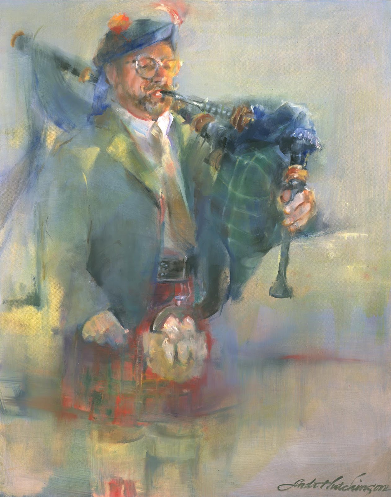
The Piper   oil/canvas   30 x 24
Painting ebbs and flows.  Good fortune ebbs and flows.  Life ebbs and flows.  So does community.  I have been blessed to live in a visually appealing area.  Many of my paintings are the result of what I see around me.  Such is the case with The Piper.  Diane and Harry have lived up the street from me for years.  Our children attended school at about the same time.  And we commonly share a love for century homes and their resultant quirks.  Theirs is a lovely yellow Victorian at the center of town.  Ours is a gray Greek Revival farmhouse further down the road.  A couple of weeks ago I noticed a "for sale" sign in their yard which both concerned me and piqued my interest.  On my daily exercise round yesterday, I stopped by while a moving van was loading up.  They are moving to Florida, a small community with a Scottish name.....so appropriate.  Diane is one of the most positive persons I have ever met.  After a bout with polio at age 6, she feels that the rest of her life has been uphill.  Her enthusiasm rubbed off and I felt instantly uplifted.  She has an amazing gift.  After a hug and some well-wishing, I was on my way, with a lilt in my step, I must say.

Thank you to Harry for posing for our art group a few years back...........a difficult standing and weighted pose I might add.  I was blessed with that communal opportunity.

Monday, June 4, 2012

Graduation!...


Proud Parents  University of Virginia
 is the perfect sketching opportunity.  A few weekends ago, our son received his masters degree in exercise physiology from the University of Virginia, founded in 1819 by President Thomas Jefferson.  The graduation was held on the lawn behind The Rotunda, the original college, teeming with graduates, balloons, expectancy and balloons.  As luck would have it, we ended up on the lawn quite a distance from where the graduate students entered, (ah, that dreaded bread and butter theory) so seeing our graduate enter was out of the question.  We just plopped down to watch the thousands of undergraduates file into the seating area.  Filed and filed and filed.  Thousands of graduates.  Over one hour of pomp.  Lucky for me......my sketch book was in my bag so I was able to entertain myself during the three-hour graduation ceremony and speech given by Katie Couric.  We were so proud.

Detail noted during the event:  the graduates in all of the almost all of disciplines filed in organized lines with a noted degree of maturity and sophistication.....until the end.  Those graduates in liberal arts seemed to immediately break line and move forward with no sense of order whatsoever.....some wearing shorts and sandals, graduation gowns not fastened, with no sense of seriousness at all.  It was at that very moment that I was most proud to hold a B.A degree!

Thursday, May 31, 2012

I want to paint like a person...yin:yang

Grande Dame   oil/canvas   30 x 40 x 1.5

For more years than I can count, the voice inside me declared that I wanted to paint like a man.  Why?  Because I loved the certainty, the broad loose brushstrokes and the bravado that seemed to ooze from the work that I admired so very much.... all painted by men.  My inspirations came from such painters as:  H. Craig Hanna, Alex Kanevsky and Randall Tiedman. I must add that there are many local, regional and national artists whose work I enjoy, but inspiration goes a step further into enticement, excitement and stomach flutters.  Time has passed.  There are now so many women artists whose work is inspiring to me:  Stanka Kordic; Rimi Yang; Jeannie McGuire; Jenny Saville and Carla O'Connor.  These female artists are, for me, grandes dames.  For the first time ever, for me, I can honestly say that gender-bias has been removed from the equation.  I want to paint like a person.

"Grande Dame" was first painted from a reality....everything in its place using local color.  Boring, boring, boring.  After a year of living with it, I attacked it with my own sense of aesthetics.  I am relieved.  I am purged.  I am totally happy with this work.

Grande Dame has been included in the 36th Annual Art Exhibition sponsored by The Fairmount Center for the Arts.
  June 3 - June 14
8400 Fairmount Road   Novelty, Ohio


Thursday, May 24, 2012

The Drawing of the 10,000 Things...


This summer I will be leading a drawing class that is a bit unusual - The Drawing of the 10,000 Things via Journals.  This whole notion spins off of the zen notion of drawing, drawing, drawing in order to perceive and understand the nature of things.  We will combine drawing realistically from nature; observations, writings, notations, page design, border design and hand-drawn letters.  Our goals will be:  better drawing skills (utilizing value, perspective, texture, line and variety); self-awareness; self-definition and the use of drawing and writing to interpret everyday reality.  The goals and subject matters will be individual to each artist.  We will incorporate critique and goal-setting as a means of self-improvement.  We will be using the Zen notion of drawing a great variety of everyday objects and drawing conclusions that will, hopefully, transfer to drawing anything at all.  A greater awareness.  The class begins on June 18, Mondays from 6:30-9 pm for 8 weeks...all at the Cuyahoga Valley Art Center.

This drawing was done some time ago at a similar class.  I discovered that rumpled and squashed things are often fragmented into triangle shapes.  Also, that the description of the key junctures of these fragments was crucial to the understanding of the drawing.

Monday, May 14, 2012

Redux...the re-making of a watercolor painting using gouache...Canned Beauty

Canned Beauty   Watercolor/Gouache   10 x 6.5
From time to time, I reconsider older works that have lain fallow.  "Canned Beauty" was always a favorite of mine, but lacked sparkle.  It was rendered totally in transparent watercolor with a navy blue background.  Something about it tickled my fancy.  I decided to rework the background including gouache, a much more opaque water medium.  I used a bright blue-violet on top and a creamy white below.  These older works are exactly the ones on which  to experiment as the emotional attachment has usually waned.  In addition, improvements seem to appear quite simply given some distance and, perhaps, more experience.  I reworked 4 paintings that day....each was improved in my opinion.  The resultant work has a primitive chunky quality that I admire and is definitely more colorful.  Sometimes the reworks provide solutions that will help expand the visual repertoire for future work.

In watercolor painting I usually hope for a transparent solution.  In oils, solutions are often reached after layers of attempts.....and I always appreciate those earlier layered attempts showing through a bit.  I enjoy seeing the struggle, the adventure.

"Canned Beauty" became a different work.  Different is good.  Nothing Ventured Nothing Gained.

Wednesday, May 9, 2012

Nevah say Nevah...on using Chinese White watercolor...April Cove...a Portage County landscape

April Cove - Portage County   Watercolor   20.5 x 13
Nevah say nevah is Bostonese  and is a bit of a conscience call to small-mindedness that creeps in when we think we have the correct solution for anything.  Just a few months back, I advised a watercolor student to pitch, yes, throw away, the tube of Chinese White that came with his set.  I am sorry, Chris.  Up until that point, I had seen far too many applications of this opaque white used in lieu of cherishing the whites of the paper which is my preferred technique of working in this transparent medium.  But recently, in our study of reflections in class, I used a thin application of Chinese White to smooth over some areas where the strokes seemed to be bothersome to me.  It allows a merging to occur.  And, I must say, I wish I had discovered this application many years ago!  Gouache is far more opaque and goes way too far in the destruction of the transparency.  I often use gouache in painting in the water medium, but usually in the background in order to intentionally juxtapose the polar opposites transparency:opacity.  And so I welcome this new bit of knowledge.....there have been many occasions where I wanted to quiet certain passages....and now I know how.  And, by the way, the visible whites in this work are cherished whites.

Sunday, May 6, 2012

Evolution Revolution...interpreting the past...Catch...a painting of my father

Catch   Oil/Canvas   14 x 10
Personal evolution keeps me working, keeps me interested, keeps me painting.  During the past couple of years, I found myself less interested in working from a life model with its inherent reality and emotion, which is inevitably connected to the sitter's openness and disposition.  Often, in group situations(which is economical to be sure), costumes are added for visual interest.  But those costumes were, in a sense, distancing, especially those that are historical or overly romantic.  Or especially, for me, those involving military uniforms.  And so, I have been using old family photographs as reference.  These allow me great freedom in their interpretation and a sense of connectedness that results in commitment.  My goal is to reduce the amount of given detail to fairly simple shapes, especially in the visage, in order to make that figure more universal, more approachable.  Definitely not a portrait.  "Catch" was painted from an old family photograph of my father at an early age.  The resultant joy from a young fisher-boy is, I think, timeless.  I am pleased.

Thursday, May 3, 2012

It's Art Walk Season!...and time to play three-handed euchre on the grass


Three-Handed   Oil/Canvas   24 x 48 x 1.5
The temperature is climbing....which signals the beginning of summertime activities.  The Akron Art Walk is this Saturday, May 5,  from 5-10 pm.  There is a host of activities within the downtown area which are more fully described on the Downtown Akron Partnership website.  Just click on Downtown Art Works Event Series.  And while you're at it, stop at Summit Artspace, located at 140 E. Market Street at the corner of Market and Summit Streets.  There is fine exhibit in the downstairs gallery of local award-winning artists and several studios on the 3rd floor as well as the grand studio of Akron Society of Artists.  Shirley Blake, our president, will certainly be there to greet you.  As for me, I will be attending "See How They Run", a British farce at Weathervane Playhouse.  My good friend Jo McGarvey is one of the performers.  So much to do...so little time.  All provide a stimulation and awareness that make our lives so wonderful!


Friday, April 27, 2012

Back to where I started..opacity:transparency...Adam Connected...a figurative work

"Adam Connected" is the result of a live model situation at our last watercolor class.  Adam is a high school art student who will be off to college next year.  And, of course, he came along with his phone, the constant companion that he caressed during the pose and more actively interacted with during the breaks.  The face and hands are painted transparently.  The clothing becomes 2-dimensional as a result of underplaying all of the wrinkles, patterns and shadows that, for me, become just too complex visually.  I guess these days I am delving further and further into simplification, which allows for more creativity throughout.  The background shapes and values simply happened, in my own consideration and re-consideration of the picture plane.  I have no need to paint all of the minutia involved in the reality of the scene.  The background is painted opaquely with the addition of gouache, which allows for almost endless reinterpretation.  So here I am again.  Fiddling with the polar notions of opacity and transparency.  It seems right to me.  Back to where I started....but, of course, with more experience and, I believe, more confidence.

Thursday, April 19, 2012

ya know it don't come easy...a painting that took years to resolve...Deference


Deference   oil/canvas   40 x 30 x .75
 Sometimes paintings paint themselves.  Rare but it happens.  Sometimes paintings go on and on forever with no satisfiable resolution in sight.  Sketches help, but are not guaranteed.  My goals in this work were to shift attention from the face and figure to the foot of this seated dancer.  After years and years of figure painting, I know that this was a lofty goal.  The face and hands are nearly always the focal area.  So, in effect, I was reversing the norm as well as the norm-in-my-brain.  The model for this work posed in late autumn 2009.  Since those sessions she:  graduated from college, married, moved to New York, moved back, bought a home and had a baby.  All those changes.  And all of those changes virtually mirrored those changes taking place on the canvas.  Although I feel that I have achieved resolution, I wouldn't want to go through this painful process again.

Enough of the upending.  More sketches.  More planning.  More thinking.

Have I learned my lesson?  Probably not.

Thursday, April 12, 2012

Food For Animals...and for thought...Pearody


Pearody   oil/canvas   8 x 24 x 1.5
Who among us hasn't experienced extreme love and attachment to a pet?  These are some of the strongest bonds we experience in our family lives, sometimes ever-so-strong due to the simplicity of the bond.  Well, Kathy Johnson of Hudson Fine Art and Framing does her annual thing to support The Humane Society of Greater Akron where a percentage of the proceeds goes to provide food for these animals who are often victims of abuse or neglect.

Where:  Hudson Fine Art & Framing; 9 Aurora Street; Hudson Ohio 44236  (located in The    Brewster Mansion right on the square)

When:  Wine and Cheese Opening; Friday, April 13 5:30-8:30 pm

What:  This year Kathy is exhibiting food art....appealing to all

Hope to see you there!

Monday, April 9, 2012

One in Every Crowd...a celebration of self...and small chicks


One in Every Crowd   oil/canvas   8 x 24 x .75
 What a wonderful notion it would be if each person, each artist, was able to grasp the beauty and strength of his or her own uniqueness!  Gone would be the petty jealousies, the competition and the rivalries, both outright and hidden, that plague us.  No more "he's got something that I want".  Instead, "I'm good with what I have.  It's different than what she has.  It's all good".  Going along with the crowd, understandably perpetuates cultural mores that provide for a smooth functioning of society.  Eliminates snags and questions.  But, in my opinion, it is only when we think for ourselves that we can rid ourselves of the standards of the "other", that we can make choices that are emotionally viable for ourselves as well as others, that we are able to arrive at a sustainable balance.  Question reality.  Our own self-made reality is as good as it gets.  It is when we feel good enough about ourselves and our own work that we are able to appreciate the work of others, even though it is different from our own.

Something to work towards.  A celebration of self.

Tuesday, April 3, 2012

the minor fall...the major lift...mood is very important to me...Daisy Play

Daisy Play   Watercolor 9 x 9
ah...some of my favorite lyrics from one of my all-time favorite songs...."Hallelujah" by Jeff Buckley.

This past weekend some of our extended family was in town and so we met for dinner at a local restaurant.  There was an entertainer...kind of a lounge singer....who sang popular songs and played guitar.  The first few were quite nice.  His voice was pleasant, as was the strumming.  The amps were turned up way too high and we were seated oh-so-close.  (I know....if it's too loud, then I'm too old....perhaps)  When he started singing this favorite song-o-mine, I cringed.  "Hallelujah" gets its power, in my opinion, from its hymn-like mood....a softness and a slowness that transcends popularity.  The delivery was the same as all of the other songs he sang.  And what did I realize from this experience? 

...that mood is a major purveyor for all kinds of art.  Even though all of the design elements and principles are carried out to perfection, ignoring the mood of a work is a huge flaw.  By using all of the tools we have to create, a painting or a song, we have the ability to manipulate the mood.  We can create a slow soft mood by using similar values, subtle hues and softer brushwork.  We, as artists, can benefit from consideration and contemplation before laying down the first stroke.

Friday, March 30, 2012

Strings...connectedness...heartstrings...an oil portrait of Nate

Strings   oil/canvas  30 x 40 x 1.5
Our lives are full of connectedness, those strings which lead to others, those strings that tug at our hearts.  Strings is a work that seemed nearly effortless, due, I believe, to my emotional connection to the guitarist, my son.  A fairly detailed sketch helped to provide a map for what I hoped to achieve....at this point I am concerned only with values and their movement throughout the work.  My color notations included:  violet, green and yellow.  This hues would help to support the moody feel of my perceptions.  I love the implied motion of the guitarist's right hand.  For me, this amount of indication is right on target.  Sometimes, for me, continued rendering leads to a tightness that becomes just too self-contained and seems to lose its service as a pathway to other areas of the work.  I am quite satisfied.  I am quite happy.

Strings.  Happy Birthday Nate.

Friday, March 23, 2012

Add...subtract...construct...deconstruct...create...Birch Brothers


The Birch Brothers   Watercolor   20.5 x 13
The painting of trees is something that painters do on a regular basis.  Those plein air painters seem to have it down to a science.....the lightest most suggestive trees in the background and gradually more suggestion in the middle and fore-grounds.  Those trees are usually just a part of the story, so their suggestive nature is a given.  Painting a singular tree or grouping is yet another matter, where the story IS the tree....where animation and gesture are oh-so-important.  The tree becomes a figure of sorts.  When we tackled the subject of trees in a current watercolor class, I chose this grouping that I pass daily.  The focal area on the birch bunch was wonderfully manageable.  The upwards cluster of tangling branches not-so.  My goal was, of course, an overall feel of late winter.  Those top branches weren't nearly as important.  Yet the push and pull of branches over and under, branches hidden and viewed, became very difficult as every effort to describe them was just too deliberate.  Addition.  Subtraction.  Construction.  Deconstruction.  Every bit of my work includes all of the above.  It is part of my process.  It is who I am.  A forceful spray from the basement hose (kept carefully away from the focal area) provided the effect I needed as well as the additional bonus of sparkling frost-like texture.  Nothing ventured.  Nothing gained.

The Birch Brothers is the result.

Tuesday, March 13, 2012

Guilty as Charged...on taking time to pose the model...Denim Coat

Denim Coat   Watercolor/Mixed   13.25 x 9.5
Yes, there was mutiny aboard our watercolor class boat!  I quickly set up our model Jessica with a pose that I thought was different from the week before..straddling a chair with her denim coat hanging between her legs.  I have very little patience for the nit-picky positioning that takes place when more than one artist is directing.  (ah....too many cooks)  In fact, there have been several occasions when this process has taken at least a half hour....a half hour of painting time.  The tasks in my life have been subdivided into two categories:  those things that need to be done so that I can paint, usually done with great impatience; and creative painting time, where I have all the patience in the world.  As the class artists pointed out the following week, the pose was definitely not a good one for those learning to paint the figure...too much was hidden from view...too many assumptions.  I, on the other hand, have spent my life making lemonade....working with what I have, even though it is less than ideal.  So....my apologies to all of the art center painters.  I will try to have more patience next time....and perhaps delegate some of the requisite tasks, such as lighting and taking money, to others.

"Denim Coat" was painted transparently.  Since there was so much darkness and little variation, I chose to accentuate the patterning on the blouse and then pull it into a side border.  Tinted gouache was added to the background.  Lemonade.

Note to myself:  pose the model at least 15 minutes before painting time begins.  Arrange a pose that sufficiently portrays most of the body parts, and includes some counter or negative space as well.

Saturday, March 10, 2012

Quantity versus Quality...there is something to be said for quantity...Daffodil Bunch...a watercolor

Daffodil Bunch   watercolor   18 x 10.5
The funny thing is, no matter how much experience I have under my belt, no matter how old I get, it's all just a repeat of what came before.  I think certain types of processes don't allow for any variation.  If you have to be part of that process, all you do is transform--or perhaps distort---yourself through that persistent repetition, and make that process part of your own personality.

Haruki Murakami
What I Talk About When I Talk About Running

This could be a quote about painting....or about anything at all upon which we are trying desperately to improve.  I think that we are sometimes so focused on quality that we try to make each work a masterpiece, and by that very action, the work  becomes far too precious.  On the other hand, just painting painting painting (quantity) eventually fuses painting into your being where transformation is then possible.  Transforming ourselves.  Pretty profound really.  I'm not sure there have been many great painters who were amazing from the get-go.  Or athletes.  Or leaders.  Or potato peelers.  By virtue of the lengthy repetition of the action, we are able to get to the point of meditation during the process.  We want each painting to be of our best effort.  But, sometimes, by letting go of that notion, we allow the process itself some room for growth.

Over the years I have painted daffodils many many times....each is different, yet the same in so many ways.  My hand is my hand.  Sure, I like some better than others.  But I have also found that others are preferred by others.  

So be it.  Paint and paint and paint, and then paint some more.

Tuesday, March 6, 2012

Painter of medium-sized polka dots with wide brush in oil?.........NOT...painting for self:painting for others...Three-Handed


Three-Handed   Oil on Canvas   24 x 48 x 1.5
Our cultural workings here in the US have become more and more specific.  I wouldn't be surprised if a doctor specializing in hands might further specialize in a particular digit....far-fetched with a bit of truth.  We artists are encouraged to find our "niche", a place where our work will become easily identified by others as our own.  OK.  Identifiable I can agree with.  But medium?  Or subject matter?  It's not for me.  As gallery advertising comes around, one sees entire exhibits made up of works of hazy trees, all painted quite the same but in different colors.  I love experimentation and play far too much to pigeonhole myself in that way.  I believe that my hand shows sufficiently enough in my work, irregardless of subject matter or medium, to call my own.  The choice of subject matter in works painted over a lifetime will portray that in which I have interest.  Those things I love.  My choices.

Most of my work involves a bit of deconstruction/reconstruction.  I simply love this process.  However, the more forms that are in the painting, the more the chaos must be controlled in order for the work to be visually read.  More hard edges than usual.  My goal in "Three-Handed" was the feel, the atmosphere of spring with diffused lighting that is both cool and warm.  I chose to keep the destruction of edges to a minimum, while ensuring a locking together the comb-like shapes of the three figures (seen as one shape) and the background.  This was my way of simplifying the information.  The grassy decorative strip at the bottom was printed onto the canvas using a linoleum block.  I thoroughly enjoy the combination of realistic painted with flat patterning, a love that comes from printed fabrics.  My loves come together.  I am satisfied......and extremely happy that I am not...

a painter of medium-sized polka dots painted with a wide brush in oil.

Friday, March 2, 2012

Fat Tuesday...the use of dark values to enhance...Mardi Gras

Fat Tuesday   Watercolor   9.25 x 13.6
 Recently in watercolor class, we designed paintings around the theme of Mardi Gras.  Here in the north, this rambunctious holiday passes relatively unnoticed.  My sister-in-law Ann lives in Louisiana and is involved in the preparation and celebration of this notorious fete.  She decorates her home for Mardi Gras as one does for Christmas or Easter.  This theme provided the opportunity for painting both sequins and feathers.  My sequins were painted with a round pretty much one-by-one, then later smushed together in spots and glazed in others to avoid a speckled appearance.  My original feathers (few of which are seen in the finished work) were painted with a new split-hair brush, a gift from mon mari.  Although I really liked the looseness and watery appearance of the work after the first session, I wanted to go for the gusto...the darks.  My work is all about the "feel" of the subject, the mood.  I wanted to include the darkness of the night and a bit of the raciness of Mardi Gras.  The darks were added by painting negatively and rhythmically.  Fat Tuesday.  Drama.

Tuesday, February 28, 2012

The Blues...the opaque and the transparent qualities of blue hues...Dirndl

Dirndl   Watercolor   20.5 x 13
"Dirndl" was painted from a model who posed in our Monday evening watercolor class.  The model was particularly delighted to pose in her dirndl skirt and vest, as she had lived in Europe for many years and felt nostalgic and emotional about her experiences.  (She performed with the circus!)  My painting was finished at home with the aid of a reference photo.  The bodice area along with the pure white puffy sleeves became sacrosanct.....it has untouched and unrefined areas....everything else was worked around it in a spiraling fashion.  As per usual, I had the most difficulty in the other not-as-important areas.  The bottom of the skirt became much too important.  Hard edges on both the top of the head and the bottom of the boots confined the figure and felt very uncomfortable to me.....I try to avoid these situations entirely.  I finally decided to wash down the bottom half of the work.  In my basement laundry tub, I let a stream of water run down the painting and I carefully avoided the bodice area.  No scrubbing which dulls whites.  Just a lifting off of some of the pigment.  When dry, I decided to rework the bottom with a different blue.  I switched from French Ultramarine, which is opaque, to Pthalo Turquoise which is much more transparent.  The transparency of a particular color is determined by the size of the particles....the smaller the more transparent/the larger the more opaque.  The combination of the Pthalo with yellows also yielded a much more satisfactory green.  Yes!  The work was finished to my satisfaction.

I have never been a book-learner.  I like to rely on my own intuitive way of working.  Reading about the properties of pigments just doesn't take.  I must find out for myself.  A hard lesson to learn sometimes.  Knowing a color's properties can definitely help in the working of a painting.  The switch-over to a more transparent blue made all the difference.  Another lesson learned.

Thursday, February 23, 2012

Many looks...capturing one look out of many...Jessica

Jessica   Charcoal/Watercolor   14 x 10
After years of sketching and contemplating the human visage, I have come to realize that there is no one "image" that captures an individual.  Consider, for a moment, the variety of faces that greet you each morning as you look in your above-the-sink-mirror................some of them are pretty scary.  Right?  Over the years, I have had the opportunity to draw and paint various models several times each.  And each time I feel that I have a grasp on a bit of truth.  It takes years and years of contemplating family members in order to completely understand that brow bone, that nose bump, that one-sided smile.  And so I have ceased to be disappointed in that notion of likeness-perfection that can only exist in a split second.  I have painted Jessica four times in the past several months....each one is different.  This particular drawing has perhaps less of a likeness than the other attempts.  Yet, I like it.  Charcoal on 90# hot press watercolor paper.  The background was washed in at home.  Experimentation.  Excitement.  A bit of truth.  Mine or hers?

Monday, February 20, 2012

The Leap into the Unknown....a work with gold leaf...Paisley Shawl

Paisley Shawl   Watercolor/Mixed with Gold Leaf   28 x 20
My New Year's art resolution for 2011 was to finish each work to the best of my ability....to consider all possibilities.  My goal was to eliminate those "just fine" works and to push them into works that excite me.  Very often, that takes a work into a mixing of mediums.  "Paisley Shawl" was a "just fine" watercolor.  The work was executed according to my sketch, my plan.  It became rather dark even though, design-wise, it was in most ways what I had intended.  It still sat in my studio over the holidays almost begging for a makeover.  I used gouache to lighten and opacify (my own word) the background.  At that point, it started to look a bit iconic, so I went with that idea.   Imitation gold leaf was applied in a horizontal strip and in bits and pieces down the shawl.  I became so excited I could hardly contain myself.  After all, isn't this what art is?  A shaking up that challenges the static  technical application that becomes part of the artistic rhythm when one has painted so many paintings. 

"Paisley Shawl" became more dynamic, more interesting and more modern in my opinion.  Oh, the stimulation!

Wednesday, February 15, 2012

Fish?...considering a subject that is back-lit...Respite

Respite   Watercolor   8 x 17
Yes, fish.  I have never liked fish, to be honest.  I have tried introducing it into our menus several times over the years, but everyone always seemed so disappointed.  But the givens are:  we needed to drop a few holiday pounds; we needed to engage in a healthier diet; and I am currently trying to mix things up as far as experiencing the new and disengaging former prejudices.  OK, then.  Fish.  Our watercolor assignment was a winter landscape.  At that time, we had absolutely no snow, and none on the horizon.  I selected an image from my files of a woodpecker that was back-lit...certainly a subject that I would usually shun.  It became a bit of a challenge as the hard edges were overwhelming and I was quick to soften them.  The bird itself was rendered a bit more brightly than in my soft grayed reference photo.  Also, the notion of just "too much white" came into play as I softened and dropped in reflective snow colors....green and pink.  It is quite the challenge to imply snow without so very much white.  The resultant painting looks a bit like Asian silk, certainly not an effect that I sought, that resulted nonetheless.  A new taste.  A new experience.  Back-lit.  Palatable.

Monday, February 13, 2012

Respect Yo-Self...avoiding a group mind-set...Chameleon...a self-portrait
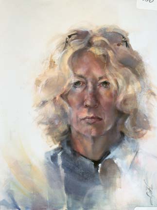
Chameleon   Oil/Canvas   20 x 16
Learning to respect yourself is, I believe, a lifelong process.  So is finding your own voice in the creation of visual art.  The big....very big...journey.  Eventually, the artist must feel secure enough in her/his own decision-making to ignore external criticism.  Competition in the form of art exhibitions is inherently a L-brain ritual....separating the work into categories:  the top winner, the peripheral winners, the accepted and the not-accepted.  All of this categorizing runs counter to the R-brain function of art-making where the pleasure is in the process, in the doing of the thing.  So, it has become my opinion that one should only enter competitions if the ego is strong enough to handle rejection.  In the circles of art groups, whether local, regional or national, the jurying is undertaken by those of like minds, with like-minded art.  The true art maverick may just have a harder time getting into the competition.  In some ways, the work in the group has been homogenized into a group mind-set that determines their own particular notion of quality art.  But we R-brainers know deep inside that art that is totally personal often cannot keep pace with that group mind set.  A contradiction to be sure.  The prize in art making is internal.  Nothing should stand in the way of it....it is just too sacred.

Chameleon was painted many years ago as a small, very small, step in self-respect.  After a lifetime of being called a paleface, I painted this work in front of my studio window during a raging snowstorm....I guess just to prove that I did, in fact, have color.  It's all a matter of opinion.

Thursday, February 9, 2012

Little Ditty...getting your brushes moving...

Juicy   Watercolor   8.5 x 5
Winter sessions of painting classes have begun.  The first class is always a challenge as assignments have not yet been made.  There are always new artists who don't quite know what to expect and sometimes arrive at that class without materials.  So the goal for lesson #1 is a simple ditty with shared materials and shared experiences.  This time I brought a bag of oranges.  Each artist was then free to cut the fruit and arrange it in a way that was pleasing.  And....we painted.  No instruction, no warnings.  Just mucking around.  Truly, there is no better way to learn to paint.  The lessons must come over time...and a few at a time.  I painted with orange and its complement blue.  The arrangement of soft and hard edges (lost and found) create a rhythm (hopefully) around the subject matter.  I don't move my brush quite as freely at the focal area in order to retain whites and a bit of crisp detail.  As always, there is a bit of a thrill as colors run into each other to become happy accidents.  No high expectations.  Just play.  A Little Ditty.

Monday, February 6, 2012

Go Figure...seeing the universal in the specific...

Fragile Patterns   Charcoal/Mixed   19 x 12.5
Figurative and portrait paintings seem to be a hard sell...at least for me.  Buyers and collectors seem to be reluctant to hang an unrecognizable visage in their living space.  I have also heard many folks who seem to be too modest to hang a picture of themselves as if it were boastful.  I have a very difficult time with this notion as I see all of mankind in a gesture, a scenario or even the placement of hands.  I relate to something in each model...something that echos a bit of my self and my longings.  I guess that I wish to relate to a bit of what the model is feeling or revealing through body language.  That is the reason why I continue to paint people and why I continue to learn about myself through them.

For me, the experience is tender.  It is pure.

Go figure.

Thursday, January 26, 2012

Informed Chaos...sends the work in a new direction.Pearody

Pearody   oil/canvas   8 x 24 x 1.5
For years now, I have been introducing a bit of chaos to my work.  Chaos in the way of subtle destruction, dripping, squeezing paint onto, scraping back, palette knife additions or subtractions, dots and lines.  This chaos provides a way of temporarily exiting the constraints of the reality of the subject matter.  New puzzles to solve.  Excitement.  The extra-ordinary.  I have come to realize that this chaos is not necessarily random...rather, it is informed.  Informed by all that I have come to be.  My experiences, my travels, my dreams,  my passions and, most importantly, the varied movements made with brush or pen on the artistic ground.  Keeping the tool moving without any particular goal while doodling, sketching and playing lets the confidence build in your own capability.  Play becomes the thing, the reward.  The more one plays, the more comfortable one becomes.  The more comfortable one becomes, the greater the possibilities.  Informed.

The right hand segment of Pearody reflects this notion.  The line work was scraped through to an earlier layer.  This process was planned so that the colors reflected, for the most part, the work that was happening on the left side of the canvas.

Chaos.  Informed.

Tuesday, January 24, 2012

Facing the White...warm up with small works...

Pumpkin Pie 1   oil/canvas   6 x 6 x 1.5

Pumpkin Pie 2   oil/canvas   6 x 6 x 1.5
Facing a white canvas or sheet of watercolor paper is a daunting task in the new year.  Our strokes are timid and insecure.  Our rhythms uncertain.  Our confidence waning.  I have faced this problem year after year when the holiday festivities pull us toward celebration and fun, which is certainly welcome, but away from the daily practice that makes for good art-making.  No athlete in any sport would be able to turn out a peak performance without the constant  and daily training demanded of him or her.  OK, then.  This year I decided to keep a few small canvases on hand for the couple of here-and-there hours that are freed up in just keep my brush moving.  In the past, my preference has been a total clean-up of the studio area in order to complement the activities in the other rooms of the house.  Not this year.  I was able to find some in-between time to paint when my guests had other things to do and other friends to visit.  As a result, the gap between the years was not so wide and so daunting.

The two pumpkin pie paintings were the result.

Tuesday, January 10, 2012

Resolution...

Rick at the Wheel...sketch
'Tis the season for resolve!  We take stock of where we are and where we would like to go.  For visual artists, ideas are everywhere....on the web, in galleries and even in the newspapers that are heading to the recycle bin.  Goals.  Techniques yet untried.  Excitement for the doing.  My own resolutions include:

* to pump up more pure color in the work.....I have long been a neutral lover....primarily for their soothing nature.....but pure color grabs the attention and excites.  I will give it a try.

* to paint more from sketches.....one step removed from reality, painting from sketches allows for more artistic freedom and interpretation

* to incorporate more patterning into the work.  I am a lover of patterns - wallpaper, fabric and the like.  Why not include them?

There we have it............Happy New Year!

Thursday, January 5, 2012

Holiday Greetings....

in the mailbox are another of the perks of the season.  My spirit is uplifted each day as I sort through the cards from those whose lives have touched our own.  I am lucky to be on the lists of a few artists who continue to craft personal greetings. That is always such a treat!  In addition, we exchange names in each of the classes for those willing to spend time on such a project.  (And those who choose not to participate are always always forgiven and, in fact, complimented on their ability to say "no" in this season of way-too-much-to-do.) The two I received this year were both complete surprises and works of wonder....I realized the tenderness of time spent in each effort.  I am amazed and pleased....these will be keepers.  The cardinal by Jackie Roberts has been worked on 140# watercolor paper to a standard envelope size and folded in half.  It appears that Carol Weigand's was worked on a watercolor postcard whose edges were taped down with artists' tape....this card was then mounted on a piece of colorful card stock which had been cut to a standard envelope size.  The taped edges became a crisp border. Carol attended my demo at Summit Artspace early in the month and I distinctly remember someone taking photos.  She has translated this photo into a charming little work.  While individual paintings would be out of the question for cards, there are other possibilities for sure:  linoleum printing; linoleum printing on printed paper; scanned and printed images on card stock; assemblages from craft supplies and rubber stamping.  Thanks to: Ann Emmitt,  Susan Mencini, Mo Mosyjowski,  Janet Neubert and Delores Zink for their handcrafted cards!!!!

I should also mention a yearly project by artist Norma Ott. She and her husband Dave do a lot of traveling.  As a result, she has lots of watercolors done at national parks.  Each year, she makes up a calendar (at Kinko's) featuring 12 of her paintings which she presents to friends and family as a gift.  What a wonderful idea!  When her calender arrives in my box, my heart goes pitter-pat.  Thank you, Norma!

Tuesday, January 3, 2012

oh, the memories...sketching during family celebrations...Nate in the car

Nate in the Car...a sketch
of Christmas 2011!  They came.  We ate. We played.  We enjoyed.  We hiked.  We listened.  They went.  All the people that I love in this world!  It is always so bittersweet!  The tree has been disassembled and the cookie tin emptied.  I keep in touch with my pencils during this time of altered reality by using small moments for small,  intimate and, hopefully, soft drawings of my loved ones that will sustain me while the merriment ends.  I never ask anyone to pose, so often the drawings remain imperfect and unfinished.  Sometimes that is definitely for the best.  Stopping too soon is always preferable in my book...sketchbook, that is.  Love.

Tuesday, December 20, 2011

Friend...a tribute....Jo McGarvey

Jo   Oil/Canvas   20 x 10 x 1.5
I believe that it was Andrew Wyeth who said that one can create from love or from hate.  It is indeed strong emotional content that makes for a good painting.  Creating from passion.  For me, anything in between just won't do.  In this case, my painting of Jo is a tribute in love for the friendship that has lasted for ever-so-many years.  Our families were fast friends.  We each had 3 boys who were stair-stepped in ages.  We holiday-ed together.  We played together.  We shared each others'  traumas as well as the triumphs in-between.  And....we cooked together.  Lots of hungry boys.  Lots of cooking.  Our paths have paralleled throughout the years and created braids of time....with some times away from and some times the returning-towards.  But the foundation is always there.  Jo is an accomplished woman and a strong woman.  We seem to be able to read each others' minds at times....the knowing that that is intuitive and yin.  And, so, this portrait is, for me, greater than the sum of its parts.  It is a tribute.  Merry Christmas, my friend.

Friday, December 16, 2011

Jo - Session 3

When I approached this painting for session 3, I was fairly certain that it would be my last.  My goals were:

* add the necklace

* add hard edges to restate my chosen rhythm around the canvas; and, if necessary, soften others

* adjust the color temperature where necessary; i.e. warming sleeve-tops of the coat.  I will admit, that I like pushing the envelope a bit away from reality and towards more exciting. 

* add highlights....for this, I used a cooled-down white using just a smudge of phthalo turquoise which is in the background and part of my original limited palette

* MOST IMPORTANTLY, I tried to avoid re-stroking areas with which I was pleased.  It serves no intent at all.  I can live with slight errors in draftspersonship more than ill-painted passages.  That is my priority. 

I am satisfied.

Wednesday, December 14, 2011

Jo - Session 2

Jo   Session 2
First off, my apologies for a really lousy photo.  I was impatient.  The natural light in my studio was next to nothing...a really gray day.  Shutter stayed open for way too long.  The painting has moved on since this photo....no chance for a re-do.  Anyways, session 2 was about 3-4 hours.  Because of the 3-4 day lapse since the first session, I was assured that my original strokes were solid.  My goals were simply to come in for more detail in particular junctures; to assess and correct color; and to establish viable rhythms in the work.  All the while, I try to avoid painting over passages that were exciting to me from the first session.  Things happened easily in this work which is not always the case.  I was very satisfied with the underplayed countenance.  The background color went to a darker turquoise, almost teal.  A good painting day.

Monday, December 12, 2011

Demonstration

Every now and then I agree to do a painting demonstration.  In this case, it was part of a group of Saturday art demonstrations at Summit Artspace as part of the Kaleidoscope 2011 exhibition.  My friend Jo agreed to model.  Demonstrations are difficult to do....mostly due to the fact that my intuitive painting process (done in solitude) is broken by talking and questioning.  I can actually feel the chaos that builds between my L- and R-brain as a result.  I find that my choices are not always the best in this situation.  Because Jo has been a friend for so very many years, I was at least acquainted with a color palette that I deemed to be her own.  I asked her to wear a coat that personifies her personality and has been her mainstay for a while.  So....the pose, the colors and the atmosphere of communion were her contributions.  She seemed at ease.  Her face was comfortable and giving, which I attribute to the fact that she is an actress and seemed to know just what it was that I wanted.  My own goals for the day were to relax and to make juicy, broad and expressive strokes on the canvas that broadly interpreted what I was taking in.  The audience was wonderful....the questions well-informed and thoughtful.  I was pleased with the image at the end of the session which lasted 2 hours.  I knew that it was something that I could build on later.
Jo   oil/canvas   20 x 10 x 1.5

Wednesday, December 7, 2011

Figure Drawing...using a horizontal format...Ethereal

Ethereal   Charcoal/Pastel   5.25 x 17.5
For the last session of our drawing class, we elected to draw the figure.  The art teacher whose room we borrow at night was happy to recommend a high school art student willing to pose and make a few Christmas dollars.  Yeah!  Maggie was athletic, long and lean.  She was able to relax well for us in this extremely horizontal pose.  Results can be seen in the accompanying slide show.  I felt that we all did well as far as simple shapes and proportions.  There were a few angles(especially for the pillowed head) that were slightly off.  Judging angles visually is difficult but can be aided by using one's pencil at arm's length to find it and replicate it on the paper.  An angle that is off just a smidgen causes the head to lose its state of relaxation and appear to be full of tension, as if getting up.  Once figure drawing is mastered, an artist will be able to use photos for reference without point to point copying without anatomical understanding thereof.  Another problematic area occurred for those whose perspective involved the foreshortening of the head area.  I recommended treating this head and shoulders area as a shallow bowl, with a losing of edges and slight shadowing in the middle with the more complete rendering around the diameter where most of the light would appear.  A difficult, but interesting illusion.

For me, nothing is more rewarding than the curves of the human figure.

Friday, December 2, 2011

Test for Doneness...

Ella   Watercolor   18.5 x 12
The other day I met an old friend for wine at a local vineyard.   She is a professional cookie baker.  We were discussing the finer points thereof when she expressed her preference for cookies that are baked JUST BEFORE browning.  I have always preferred those with a golden color....probably baked a minute or two longer.  That very evening at critique, there were two amazing works on view whose makers expressed that they were "in progress".  Whoa.  I so loved them both as they were.  Michael Nevin paints street scenes, especially Chicago street scenes.  In this case the pencil drawing was revealed....some of the buildings and windows were painted in.  The pencil marks playing with the paint was invigorating to me!  Undercooked perhaps to him.  Barbara Krans Jenkins paints with colored pencil on dried gourds.  She has a fine eye and usually renders small flowers and birds on them.  When finished, one would be hard pressed to know that they are gourds....they are ceramic in nature.  In this case, she was asked to paint abstractly on the gourd using certain colors.  It seemed that this was a bit out of her comfort zone.  She had erased some masses of color thinking that they were mistaken.  The bits of color that had settled into crevices was wonderful....it was there but wasn't.  There was a good deal of rendering on part of the gourd which meandered into the halfway places.  Superb.  I would have considered it a fait accompli.  Again, she considered it undercooked.  Which just shows to go ya that every maker-of-things has a personal aesthetic that takes them along the artistic path and lets them off at different exits.  I feel that there are artists and people of all kinds who carry things too far just because they feel they are doing a good job.  If a little if good, then a lot must be great.  Not always.  An undercooked work allows the viewer to participate in the work....he/she is therefore engaged in the work as well.  The rule of 3's.  That which has been left undone.  That in which there is space to grow.

There are two images here of Ella, a high school art student who modeled for our watercolor class.  I later took the painting to completion at home.  But in this work in particular, I so missed the rawness of the work at the end of the live session.  This lesson will suit me well.

And as for cookies.....they rule.  Undercooked.  Slightly golden.  Whatever.  Joyful participation.

Tuesday, November 29, 2011

Let the Wild Rumpus Begin!...

Christmas Chaos   Watercolor on Yupo   8 x 8
Holiday season is a crazy mix of emotions!  The extreme childlike joy that the season provides is immeasurable.  Likewise,  the frustrations.  We have a holiday tradition here that requires us to fix everything that has been functionally broken for the past year....all in the month of December.  Add to that the tempestuously tangled coils of holiday lights that you remember neatly coiling and organizing the January past.  How does it happen?  Holiday decorations defy organization entirely. (or the possibility of attic gremlins)

"Christmas Chaos" was painted at the end of last holiday season using a few bulbs that had hidden during attic reassignment.  Yupo paper provides the texture.  In fact, one simply cannot escape texture when using this paper, as the surface is a slippery plate.  Adding more pigments always always disturbs what is underneath.  Smooth passages are impossible.  Although this paper is not my favorite, I can understand how using it in certain instances will support chaotic intentions......

such as holiday decorations.

And, as far as those cheap light strings that work only for one year (or half of them go out).....I vow not to purchase them any more.  Please recycle them at :

Recycle holiday lights


All lights sent for recycling should be sent to:
HolidayLEDs.com Recycling Program
C/O Classic Turning, Inc.
4905 James McDivitt Street
Jackson, MI 49201-8958

Friday, November 25, 2011

Just what is expressive drawing?...my own definition...Fragile Patterns

Fragile Patterns   Charcoal/Mixed   19 x 12.5
In the time I have been writing this blog, there have been more hits on my expressive drawing posts than any others.  Unfortunately, until now, I have only described the steps we took in workshops without explaining exactly what I mean.  Expressive drawing is my own moniker, albeit general, that signifies a drawing where other considerations trump the exactness of the subject.  And, hopefully, it leads to expressive painting as well.

I use the design approach to drawing and painting.  Design  elements are the artist's tools.  They include:
1.  Shape (pattern, form, mass, object, subject matter)
2.  Value  (light and dark, tone, tint)
3.  Space (the illusion of 3-dimensional depth and 2-dimensional flatness)
4.  Edges (blurred and sharp, lost and found)
5.  Color Temperature (warm and cool)
6.  Texture (surface variation)
7.   Line (drawing versus mass painting)
8.  Color Hue (spectrum clossifications: red, yellow, blue, etc; local and arbitrary hues)
9.  Color Intensity (brightness, neutral versus pure)


The design principles ore the organizing aesthetic ideas that guide your use of elements in a painting. They are:
1 , Dominance (emphasis, focal point)
2,  Movement (rhythm,, directions, gesture, transition)
3,  Variety (contrast, conflict, tension)
4,  Unity (harmony, balance or not with intention)

These elements are shared by artists of all kinds from illustrative to culinary.  Each artist has his/her personal sense of aesthetic "correctness" that is a personal mix of the elements and principles dependent upon his/her preferences.  My own mix is just that...my own.  In expressive drawing, these principles are in play right along with the subject, the reality.

Drawing expressively relies on a good foundation in drawing; the desire for a bit of risk-taking; enjoying happy accidents and occasional chaos;  a skill in gross motor drawing from the shoulder (as opposed to fine motor with the wrist); and the ability to trust your own problem- solving and decision-making ability.

My own preferences for an expressive drawing or painting include:

* moving from 3-dimensional correctness and detail in the focal area to 2-dimensional flatness    in the far corners of the work

* calligraphic line (especially the S-curve) that mimic nature

* lines that extend too far

* broken line

* echo lines (or power lines) in important areas for strength

* combining like-valued shapes for simplicity

* unexpected shapes wherever

* warms played against cools

* line played against mass

* amazing neutrals played against a few pures

* as many lost edges as possible....leading to a bit of beautiful (hopefully) nothingness

* and rhythm, rhythm, rhythm using edges to create movement