is one of those humorous lists that artists pass on or e-mail to each other. This list was shared by Tom Auld and is worth further sharing. There is no credit line.
1. Constantly compare yourself to other artists.
2. Talk to your family about what you do and expect them to cheer you on.
3. Base the success of your entire career on one project.
4. Stick with what you know.
5. Undervalue your expertise.
6. Let money dictate what you do.
7. Bow to societal pressures.
8. Only do work that your family would love.
9. Do whatever the client/customer/gallery owner/patron/investor asks.
10.Set unachievable/overwhelming goals. To be accomplished by tomorrow.
Subtitle: What Not to Do. See yourself in any of the above?
Thursday, October 20, 2011


Wednesday, October 19, 2011
Fragile Patterns...
 |
| Fragile Patterns Charcoal/Mixed 19 x 12.5 |
Pattern recognition and musical patterning are functions of the right brain.
Fragile patterns celebrates this notion.
Monday, October 17, 2011
Stem to Stem...a group pumpkin gesture
 |
| Stem to Stem oil/canvas 20 x 10 x 1.5 |
The work has been drying for several weeks now. I am quite pleased.
Wednesday, October 12, 2011
Endless Possibilities...a humble onion
 |
| l'oignon watercolor |
I have chosen my painting "l'oignon" to accompany this entry, as I feel it is perhaps the most sensitive watercolor I have done to date. Of course, most in my circles would call it a watercolor sketch, as it doesn't have the power (and background) of a powerful painting. And, most likely, it would never be accepted into a major exhibition. Too small. Not enough impact. But sensitive I think.
Monday, October 3, 2011
The Letting Go..the real + the imagined...carousel
 |
| The Letting Go oil/canvas 40 x 30 x 1.5 |
Learn. Re-learn. Keep moving.
Monday, September 26, 2011
Safari...
 |
| A Flair for Drama oil/canvas 20 x 16 x 1.5 |
I do not know at this time. Perhaps the journey is over. Perhaps not.
Tuesday, September 20, 2011
Fright Night...
 |
| Shocking Mixed/Paper 34.5 x 22 |
Friday, September 16, 2011
Ah....Middle Age...a profile...
 |
| Middle Age oil/canvas 16 x 8 x 1.5 |
P.S. A simple look around the studio revealed similar bodies, even among those who scoffed. Life is interesting.
Wednesday, September 14, 2011
Bold versus Sublime...
 |
| Pumpkin with Twisty Stem Watercolor |
"Pumpkin with a Twisty Stem" was begun as a watercolor monoprint. I painted tender strokes onto a piece of plexiglass then transferred it by pressing onto a sheet of hot press watercolor paper. I continued to coax the image into being. The sublime is more easily accomplished with this versatile medium. I am pleased with these results.
Monday, September 12, 2011
Torrit Gray...in praise of neutrals
I am in love. With Torrit Gray. No, not a guy... a paint from Gamblin.
I am a value painter. But I do appreciate neutrals a great deal, especially when laid next to pures and sparkling brights. I have always mixed my own grays. It is usually quite an ordeal, searching for a particular neutral nuance, while adding and adding and subtracting with my palette knife. This summer I found in my color box a promotional tube of Torrit Gray from Gamblin. I have absolutely no idea where it came from. But I now hail its unexpected arrival. Because it is such a beautiful gray, in my opinion, I found myself simply mixing the pure hue of my choice to get it to lean in a particular direction. The tube says " In honor of Earth Day, we make this oil color from recycled pigments collected by our air filtration system". Wow.
There is a special link on the Gamblin site that explains this pigment and its making. I found it fascinating.
Torrit Gray is quite a guy.
Dorothy Shinn, April 14, 2005 review of Yves Saint-Laurent, Akron Beacon Journal
I am a value painter. But I do appreciate neutrals a great deal, especially when laid next to pures and sparkling brights. I have always mixed my own grays. It is usually quite an ordeal, searching for a particular neutral nuance, while adding and adding and subtracting with my palette knife. This summer I found in my color box a promotional tube of Torrit Gray from Gamblin. I have absolutely no idea where it came from. But I now hail its unexpected arrival. Because it is such a beautiful gray, in my opinion, I found myself simply mixing the pure hue of my choice to get it to lean in a particular direction. The tube says " In honor of Earth Day, we make this oil color from recycled pigments collected by our air filtration system". Wow.
There is a special link on the Gamblin site that explains this pigment and its making. I found it fascinating.
Torrit Gray is quite a guy.
Here’s the secret of being a great colorist: it doesn’t matter how well you combine the bright, obvious colors, it’s the so-called dull, closely related shades - gray-greens, pewters, tans, muted browns, umbers, ochres, stormy blues and charcoals - that determines whether you have an eye for color.
Dorothy Shinn, April 14, 2005 review of Yves Saint-Laurent, Akron Beacon Journal
Friday, September 2, 2011
Hanging Around...
 |
| Boston Beat oil/canvas 40 x 30 x 1.5 |
Resolution is always sweet. Sometimes attainable. Sometimes not.
Wednesday, August 31, 2011
Re-Do...
 |
| Onionskin Watercolor/Gouache 20.5 x 13 |
Onionskins......layer upon layer. Sometimes it takes a while to get to the inside.
Monday, August 29, 2011
A painting is never finished....
It simply stops in interesting places.
Girls Named Susan oil/canvas 8 x 8
Phil Gardner

I know artists on both ends of this spectrum....those whose goal is a signature and a frame, being more stimulated by the product than the process ; as well as those who add a brush stroke now and again for decades.....really. I guess I am somewhere in the middle. I really like to keep a painting leaning against my studio wall for a while, usually upside-down, being somewhat certain that I have resolved most major issues. The release of the work just happens....either sooner or later. That doesn't seem to matter. It is deeply disconcerting to find awkward passages in those works that have "passed over". Usually, for me, it happens more often in small works, those little paintings that I would like to think are so casual that they fill in the gaps; those little paintings that are taken a bit less seriously; those that I haven't pondered about in excess. And yet, "Girls Named Susan" hung on my studio wall for less than a week when I realized that it could me made stronger and more exciting by adding some violet passages. I succumbed. Removed from the frame, it was. Back on the easel. I am happier.
I think it is a mistake to constantly correct paintings....that goes nowhere. The best tack for me is to internalize the lesson learned and apply it to future works. I am, at this point, wise enough to understand that perfectionism is rarely the solution for me. I adore the happy accidents along the way that provide a searching, a discovery. And so.................I really do try to honor the release of a work into completion.
Almost always. Never say never.
Tuesday, August 23, 2011
Game On...
 |
| Saturday Morning Mancala...a sketch |
Friday, August 19, 2011
Rediscovery...
This week I have been getting some work ready for an exhibit which requires fetching, cleaning and, sometimes, framing. In doing so, I come across works that had been put aside. "Amanda" is such a work, a charcoal drawing which gave me pause. In fact, I pulled it out twice. Mostly, in pulling out past works, I focus and fixate on weak passages....those passages that haven't been considered.....well....well enough in my opinion. In this case, I was pleasantly surprised. Because I have been painting all summer, the strength of the drawing and its values pleased me. I loved the quick and spontaneous way the charcoal stick had moved around the paper. The color of mid-tone paper was satisfying. I enjoyed the rendering of the short and choppy hairstyle. I remember being disappointed at its completion that the likeness wasn't right-on. In the rediscovery, I had completely forgiven myself for this shortcoming and was thrilled with its essence.
Time heals. Rediscovery.
Time heals. Rediscovery.
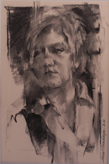 |
| Amanda Charcoal/Paper 16.5 x 11 |
Wednesday, August 17, 2011
Glory Be to Limoncello!...
 |
| August Limoncello oil/canvas 20 x 10 x 1.5 |
"August Limoncello" is the painted ode.
Thursday, August 11, 2011
Flowers have an expression...
of countenance as much as men and animals. Some seem to smile; some have a sad expression; some are pensive and diffident; others again are plain, honest and upright, like the broad-faced sunflower and the hollyhock.
Sun Queen oil/canvas 20 x 16 x .5

Henry Ward Beecher
Painting with the season seems to suit me. One of my challenges this summer is to incorporate a bolder color scheme into my work....just to push my comfort zone. I am a unadulterated neutral-lover. Loud colors scare me. This morning while leafing through a fashion magazine, I came across a multi-paged article on bold color-blocked garments. I shuddered. "Sun Queen" is fresh off the easel. I am not certain I am satisfied yet. But the colors are bolder than I can recall using before. The power of the sunflower seems to demand it.
Monday, August 8, 2011
essence...
 |
| Virginia Foothills oil/canvas 20 x 10 x 1.5 |
The Place: Carter Mountain in Virginia
The Time: a muggy day in May
My husband and I accompanied our son Seth and his friend Louise on an upwards hike up the mountain. I was promised a natural fruit slushy of my choice at the top. Well.....both Seth and Louise are marathon runners. They trudged upwards effortlessly. I enjoyed the exercise but was happy to wearing my sweat band......I was sweating like a.....well.....perspiring to some degree.
The fruit slushy was fabulous. We took many photos. The trip down was easier. The day was amazing.
The patchwork patterning of the orchards was intriguing.
Essence.
Thursday, August 4, 2011
Balancing Act...
 |
| Mary in Polka Dots oil/canvas 30 x 24 x .5 |
I have watched people straighten a barely-crooked painting on a wall as they walk by. I believe that a need for balance is deeply engrained in our physiology.
Tuesday, August 2, 2011
I am not a traditional realist...
 |
| Tomato Basket oil/canvas 16 x 20 x 1.5 |
"Tomato Basket" took quite a while to paint, I remember being confused by my own desires being in conflict with the window behind the basket. The tomatoes literally rotted while I figured it all out.
I am what I am and that's all that I am........Popeye
Thursday, July 28, 2011
Dorothy...
 |
| Unsung Dorothy oil/canvas 20 x 16 x 1.5 |
The world turns thanks to the efforts of all the unsung Dorothys.
Wednesday, July 27, 2011
and it's HOT HOT HOT...
 |
| Red Gold oil/canvas 6 x 6 x 1.5 |
All forms present their own particular problems in painting. Circles. Circles. Circles. Without hard and soft edges, the forms become too self-enclosed for me, preventing the movement around the painting. I have learned this over the years with repeated efforts at painting pumpkins. I love to play off these circles with line...the vines...and with texture...the leaves and the small buds at the tops. For me, these considerations have improved my tomato painting efforts.
Add balsamic vinegar, soft mozzarella, salt or mayonnaise. Life is good.
Tuesday, July 19, 2011
Brush your teeth and paint some flowers...
 |
| For the Love of Geranium oil/canvas board 8 x 8 |
"For the Love of Geranium" is the result.
Friday, July 15, 2011
Daily Painting...or painting daily?
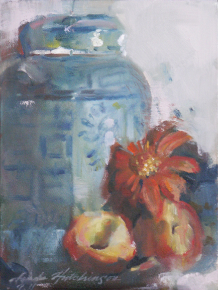 |
| Ginger Jar with Peaches oil/canvas 12 x 9 x 1.25 |
"Ginger Jar with Peaches" is a smaller 12 x 9 painting. A 2-day painting. The best I can do.
How do they do it?
Wednesday, July 13, 2011
Express Yourself...
 |
| Grande Dame oil/canvas 30 x 40 x 1.5 |
While I am certain that there are those who prefer the first version, I owe it to myself to be myself. Not painting to an audience.
I felt as if I had come home. At long last.
Monday, July 11, 2011
Surprise!
 |
| Jardiniere watercolor/mixed 20.5 x 12 |
Surprise! Immediately afterwards, I was very confused as to the amount of affection I felt for this work. Now, several weeks later, I find myself liking it.
SURPRISE!
Thursday, June 30, 2011
The ideas that won't go away...a carousel and its implications...The Letting Go
are the ones to which we need pay attention. The notion of a calliope has long been one of those ideas for me. Many times observed. Many times photographed. During a recent trip to Boston we happened upon a calliope filled with children, some smiling and some hesitant, on a brisk sunny morning. I stood at the edge and kept snapping photos, one after the other. "The Letting Go" is the resultant painting, one I have been thinking about for years and years. My attraction is definitely not nostalgic....although I have seen some delightful paintings that exude this quality. My idea has more to do with leaving the "round and round", about becoming fearless, and about letting go of past hurts and hurtful relationships. A spinning away from the expected and the predictable. The painting was created from many references including my own hand. The most difficult part to resolve was the value one....I was shooting for a light-filled canvas. Yet, I am value painter and needed to include powerful darks....that is who I am. I feel that I came to a useable compromise.
Last night on "So You Think You Can Dance", one of the beautiful choreographies was conceived from this same concept. Interesting! Synchronicity.
The Letting Go
Last night on "So You Think You Can Dance", one of the beautiful choreographies was conceived from this same concept. Interesting! Synchronicity.
The Letting Go
Tuesday, June 28, 2011
The Beauty of Simple Shapes...
 |
| Eleanor...a sketch |
"Eleanor" is a sketch of my mother-in-law done on the deck of our vacation rental at the end of the day when light was waning. I don't need any other detail to tell me that it is indeed her. It is her shape, her posture, her figure.
Monday, June 27, 2011
Flexibility...
 |
| Lemonade watercolor 13.5 x 18 |
Lemonade from lemons. Fresh at that.
Friday, June 24, 2011
Constant Change...
 |
| Slice watercolor on paper 2.5 x 7.5 |
Thursday, June 23, 2011
Give More Stickers
Recently I had the most wonderful experience of coloring with a lovely 3-year-old girl named Jaidyn on an extended family vacation to the shore. She was armed with a lovely set of Crayola Twistables that I also carry in my drawing toolbox. As we colored and scribbled, we chatted about the yuckiness of boo-boos and the deliciousness of milk. About every 5 minutes, she awarded my sketchbook with a sticker. As you can see, I was rewarded with many stickers....which definitely felt great.
Jaidyn's approach was one of play....non-judgmental and honest. Naive. It put things into perspective for me...at least for a short while.
Give more stickers. Receive more stickers. And dip some Oreos while you're at it.
Wednesday, June 8, 2011
Home...
 |
| Boston Beat oil/canvas 40 x 30 x 1.5 |
Tuesday, June 7, 2011
Nesting...
 |
| Hand Woven watercolor/gouache 11.75 x 10 |
Friday, June 3, 2011
Organic...
 |
| Organic Carrots watercolor 10 x 17 |
Thursday, June 2, 2011
Postcard Art....
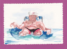 |
| Man on Floatie....a postcard painting |
If he only knew.
Tuesday, May 31, 2011
Inside Out...
 |
| Derby Pam Watercolor 9 x 13.75 |
Monday, May 30, 2011
Memorial...
 |
| Rockamelon oil/canvas 8 x 16 x 1.5 |
Friday, May 27, 2011
The Beginning. The BEGINNING is EVERYTHING
of any work is all-important. The energy, the strokes and fervor with which pigment is applied sets the pace for the entire work. Many of the artists that come to my classes state that they want to learn to paint and draw more loosely. Loose is scary. It is out of control. Loose strokes cannot be added to a tight painting for any effect other than that of an afterthought. The goal is: loose to control; big brushes to smaller; thin paint to thicker paint. The beginning is everything.
I couldn't agree more.
I have been reading a book entitled Blue Nude by Elizabeth Rosner, recommended by a fellow artist. Interesting to be sure. The author is definitely familiar with art processes...and feelings. I see myself on nearly every page. At one point, the blocked artist named Danzig states: Begin again. How many times had he said it? The phrase was half encouragement, half admonishment, the constant reminder to his students that the beginning was all that mattered and, at the same time, the very thing that had to be executed with abandon. Perfect and irrelevant.
I couldn't agree more.
Wednesday, May 25, 2011
Handmade...
 |
| Mexican Glass watercolor/gouache 19 x 11 |
"Mexican Glass" was painted in the summer...I remember it well. Along with the Mexican blanket flowers from our garden. Hot. Cool.
Tuesday, May 24, 2011
The Case for Original Art...
 |
| Precarious Stack of Vintage Bowls Watercolor 12.5 x 9 |
So, OK. Buy generic toilet paper....bars of soap in bulk. But engage in the liveliness of original art and the artists who choose to spend their lives in wonder. Participate. Oh, yeah.
Monday, May 23, 2011
Measure Twice, Cut Once...
 |
| Blueberries and Lilacs watercolor 9.75 x 14 |
Let this be a lesson to me, to us.
Wednesday, May 18, 2011
Blue....
 |
| Blue charcoal/pastel 14.5 x 10 |
Justice has been served. "Blue" is my response.
Tuesday, May 17, 2011
There is simply no substitute...
 |
| Bundled (Mo) Watercolor 14 x 10 |
Friday, May 13, 2011
Themes...
 |
| Dappled 2 oil on canvas 40 x 30 x 1.5 |
Thus, one of my themes is "things dappled". I hope to continue all this vein for some time to come. "Dappled" and "Dappled 2" have been included in the Artists Archives of the Western Reserve annual May exhibition.
Glory be to God for dappled things--
For skies of couple-colour as a brinded cow;
For rose-moles all in stipple upon trout that swim;
Fresh-firecoal chestnut-falls; finches' wings;
Landscape plotted and pieced--fold, fallow, and plough;
And all trades, their gear and tackle and trim.
All things counter, original, spare, strange;
Whatever is fickle, freckled (who knows how?)
With swift, slow; sweet, sour; adazzle, dim;
He fathers-forth whose beauty is past change:
Praise Him."
— Gerard Manley Hopkins (The Poems of Gerard Manley Hopkins)
P.S. I was a little freckle-faced girl.
Monday, May 9, 2011
Drawing as Finished Art...
 |
| Power Tie charcoal/pastel 17 x 8.75 |
Thursday, May 5, 2011
Fine or Chunky?...
 |
| Silverplate Pot watercolor/charcoal 9.5 x 10 |
I was reminded of who am am.
Wednesday, May 4, 2011
Feelings...
 |
| Awakening watercolor 19 x 9.5 |
Whether inspiration is based on what one sees or on ideas, the artist's job is to react emotionally to what inspires him. Be less demanding of the source of your inspiration and give more guts to the representation of your visions and ideas.
Alex Powers
Friday, April 29, 2011
Baaaa.....d to the bone...
 |
| Reverence oil on canvas 30 x 40 x .75 |
The highest purpose is to have no purpose at all. This puts one in accord with nature in her manner of operation......John Cage
One who lives in accordance with nature does not go against the way of things. He moves in marmony with the present moment always knowing the truth of just what to do......Lao Tzu (Tao de Ching)
Thursday, April 28, 2011
Workshop Work...
 |
| Fedora and Stripes charcoal/paper 20.5 x 13 |
Wednesday, April 27, 2011
Handed-ness Matters...
 |
| Paint Dancer Detail |
Tuesday, April 26, 2011
The King Midas Touch...
 |
| Gerbera watercolor/mixed on paper 9.5 x 12.5 |
Never say never.
Subscribe to:
Posts (Atom)