 |
| Simple Chair with Detail oil/canvas 60 x 20 x 1.5
is how I would describe this chair that I love so much. It was purchased many years ago (actually another as well) at an antiques store in Ravenna. Who knows why something catches one's eye and becomes the object of affection? It has so many of the qualities that I enjoy: layered and chippy paint, a simple design and complex floral patterns decoupaged on top. Attempts to "antique" it are apparent, yet actually fall short these days, as age and wear have actually "antiqued" it. It is rarely used to sit on. More like to stand on to water plants and to reach top-shelf items. Maybe to install a new curtain rod. At any rate, it fits into my love of the polar opposites: simple...yet complex. It really is more valuable than this tribute. It delights my eye.
|
Friday, November 2, 2012
Simple...yet complex...
Monday, October 29, 2012
Yellow Rising...combining realistic painting with patterning
 |
| Yellow Rising watercolor 27.5 x 15 |
....for the moment.
Saturday, October 27, 2012
A Rare Treat...enjoying the music of The Speedbumps...Cellist
 |
| Cellist pastel/paper 20.5 x 13 |
Monday, October 22, 2012
Line:Mass...a self-portrait
 |
| The Devil in Disguise
There are really two distinct approaches to drawing: line and mass, and I believe that, for each of us, one excites more than the other. Line involves line-making, all kinds, in order to build the surfaces and to define the subject. Lines can be overlaid; hatched and cross-hatched. Line drawings can run the gamut from simple to complex. Lines are strong and resilient. Lines are produced from the the drawing tool, the pencil, from its stylus end. Mass, on the other hand, results from often using the sides of the tool, with lots of mushing around. Blending stumps are used, as are erasers. The end result is, in my opinion, softer and more painterly. I am definitely a mass-person. However, as in most aspects of my life, I am a hybrid. I like to use the power of the line to add a bit of punch (I like to think of it as punctuation) to a softer mass drawing.
The Devil in Disguise was drawn while looking in a mirror. I am very satisfied in its ability to convey what I wanted: that the mask is indeed separate from the head and that is presence has squished my eyes into an uncomfortable position. I am also satisfied with the mass and mark-making, a good combination, I think, of the two approaches.
|
Monday, October 15, 2012
Blue Pumpkin... celebrating the unusual
 |
| Blue Pumpkin with Japanese Lanterns oil/canvas 20 x 16 x 1.5 |
reveals my fascination with the unusual, the different. Sure, I like orange pumpkins. Who doesn't? But a blue pumpkin challenges our "pumpkin notion" and, perhaps, in this color shift, enables us to see this grand harbinger of autumn in a new way. Paring the heaviness of the gourd with the light, papery Japanese lanterns and the berries was a good thing, I think. This year my husband brought home a white pumpkin for our buffet. Different is good. Different excites.
Tuesday, October 9, 2012
Mini Pumpkins...observing the to's and fro's of light

By the way, the class voted on studying the human figure for the majority of class time. Hopefully, the pumpkin lesson will translate well.
Thursday, October 4, 2012
Stem to Stem...painting a group gesture of pumpkins
 |
| Stem to Stem oil/canvas 20 x 10 x 1.5 |
"Stem to Stem" can be seen in person at Hudson Fine Art and Framing in picturesque Hudson, Ohio.
Monday, October 1, 2012
Seedless...mixing it up
 |
| Seedless Watercolor/Mixed on paper 7 x 10
is my response to our first project in watercolor class. That first week presents time limitations due to our discussions of materials and goals, so I usually bring some sort of subject along (usually some kind of produce) which gets our brushes wet, our minds realigned and our preferences stated. One of our quests is self-definition which allows us to think about just which design principles provide us with a thrill. Each artist is thrilled in his or her own way. By prioritizing those principles a bit, we are more clearly able to focus on the kind of work we choose to do, the language we wish to speak, the ways in which our paintings become our own. A unique translation, so to speak. My own thrills involve a bit of "messing up" and some layering that allows for both transparency and opacity to work their magic. After painting quite a while, making some of the individual grapes both solid and well-defined, I turned to printers ink which was rolled onto a plate and pressed onto the background. Ah, yes. It's me.
|
Monday, September 24, 2012
Organic Curves...sketches of my feline friend Sophia


are everywhere! Such is nature. There are no straight lines in the human body. The only straight lines describe the man-made. The yin and the yang. In calligraphy, the S-curve is one of the most difficult to master, it seems to me, as it involves a release of control. On our recent trip to San Francisco, we apartment-sat our son's place. Two amazing felines filled our days with delight and warmth. Sophia is a lap cat to the max. On two separate occasions I studied her form...the first a circular sleeping pose and the second a study of the way the hair grew on her haunches. Muscles, fur, the soft pads on the paws....all delightfully organic. I became totally absorbed in the drawing of each of these small sketches....each took about an hour.
Two hours well spent.
Wednesday, September 19, 2012
Reunion...inspired by vintage photos
 |
| Reunion oil on canvas 40 x 30 x .5 |
One's art needs to be personally elevated and seen as its own reward.
Competitiveness seems to be flourishing in our current culture with "VOTE FOR ME" television shows and best-of-lists that pepper every community from burgers to spas. The last time I tried to fill one out, I had so little knowledge of most of the businesses that my vote was not eligible. We prefer the simpler life of cooking and spa-ing(yeah, right) at home. This voting rage appears to be a boon for all venues, however, as the participation of the public seems to multiply both enthusiasm and involvement. "The Voice" has been an amplifier for the music industry. OK. Good. Great.
My own problem stems from the "VOTE FOR ME"-thing that is so very foreign and repellent to my being. My mother had to push me out of the door to sell Girl Scout Cookies. And I guarantee that my parents didn't sell any in my support. I have even received "VOTE FOR ME" emails from other artists who have neglected to check their e-mailing lists for other participating artists which seems a bit insensitive. Quite frankly, I am a bit like Harry Chapin's Mr. Tanner.....who did not know how well he sang...it just made him whole.
So....vote for me...or not....as I have quite happy to be among the 135 entries in this exhibit!
Tuesday, August 21, 2012


Wednesday, August 15, 2012
The Crayola Girls..jazzing up some vintage photos
 |
| The Crayola Girls oil/canvas 40 x 30 x 1.25
A year ago, six months ago even, I would never have guessed I would be using cad yellow deep as a major color shape in a painting. But...I do pay attention to what catches my eye visually, those little glances that give me a minor thrill. And, in this case, it was a magazine cover that sparked the excitement. Originally I had planned to give each of the skirts a different patterned treatment. But the simplicity of the skirt forms won me over and I decided to wait a while on that decision. Another prospect was to paint a dark horizontal behind the shoulder blades in order to bring up the hands resting on the middle girl's shoulders. That, too, was considered and sent to the possibilities file. A month later, I was still happy with the simplicity of the work. As every artist knows, changing just one thing in a work sets up a domino effect of changes that must be made in order to make the work consistent, appropriate and balanced. And so, this is my final answer. "The Crayola Girls" can be seen at Hudson Fine Art and Framing.
P.S. My Grandma Daisy is the sister on the right. |
Tuesday, August 14, 2012
The Drawing of the 10,000 Things...small drawing of a crushed Coke can
 |
| Coke can sketch |
* drawing things within transparent packaging or glass, and the resultant distortions
* considering 2 point perspective and the importance of eye level
* the importance of drawing what we see versus what we "think" we see....a carryover from our L-brained " 6-year-old way of knowing" which is often in error
* holding off on the drawing of detail in order to first consider larger forms
* how to best represent various materials and their inherent qualities: cloth (light vs. heavy); straw, plastic, iron, glass, cotton, etc.
* gestures...even toothbrushes have them
* forms spiraling and forms symmetrical
* line versus mass
* surface variation and texture
* and ellipses, ellipses, ellipses
The small slide show features the three favorite drawings by each artist. I think we did a wonderful job!
Wednesday, August 1, 2012
Rockamelon....summer delight
 |
| Rockamelon oil on canvas 8 x 16 x 1.5 |
Summer's lease hath all too short a date.
William Shakespeare
Aficionados of August revel in relinquishment. When it's one hundred degrees in the shade, it's too hot to be anything but receptive and reflective. Let a seasonally sanctioned sojourn of slow joys refill the authentic reservoir of creative energy. This month on the Simple Abundance path we commit to discovering, acknowledging, appreciating, owning, and honoring our authentic gifts, transforming no only our own lives, but the lives of those we love.
Sara Ban BreathnachSimple Abundance
Watermelons are fun. They have fun colors, fun textures and funny shapes. Biting into an ice cold slice is definitely one of my summer pleasures. "Rockamelon" is my tribute to this simple, yet luxurious, fruit.
Sara Ban Breathnach's Simple Abundance A Daybook of Comfort and Joy is a constant source of reference for me. It's simple message of spirituality has gotten me through the worst of times. And it's always there on the shelf during the best of times.
Friday, July 20, 2012
Picket Fence...the American Dream
 |
| Picket Fence oil/canvas 40 x 30 x .75 |
Tuesday, July 17, 2012
Hydrangea Bloom...the first fresh stroke
 |
| Hydrangea Bloom oil/wood panel 9 x 9 x 1 |
Thursday, July 12, 2012
I am not a painter of flowers...but....
 |
| Knock Out oil/canvas 12 x 9 x 1.5 |
"Knockout" was painted a couple of weeks ago, after my exposure to these glorious blooms. Will I grow them? Probably not. Will I paint them? Just did.
Flowers are cheerful. That plop of color would be welcome on any wall.
Tuesday, July 3, 2012
Reunions...
 |
| Reunion oil/canvas 40 x 30 x .5 |
For this group gesture, my goal was to reduce the importance of each face, while, enhancing the importance of the group gesture....its flow, its animation , its negative spaces.
Roller Coasters are no longer constructed of wood. High "divies" have been removed due to liability. But there is always an Uncle Henry.
Wednesday, June 27, 2012
Gesture...
 |
| Brooklyn Beat Watercolor/Mixed on Paper 20.5 x 28 |
Friday, June 22, 2012
Then it follows that the windows are the soul of the home
 |
| Fenetre oil/canvas board 8 x 8 It has been said the eyes are the windows of the soul. Attributed perhaps to Shakespeare or Leonardo. The eye is the window of the soul, the mouth the door. The intellect, the will, are seen in the eye; the emotions, sensibilities, and affections, in the mouth. The animals look for man's intentions right into his eyes. Even a rat, when you hunt him and bring him to bay, looks you in the eye. Hiram Powers, American sculptor (1805 - 1873) The window is the twixt-tween between the interior and the exterior, the entrance or the exit. The yin and the yang. We are either outside looking in, or inside looking out. Simple yet profound. While wandering on the grounds of the John Brown home in Hudson, I came upon this small window in one of the out buildings. The lace curtain told me a bit about the owner. The window itself reflected the warm green of the surrounds. The shutters hung imperfectly. This simple image is very beautiful to me. Stream of consciousness might have something to do with it as I have spent several summer weekends re-painting the shutters of our own 150-year-old dwelling. Those same shutters. Constructed from wood. Hand-doweled together. Layers of paint telling the story of many updates. Genius in fact. As I scrape and paint, I think about how long it took just to make one shutter. Patience. Endurance. Part of the Past yet living in the present. So many stories. It was my own story, I think, that connected me to this one. |
Tuesday, June 19, 2012
Plein Air!...Tannery...John Brown's home in Hudson, Ohio
 |
| Tannery oil/canvas 14 x 11 x .5 |
"Tannery" was painted on site at the John Brown home. This painting, and many many others, are currently on exhibit and for sale at the gallery. Check it out. You might even find some small bugs or bits of grass in the paint....all for the same low price.
Sunday, June 17, 2012
Secrets...from a garden statue
 |
| Secrets Watercolor/Mixed 17.5 x 12.5
The subject of our last watercolor class of the year was architectural detail. There were stained glass window, archway and garden post paintings. As this has been a particularly busy time for me, I elected to search my photo archives....and chose a photo taken of this cement garden sculpture that I found on the grounds of an antique shop in Ravenna. This lovely maiden was found lying down on a dolly. I began by painting what I saw...the curves of the torso, the hand-carved clumps of hair and the motionless eyes. A woman in stone. Silent. Wow. My mind wandered to where this maiden had been, where she had been perched over time, and to the her future. My only directive to myself was "pocked"...a surface characteristic that was, I deemed, essential to the story. I was in luck. This scrap of watercolor paper had been soaked and re-soaked...scrubbed and re-scrubbed. In fact, as I soon discovered, the sizing was gone and pocking occurred each time the brush hit the surface. Oh, the thrill! It needed more. Gouache and slight pastel strokes were added. The calligraphy was added with watercolor pencil and with line direction in mind. The small heart above the breast is applied gold leaf. Silent as she was, she revealed her secrets. I am pleased.
Secrets...we all have them.
|
Tuesday, June 12, 2012
Goal Setting...
 | ||||
| Cellist Pastel 20.5 x 13 |
I was satisfied with the result and the experience took me out of my comfort zone. What could be better....inky blue + musician? Nothing.
Sunday, June 10, 2012
The ebb and flow...
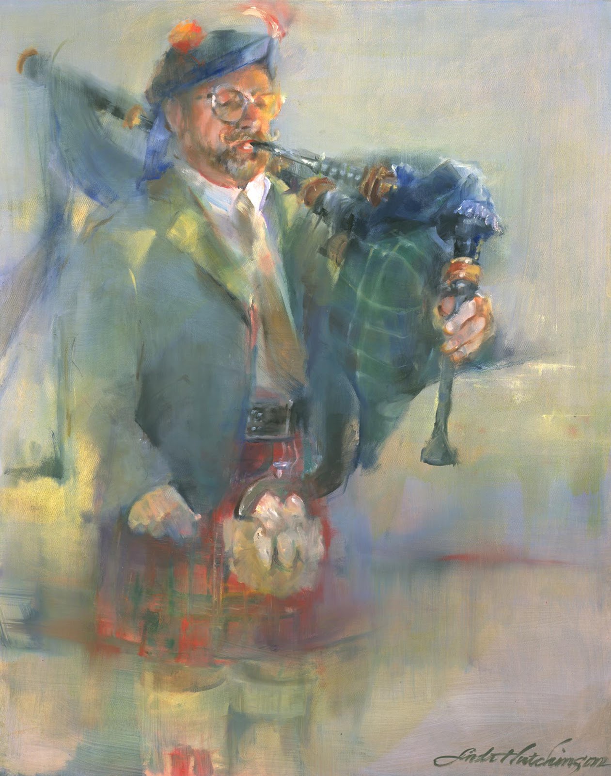 |
| The Piper oil/canvas 30 x 24 |
Thank you to Harry for posing for our art group a few years back...........a difficult standing and weighted pose I might add. I was blessed with that communal opportunity.
Monday, June 4, 2012
Graduation!...
 |
| Proud Parents University of Virginia |
Detail noted during the event: the graduates in all of the almost all of disciplines filed in organized lines with a noted degree of maturity and sophistication.....until the end. Those graduates in liberal arts seemed to immediately break line and move forward with no sense of order whatsoever.....some wearing shorts and sandals, graduation gowns not fastened, with no sense of seriousness at all. It was at that very moment that I was most proud to hold a B.A degree!
Thursday, May 31, 2012
I want to paint like a person...yin:yang
 |
| Grande Dame oil/canvas 30 x 40 x 1.5 |
For more years than I can count, the voice inside me declared that I wanted to paint like a man. Why? Because I loved the certainty, the broad loose brushstrokes and the bravado that seemed to ooze from the work that I admired so very much.... all painted by men. My inspirations came from such painters as: H. Craig Hanna, Alex Kanevsky and Randall Tiedman. I must add that there are many local, regional and national artists whose work I enjoy, but inspiration goes a step further into enticement, excitement and stomach flutters. Time has passed. There are now so many women artists whose work is inspiring to me: Stanka Kordic; Rimi Yang; Jeannie McGuire; Jenny Saville and Carla O'Connor. These female artists are, for me, grandes dames. For the first time ever, for me, I can honestly say that gender-bias has been removed from the equation. I want to paint like a person.
"Grande Dame" was first painted from a reality....everything in its place using local color. Boring, boring, boring. After a year of living with it, I attacked it with my own sense of aesthetics. I am relieved. I am purged. I am totally happy with this work.
Grande Dame has been included in the 36th Annual Art Exhibition sponsored by The Fairmount Center for the Arts.
June 3 - June 14
8400 Fairmount Road Novelty, Ohio
Thursday, May 24, 2012
The Drawing of the 10,000 Things...

This summer I will be leading a drawing class that is a bit unusual - The Drawing of the 10,000 Things via Journals. This whole notion spins off of the zen notion of drawing, drawing, drawing in order to perceive and understand the nature of things. We will combine drawing realistically from nature; observations, writings, notations, page design, border design and hand-drawn letters. Our goals will be: better drawing skills (utilizing value, perspective, texture, line and variety); self-awareness; self-definition and the use of drawing and writing to interpret everyday reality. The goals and subject matters will be individual to each artist. We will incorporate critique and goal-setting as a means of self-improvement. We will be using the Zen notion of drawing a great variety of everyday objects and drawing conclusions that will, hopefully, transfer to drawing anything at all. A greater awareness. The class begins on June 18, Mondays from 6:30-9 pm for 8 weeks...all at the Cuyahoga Valley Art Center.
This drawing was done some time ago at a similar class. I discovered that rumpled and squashed things are often fragmented into triangle shapes. Also, that the description of the key junctures of these fragments was crucial to the understanding of the drawing.
Monday, May 14, 2012
Redux...the re-making of a watercolor painting using gouache...Canned Beauty
 |
| Canned Beauty Watercolor/Gouache 10 x 6.5 |
In watercolor painting I usually hope for a transparent solution. In oils, solutions are often reached after layers of attempts.....and I always appreciate those earlier layered attempts showing through a bit. I enjoy seeing the struggle, the adventure.
"Canned Beauty" became a different work. Different is good. Nothing Ventured Nothing Gained.
Wednesday, May 9, 2012
Nevah say Nevah...on using Chinese White watercolor...April Cove...a Portage County landscape
 |
| April Cove - Portage County Watercolor 20.5 x 13 |
Sunday, May 6, 2012
Evolution Revolution...interpreting the past...Catch...a painting of my father
 |
| Catch Oil/Canvas 14 x 10 |
Thursday, May 3, 2012
It's Art Walk Season!...and time to play three-handed euchre on the grass
 |
| Three-Handed Oil/Canvas 24 x 48 x 1.5 |
Friday, April 27, 2012
Back to where I started..opacity:transparency...Adam Connected...a figurative work

Thursday, April 19, 2012
ya know it don't come easy...a painting that took years to resolve...Deference
 |
| Deference oil/canvas 40 x 30 x .75 |
Enough of the upending. More sketches. More planning. More thinking.
Have I learned my lesson? Probably not.
Thursday, April 12, 2012
Food For Animals...and for thought...Pearody
 |
| Pearody oil/canvas 8 x 24 x 1.5 |
Where: Hudson Fine Art & Framing; 9 Aurora Street; Hudson Ohio 44236 (located in The Brewster Mansion right on the square)
When: Wine and Cheese Opening; Friday, April 13 5:30-8:30 pm
What: This year Kathy is exhibiting food art....appealing to all
Hope to see you there!
Monday, April 9, 2012
One in Every Crowd...a celebration of self...and small chicks
 |
| One in Every Crowd oil/canvas 8 x 24 x .75 |
Something to work towards. A celebration of self.
Tuesday, April 3, 2012
the minor fall...the major lift...mood is very important to me...Daisy Play
 |
| Daisy Play Watercolor 9 x 9 |
This past weekend some of our extended family was in town and so we met for dinner at a local restaurant. There was an entertainer...kind of a lounge singer....who sang popular songs and played guitar. The first few were quite nice. His voice was pleasant, as was the strumming. The amps were turned up way too high and we were seated oh-so-close. (I know....if it's too loud, then I'm too old....perhaps) When he started singing this favorite song-o-mine, I cringed. "Hallelujah" gets its power, in my opinion, from its hymn-like mood....a softness and a slowness that transcends popularity. The delivery was the same as all of the other songs he sang. And what did I realize from this experience?
...that mood is a major purveyor for all kinds of art. Even though all of the design elements and principles are carried out to perfection, ignoring the mood of a work is a huge flaw. By using all of the tools we have to create, a painting or a song, we have the ability to manipulate the mood. We can create a slow soft mood by using similar values, subtle hues and softer brushwork. We, as artists, can benefit from consideration and contemplation before laying down the first stroke.
Friday, March 30, 2012
Strings...connectedness...heartstrings...an oil portrait of Nate
 |
| Strings oil/canvas 30 x 40 x 1.5 |
Strings. Happy Birthday Nate.
Friday, March 23, 2012
Add...subtract...construct...deconstruct...create...Birch Brothers
 |
| The Birch Brothers Watercolor 20.5 x 13 |
The Birch Brothers is the result.
Tuesday, March 13, 2012
Guilty as Charged...on taking time to pose the model...Denim Coat
 |
| Denim Coat Watercolor/Mixed 13.25 x 9.5 |
"Denim Coat" was painted transparently. Since there was so much darkness and little variation, I chose to accentuate the patterning on the blouse and then pull it into a side border. Tinted gouache was added to the background. Lemonade.
Note to myself: pose the model at least 15 minutes before painting time begins. Arrange a pose that sufficiently portrays most of the body parts, and includes some counter or negative space as well.
Saturday, March 10, 2012
Quantity versus Quality...there is something to be said for quantity...Daffodil Bunch...a watercolor
 |
| Daffodil Bunch watercolor 18 x 10.5 |
The funny thing is, no matter how much experience I have under my belt, no matter how old I get, it's all just a repeat of what came before. I think certain types of processes don't allow for any variation. If you have to be part of that process, all you do is transform--or perhaps distort---yourself through that persistent repetition, and make that process part of your own personality.
Haruki Murakami
What I Talk About When I Talk About Running
This could be a quote about painting....or about anything at all upon which we are trying desperately to improve. I think that we are sometimes so focused on quality that we try to make each work a masterpiece, and by that very action, the work becomes far too precious. On the other hand, just painting painting painting (quantity) eventually fuses painting into your being where transformation is then possible. Transforming ourselves. Pretty profound really. I'm not sure there have been many great painters who were amazing from the get-go. Or athletes. Or leaders. Or potato peelers. By virtue of the lengthy repetition of the action, we are able to get to the point of meditation during the process. We want each painting to be of our best effort. But, sometimes, by letting go of that notion, we allow the process itself some room for growth.
Over the years I have painted daffodils many many times....each is different, yet the same in so many ways. My hand is my hand. Sure, I like some better than others. But I have also found that others are preferred by others.
So be it. Paint and paint and paint, and then paint some more.
Tuesday, March 6, 2012
Painter of medium-sized polka dots with wide brush in oil?.........NOT...painting for self:painting for others...Three-Handed
 |
| Three-Handed Oil on Canvas 24 x 48 x 1.5 |
Most of my work involves a bit of deconstruction/reconstruction. I simply love this process. However, the more forms that are in the painting, the more the chaos must be controlled in order for the work to be visually read. More hard edges than usual. My goal in "Three-Handed" was the feel, the atmosphere of spring with diffused lighting that is both cool and warm. I chose to keep the destruction of edges to a minimum, while ensuring a locking together the comb-like shapes of the three figures (seen as one shape) and the background. This was my way of simplifying the information. The grassy decorative strip at the bottom was printed onto the canvas using a linoleum block. I thoroughly enjoy the combination of realistic painted with flat patterning, a love that comes from printed fabrics. My loves come together. I am satisfied......and extremely happy that I am not...
a painter of medium-sized polka dots painted with a wide brush in oil.
Friday, March 2, 2012
Fat Tuesday...the use of dark values to enhance...Mardi Gras
 |
| Fat Tuesday Watercolor 9.25 x 13.6 |
Tuesday, February 28, 2012
The Blues...the opaque and the transparent qualities of blue hues...Dirndl
 |
| Dirndl Watercolor 20.5 x 13 |
I have never been a book-learner. I like to rely on my own intuitive way of working. Reading about the properties of pigments just doesn't take. I must find out for myself. A hard lesson to learn sometimes. Knowing a color's properties can definitely help in the working of a painting. The switch-over to a more transparent blue made all the difference. Another lesson learned.
Subscribe to:
Posts (Atom)