|
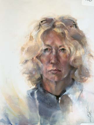
| Fragile Patterns Charcoal/Mixed 19 x 12.5 |
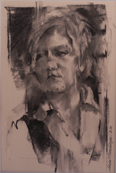
In the time I have been writing this blog, there have been more hits on my expressive drawing posts than any others. Unfortunately, until now, I have only described the steps we took in workshops without explaining exactly what I mean. Expressive drawing is my own moniker, albeit general, that signifies a drawing where other considerations trump the exactness of the subject. And, hopefully, it leads to expressive painting as well.
I use the design approach to drawing and painting. Design elements are the artist's tools. They include:
1. Shape (pattern, form, mass, object, subject matter)
2. Value (light and dark, tone, tint)
3. Space (the illusion of 3-dimensional depth and 2-dimensional flatness)
4. Edges (blurred and sharp, lost and found)
5. Color Temperature (warm and cool)
6. Texture (surface variation)
7. Line (drawing versus mass painting)
8. Color Hue (spectrum clossifications: red, yellow, blue, etc; local and arbitrary hues)
9. Color Intensity (brightness, neutral versus pure)
The design principles ore the organizing aesthetic ideas that guide your use of elements in a painting. They are:
1 , Dominance (emphasis, focal point)
2, Movement (rhythm,, directions, gesture, transition)
3, Variety (contrast, conflict, tension)
4, Unity (harmony, balance or not with intention)
These elements are shared by artists of all kinds from illustrative to culinary. Each artist has his/her personal sense of aesthetic "correctness" that is a personal mix of the elements and principles dependent upon his/her preferences. My own mix is just that...my own. In expressive drawing, these principles are in play right along with the subject, the reality.
Drawing expressively relies on a good foundation in drawing; the desire for a bit of risk-taking; enjoying happy accidents and occasional chaos; a skill in gross motor drawing from the shoulder (as opposed to fine motor with the wrist); and the ability to trust your own problem- solving and decision-making ability.
My own preferences for an expressive drawing or painting include:
* moving from 3-dimensional correctness and detail in the focal area to 2-dimensional flatness in the far corners of the work
* calligraphic line (especially the S-curve) that mimic nature
* lines that extend too far
* broken line
* echo lines (or power lines) in important areas for strength
* combining like-valued shapes for simplicity
* unexpected shapes wherever
* warms played against cools
* line played against mass
* amazing neutrals played against a few pures
* as many lost edges as possible....leading to a bit of beautiful (hopefully) nothingness
* and rhythm, rhythm, rhythm using edges to create movement