 |
| Catch Oil/Canvas 14 x 10 |
Sunday, May 6, 2012
Evolution Revolution...interpreting the past...Catch...a painting of my father


Thursday, May 3, 2012
It's Art Walk Season!...and time to play three-handed euchre on the grass
 |
| Three-Handed Oil/Canvas 24 x 48 x 1.5 |
Friday, April 27, 2012
Back to where I started..opacity:transparency...Adam Connected...a figurative work

Thursday, April 19, 2012
ya know it don't come easy...a painting that took years to resolve...Deference
 |
| Deference oil/canvas 40 x 30 x .75 |
Enough of the upending. More sketches. More planning. More thinking.
Have I learned my lesson? Probably not.
Thursday, April 12, 2012
Food For Animals...and for thought...Pearody
 |
| Pearody oil/canvas 8 x 24 x 1.5 |
Where: Hudson Fine Art & Framing; 9 Aurora Street; Hudson Ohio 44236 (located in The Brewster Mansion right on the square)
When: Wine and Cheese Opening; Friday, April 13 5:30-8:30 pm
What: This year Kathy is exhibiting food art....appealing to all
Hope to see you there!
Monday, April 9, 2012
One in Every Crowd...a celebration of self...and small chicks
 |
| One in Every Crowd oil/canvas 8 x 24 x .75 |
Something to work towards. A celebration of self.
Tuesday, April 3, 2012
the minor fall...the major lift...mood is very important to me...Daisy Play
 |
| Daisy Play Watercolor 9 x 9 |
This past weekend some of our extended family was in town and so we met for dinner at a local restaurant. There was an entertainer...kind of a lounge singer....who sang popular songs and played guitar. The first few were quite nice. His voice was pleasant, as was the strumming. The amps were turned up way too high and we were seated oh-so-close. (I know....if it's too loud, then I'm too old....perhaps) When he started singing this favorite song-o-mine, I cringed. "Hallelujah" gets its power, in my opinion, from its hymn-like mood....a softness and a slowness that transcends popularity. The delivery was the same as all of the other songs he sang. And what did I realize from this experience?
...that mood is a major purveyor for all kinds of art. Even though all of the design elements and principles are carried out to perfection, ignoring the mood of a work is a huge flaw. By using all of the tools we have to create, a painting or a song, we have the ability to manipulate the mood. We can create a slow soft mood by using similar values, subtle hues and softer brushwork. We, as artists, can benefit from consideration and contemplation before laying down the first stroke.
Friday, March 30, 2012
Strings...connectedness...heartstrings...an oil portrait of Nate
 |
| Strings oil/canvas 30 x 40 x 1.5 |
Strings. Happy Birthday Nate.
Friday, March 23, 2012
Add...subtract...construct...deconstruct...create...Birch Brothers
 |
| The Birch Brothers Watercolor 20.5 x 13 |
The Birch Brothers is the result.
Tuesday, March 13, 2012
Guilty as Charged...on taking time to pose the model...Denim Coat
 |
| Denim Coat Watercolor/Mixed 13.25 x 9.5 |
"Denim Coat" was painted transparently. Since there was so much darkness and little variation, I chose to accentuate the patterning on the blouse and then pull it into a side border. Tinted gouache was added to the background. Lemonade.
Note to myself: pose the model at least 15 minutes before painting time begins. Arrange a pose that sufficiently portrays most of the body parts, and includes some counter or negative space as well.
Saturday, March 10, 2012
Quantity versus Quality...there is something to be said for quantity...Daffodil Bunch...a watercolor
 |
| Daffodil Bunch watercolor 18 x 10.5 |
The funny thing is, no matter how much experience I have under my belt, no matter how old I get, it's all just a repeat of what came before. I think certain types of processes don't allow for any variation. If you have to be part of that process, all you do is transform--or perhaps distort---yourself through that persistent repetition, and make that process part of your own personality.
Haruki Murakami
What I Talk About When I Talk About Running
This could be a quote about painting....or about anything at all upon which we are trying desperately to improve. I think that we are sometimes so focused on quality that we try to make each work a masterpiece, and by that very action, the work becomes far too precious. On the other hand, just painting painting painting (quantity) eventually fuses painting into your being where transformation is then possible. Transforming ourselves. Pretty profound really. I'm not sure there have been many great painters who were amazing from the get-go. Or athletes. Or leaders. Or potato peelers. By virtue of the lengthy repetition of the action, we are able to get to the point of meditation during the process. We want each painting to be of our best effort. But, sometimes, by letting go of that notion, we allow the process itself some room for growth.
Over the years I have painted daffodils many many times....each is different, yet the same in so many ways. My hand is my hand. Sure, I like some better than others. But I have also found that others are preferred by others.
So be it. Paint and paint and paint, and then paint some more.
Tuesday, March 6, 2012
Painter of medium-sized polka dots with wide brush in oil?.........NOT...painting for self:painting for others...Three-Handed
 |
| Three-Handed Oil on Canvas 24 x 48 x 1.5 |
Most of my work involves a bit of deconstruction/reconstruction. I simply love this process. However, the more forms that are in the painting, the more the chaos must be controlled in order for the work to be visually read. More hard edges than usual. My goal in "Three-Handed" was the feel, the atmosphere of spring with diffused lighting that is both cool and warm. I chose to keep the destruction of edges to a minimum, while ensuring a locking together the comb-like shapes of the three figures (seen as one shape) and the background. This was my way of simplifying the information. The grassy decorative strip at the bottom was printed onto the canvas using a linoleum block. I thoroughly enjoy the combination of realistic painted with flat patterning, a love that comes from printed fabrics. My loves come together. I am satisfied......and extremely happy that I am not...
a painter of medium-sized polka dots painted with a wide brush in oil.
Friday, March 2, 2012
Fat Tuesday...the use of dark values to enhance...Mardi Gras
 |
| Fat Tuesday Watercolor 9.25 x 13.6 |
Tuesday, February 28, 2012
The Blues...the opaque and the transparent qualities of blue hues...Dirndl
 |
| Dirndl Watercolor 20.5 x 13 |
I have never been a book-learner. I like to rely on my own intuitive way of working. Reading about the properties of pigments just doesn't take. I must find out for myself. A hard lesson to learn sometimes. Knowing a color's properties can definitely help in the working of a painting. The switch-over to a more transparent blue made all the difference. Another lesson learned.
Thursday, February 23, 2012
Many looks...capturing one look out of many...Jessica
 |
| Jessica Charcoal/Watercolor 14 x 10 |
Monday, February 20, 2012
The Leap into the Unknown....a work with gold leaf...Paisley Shawl
 |
| Paisley Shawl Watercolor/Mixed with Gold Leaf 28 x 20 |
"Paisley Shawl" became more dynamic, more interesting and more modern in my opinion. Oh, the stimulation!
Wednesday, February 15, 2012
Fish?...considering a subject that is back-lit...Respite
 |
| Respite Watercolor 8 x 17 |
Monday, February 13, 2012
Respect Yo-Self...avoiding a group mind-set...Chameleon...a self-portrait
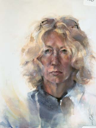 |
| Chameleon Oil/Canvas 20 x 16 |
Chameleon was painted many years ago as a small, very small, step in self-respect. After a lifetime of being called a paleface, I painted this work in front of my studio window during a raging snowstorm....I guess just to prove that I did, in fact, have color. It's all a matter of opinion.
Thursday, February 9, 2012
Little Ditty...getting your brushes moving...
 |
| Juicy Watercolor 8.5 x 5 |
Monday, February 6, 2012
Go Figure...seeing the universal in the specific...
 |
| Fragile Patterns Charcoal/Mixed 19 x 12.5 |
For me, the experience is tender. It is pure.
Go figure.
Thursday, January 26, 2012
Informed Chaos...sends the work in a new direction.Pearody
 |
| Pearody oil/canvas 8 x 24 x 1.5 |
The right hand segment of Pearody reflects this notion. The line work was scraped through to an earlier layer. This process was planned so that the colors reflected, for the most part, the work that was happening on the left side of the canvas.
Chaos. Informed.
Tuesday, January 24, 2012
Facing the White...warm up with small works...
 |
| Pumpkin Pie 1 oil/canvas 6 x 6 x 1.5 |
 |
| Pumpkin Pie 2 oil/canvas 6 x 6 x 1.5 |
The two pumpkin pie paintings were the result.
Tuesday, January 10, 2012
Resolution...
 |
| Rick at the Wheel...sketch |
* to pump up more pure color in the work.....I have long been a neutral lover....primarily for their soothing nature.....but pure color grabs the attention and excites. I will give it a try.
* to paint more from sketches.....one step removed from reality, painting from sketches allows for more artistic freedom and interpretation
* to incorporate more patterning into the work. I am a lover of patterns - wallpaper, fabric and the like. Why not include them?
There we have it............Happy New Year!
Thursday, January 5, 2012
Holiday Greetings....

I should also mention a yearly project by artist Norma Ott. She and her husband Dave do a lot of traveling. As a result, she has lots of watercolors done at national parks. Each year, she makes up a calendar (at Kinko's) featuring 12 of her paintings which she presents to friends and family as a gift. What a wonderful idea! When her calender arrives in my box, my heart goes pitter-pat. Thank you, Norma!
Tuesday, January 3, 2012
oh, the memories...sketching during family celebrations...Nate in the car
 |
| Nate in the Car...a sketch |
Tuesday, December 20, 2011
Friend...a tribute....Jo McGarvey
 |
| Jo Oil/Canvas 20 x 10 x 1.5 |
Friday, December 16, 2011
Jo - Session 3
When I approached this painting for session 3, I was fairly certain that it would be my last. My goals were:
* add the necklace
* add hard edges to restate my chosen rhythm around the canvas; and, if necessary, soften others
* adjust the color temperature where necessary; i.e. warming sleeve-tops of the coat. I will admit, that I like pushing the envelope a bit away from reality and towards more exciting.
* add highlights....for this, I used a cooled-down white using just a smudge of phthalo turquoise which is in the background and part of my original limited palette
* MOST IMPORTANTLY, I tried to avoid re-stroking areas with which I was pleased. It serves no intent at all. I can live with slight errors in draftspersonship more than ill-painted passages. That is my priority.
I am satisfied.
* add the necklace
* add hard edges to restate my chosen rhythm around the canvas; and, if necessary, soften others
* adjust the color temperature where necessary; i.e. warming sleeve-tops of the coat. I will admit, that I like pushing the envelope a bit away from reality and towards more exciting.
* add highlights....for this, I used a cooled-down white using just a smudge of phthalo turquoise which is in the background and part of my original limited palette
* MOST IMPORTANTLY, I tried to avoid re-stroking areas with which I was pleased. It serves no intent at all. I can live with slight errors in draftspersonship more than ill-painted passages. That is my priority.
I am satisfied.
Wednesday, December 14, 2011
Jo - Session 2
 |
| Jo Session 2 |
Monday, December 12, 2011
Demonstration
Every now and then I agree to do a painting demonstration. In this case, it was part of a group of Saturday art demonstrations at Summit Artspace as part of the Kaleidoscope 2011 exhibition. My friend Jo agreed to model. Demonstrations are difficult to do....mostly due to the fact that my intuitive painting process (done in solitude) is broken by talking and questioning. I can actually feel the chaos that builds between my L- and R-brain as a result. I find that my choices are not always the best in this situation. Because Jo has been a friend for so very many years, I was at least acquainted with a color palette that I deemed to be her own. I asked her to wear a coat that personifies her personality and has been her mainstay for a while. So....the pose, the colors and the atmosphere of communion were her contributions. She seemed at ease. Her face was comfortable and giving, which I attribute to the fact that she is an actress and seemed to know just what it was that I wanted. My own goals for the day were to relax and to make juicy, broad and expressive strokes on the canvas that broadly interpreted what I was taking in. The audience was wonderful....the questions well-informed and thoughtful. I was pleased with the image at the end of the session which lasted 2 hours. I knew that it was something that I could build on later.
 |
| Jo oil/canvas 20 x 10 x 1.5 |
Wednesday, December 7, 2011
Figure Drawing...using a horizontal format...Ethereal
 |
| Ethereal Charcoal/Pastel 5.25 x 17.5 |
For me, nothing is more rewarding than the curves of the human figure.
Friday, December 2, 2011
Test for Doneness...
 |
| Ella Watercolor 18.5 x 12 |
There are two images here of Ella, a high school art student who modeled for our watercolor class. I later took the painting to completion at home. But in this work in particular, I so missed the rawness of the work at the end of the live session. This lesson will suit me well.
And as for cookies.....they rule. Undercooked. Slightly golden. Whatever. Joyful participation.
Tuesday, November 29, 2011
Let the Wild Rumpus Begin!...
 |
| Christmas Chaos Watercolor on Yupo 8 x 8 |
"Christmas Chaos" was painted at the end of last holiday season using a few bulbs that had hidden during attic reassignment. Yupo paper provides the texture. In fact, one simply cannot escape texture when using this paper, as the surface is a slippery plate. Adding more pigments always always disturbs what is underneath. Smooth passages are impossible. Although this paper is not my favorite, I can understand how using it in certain instances will support chaotic intentions......
such as holiday decorations.
And, as far as those cheap light strings that work only for one year (or half of them go out).....I vow not to purchase them any more. Please recycle them at :
Recycle holiday lights
All lights sent for recycling should be sent to:
HolidayLEDs.com Recycling Program
C/O Classic Turning, Inc.
4905 James McDivitt Street
Jackson, MI 49201-8958
Friday, November 25, 2011
Just what is expressive drawing?...my own definition...Fragile Patterns
 |
| Fragile Patterns Charcoal/Mixed 19 x 12.5 |
I use the design approach to drawing and painting. Design elements are the artist's tools. They include:
1. Shape (pattern, form, mass, object, subject matter)
2. Value (light and dark, tone, tint)
3. Space (the illusion of 3-dimensional depth and 2-dimensional flatness)
4. Edges (blurred and sharp, lost and found)
5. Color Temperature (warm and cool)
6. Texture (surface variation)
7. Line (drawing versus mass painting)
8. Color Hue (spectrum clossifications: red, yellow, blue, etc; local and arbitrary hues)
9. Color Intensity (brightness, neutral versus pure)
The design principles ore the organizing aesthetic ideas that guide your use of elements in a painting. They are:
1 , Dominance (emphasis, focal point)
2, Movement (rhythm,, directions, gesture, transition)
3, Variety (contrast, conflict, tension)
4, Unity (harmony, balance or not with intention)
These elements are shared by artists of all kinds from illustrative to culinary. Each artist has his/her personal sense of aesthetic "correctness" that is a personal mix of the elements and principles dependent upon his/her preferences. My own mix is just that...my own. In expressive drawing, these principles are in play right along with the subject, the reality.
Drawing expressively relies on a good foundation in drawing; the desire for a bit of risk-taking; enjoying happy accidents and occasional chaos; a skill in gross motor drawing from the shoulder (as opposed to fine motor with the wrist); and the ability to trust your own problem- solving and decision-making ability.
My own preferences for an expressive drawing or painting include:
* moving from 3-dimensional correctness and detail in the focal area to 2-dimensional flatness in the far corners of the work
* calligraphic line (especially the S-curve) that mimic nature
* lines that extend too far
* broken line
* echo lines (or power lines) in important areas for strength
* combining like-valued shapes for simplicity
* unexpected shapes wherever
* warms played against cools
* line played against mass
* amazing neutrals played against a few pures
* as many lost edges as possible....leading to a bit of beautiful (hopefully) nothingness
* and rhythm, rhythm, rhythm using edges to create movement
Monday, November 21, 2011
Landscape!...
 |
| Pumpkin Patch Watercolor 8.75 x 8.75 |
The next painting is always my favorite.
Thursday, November 17, 2011
Just how far will you go...
 |
| Pumpkin with Canned Peppers Pastel/Paper 7.75 x 8.5 |
Surprises are so sweet.
Monday, November 14, 2011
Gourds...
 |
| Gourd Fest Watercolor 8 x 12 |
Thursday, November 10, 2011
Tools...
 |
| Kitchen Mix Watercolor 10 x 10 |
Tools are personal and soulful by nature. Add to that a willing artist. I do not value a dozen cloned photorealistic works nearly as much as a dozen individual interpretations. Enter emotion. Va-voom.
Tuesday, November 8, 2011
Raking...
 |
| Raking Watercolor/Graphite 21 x 13.25 |
The challenge then, for me, is to be able to save the original spark as the painting marches onward and becomes a bit weightier.
Friday, October 28, 2011
and speaking of inky blue...a Halloween sky
 |
| Halloween Sky Watercolor |
Beautiful. Thoughtful. Inky Blue.
copyright: Vanity Fair, November 2011.
Wednesday, October 26, 2011
Inky Blue over baby blue...

Paying attention to what gives us a buzz is fun as well as informative. It seems as if we spend so much of our lives trying to fit in that we ignore our preferences. A lot of this is cultural as well.....as well as gender-bent. (don't get me started)
"Halloween Sky" was painted from a memory that was presented to me as I headed home due East one late night after class. Inky blue was part of that memory. Wait a minute....inky blue was the memory.
My personal fashion style: baggy. soft. And, above all, garments and cloth items made in India.
Monday, October 24, 2011
Play Time...just for the doing and stamping...
 |
| Bibliophile Mixed/Paper 14 x 7 |
Fun. Not-so-serious. Yeah.
Thursday, October 20, 2011
How to Feel Miserable as An Artist
is one of those humorous lists that artists pass on or e-mail to each other. This list was shared by Tom Auld and is worth further sharing. There is no credit line.
1. Constantly compare yourself to other artists.
2. Talk to your family about what you do and expect them to cheer you on.
3. Base the success of your entire career on one project.
4. Stick with what you know.
5. Undervalue your expertise.
6. Let money dictate what you do.
7. Bow to societal pressures.
8. Only do work that your family would love.
9. Do whatever the client/customer/gallery owner/patron/investor asks.
10.Set unachievable/overwhelming goals. To be accomplished by tomorrow.
Subtitle: What Not to Do. See yourself in any of the above?
1. Constantly compare yourself to other artists.
2. Talk to your family about what you do and expect them to cheer you on.
3. Base the success of your entire career on one project.
4. Stick with what you know.
5. Undervalue your expertise.
6. Let money dictate what you do.
7. Bow to societal pressures.
8. Only do work that your family would love.
9. Do whatever the client/customer/gallery owner/patron/investor asks.
10.Set unachievable/overwhelming goals. To be accomplished by tomorrow.
Subtitle: What Not to Do. See yourself in any of the above?
Wednesday, October 19, 2011
Fragile Patterns...
 |
| Fragile Patterns Charcoal/Mixed 19 x 12.5 |
Pattern recognition and musical patterning are functions of the right brain.
Fragile patterns celebrates this notion.
Monday, October 17, 2011
Stem to Stem...a group pumpkin gesture
 |
| Stem to Stem oil/canvas 20 x 10 x 1.5 |
The work has been drying for several weeks now. I am quite pleased.
Wednesday, October 12, 2011
Endless Possibilities...a humble onion
 |
| l'oignon watercolor |
I have chosen my painting "l'oignon" to accompany this entry, as I feel it is perhaps the most sensitive watercolor I have done to date. Of course, most in my circles would call it a watercolor sketch, as it doesn't have the power (and background) of a powerful painting. And, most likely, it would never be accepted into a major exhibition. Too small. Not enough impact. But sensitive I think.
Subscribe to:
Posts (Atom)