Search This Blog

Monday, September 7, 2020

Farming

Farming   watercolor   19 x 11
is a difficult endeavor, although it holds a rather romantic notion in our minds...one of simplicity and honesty, I think. 

My goal in painting this work was to focus on a foreground of semi-nothingness, a quilt work patterning where values and color tonalities have minimal variation.  And, I realize that this challenge may have been far more easily accomplished in oil than watercolor.  For the reference photo, I pulled off of a major highway and hiked to the edge of a local farm.  The terrain was horribly uneven and difficult to maneuver.  I chose a spot leading up to the farm that best seemed to illustrate my goal.  The sky was minimalized.  The buildings were done in just a few strokes.  Most of the work was, of course, in the foreground, where I attempted to achieve chaos and uncertainty.  I am satisfied with this attempt, although I found myself yearning for more opacity, as transparent watercolor has a limited range of workability.

All in all, I feel that this work totally exemplifies the difficulties of farming.

Tuesday, September 1, 2020

Steeple

Steeple   watercolor   20 x 12 
During the virus shut-down, my walking path is fairly regular...a small loop around the small community where we live.  Steeples have always intrigued me...this one just atop an abandoned medical building.  While not particularly engaging, it still represents, to me, an uplifting, a reaching toward the optimistic, the infinite. 

Originally, the background colors were very bright, leaning the work more toward the typical watercolor painting.  I could not resist the urge to pair the transparent with the opaque, so a wash of Chinese White was applied to the background, quieting the sky and moving the structure to the forefront.  I am not quite sure I am happy with this decision, but the sky area is now more akin with what we experience here in northeast Ohio.  I definitely have an allergy to happy happy skies. 

Over the years, I have also some to dislike, in my own work, the more primary application of paint to replicate shingles and bricks. So, in this case, the end of an eraser was dipped into a giant puddle of paint, creating a more secondary, chaotic and imperfect application. 

I am pleased with this more interpretive consideration of the subject.

Wednesday, August 19, 2020

Garden Phlox

Garden Phlox   watercolor   10 x 10
What watercolor class would be complete without a floral study?  ....which I consider to be among the most difficult of subjects, due to the fact that there is an overwhelming amount of information that must be sifted and sorted.

But I also believe that there must be a why...the reason why this particular bloom, among so very many, was selected as a subject.  For me, this painting was color-driven.  As I pass by it beside our porch, I am momentarily stunned by its color, the mysterious product of nature.  The overall atmosphere is so much more important to me than perfect leaves, perfect blossoms, perfect stems.

The greatest challenge in this one was the middle circle, the missing area that contains information on a plane that is further back than the outer rim of blossoms. The background wash was extended into this inner circle and the information only suggested.  And, of course, I added my signature brown to neutralize the sweetness of the so much pure color.  I also like the stem which has been skewed from the vertical.

I am pleased.

Saturday, August 15, 2020

Fruits of the Summer...I just couldn't stop!

Cherries   watercolor/cold wax on wood cradle   8 x 8 x .75

Plums   watercolor/cold wax on wood cradle   8 x 8 x .75

Watermelon   watercolor/cold wax on wood cradle   8 x 10 x 1.5

Grapes   watercikir/cold wax on wood cradle   98 x 8 x .75

Thursday, August 6, 2020

Fruits of the Summer and Parlor Tricks

I am not really into parlor tricks, or "special effects" in painting.....as I value solid painting skills and solid brushwork...at least that is my aim.  Sure, I have used wadded up plastic wrap to create texture and rely regularly on spritzing for its subtle effects.  But I have to draw the line at sponged trees.  In fact, being a watercolor purist nagged at me for years before I succumbed to being "allowed" to add Chinese white or gouache for more opacity.  I am more forgiving these days.  My notion of what makes for good artwork has expanded considerably.

These small fruit paintings were adhered to wood cradles with acrylic matte medium and glazed on top with cold wax.  The resultant effects were quite exciting to me, as a painter who always matted and framed watercolors.  (increasing their size substantially)  I worked in brighter colors and simpler shapes.  The results are richer, more compact.  I feel that they pack more of a punch, being similar to small oil paintings which I usually work on a gallery wrap canvas.  Very exciting.

Do watercolors always have to be matted and framed?  I think not.  And I am anxious to try some larger works using this method.

Granny Smith and Lime   watercolor/cold wax on wood cradle   8 x 8 x .75

Lemon   watercolor/cold wax on wood cradle   8 x 8 x .75

Grapefruit   watercolor/cold wax on wood cradle   8 x 8 x .75

Friday, July 31, 2020

Waiting For a Friend


There were two major opportunities in this little scenario that gave me pause.

The first....a black-lit situation.  These have always made me uncomfortable, as I am a value painter who relishes the shifts of light over the terrain of the human face.  With the light coming from behind, the value play, while atmospheric, is so limited.  In these cases, it seems to me, the silhouette, the profile becomes more important...harder edges result.  So....this case allowed for some practice in this situation.  I find it less interesting, but still enjoyable.

The second....waiting.  I have heard it said that real life is what happens when one is waiting for something more exciting to come along.  This young woman, intent on her phone, was seemingly waiting for cues from "the somewhere else" to amuse and entertain her.  Being a person who immensely enjoys the free play of my own mind, I find this alternative both alien and unsatisfactory.  Being alone provides me with so much pleasure!  People with cell phones are never alone...how sad?

Monday, July 27, 2020

Too Complicated

I have dozens of sketchbooks.  And, since our current sense of time and scheduling has been seriously challenged, I have found myself meandering through these small journals that have taken me on many journeys throughout the years.  They are diaries to me.  And....I have found that my freshest and most appealing observations have been found on these small pages.  They have seen me through vacations with family and friends, through the births of grandchildren and to emergency and waiting rooms at various hospitals. The sketches are often unfinished and imperfect, yet somehow hit the mark.

This is one of my favorites:  an 87 year old woman in the waiting room of a knee surgeon who kept saying to her companion (over and over again):  ..."and that's another example of how things are too complicated these days".
The year:  2012.

She had no idea.

Thursday, July 16, 2020

Bowl of Cherries

Bowl of Cherries   watercolor   10 x 14
was an "in search of" painting for me.  The previous two works were experimental, with an attempt at channeling the processes of two of my hero watercolorists.  Both were on the minus side of satisfactory...perfectly presentable, but not me.  While I did manage to stretch my boundaries, and to understand other ways of interpretation, I longed to be in my own skin.  Just as in life, it seems to take only a short road trip to appreciate the comforts of home.

The set up was lit.  The subject drawn and mostly understood.  All of the qualities that I most value seemed to come together.  The background was originally a watery beautifully-painted blue.  But as I am also an oil painter, and because I highly value the richness of dark values, another wash was added....and I was happy as a clam.  Imperfect edges.  Lost and found qualities.  The subtle description of the woven cloth. Drippy paint.

I was happy to be home.

Tuesday, July 7, 2020

Hopeful

Hopeful   watercolor/pencil   16 x 10.5
Each Spring we anticipate the arrival of bluebirds who fill our box with a nest and small blue eggs.  They face many hazards:  late Spring freezing, parasites and house wren assassins who pierce their tiny eggs.  It becomes a real-life drama in our own back yard.  Will they fledge?  We are always HOPEFUL.

Monday, June 29, 2020

Sliding Back Into Watercolors

Red Bud   watercolor   13.5 x 10
is a daunting task.  This painting was one of the first watercolors of the season.  As I have little patience for perfectly arranged bouquets, I stuck some red bud branches into a jar, along with some vinca vine for interest. Floral paintings can easily become a story about the vase, which doesn't do much for me.  Simple stories do. The palette was limited.  Detail was kept to a minimum.  Both sides of the paper were lightly misted with water, as the transition from wet to dryer is one that both appeals and excites. The bottom background shape was painted with a light wash from the mixing well of the palette, combining all of the previously used colors to create a harmonic neutral.  And, of course, brown (a reddish tone) in the top background.  I have found that I like to offset the sweet floral hues with an earthy brown which, for me, keeps the floral paintings from reading too sweetly.

After years and years of painting both from life, and from reference photos out of necessity, I have found that I much prefer the imperfect boldness that occurs when I paint from life. 

I am still trying to define what, for me, makes a good painting.  It is always so elusive.

I am ready to  move one.

Wednesday, June 10, 2020

Boys and Creeks

Boys and Creeks  oil/canvas   30 x 20 c 1.5
My husband loves poking around in creeks.  Our three sons loved poking around in creeks.  And now, our grandchildren are following suit.  There is an exciting world living just beneath the surface.....crawdads, fossils, and interesting rocks and minerals beckon.  Wet feet?  No worries.  Dirty hands?  A momentary inconvenience.  Muddy boots?  They can be cleaned.

During the virus, our family has kept in touch more than ever as we share photos from across the country.  Seeing these daily activities, as well as coping activities, has provided us with such pleasure.  From the seaside beaches of California to the shallows of Ohio's rivers and streams, we are united in the passion of exploration. 

This painting was referenced from such a photo. I am in awe of their resilience and their spirit. 

Sunday, May 31, 2020

Orange E

Orange E   charcoal/watercolor   13.5 x 11
is our wonderful 7-year-old grandson, whose snaggle-tooth grin could not be ignored.  This drawing is, and was intended to be soft.  It is rendered in charcoal on Rives BFK, a highly-rated paper, usually used for printmaking.  It's soft surface and weight was perfect for this project.  At the end, I decided to use watercolor for his sweatshirt, as E.'s favorite color is orange, which he frequently wears.

In terms of photo references, I will admit that the lighting was not perfect, as the photo was taken during a Facetime chat...an amazing process, that I could never have dreamed to be possible.  We take what we can get these days.  Of course, for a dramatic rendering, where shadows and lights create a more interesting patterning on the face, a studio set-up with lighting and a more considered picture-taking process would have possible. 

I believe that, in this case, the softer presentation of everyday lighting worked out well.

And....btw....those baby-teeth-hangers-on have now been replaced with some emerging larger pearly-whites.  I love this age.  Enthusiasm.  A lightness of spirit.  Hope.

Tuesday, May 19, 2020

Harbinger

Harbinger   waterclor   6 x 9
is a perfect description for the robin, whose presence marks the onset of warmer weather.  This small work is another warm-up to reacquaint myself with the watercolor medium.  As I painted this small wonder, I cam to realize how very round they are!

This was an additional challenge for me, as I am more comfortable with large brushes than small, large formats than small.  And...retaining the "whites" is always the greatest challenge!

I am pleased.

Thursday, May 14, 2020

Switching Gears

Fistful   watercolor   6 x 9
from oils to watercolors.  Where I live, in Ohio, the year is divided into four distinct seasons...weather-wise, food-wise, and attitude.  This I love.  Because my painting loves are equally divided between oils and watercolors, I switch up mediums seasonally.  I have tried to do both simultaneously and it just doesn't work....for me.  Different feels, different clean ups, different approaches.  Too confusing.

Enter Spring.....I decided to do just a couple of small ditties to whet my watercolor appetite and to rid myself of the fear of the white paper.  No formal set-ups....just a fistful of blooms from our yard.  I was so happy to be painting this work and opposed the transparent pigments of the blooms with a more opaque handling of the background....just chalky like I like it.  Fistful. 

Friday, May 8, 2020

The Paper at the Back of the Closet

Kick   mixed/paper   27.5 x 18
was given to me many years back.  Forgotten. What is it?  Giant roll.  Heavy heavy.  A bit of texture.  Feels like watercolor paper.  No label.

And so, given our current circumstances, I decided to give it a try. What was meant to be a tender charcoal drawing morphed into the unintended...strong, aggressive.  No pigment could be moved around.  The blending stump was useless.  Watercolor stayed put and immediately sunk in.  No ability to wipe off splatters.

I must say that in the past, I have been quite excited and stimulated by the feel of a new ground as it allows for a bit of chaos, providing a novel experience.  In fact, I have prided myself on this flexibility.  But here I reached my limit.  The struggle was almost unbearable. 

Nevertheless, I took the work to finish. While I am pleased with the result, I am not anticipating using it again. 

Lesson to be learned:  label all papers when you can. I believe that it was unsized. 


Friday, May 1, 2020

Flight of Fancy

Ascension   oil/canvas   24 x 48 x 1.5
This painting, is, was a flight of fancy for me.  While based in reality (the reference photos were shot at the parade in University Circle  Cleveland several years back), its intention is simply "upwards".  During this weird time period of sickness and fear, I needed this flight of fancy to maintain equilibrium, a return to a positive outlook when faced with so much turmoil and distress.

Actually, my brain takes MANY flights of fancy each day.  I am not sure if this happens to anyone else, or to everyone.  But I can say for certain, that these little mind travels are imperative to my emotional well being.  It is only when my mind is otherwise occupied with sociability and tasks that life becomes, well, dull and static. 

And, as sychronicity would have it, I am currently reading my first ever surrealistic work, Nadja by Andre Breton.  He questions whether or not we are defined by the lives we lead on a daily basis OR by the surprises, the flights of fancy, that we take.

And, so it is that this work is a bit of, I believe, surrealism on my part.  My flight of fancy.

Wednesday, April 22, 2020

Koi

Koi   oil/wood panel   18 x 24 x 1.5
Paintings of Koi fish are not unusual.  In fact, a couple of artists are known for their large eloquent studies of their color and movement.  But my reason for painting this work was strictly sentimental.  This celebrates our son and daughter-in-law earlier in their relationship. 

Resolution of this work came very very slowly...partly because I worked on a gessoed wood panel, which is not my norm.  This surface responds completely differently to stroke-making, causing a bit of tension on my part.  And, I suppose, partially because there is a bit of a story here.  Most of my figures are "lost in space", allowing me to meander between the figure and the ground, eliminating much along the way.  But here, in this instance, when telling a story, the pieces must in more in tact.  I am satisfied.

Wednesday, April 15, 2020

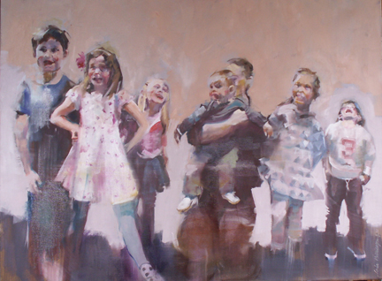
Kids

Kids   oil/canvas   30 x 40 x 1.5
ARE THE BEST!   This painting was a joy to paint....from reference photos taken at a birthday celebration at COSI in Columbus shortly before Ohio's shelter-in-place began. Out of the many shots taken, this one in particular revealed the many personalities and energies of these kids...the bashful, the giddy, the superheroes. 

My goals were threefold:  to let the individual personalities express themselves; to sublimate the "likenesses" so that the group gesture would shine through; and to emphasize the counter-spaces between the figures to enhance the interconnectedness of the positives and negatives.

I am supremely happy with the outcome....makes me wish I were a kid again!

Monday, April 6, 2020

Bouquet Without Stems

Bouquet Without Stems   oil/canvas   12 x 12 x 1.5
was not a planned project.  Sometime in March, I started seeing lots of primrose plants in the stores.  Primroses are on my list of "poorly painted subjects from the past" that, eventually, I have plans to attempt again....along with swans and pumpkins.  And so, I laid a plan.  On the way to class, I stopped to pick up a primrose plant...three stores later, I was still being told that they had all died.  And so I ended up with one of those fairly nondescript bouquets that is a mix of lovely separates with no particular theme.  Attempts to put this bunch in any vase at the art center created a leaning, skinny bouquet with no rhythm.    Considering all of my options, I chose to paint each of the kinds separately on a flat two-dimensional, tile-like plane.

No stems.

Tuesday, March 31, 2020

This Little Piggy

This Little Piggy   oil/canvas   12 x 16 x .5
Small children and baby animals are sure-fire subjects for a painting.  Who does't love 'em?  One of the hazards, in my view, is the overly-saccharine quality that can spoil the serious thoughtfulness of a work.  Another, in the case of a pig, is its overall round and fairly uninteresting shape.  I recall here, my first few paintings that included pumpkins and the difficulties I had in the rendering of such large, round shapes.  For me, for my own sense of "correctness", that shape must be broken up in some way.  The outside-in::inside-out principle  must be put to use here.....for me....so that I can feel satisfied upon completion.....the pig likeness and the overall design of the picture plane are both important to me.

Tuesday, March 17, 2020

Rachel

Rachel   oil/canvas   16 x 12 x .5
is a budding artist in my evening oil class.  Our challenge was to pose for the camera in winter gear....the point was "to look cold".  At that point in February,  we really didn't have to try that hard, I might add.  I printed the photos (in gray scale) at home, laid them face-down on the table, where each artist selected another's portrait to paint. 

I have taken a liking to toning my canvas well ahead of time in a color that complements and supplements the overall palette.  My toned canvas was a turquoise-y blue.  This cool tone was selected in order to counter the warmer flesh tones which would lie on top.  This blue can be seen on the hat, on the face, in the hair and on the shoulder areas.  For me, it adds a bit of excitement, a bit of chaos, to what might become a too-tightly-rendered portrait.  It seems that we all have a more difficult time with "looseness" in a portrait situation, especially when likeness is a goal. 

I hope that Rachel is pleased.....because I am!

Tuesday, March 3, 2020

Les Pieds

Les Pieds     pastel/mixed   28 x 21
is a work completed as a result of our Tuesday evening sessions of live modeling featuring the young ballet dancers of Ballet Excel Ohio.  I use these sessions as experimentation....as a springboard to hatch new ideas...new forms of visual expression.  The model typically performs a series of limited-time poses before settling into a pose for the rest of the evening.  I used two of these quick poses along with the longer one on one sheet of paper using pastel.

At home, I worked on these three drawings to attempt to create a unified whole...washes of water were added to create softer edges where needed.  Then, using a combination of linoleum blocks, one uncut and one a pre-cut design, to print on top using relief ink.  I used cut pieces of tracing paper on top of the shapes I wished to retain in order to block the printing.  The final pass was spent in trying to merge both the drawing and the printing processes...searching for a bit of balance.

By enunciating the feet and diminishing the facial features, the attention was shifted to the feet.  (hopefully).  I am satisfied.  In fact, I am pleased.

Tuesday, February 18, 2020

Uniqke

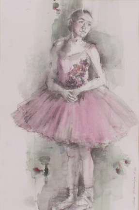
Uniqke   watercolor and pencil   20.5 x 13.5
Each and every session of life-drawing and painting involving the young dancers as models has been a one-of-a-kind experience.  The relationship between artist and model is an intimate one, even  during the 2-3 hours that we spend together.  Each dancer's personality is revealed in subtle ways, along with her individual talents.

This young dancer oozed grace from every pore in her being.  She had a sunshine personality and a quiet stance.  She took the most simple of poses and turned it into an extreme experience for me.  I believe that this simple watercolor and pencil drawing echoed her personality.  No drama.  No excess.  Simply beautiful.

It was a rewarding experience for me.

ONE-OF-A-KIND.

Tuesday, February 4, 2020

Suddenly

Suddenly   watercolor and gouache   28 x 18
the falling sun came through the October skies, making the treeline sparkle like jewels.  This grand finale occurred just a half mile away from our home upon return from a week-long road trip to St. Louis.  I am just grateful that I was paying attention!

I am convinced that looking up and looking down should be added to our visual repertoires....looking straight ahead can be limiting.

There is no way to replicate the sparkling jewel tones I witnessed that day, at least for me.   But I tried, once again finding a perfect use for the handmade florescent watercolors made at Case for Making in San Francisco!

What a rush!

Tuesday, January 21, 2020

Grace is Her Middle Name

Grace is Her Middle Name   Artgraf used as watercolor   13 x 10.5
Each Tuesday evening at Cuyahoga Valley Art Center we artists are treated to a live model session by the young dancers at Ballet Excel Ohio.  I use these sessions to play with my materials and to experiment.  On this particular evening, I used the ArtGraf Tailor Shape  by Viarco which are blocks of pressed pigment that can be used for drawing or painting, when a brush dipped in water is applied.  They are thick.  They are chunky.  They are opaque. And they are strong.  Hence, a chunkier work of art can be expected.  This work was done on 140# Fabriano Artistico hot press watercolor paper.

As the light on the model washed out subtler nuances of value, I chose to go with a simple 3-value work, with the white of the paper in a dominant role.....I honestly had a difficult time pushing the pigment around.  But I am satisfied, as this experiment resulted in a stronger work....stronger, albeit, than I am used to.

I admire these young dancers and look forward to their production of "Snow Queen" in March.

Tuesday, January 7, 2020

Personhood


She Dreams of Flight   oil/canvas   30 x 20 x 1.5 

She Dreams of Flight oil/canvas 30 x 20 x 1.5 This painting was accomplished with a photo reference, one of many I shot a few years ago at the University Circle parade in Cleveland, Ohio. The parade is unparalleled...a spectacle of joy! This little girl wore a pair of dollar store wings....Actually, a few years ago, I purchased a pair myself, as their magic awoke the aspiring little girl in me. Because I had only a rear view, I was able to paint an idea, without conforming to the notion of likeness. I saw the universal in her, the desires of each person to fly, to become, to attain, irregardless of cultural restrictions. I became that little girl. I wish her only happiness and joy.

Tuesday, December 10, 2019

Scary

Sisters in Spirit   watercolor   21.5 x 13
means so many things to so many people.  In fact, I think that our notion of what is scary is being constantly pushed to the extreme these days. 

In this painting, I chose to depict two seemingly innocent young girls in sweet patterned dresses, each wearing Halloween heads.  That, in and of itself, is a bit disturbing.  Things are not as they "should be".  I decided to push the envelope by scewing their bodies slightly off the vertical.  Diagonal placement leaves the viewer a bit disoriented....will they tip over?  will they rock towards the vertical.  In addition, the figures and the background were merged in a sameness that, in my opinion, adds a bit of other-worldliness to the presentation.

I am pleased with this work.  It is not only what we have to say, but how we say it, that makes for a more creative viewpoint.

Tuesday, November 19, 2019

Ballerinas Also Rest

Sequined Skirt   conte crayon/pastel   20.5 x 12
I always look forward to Tuesday evenings when Ballet Excel Ohio teams up with Cuyahoga Valley Art Center to provide young dancers with live models for the evening.  Typically the session begins with a series of 1-5 minute poses, wherein we are more likely to be treated to particular dance movements, where the body itself, as well as the negative space surrounding the body, becomes the subject.  The major shapes in the work are complex, broken up and imply the energy of the dance.  Subsequently, the model is posed in a more static restful position which she will hold, with small breaks, until the end of the session.  This is when observational skills are piqued and extended.  The major shapes are more self-enclosed, less dynamic.  This quietude leads to a completely different kind of work...one that is more of an exchange between model and artist, one that offers an emotional countenance.  These things, then, become the subject of the work.  Two completely different kinds of work.

In looking back over the past works, I see that most of my work has been a welcome exchange between the seated model and myself...a quieter, more serious kind of contemplation.

I think that when our sessions begin again in January, I will try to make more creative and dynamic works from the gesture poses.....a bit daunting....but very exciting....I love giving myself new challenges.

Tuesday, November 12, 2019

Pump up the Color!

Mexican Sunflowers   watercolor   13 x 10
Some would deem watercolor to be the perfect medium for floral work.  I agree that that can be true.  However, my tastes run to the richer, the meatier, the weightier.....too much lightness, for me, can not be taken seriously.  These particular flowers are Mexican sunflowers.  The seeds were sewn indoors, then later transplanted to the garden.  Late summer.....these blooms create a trellis-like entangling, about 6 feet in height.  The hummingbirds love them.  We love them.  The color is spectacular.....the most fluorescent hue imaginable!

Fluorescent?  Lucky me.  Last birthday I received some watercolor pans from Case for Making, a San Francisco-based storefront that carries handmade pigments.  The ones used here (as well as several other autumn projects):  fluorescent orange light and fluorescent flame red. 

In the working of this painting, the entangling of the blooms got to be too much, just too tedious.  That is when I used a blue-tinted gouache to separate the top.  This break almost reads as sky,  and the design benefits greatly. 

Color me fluorescently happy.

Saturday, November 2, 2019

A Glimpse

Doe, A Dear
This work began as reference photo shot deep within the woods.  The animal was barely visible, his own self-protective camouflage coloring working as it should.  The background was, of course, filled with texture....leaves, leaves, branches and leaves.  What I have done here is, in my own opinion, to create a better painting than what was provided by my reference.  I know what I like....and any attempt to alter it has been discarded, repainted, and, perhaps, discarded again.  I have absolutely no interest in painting hyper-realism.  (I am probably unable to do it anyways). 

In looking at the work, and trying to understand a few of the major decisions that made this work personal, I found:

- The value of the deep woods in the background was maintained, while eliminating the texture. 

- Some shapes were simplified and made two-dimensional, to further simplify

- the largest major shape (deer torso) has been broken into, primarily because I wanted more interest     in the face and head

- and, as always, values were slightly pushed to a blackish-violet in some areas to further rhythmic        viewing and focal point description

These decisions were made intuitively....it is only when finished, that I try to understand why things happened as they did.

Although my final work reveals more than just a glimpse, I am happier.

Thursday, October 17, 2019

One Day

One Day   oil/canvas   30 x 30 x 1.5
Late Summer.  A trip to our "way back" to dump garden detritus. A glance over to our out building that currently houses our wood supply for winter.  The light was spectacular!  ...it was the kind of situation that I often search for in vain.  This time it was, quite simply, happenstance. 

I have painted day lilies before.  They don't work that well singularly, but are dynamic as a group.  And, yes, each blossom blooms for only one day. 

While there were areas that offered up problems to be solved, the work was mostly simple in resolution.  My own cemented sense of design required a dark on the left edge....my preference always being to solve with value shifts.  And, yet, a heavy dark shape would have destroyed the feeling of lightness that day.  So my resolution, while a bit ambiguous, is satisfactory.  It definitely recalls the feeling that I had....that day....that hour...that moment.

Thursday, October 10, 2019

Coneflowers

Coneflowers   12 x 4 x 1.5
was intended as small between-the-lines painting...nothing serious, small in size....just an exercise.  Flowers are the perfect vehicle for such a work.  Without the seriousness of a larger or more contemplative work, I feel free to explore and try out new techniques.

In this case, this very small canvas was toned with what I would call "navy blue", a neutralized dark blue that was probably mixed with French ultramarine and burnt sienna.  The background leaves and pods are closer in value to the toned ground so they fade to the background.  The pink leaves were intentionally scraped and pulled back to allow that blue toned ground to become a major player. 

I am pleased. 

Thursday, September 26, 2019

Simplicity

Bread, Wine and Turnips   oil/canvas   15 x 12 x .5
is a quality that I strive for in my work.  Actually, I think that it took me quite a long time to realize it.  Backgrounds were painted in....then painted over.  Chair legs were carefully painted in and then painted over and substituted with horizontal strokes that simply suggested a place for the model to sit.  And, now, so we have it.  So I have it...another requisite that makes my art my own. 

I have a belief that the power of the work is somehow divided between all of the objects in the plane....so, it follows, for me, that the fewer the things, the more power that each one holds.  Big and little things arranged pleasingly on the page.

The reference for this simple still life came from a series of photos taken on my patio many years back....it was a veritable feast, a banquet.  The long horizontal painting was sold, but I have so many reference photos that I can now produce several smaller works from the original, and quite painstakingly arranged, feast.  This work pleases me as it has the feel that I was going for...a few simple ingredients can make a painting that I enjoy.......and, also, I think that a few simple ingredients can produce an exquisite meal.  We live in complex times.  I crave simplicity for balance.

Thursday, September 12, 2019

Rorschach

Rorschach   oil/canvas   24 x 30 x 1.5
This pair of young dancers were quite remarkable....during the warm-up poses, they assumed several premeditated poses in which their two bodies created interesting shapes and outstanding visuals.  I was truly taken with their expertise!

The most exciting part of figurative painting, to me, is the shape of the core, the limbs, and, subsequently, the diminishing of the facial features to create intriguing lines....an overall visual that is greater than the sum of the parts....gestalt!!!

This was an exciting painting to work on...I feel that it mirrors that which their young bodies were trained to do.  Thank you.

Wednesday, August 28, 2019

Sequins are just Gravy

INTENSITY.  I can easily recognize it.  I live it. ...and, to me, it is easily recognized in a few other individuals.  A tension in the body.  A perking up of the senses.  A refusal to take things lightly. Fire in the belly....not in each and every undertaking, but in the discipline that fuels a person's soul.

This young dancer was the epitome of intensity...of discipline.

While the sequins on her costume were fun to paint....small specks of retained white paper amidst the color to imply the multidimensional reflection of the light...sequins are just gravy here.

She could, in my opinion, be just as distinctive in a simple leotard.  INTENSITY.
Sequins Optional   watercolor   20 x 12

Monday, August 5, 2019

Wendy

Wendy   charcoal and pastel on paper   14.5 x 11
is one of the younger dancers in the troupe.  And yet, her whole being embodies extraordinary discipline.   I thorough enjoyed making this drawing!

Tuesday, July 23, 2019

Budded

Budded   watercolor   18.5 x 7
Our challenge was to paint a tree in its early spring budded state....not an easy task, given the small white blooms....in watercolor!  As I do not use opaque white in any form, or masking fluid, my challenge was to use brushwork to move around the work, avoiding the buds, thereby using the white of the paper for the blooms.  The tree I selected was one that I photographed while in the drive-through line at McDonald's.  The moody spring sky behind added to the immensity of the day...as well as to the immensity of the challenge.  The buds at the horizon line are mostly pure white.  Those at the top were toned to blend in with the sky.

Final word:  this is the best I could do with a difficult challenge....This small painting makes me happy.

Sunday, July 14, 2019

Clownfish

Clownfish   mixed/paper   19.5 x 12
are important roles to dance in "The Little Mermaid".  And these dancers were so impressive....quite a pair.  They were both dedicated, focused and graceful to the max.  No Alphas.  Two halves::one whole. And....just as a school of fish moves instantly together, sensing the minute neuromuscular movements of the others, these two young dancers were oh-so-in-sync.  Each pose, not only portrayed each dancer to advantage, but also formed an interesting together shape.  They moved without speaking a word.

THESE DANCERS WERE AMAZING!


And...as for the highly developed sensitivity to the movements of the other....

I sometimes think that the world would be so much more pleasant if we all learned this sensitivity...we all learned to dance.

And....just maybe...we would be better drivers.

Sunday, July 7, 2019

M as Shark - The Little Mermaid

M as Shark   mixed/paper   20 x 13
Konstantin Stanislavski remarked that "there are no small parts, only small actors."  Some of the young ballet dancers that we have painted have the "chorus" roles, the smaller parts.  I suspect that these roles go to the younger, less experienced dancers.  M. stood before us in her shark costume...the dearest shark I have ever seen.  While this hat and these fin attachments are clever as can be, my goal was to give to M. the innocence and humility that enveloped her.  No grand gestures here.  Her stance was natural.  No affectation.  Hooray for sharks!

Dabbs Greer, a bit actor, once said, "Every character actor, in their own little sphere, is the lead".


Friday, June 28, 2019

Easy Livin'

Easy Livin'   conte crayon on toned pastel paper   15.5 x 11.5
is a drawing that I like...completed at an expressive drawing workshop.  The reference was an old family photo that features two couples in swimsuits at a favorite lake.  Toned paper was used...quite handy as used as a mid-tone value.  Individual characteristics are downplayed, while the group gesture becomes all-important...the way in which the four figures relate to each other to support their relationships.  Negative spaces become important.  Patterns of darks were worked in a balanced way, creating a satisfactory pattern of its own, independent of the details of the reality provided.  Likewise with the whites.  This drawing was worked by using basically only three values. While likenesses and leg details were mostly suggested, I placed the emphasis on the relationships of the torsos...not the torsos themselves, but on the relationships between them.

I like this drawing very much.  It was fun to do and provides the feeling that I wished to convey in a minimal way.  Less is more

Thursday, June 13, 2019

Bunch

Bunch   watercolor   16.75 x 9.5
I believe that flowers are possibly the most difficult subject for me to paint...so complex...so many relationships!  For that reason, I prefer to paint them in a bunch, along with their wild natures, as opposed to the restraints of a vase or mise-en scene setting that further dilutes their energy.

This bunch was plucked from our yard.  I am basically happy with the work, but, in retrospect, wish that I had included some other varieties. 

There is always next spring.

Wednesday, June 5, 2019

Ants-in-Your-Pants-Goals

S.
I am, without a doubt, a goal-oriented person.  I am a list-maker who derives great pleasure from being organized.  The end of each studio session is dedicated to actually naming the goals for the next, unless more time is needed for contemplation of a given work. 

That being said, travelling presents a problem for a person like me.  It is simply not possible to drag along armloads of art supplies.  And so I have devised a solution that keeps me content at the same time I am able to visit without too much offense.  The latest venture was a visit for a week in North Carolina.  Three very small watercolors were made on a deck providing afternoon sun.  But my favorite activity is to make small drawings from life while the family is gathered around, in discussion, or in front of TV.  Nothing posed.  Just several drawings begun at once and keeping an eye out for the model to resume a particular pose.  This trip I ended up with two small drawings that pleased me.  This one took a couple of hours, but I was content to pick away. Kept my attention up.  Feels good to produce something worthwhile. 

And.....keeps the ants out of my pants...temporarily.

Saturday, May 18, 2019

Establishing a Rhythm


Majorette   oil/canvas   24 x 8 x .5
When I was a young girl, a little girl, I was in awe of Jan, a teenage girl who lived across the street in our little neighborhood of post-war brick cape cod homes in Akron, Ohio.  Jan was a twirler, a majorette, who practiced in her yard....her baton catching the light as it spun around, sometimes high into the sky.  She caught it deftly and continued her routine.  On game days, she emerged from her home in total regalia.  My memory of her costume has faded, but those heavy white leather boots with giant tassels are embedded in my mind. 

My own experience with baton twirling was short-lived.  I guess I just didn't "have it".  It may have been limited coordination, or, perhaps, interest.

This work of a drum majorette was inspired by a vintage photo of my husband's aunt....probably taken in the late 40's. 

Figurative work is my favorite.  For me, it has evolved into a sublimation of the facial features along with the placement of several focal points, established by choice, to lead the eye around the entire figure and its posture.  The regimentation of the twirler is reflected in her posed stance.  Discipline.

And the....there are those boots.

Some time ago, another astute artist picked up on my method at a local critique.  He was quick to point out the use of the multiple focal points.  We seem to love and to need a focal area in the work....why not several?  They actually create their own rhythm.

Thursday, May 9, 2019

Intensity

Intensity- L.   oil/canvas   16 x 12 x .5
is a quality that I share with L., a painter who has been in several of my classes over the years.  He holds a full time job and has a wife and two children.  His plate is full.  And, yet, his drive to create art is admirable, and sometimes painful, as he struggles to find TIME TIME TIME.

This painting was made at a final class session where the assignment was to create a painting by simply watching and observing  someone else at work....an artist who is in constant motion while observing the subject of his/her own painting.

This assignment is tough, but allows one to get at the "nitty gritty"...the important stuff...big shapes and simplified forms.  I did take a photo and did a few minor corrections at home, but was careful not to overwork the simplicity that had been achieved during the session.

I have found, over years of observing and drawing people at work, that a person will resume one of two or three positions continually, which helps with clarification, if only you are patient.

Ah, yes.......INTENSITY and PATIENCE.

Saturday, April 27, 2019

Blue to Yellow....a subtle change

When Sheep are Golden   oil/canvas   16 x 20 x 1.5
Come February, the light changes, creating a noticeable shift from cool to warm outdoor palettes.  This simple painting almost painted itself....very very rare.  I started with the same notion of a changing color temperature and a drawing.

The biggest challenge for me was to create the chaotic texture of that marvelous wool.....as a knitter of many years, I wanted to honor the glory of the sheep's contribution to our well being.  A bit of time was spent on hard and soft edges.  The background was kept simple.

I can honestly say that I truly love this work.

What's not to love when talking sheep?