
Tuesday, December 1, 2020
Mogadore Reservoir


Thursday, November 19, 2020
My Porch

Monday, November 9, 2020
Essential Lotto

Saturday, November 7, 2020
The Yellow Sofa
 |
| The Yellow Sofa ArtGraf graphite block 36 x 29 |
Tuesday, October 13, 2020
A Hole in Rodanthe
 |
| A Hole in Rodanthe watercolor 29 x 20 |
The ocean had offered up twigs, branches, and many many conch shells, each showing the wear of the tides. It was impossible not to feel amazingly primitive...so opposed to the sequestered lives we live daily.
In this work, my challenge was to merge the figure with the seaside. While working, I was able to relive the experience.
I am satisfied.
Thursday, October 1, 2020
Gal from Maine
 |
| Gal from Maine watercolor/cold wax/wood cradle 11 x 14 x .75 |
When our son's family comes to visit, they bring along their two delightful Maine Coon cats. These felines are gentle giants...fluffy, snuggly and easy to get along with. One of their endearing quirks is that they love to drink from bathroom sink faucets and cozy up in the bathroom sinks....lucky for us that we have two side-by-side sinks to accommodate them!
The greatest challenge in rendering animals is to get the feel of the fur without getting too detailed, as detail takes away from the coat as a whole. These cats have a tortoise appearance, with many layers of color rolled into one. I began with some warm washes and tried to sublimate the fur to the form of the animal. Cooler and neutral layers were placed on top. Initially, I started to put in the actual spigot and handles, but that was much too much detail for my liking. They disappeared into the dark background.
I like the feel of this work. I also like the placement of the whites, which were toned down a bit at the end.
Most of all, I love these cats!
Monday, September 14, 2020
Jeanne's Peaches Plus One
 |
| Jeanne's Peaches Plus One watercolor/cold wax/wood 14 x 11 x .75 Wow...this new blogger is a bit tough to figure out and, quite frankly, I just hate the time that it takes to figure it out! The challenge with this work was to paint something in a jar....this situation causes the subject to receive light in a more diffused way...shapes merge and separate with less distinction. It is a terrific lesson in painting what you see, rather than what you know to be true. In this case, I chose a GIANT jar of peaches given to us last Christmas. Because it is so very lovely, I cannot bear the thought of actually using it! And....this work was fixed with cold wax and fixed permanently to a wood cradle...an exciting frameless option for watercolor paintings. |
Monday, September 7, 2020
Farming
 |
| Farming watercolor 19 x 11 |
My goal in painting this work was to focus on a foreground of semi-nothingness, a quilt work patterning where values and color tonalities have minimal variation. And, I realize that this challenge may have been far more easily accomplished in oil than watercolor. For the reference photo, I pulled off of a major highway and hiked to the edge of a local farm. The terrain was horribly uneven and difficult to maneuver. I chose a spot leading up to the farm that best seemed to illustrate my goal. The sky was minimalized. The buildings were done in just a few strokes. Most of the work was, of course, in the foreground, where I attempted to achieve chaos and uncertainty. I am satisfied with this attempt, although I found myself yearning for more opacity, as transparent watercolor has a limited range of workability.
All in all, I feel that this work totally exemplifies the difficulties of farming.
Tuesday, September 1, 2020
Steeple
 |
| Steeple watercolor 20 x 12 |
Originally, the background colors were very bright, leaning the work more toward the typical watercolor painting. I could not resist the urge to pair the transparent with the opaque, so a wash of Chinese White was applied to the background, quieting the sky and moving the structure to the forefront. I am not quite sure I am happy with this decision, but the sky area is now more akin with what we experience here in northeast Ohio. I definitely have an allergy to happy happy skies.
Over the years, I have also some to dislike, in my own work, the more primary application of paint to replicate shingles and bricks. So, in this case, the end of an eraser was dipped into a giant puddle of paint, creating a more secondary, chaotic and imperfect application.
I am pleased with this more interpretive consideration of the subject.
Wednesday, August 19, 2020
Garden Phlox
 |
| Garden Phlox watercolor 10 x 10 |
But I also believe that there must be a why...the reason why this particular bloom, among so very many, was selected as a subject. For me, this painting was color-driven. As I pass by it beside our porch, I am momentarily stunned by its color, the mysterious product of nature. The overall atmosphere is so much more important to me than perfect leaves, perfect blossoms, perfect stems.
The greatest challenge in this one was the middle circle, the missing area that contains information on a plane that is further back than the outer rim of blossoms. The background wash was extended into this inner circle and the information only suggested. And, of course, I added my signature brown to neutralize the sweetness of the so much pure color. I also like the stem which has been skewed from the vertical.
I am pleased.
Saturday, August 15, 2020
Fruits of the Summer...I just couldn't stop!
 |
| Cherries watercolor/cold wax on wood cradle 8 x 8 x .75 |
 |
| Plums watercolor/cold wax on wood cradle 8 x 8 x .75 |
 |
| Watermelon watercolor/cold wax on wood cradle 8 x 10 x 1.5 |
 |
| Grapes watercikir/cold wax on wood cradle 98 x 8 x .75 |
Thursday, August 6, 2020
Fruits of the Summer and Parlor Tricks
These small fruit paintings were adhered to wood cradles with acrylic matte medium and glazed on top with cold wax. The resultant effects were quite exciting to me, as a painter who always matted and framed watercolors. (increasing their size substantially) I worked in brighter colors and simpler shapes. The results are richer, more compact. I feel that they pack more of a punch, being similar to small oil paintings which I usually work on a gallery wrap canvas. Very exciting.
Do watercolors always have to be matted and framed? I think not. And I am anxious to try some larger works using this method.
 |
| Granny Smith and Lime watercolor/cold wax on wood cradle 8 x 8 x .75 |
 |
| Lemon watercolor/cold wax on wood cradle 8 x 8 x .75 |
 |
| Grapefruit watercolor/cold wax on wood cradle 8 x 8 x .75 |
Friday, July 31, 2020
Waiting For a Friend
 |
The first....a black-lit situation. These have always made me uncomfortable, as I am a value painter who relishes the shifts of light over the terrain of the human face. With the light coming from behind, the value play, while atmospheric, is so limited. In these cases, it seems to me, the silhouette, the profile becomes more important...harder edges result. So....this case allowed for some practice in this situation. I find it less interesting, but still enjoyable.
The second....waiting. I have heard it said that real life is what happens when one is waiting for something more exciting to come along. This young woman, intent on her phone, was seemingly waiting for cues from "the somewhere else" to amuse and entertain her. Being a person who immensely enjoys the free play of my own mind, I find this alternative both alien and unsatisfactory. Being alone provides me with so much pleasure! People with cell phones are never alone...how sad?
Monday, July 27, 2020
Too Complicated

This is one of my favorites: an 87 year old woman in the waiting room of a knee surgeon who kept saying to her companion (over and over again): ..."and that's another example of how things are too complicated these days".
The year: 2012.
She had no idea.
Thursday, July 16, 2020
Bowl of Cherries
 |
| Bowl of Cherries watercolor 10 x 14 |
The set up was lit. The subject drawn and mostly understood. All of the qualities that I most value seemed to come together. The background was originally a watery beautifully-painted blue. But as I am also an oil painter, and because I highly value the richness of dark values, another wash was added....and I was happy as a clam. Imperfect edges. Lost and found qualities. The subtle description of the woven cloth. Drippy paint.
I was happy to be home.
Tuesday, July 7, 2020
Hopeful
 |
| Hopeful watercolor/pencil 16 x 10.5 |
Monday, June 29, 2020
Sliding Back Into Watercolors
 |
| Red Bud watercolor 13.5 x 10 |
After years and years of painting both from life, and from reference photos out of necessity, I have found that I much prefer the imperfect boldness that occurs when I paint from life.
I am still trying to define what, for me, makes a good painting. It is always so elusive.
I am ready to move one.
Wednesday, June 10, 2020
Boys and Creeks
 |
| Boys and Creeks oil/canvas 30 x 20 c 1.5 |
During the virus, our family has kept in touch more than ever as we share photos from across the country. Seeing these daily activities, as well as coping activities, has provided us with such pleasure. From the seaside beaches of California to the shallows of Ohio's rivers and streams, we are united in the passion of exploration.
This painting was referenced from such a photo. I am in awe of their resilience and their spirit.
Sunday, May 31, 2020
Orange E
 |
| Orange E charcoal/watercolor 13.5 x 11 |
In terms of photo references, I will admit that the lighting was not perfect, as the photo was taken during a Facetime chat...an amazing process, that I could never have dreamed to be possible. We take what we can get these days. Of course, for a dramatic rendering, where shadows and lights create a more interesting patterning on the face, a studio set-up with lighting and a more considered picture-taking process would have possible.
I believe that, in this case, the softer presentation of everyday lighting worked out well.
And....btw....those baby-teeth-hangers-on have now been replaced with some emerging larger pearly-whites. I love this age. Enthusiasm. A lightness of spirit. Hope.
Tuesday, May 19, 2020
Harbinger
 |
| Harbinger waterclor 6 x 9 |
This was an additional challenge for me, as I am more comfortable with large brushes than small, large formats than small. And...retaining the "whites" is always the greatest challenge!
I am pleased.
Thursday, May 14, 2020
Switching Gears
 |
| Fistful watercolor 6 x 9 |
Enter Spring.....I decided to do just a couple of small ditties to whet my watercolor appetite and to rid myself of the fear of the white paper. No formal set-ups....just a fistful of blooms from our yard. I was so happy to be painting this work and opposed the transparent pigments of the blooms with a more opaque handling of the background....just chalky like I like it. Fistful.
Friday, May 8, 2020
The Paper at the Back of the Closet
 |
| Kick mixed/paper 27.5 x 18 |
And so, given our current circumstances, I decided to give it a try. What was meant to be a tender charcoal drawing morphed into the unintended...strong, aggressive. No pigment could be moved around. The blending stump was useless. Watercolor stayed put and immediately sunk in. No ability to wipe off splatters.
I must say that in the past, I have been quite excited and stimulated by the feel of a new ground as it allows for a bit of chaos, providing a novel experience. In fact, I have prided myself on this flexibility. But here I reached my limit. The struggle was almost unbearable.
Nevertheless, I took the work to finish. While I am pleased with the result, I am not anticipating using it again.
Lesson to be learned: label all papers when you can. I believe that it was unsized.
Friday, May 1, 2020
Flight of Fancy
 |
| Ascension oil/canvas 24 x 48 x 1.5 |
Actually, my brain takes MANY flights of fancy each day. I am not sure if this happens to anyone else, or to everyone. But I can say for certain, that these little mind travels are imperative to my emotional well being. It is only when my mind is otherwise occupied with sociability and tasks that life becomes, well, dull and static.
And, as sychronicity would have it, I am currently reading my first ever surrealistic work, Nadja by Andre Breton. He questions whether or not we are defined by the lives we lead on a daily basis OR by the surprises, the flights of fancy, that we take.
And, so it is that this work is a bit of, I believe, surrealism on my part. My flight of fancy.
Wednesday, April 22, 2020
Koi
 |
| Koi oil/wood panel 18 x 24 x 1.5 |
Resolution of this work came very very slowly...partly because I worked on a gessoed wood panel, which is not my norm. This surface responds completely differently to stroke-making, causing a bit of tension on my part. And, I suppose, partially because there is a bit of a story here. Most of my figures are "lost in space", allowing me to meander between the figure and the ground, eliminating much along the way. But here, in this instance, when telling a story, the pieces must in more in tact. I am satisfied.
Wednesday, April 15, 2020
Kids
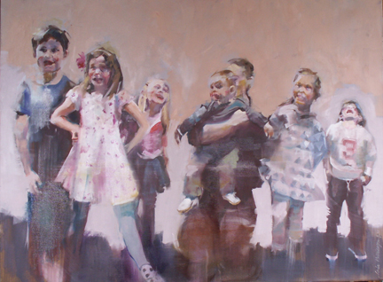 |
| Kids oil/canvas 30 x 40 x 1.5 |
My goals were threefold: to let the individual personalities express themselves; to sublimate the "likenesses" so that the group gesture would shine through; and to emphasize the counter-spaces between the figures to enhance the interconnectedness of the positives and negatives.
I am supremely happy with the outcome....makes me wish I were a kid again!
Monday, April 6, 2020
Bouquet Without Stems
 |
| Bouquet Without Stems oil/canvas 12 x 12 x 1.5 |
No stems.
Tuesday, March 31, 2020
This Little Piggy
 |
| This Little Piggy oil/canvas 12 x 16 x .5 |
Tuesday, March 17, 2020
Rachel
 |
| Rachel oil/canvas 16 x 12 x .5 |
I have taken a liking to toning my canvas well ahead of time in a color that complements and supplements the overall palette. My toned canvas was a turquoise-y blue. This cool tone was selected in order to counter the warmer flesh tones which would lie on top. This blue can be seen on the hat, on the face, in the hair and on the shoulder areas. For me, it adds a bit of excitement, a bit of chaos, to what might become a too-tightly-rendered portrait. It seems that we all have a more difficult time with "looseness" in a portrait situation, especially when likeness is a goal.
I hope that Rachel is pleased.....because I am!
Tuesday, March 3, 2020
Les Pieds
 |
| Les Pieds pastel/mixed 28 x 21 |
At home, I worked on these three drawings to attempt to create a unified whole...washes of water were added to create softer edges where needed. Then, using a combination of linoleum blocks, one uncut and one a pre-cut design, to print on top using relief ink. I used cut pieces of tracing paper on top of the shapes I wished to retain in order to block the printing. The final pass was spent in trying to merge both the drawing and the printing processes...searching for a bit of balance.
By enunciating the feet and diminishing the facial features, the attention was shifted to the feet. (hopefully). I am satisfied. In fact, I am pleased.
Tuesday, February 18, 2020
Uniqke
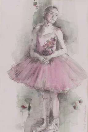 |
| Uniqke watercolor and pencil 20.5 x 13.5 |
This young dancer oozed grace from every pore in her being. She had a sunshine personality and a quiet stance. She took the most simple of poses and turned it into an extreme experience for me. I believe that this simple watercolor and pencil drawing echoed her personality. No drama. No excess. Simply beautiful.
It was a rewarding experience for me.
ONE-OF-A-KIND.
Tuesday, February 4, 2020
Suddenly
 |
| Suddenly watercolor and gouache 28 x 18 |
I am convinced that looking up and looking down should be added to our visual repertoires....looking straight ahead can be limiting.
There is no way to replicate the sparkling jewel tones I witnessed that day, at least for me. But I tried, once again finding a perfect use for the handmade florescent watercolors made at Case for Making in San Francisco!
What a rush!
Tuesday, January 21, 2020
Grace is Her Middle Name
 |
| Grace is Her Middle Name Artgraf used as watercolor 13 x 10.5 |
As the light on the model washed out subtler nuances of value, I chose to go with a simple 3-value work, with the white of the paper in a dominant role.....I honestly had a difficult time pushing the pigment around. But I am satisfied, as this experiment resulted in a stronger work....stronger, albeit, than I am used to.
I admire these young dancers and look forward to their production of "Snow Queen" in March.
Tuesday, January 7, 2020
Personhood
 |
She Dreams of Flight oil/canvas 30 x 20 x 1.5 |
She Dreams of Flight oil/canvas 30 x 20 x 1.5 This painting was accomplished with a photo reference, one of many I shot a few years ago at the University Circle parade in Cleveland, Ohio. The parade is unparalleled...a spectacle of joy! This little girl wore a pair of dollar store wings....Actually, a few years ago, I purchased a pair myself, as their magic awoke the aspiring little girl in me. Because I had only a rear view, I was able to paint an idea, without conforming to the notion of likeness. I saw the universal in her, the desires of each person to fly, to become, to attain, irregardless of cultural restrictions. I became that little girl. I wish her only happiness and joy.
Tuesday, December 10, 2019
Scary
 |
| Sisters in Spirit watercolor 21.5 x 13 |
In this painting, I chose to depict two seemingly innocent young girls in sweet patterned dresses, each wearing Halloween heads. That, in and of itself, is a bit disturbing. Things are not as they "should be". I decided to push the envelope by scewing their bodies slightly off the vertical. Diagonal placement leaves the viewer a bit disoriented....will they tip over? will they rock towards the vertical. In addition, the figures and the background were merged in a sameness that, in my opinion, adds a bit of other-worldliness to the presentation.
I am pleased with this work. It is not only what we have to say, but how we say it, that makes for a more creative viewpoint.
Tuesday, November 19, 2019
Ballerinas Also Rest
 |
| Sequined Skirt conte crayon/pastel 20.5 x 12 |
In looking back over the past works, I see that most of my work has been a welcome exchange between the seated model and myself...a quieter, more serious kind of contemplation.
I think that when our sessions begin again in January, I will try to make more creative and dynamic works from the gesture poses.....a bit daunting....but very exciting....I love giving myself new challenges.
Tuesday, November 12, 2019
Pump up the Color!
 |
| Mexican Sunflowers watercolor 13 x 10 |
Fluorescent? Lucky me. Last birthday I received some watercolor pans from Case for Making, a San Francisco-based storefront that carries handmade pigments. The ones used here (as well as several other autumn projects): fluorescent orange light and fluorescent flame red.
In the working of this painting, the entangling of the blooms got to be too much, just too tedious. That is when I used a blue-tinted gouache to separate the top. This break almost reads as sky, and the design benefits greatly.
Color me fluorescently happy.
Saturday, November 2, 2019
A Glimpse
 |
| Doe, A Dear |
In looking at the work, and trying to understand a few of the major decisions that made this work personal, I found:
- The value of the deep woods in the background was maintained, while eliminating the texture.
- Some shapes were simplified and made two-dimensional, to further simplify
- the largest major shape (deer torso) has been broken into, primarily because I wanted more interest in the face and head
- and, as always, values were slightly pushed to a blackish-violet in some areas to further rhythmic viewing and focal point description
These decisions were made intuitively....it is only when finished, that I try to understand why things happened as they did.
Although my final work reveals more than just a glimpse, I am happier.
Thursday, October 17, 2019
One Day
 |
| One Day oil/canvas 30 x 30 x 1.5 |
I have painted day lilies before. They don't work that well singularly, but are dynamic as a group. And, yes, each blossom blooms for only one day.
While there were areas that offered up problems to be solved, the work was mostly simple in resolution. My own cemented sense of design required a dark on the left edge....my preference always being to solve with value shifts. And, yet, a heavy dark shape would have destroyed the feeling of lightness that day. So my resolution, while a bit ambiguous, is satisfactory. It definitely recalls the feeling that I had....that day....that hour...that moment.
Thursday, October 10, 2019
Coneflowers
 |
| Coneflowers 12 x 4 x 1.5 |
In this case, this very small canvas was toned with what I would call "navy blue", a neutralized dark blue that was probably mixed with French ultramarine and burnt sienna. The background leaves and pods are closer in value to the toned ground so they fade to the background. The pink leaves were intentionally scraped and pulled back to allow that blue toned ground to become a major player.
I am pleased.
Thursday, September 26, 2019
Simplicity
 |
| Bread, Wine and Turnips oil/canvas 15 x 12 x .5 |
I have a belief that the power of the work is somehow divided between all of the objects in the plane....so, it follows, for me, that the fewer the things, the more power that each one holds. Big and little things arranged pleasingly on the page.
The reference for this simple still life came from a series of photos taken on my patio many years back....it was a veritable feast, a banquet. The long horizontal painting was sold, but I have so many reference photos that I can now produce several smaller works from the original, and quite painstakingly arranged, feast. This work pleases me as it has the feel that I was going for...a few simple ingredients can make a painting that I enjoy.......and, also, I think that a few simple ingredients can produce an exquisite meal. We live in complex times. I crave simplicity for balance.
Thursday, September 12, 2019
Rorschach
 |
| Rorschach oil/canvas 24 x 30 x 1.5 |
The most exciting part of figurative painting, to me, is the shape of the core, the limbs, and, subsequently, the diminishing of the facial features to create intriguing lines....an overall visual that is greater than the sum of the parts....gestalt!!!
This was an exciting painting to work on...I feel that it mirrors that which their young bodies were trained to do. Thank you.
Wednesday, August 28, 2019
Sequins are just Gravy
This young dancer was the epitome of intensity...of discipline.
While the sequins on her costume were fun to paint....small specks of retained white paper amidst the color to imply the multidimensional reflection of the light...sequins are just gravy here.
She could, in my opinion, be just as distinctive in a simple leotard. INTENSITY.
 |
| Sequins Optional watercolor 20 x 12 |
Monday, August 5, 2019
Wendy
 |
| Wendy charcoal and pastel on paper 14.5 x 11 |
Tuesday, July 23, 2019
Budded
 |
| Budded watercolor 18.5 x 7 |
Final word: this is the best I could do with a difficult challenge....This small painting makes me happy.
Sunday, July 14, 2019
Clownfish
 |
| Clownfish mixed/paper 19.5 x 12 |
THESE DANCERS WERE AMAZING!
And...as for the highly developed sensitivity to the movements of the other....
I sometimes think that the world would be so much more pleasant if we all learned this sensitivity...we all learned to dance.
And....just maybe...we would be better drivers.
Subscribe to:
Posts (Atom)