 |
| Hyper Peppers watercolor 8 x 8.5 |
Tuesday, May 15, 2018


Monday, May 7, 2018

Thursday, April 19, 2018
John A......taking the scenic route
 |
| John A. watercolor/gouache 20 x 12 |
John posed for our watercolor class a few sessions ago. It was attacked quickly, yet lightly. Upon review, I discovered that the front arm took too much attention away from the face, so I began moving pieces and parts, blocks of color around. As you can see, I am no slave to reality, and quite enjoy shifting focus and values to further my goal. Background areas were painted, then washed off in my laundry tub to soften and blend. (Note: washed off, letting only water hit the surface....not scrubbed off) Eventually, I brushed and squeezed on a blue gouache mix left over from another project. My heart went pitter pat. I realized that I had come as close as possible to the version that pleased me. Granted, I never start out to take the long way around to anything(the scenic route), but meandering can be beautiful as well as teaching us a few things along the way.
I am pleased.
Wednesday, April 11, 2018
Pink Tulips
 |
| Pink Tulips watercolor on Khadi 13 x 13 |
The end result is a far cry from my original idea....a bit more formal than my usual, but more becoming, I think, to the lush pink tulips. I had been wanting to try this layering of washes for years. This painting provided the opportunity to give it a try. This is a technique used by watercolor artist Catherine Anderson whose work I explored many years ago. Nothing ventured. Nothing gained.
Friday, March 30, 2018
Bunny Girl
 |
| Bunny Girl Watercolor 13 x 8 |
For me, "Bunny Girl" has a lovely effortless quality.
I yearn to retrieve the child artist within.
At times.
Monday, March 19, 2018
Me, Myself and I
 |
| Me, Myself and I watercolor 15 x 12.5 |
I am reminded of the words of Kirk Mangus who often thought about aesthetic judgment. He said, "Beauty is a figment of the imagination. It is also completely controlled by prejudices.". Soetsu Yanagi, a potter and founder of mingei, the Japanese folk craft movement, expressed similar ideas born from the philosophy of Zen writes:
A true artist is not one who chooses beauty in order to eliminate ugliness, he is not one who dwells in a world that distinguishes between the beautiful and the ugly, but rather he is one who has entered the realm where strife between the two cannot exist.
That is where I dwell...where I choose to dwell. For me, beauty lies in the process of the work itself, how we choose to spend our hours, our days.
Friday, March 9, 2018
Haystacks...and furrows
 |
| Haystacks oil on canvas 8 x 24 x .5 |
The quest in this work was the relationship between the haystacks themselves...and the furrows...a play between the cool and the warm.
While a completed snow-covered scene can be beautiful, it can tend towards sweetness and become a bit Hallmark-y. The rural Pennsylvania scenes that feature both dead grasses along with pockets and dustings of snow a la Andrew Wyeth convey great power and mystery to me. As an Ohioan, I will attest to the fact that most of the winter scenes depict these two polar opposites. One of my current reads is The Poetics of Space by Gaston Bachelard, a French philosopher. I am currently in my second go-through in order to absorb his thoughts that I have chosen to underline. He speaks of the poet's mind which is
touched by the attraction of opposites, which lends dynamism to the great archetypes.
This canvas was toned with orange, which became the base for the furrow. The process continued slowly, as I tippy-toed toward the amount of snow coverage that satisfied my visual. In the earlier stages, the diagonal furrows were more dominant....which lead them into distraction. I did not anticipate just how much energy this problem would require. I am also reminded of a similar horizontal landscape by the late Jack Richard.....it remains in my mind to this day....it was spot on.
Most of the bales we see today are machine-made and coiled. These stacks are the work of the Amish.
Friday, February 16, 2018
Weight...
 |
| Weight oil on canvas 48 x 36 x 1.5 |
My current read is Supernormal by Meg Jay. As it turns out, the most accurate predictor of those with grit, with determination and resilience, is LOVE... loving relationship(s) is what truly turns the tide...gets us over the hump. My own personal hero is LeBron James, also an Akron-ite.
This painting was 90% complete in the winter of 2016-17. It was then propped against the wall and approached again this winter. After years of trying to get portrait-perfect faces, I have been experimenting, for several years now, with subduing the faces, in order to defer to the figure, or figures, in their gestural entities, for the purpose of more accurate story-telling.
Saturday, February 3, 2018
Winter is Long in Canada
 |
| Winter is Long in Canada oil 20 x 16 x 1.5 |
Our Canadian model was apt and professional. I thoroughly enjoyed making this work "my own". I am hoping to find more time for live work this coming year.
Monday, January 29, 2018
Ode to Peppermint...
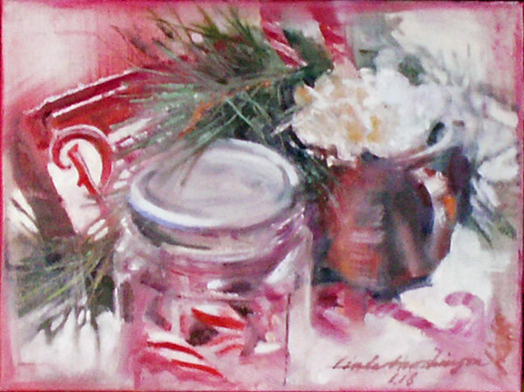 |
| Ode to Peppermint oil 9 x 12 x .5 |
Actually, the most difficult passages were the pine branches....they are, at the same time, quite delicate, yet strong, and very very complicated. Each stroke was just too strong, until I pulled out my rigger brush and thinned the paint substantially.
A final passage was required to strengthen the reds and whites, especially at the intersections of the two. I am happy, as this small scene captures what I felt during this very special season.
Tuesday, January 23, 2018
Back in the Saddle Again
 |
| Tea and Oranges oil 12 x 9 x .5 |
Enter the forgotten studio....the paint hardened on the palette....the tidied piles of creativity that lack the doing....this is scary stuff....approaching the blank canvas or paper for the first time in a while, which I liken to any activity that has gone dormant.
I find that simple still lifes are the first step I need to take to find my strokes again....simple compositions that take little thought and household items at the ready. The subjects for the still life are quite forgiving as regards draftsmanship.....who cares if the mug is a bit too wide?....the orange a bit smaller?
This simple painting is my first exercise of the New Year 2018. Happy New Year!
Tuesday, December 19, 2017
Holiday Greetings

I hope that your holiday season was majestic in some way. I also hope that we can discover the majestic in like simple subjects throughout the coming year.
This small 5 x 7 card (Strathmore cards designed for watercolor) was taped around the edges while I painted. I then removed the tape and painted the peak decorations to break the boundary for more interest.
Saturday, December 9, 2017
Ruvati sinks, Mungo Park, Ben Stiller and Naomi Watts


While traveling, I have pretty much given up hauling any paint set along, even the smaller travel sets. Instead, I try to use the small bits of otherwise-unscheduled time to sketch. These sketches can be aborted at any time. Some of the unfinished ones are among my favorites! Over the years, these sketches have become like small journals, little bites of time, where notes remind me of activities and conversations. Just before Thanksgiving of this year, we were fortunate to rent a "little house" (a charming A-frame) on the Outer Banks, for a few days of quiet and oneness with nature.
The top sketch is my loving partner engaged in reading, one of his favorite pastimes. His book is Travels in the Interior of Africa by Mungo Park, a treasure on loan from one of his friends.
The second sketch is our son while we are watching the movie "While We're Young", starring Ben Stiller and Naomi Watts, a light-hearted movie with some bits of wisdom tucked in.....aren't they all?It was a fun way to spend an evening.
The third sketch is of my husband again, keeping warm with his sweatshirt hood surrounding, laying back in the limited amount of lighting available while we discussed the unusually modern and lovely appliances that made this small rental such a pleasure. We (maybe just I ) have been considering a kitchen update sometime in the future, so we gather ideas when we can. Although the sketch is a bit unflattering, the spotty play of light made this sketch exciting to do....It conveys a great mood, I think.
When I look back at these some time in the future, I am sure I will be smiling as I recall these sweet and rare hours spent with my dear ones.
Thursday, November 30, 2017
Partial to Peaches
 |
| Partial to Peaches watercolor on Khadi 5.75 x 18 |
Saturday, November 11, 2017
Bittersweet with Pumpkins
 |
| Bittersweet with Pumpkins watercolor on Khadi 13.75 x 10 |
O.K. I like the colors.
Sunday, October 29, 2017
Varietal 2
 |
| Varietal2 oil/canvas 8 x 24 |
Tuesday, October 24, 2017
White Pumpkins and Roadside Purple
 |
| White Pumpkins and Roadside Purple oil 9 x 12 |
This is the second "quickie" painting done to regain a sense of balance within the bounds of painting exactly what is in front of me through direct observation. The light source was a studio lamp. The canvas was pre-toned in a warmish neutral. White pumpkins have always been thrilling to me. Added to that is a bunch of roadside wildflowers that carry a vibrant purple that can be seen from afar. They always pop up this time of year much to my delight.
Wednesday, October 18, 2017
Pumpkin and Nasturtium...Searching for Balance
 |
| Pumpkin and Nasturtium oil 12 x 9 |
This canvas was pre-toned with a warmish mix. Day 1 left me feeling satisfied...painting only what I see, and foregoing all that I imagine. It was healing.
Saturday, October 7, 2017
Equilibrium
 |
| Equilibrium oil 30 x 42 |
I am now realizing that I needed to declare a value dominance of the work, one that supports the mood that I am trying to achieve, in addition to the playful distribution and linkage of values.
This lesson was learned the hard way.
Thursday, September 28, 2017
En Plein Air
 |
| En Plein Air oil on canvas 24 x 12 x 1.5 |
Some paintings literally paint themselves. This was one of them. I still find myself wishing that all communities could be treated to this kind of gentle magic.
Sunday, September 10, 2017
Neighborhood
 |
| Neighborhood oil 20 x 60 x 1.5 |
This painting was inspired by reference photos shot in early spring in the Glen Echo neighborhood of Columbus, Ohio. My goal was to sublimate individual details in each of the homes while creating rhythm that weaves itself between them.
Thursday, August 31, 2017
Cherries and Scribbles
 |
| Cherries and Scribbles oil 8 x 24 x .5 |
So, I guess it would seem that this work satisfies me on so many levels....aesthetically, of course.
Monday, August 21, 2017
Lemons and Merlot
 |
| Lemons and Merlot oil 20 x 10 |
 |
| Banquet oil 20 x 60 x 1.5 |
Luckily, I still have all of those reference photos that make my set-up that summer all too real. There are many possibilities. I guess that is what I thrive on...possibilities.
Friday, August 4, 2017
Jane
 |
| Jane oil 30 x 24 |
Painting a portrait only works out well for me when I am able to feel an emotional connection to the model. For that to happen, the sitter must be open to the silent visual conversation and intimacy that must take place. For me, all of the pieces fell into place.
And her name? Jane is simple, direct and feminine. Thank you, Jane, for a wonderful experience!
Friday, July 21, 2017
White Peaches
 |
| White Peaches oil 12 x 9 x 1.5 |
In this case, I chose to give homage to white peaches that my husband brought back from a trip to North Carolina, knowing that their subtle taste is exquisite to me. I chose to pair them with a bunch of white daisies that we had plucked from the garden.
In most of my previous floral and fruit paintings, I have used a grayed down compliment for the background. Over the years, I have come to enjoy the earthiness that comes from using browns in floral works. For me, it is an antidote to the overindulgence of the sweetness inherent in the subject matter, as well as a way to use darker values, which I tend to like. In this case a mix of violet and brown did the trick. I am satisfied.
Tuesday, July 18, 2017
Sunflower Pair Redux
 |
| Sunflower Pair |
 |
| Sunflower Pair Redux |
To redux or not to redux.
Thursday, June 29, 2017
V. Mired in Blue
 |
| Mired in Blue watercolor 19 x 7.5 |
While painting just the figure is an admirable aim, which I so much enjoy in the work of others, is near to impossible to me, as a search for design and color to take the work into more "me-ness". As I tell the artists in my classes, the search for your personal aesthetic is a long and arduous road, only achieved after the reality of the subject has fully been discovered, achieved, and discovered and achieved again and again. And, so, while I fully admire the simplicity and beauty of just the reality of the model, I must, at this point, be satisfied with my own way of working. And....to celebrate it.
Thursday, June 22, 2017
Lost and Found,
 |
| Lost and Found conte and pastel on Rives BFK 18 x 21.5 |
This drawing was referenced from a photo shot last September at a family wedding, where our granddaughter, just two, was given the responsibility of being a flower girl. During the long wait, she dropped the basket a couple of times, and patiently replaced the petals into the basket. She took this job quite seriously.
The biggest challenge during this work was to push and pull those hard and soft edges for the purpose of movement throughout the composition. This is a process that I particularly enjoy, along with a manipulation and shifting of values in an attempt to create work with strong design, while remaining soft.
Initially, I had planned only a light sketch. The project morphed into a more complete painting-like drawing, in which the Rives BFK (a printmaking paper) was pushed as far as it could go in terms of workability.
I take my job quite seriously as well.
Friday, June 16, 2017
Happy Father's Day
 |
| Rick - a sketchbook drawing |
Wednesday, June 7, 2017
Cherry Pie
 |
| Cherry Pie Watercolor on Khadi paper 12 x 12 |
Recently, while having a bit of brunch in Clintonville, we stopped into a wonderful place....Dough Mama. On the wall was a wonderful pie drawing that inspired my own version. This painting is more meticulous than usual for me, as I took painstaking care in the overs and unders of the latticework crust. I attempted to keep sparkling whites, mostly in the cherry filling. The background was the devil. Each color seemed wrong...too colorful to compete with the vibrant pie. I finally layered the background with a pick-type brush (cut out like a comb) using white gouache for a more subtle application. In this regard, I was inspired by a children's book in which all of the illustrations were painting on wood, with the grain as part of the overall texture. I am pleased.
Care for a slice?
Wednesday, May 31, 2017
Spring in Clintonville
 |
| Spring in Clintonville watercolor 18.5 x 16 |
My aim here was to merge the home with the surrounding environment. My sense of aesthetics seems to reject subjects that are too enclosed, too encased, too separate. And, while I can see some passages that I would improve, this is, after all, watercolor, and "just one more correction" can easily slide into overworked. I am gradually learning to ease into finish leaving a bit undone. Overall, I am pleased. The mood of the work is exactly what I wanted.
Wednesday, May 24, 2017
The Wee Hours
 |
| Sophia Sketchbook Drawing |
Saturday, May 6, 2017
Pink Hyacinths
 |
| Pink Hyacinths Watercolor 11 x 14 |
I have come to realize that reality and design in painting are often at odds with each other, and yet both have a world to offer. And, again, as always, the recipe, the balance, between the two must be determined by each individual artist. I am happiest when design rules...the place where reality becomes a supporting actor. A growth spurt...another level of perception.
I am pleased.
Friday, April 21, 2017
Corner Cupboard
 |
| Corner Cupboard Watercolor 19 x 28 |
This work was actually fun to paint, as the cherished whites became the story, and my quick, imperfect strokes reinforced my notion of the subject.
Thursday, April 13, 2017
Bully Bunny OR A Preconceived Notion Run Amuck
 |
| Bully Bunny watercolor/relief ink 20 x 10 |
All I can say is SURPRISE! Yes, bunnies are sweet. But in this case, this bunny was a bully!
Sunday, April 2, 2017
Painting Flowers is the test...
 |
| Daisy Tumble watercolor 7.5 x 9.5 |
Tuesday, March 14, 2017
She Chose Carefully
 |
| She Chose Carefully oil on burlap on canvas 48 x 24 |
The canvas: had been gessoed and covered in burlap and gessoed and gessoed some more. It had been leaning in the studio for at least a couple of years. My other experiments on burlap were nature-oriented, a more apt application, I think. But that day, that particular day, I needed some excitement of the art kind. I grabbed up that canvas and began work. Layers and layers of raw umber. The color was added later. And, while I like the final result (the burlap relating to the bags of grain and beans at the market), the process was made much more difficult by all of the texture.
Too much gesso. Too much paint. Too much work. Was it worth the effort? YES!!!!!
Saturday, February 25, 2017
Excess Baggage
 |
| Excess Baggage Watercolor 25.5 x 16 |
My own work is the product of a fusion of two stacks of suitcases. The glove was added upon the suggestion of one of the classroom artists and was painted from my very own globe.
I enjoy painting stacks of things....perhaps an attempt to maintain an illusion of balance, as well as to implicate the precarious nature of things....of life itself.
Most of the luggage was painted first with raw umber to indicate dark and light patterns. Glazes of color were added later. The use of this color, to me, not only implies leather, but also creates the feel of "all things vintage" A license plate with my husband's initials had to be included.
And as for the title "Excess Baggage"....don't we all have some? I am using this work to inspire me to travel more lightly, to maneuver my way with less stuff.
Enough Said.
Sunday, February 12, 2017
Winter Wood
 |
| Winter Wood Watercolor 27.5 x 15 |
This painting was a daunting task. Several times within the process I thought all was lost. I continued to push, pull and scrape. Part of the endeavor was the maintenance of the cherished white particles which are the white of the paper. Khadi paper provided the texture and gritty quality that I desired. I am satisfied.
I am so happy to have completed this work in January as the unexpected warmth this year has presented a completely different view outside my studio windows....tomorrow's high is expected to be 70 degrees. It feels wrong.
Saturday, February 4, 2017
Young Buck
 |
| Young Buck Oil 20 x 16 x 1.5 |
A Boy. A Man. A Deer. A Dear.
Friday, January 20, 2017
On the Move...
 |
| Sketchbook Study Maine Coon |
A morning well spent.
Wednesday, January 4, 2017
Deb Drawing Me...but not feeling well
 |
| Deb Drawing Me conte crayon and pastel on unknown bumpy paper 10 x 10 |
Strokes made from life are less accurate, but often more expressive...and the search for truth more impulsive.
This small drawing was completed in about an hour. Deb, who is usually the perkiest artist in class was not feeling well. While her feeling of malaise was nothing I would ever wish for, I am somewhat satisfied in the truth of this drawing.
Personally, I can never understand why the viewing public seems to prefer the photo-studio smiles of the sitter. What are we really after?
And....Deb was feeling much better the following week.
Friday, December 16, 2016
Holiday Greeting 2016 (PRESENTS::PRESENCE)

While gift boxes are certainly a viable subject, they imply a bit of the shallow commercialism that seizes us this beautiful time of year. And yet, they are so beautiful, so colorful, so magical, so playful. While working on them, I considered the notion of presents::presence. While each of us probably gave a few presents, and even received a few, the notion of PRESENCE is the quality that I aim for. I have noticed that most of the people I know and love are supremely capable of PRESENCE in the doing of what moves them. I guess we call it passion. And to be present in the moment, whether visiting with friends and family, or while pursuing our passions, is the gift I wish for all.....and for myself.
Wednesday, November 16, 2016

Monday, October 31, 2016
Polish Pottery
 |
| Polish Pottery watercolor 9 x 19 |
I need some coffee.
Monday, October 17, 2016
Hydrangea Blooms
 |
| Hydrangea Blooms Watercolor 13 x 10 |
Subscribe to:
Posts (Atom)