Search This Blog

Monday, June 27, 2011

Flexibility...

Lemonade   watercolor   13.5 x 18
is a characteristic that keeps us fresh and new.  It keeps the doldrums away, for the most part.  It helps up to solve new problems in a new way.  It prompts us to reuse, deconstruct and reconstruct.  I believe that it is a key ingredient for happiness.  When we first started visiting Charlottesville, Virginia a few years back we wandered into a spacious gallery called Sage Moon.  Great ambiance.  Several rooms.  Artwork by professionals and school children alike.  A cultural mecca.  Owner Morgan MacKenzie-Perkins, a dynamo to be certain, had to close this gallery due to the economy's downturn.  She picked up the pieces and found a new way to operate.  The works she features are shown in various local locations, including Siips Wine Bar.  Although she regrets this turn of events, she has certainly made the most of a bad situation.  Thanks to Morgan, many artists are still being shown in this wonderfully cultural community.

Lemonade from lemons.  Fresh at that.

Friday, June 24, 2011

Constant Change...

Slice   watercolor on paper   2.5 x 7.5
is difficult for painters to capture.  We deal with a frozen moment situation.  Claude Monet solved his curiosity with haystacks by painting an entire series.  Contemporary kinetic sculptors such as Janet Echelman and Anne Lilly create works whose movement IS the art.  Gazing at the face of a loved one provides multitudinous "looks" in the course of a day.  Which one to choose for the frozen moment?  Likewise with the ocean.  Colors, texture and direction change many times during the course of the day.  During our shore vacation, I painted only 2 very small watercolors of the ocean.  There could have been dozens.  Yet each one allows me to feel the infinite.

Thursday, June 23, 2011

Give More Stickers

Recently I had the most wonderful experience of coloring with a lovely 3-year-old girl named Jaidyn on an extended family vacation to the shore.  She was armed with a lovely set of Crayola Twistables that I also carry in my drawing toolbox.  As we colored and scribbled, we chatted about the yuckiness of boo-boos and the deliciousness of milk.  About every 5 minutes, she awarded my sketchbook with a sticker.  As you can see, I was rewarded with many stickers....which definitely felt great. 
                    Picasso said: Every child is an artist.  The problem is how to remain an artist once                                                we grow up.

Jaidyn's approach was one of play....non-judgmental and honest.  Naive.  It put things into perspective for me...at least for a short while.

          Give more stickers.  Receive more stickers.  And dip some Oreos while you're at it.

Wednesday, June 8, 2011

Home...

Boston Beat   oil/canvas   40 x 30 x 1.5
is where the heart is.  Certainly true.  I am a notorious homebody.  Home is where I work, where I relax, where I cook and garden and where I worry.  Thomas Moore expounds upon the great soulfulness of home in The Re-Enchantment of Everyday Life.  Still, travel opens up great windows of awareness.  To travel is to experience new sounds, smells and flavors, as well as sights.  A spring trip to Boston was like a jolt of adrenaline.  Two new paintings are the result.  A pair of street musicians in Boston Commons in the early spring light was a momentous experience.  I envied their musicality, their spontaneity and their seeming unawareness of onlookers.  "Boston Beat" is the result.

Tuesday, June 7, 2011

Nesting...

Hand Woven   watercolor/gouache   11.75 x 10
is a fairly common sight this time of year, especially if you are an observant nature-lover.  My husband knows where every feathered nest is in our yard.  We wait on the trimming until the first brood has flown.  We painted nests in class.  Almost every artist was able to bring in an abandoned nest.  There they were in all their glory...feathers, strings, fishing line, small bits of paper and even some Chinese money plants woven in.  They are an art form unto themselves.  The challenge was to create an entire composition around the nest....where the dark brownness of the nest did not overwhelm value-wise to create a "hole" in the picture.  We had some amazing results!  Each one different.  Each beguiling.  The results were as glorious as the nests themselves.

Friday, June 3, 2011

Organic...

Organic Carrots   watercolor   10 x 17
is a word we've been hearing a lot lately.  Organic signifies no pesticides.  No chemicals to ingest.  No  plastic bags.  Just like anything else, there are arguments on either side.  Organic foods cost much more.  The produce is usually smaller.  It doesn't last as long.  More trips to the market.  But, gee, it is always so beautiful.  Where else can you get carrots with the tops still on them?  Much more beautiful to paint!  Carrots in a plastic bag yield no measurable aesthetic qualities.  I will be honest....just about the only time I spring for organic is for painting....then we eat it up quickly.  A good plan.  Organic markets please the eye as well as the palate.

Thursday, June 2, 2011

Postcard Art....

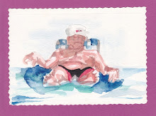
Man on Floatie....a postcard painting
is a fun vacation thing to do.  My work does not rely on the outer environment so traveling doesn't necessarily involve big plans for plein air painting.  Some artists I know love to make travel journals that involves art-making each day designed around a place and time.  Not me.  I actually relish the break from the intensity of studio work.  I pack a small wicker suitcase with:  drawing materials, a small set of pan watercolors, a couple of brushes, and some postcards.  I find traveling with oils too cumbersome.  I like to travel lightly.  Painting small cards and actually putting them in the mail is a fun thing to do.  I enjoy the look of a handmade postcard after it has traveled across the country.  Most folks enjoy receiving them as well.  And, well, the others are happy to give them back to me.  One of my favorites was done quite a few years back around the pool of beach-side condominiums.  The patriarch of a large family spent the afternoon in a floatie-of-sorts.  And I spent the afternoon painting him.  I really don't think he knew what I was doing.  It took so very long, as I recall, as I had to wait for his floatie to spiral around toward me repeatedly....each time gaining only a couple of strokes.

If he only knew.

Tuesday, May 31, 2011

Inside Out...

Derby Pam   Watercolor   9 x 13.75
Part of my painting and drawing process involves working from the inside out.  For me, this makes sense.  The block-in is extremely light.  Not committing to hard edges until the necessary tipping point allows for greater flexibility and malleability during the rendering.  Especially necessary for portraits, as every facial feature relates to every other facial feature, including muscles, tendons, bones and the obvious eyes-nose-mouth.  The artists in my class requested a painting demonstration.  I rarely comply, but a class vote put me in the minority.  Painting and talking is just too hard.  I much prefer the tunnel-vision-focus where I can achieve the state of mushin.  Pam was a willing model.  The painting was finished  from a photograph in four passes, top to bottom, although I will confess to leaving it on my table and noodling over it throughout the weekend.  I shot photos of the progression which should be available by tomorrow.  Whew!!!!

Monday, May 30, 2011

Memorial...

Rockamelon   oil/canvas   8 x 16 x 1.5
Day is a time to visit grave sites and to remember those who are no longer with us.  It is also a time to remember those delicious picnic food flavors!  Happy burger-potato salad-baked beans-watermelon day!

Friday, May 27, 2011

The Beginning. The BEGINNING is EVERYTHING

of any work is all-important.  The energy, the strokes and fervor with which pigment is applied sets the pace for the entire work.  Many of the artists that come to my classes state that they want to learn to paint and draw more loosely.  Loose is scary.  It is out of control.  Loose strokes cannot be added to a tight painting for any effect other than that of an afterthought.  The goal is:  loose to control; big brushes to smaller; thin paint to thicker paint.  The beginning is everything.

I have been reading a book entitled Blue Nude by Elizabeth Rosner, recommended by a fellow artist.  Interesting to be sure.  The author is definitely familiar with art processes...and feelings.  I see myself on nearly every page.  At one point, the blocked artist named Danzig states:    Begin again.  How many times had he said it?  The phrase was half encouragement, half admonishment, the constant reminder to his students that the beginning was all that mattered and, at the same time, the very thing that had to be executed with abandon.  Perfect and irrelevant.

I couldn't agree more.

Wednesday, May 25, 2011

Handmade...

Mexican Glass   watercolor/gouache   19 x 11
I appreciate all things handmade and have actually found myself "rescuing" such things from thrift stores.....(no, I am not a hoarder).  They are sacred.  Because they are so often handmade, I seem to love all things Mexican...the glass, the jewelry and the frames.  The glass is full of bubbles and the glassware sometimes a bit lopsided.  The framing is my absolute favorite, but a bit difficult to work with as the metric system is used for assembly.  Fitting them with glass is tricky.


"Mexican Glass" was painted in the summer...I remember it well.  Along with the Mexican blanket flowers from our garden.  Hot.  Cool.

Tuesday, May 24, 2011

The Case for Original Art...

Precarious Stack of Vintage Bowls   Watercolor   12.5 x 9
Just last week my son was searching for some white glazed pots for his indoor plants.  His trips to some Mom and Pop plant stores yielded much better results than a trip to Lowe's.  Large discount houses cater to the lowest common denominator with more generic products.  The same with art prints which have been killed with correctness.  Of course, we all need those deep discounts in some arenas of our lives.  But, for me, what we choose to put on our walls defines us personally....our senses of visual aesthetics.  No generic here, please.  Original art is one of a kind.  It has a personality and character all its own.  It speaks of the artist's hand who created it.  Lively.  Nurturing.  Lovely.  The more I am able to celebrate my own uniqueness, my own oneness, the less I am able to tolerate generic artwork.

So, OK.  Buy generic toilet paper....bars of soap in bulk.  But engage in the liveliness of original art and the artists who choose to spend their lives in wonder.  Participate.  Oh, yeah.

Monday, May 23, 2011

Measure Twice, Cut Once...

Blueberries and Lilacs   watercolor   9.75 x 14
O.K.  I have to keep repeating this mantra.  Preparation is a key ingredient to the success of a painting.  But I don't think that I am unlike most artists who want to jump ahead to the fun stuff, the painting.  Impulsiveness.  At the Mentor watercolor workshop, we spent the first hour drawing our still life set-ups.  My goals were the following:  to familiarize myself with the subject matter; to understand the underlying rhythms of dark and light values that lead the eye through the painting; and to be able to merge similarly valued shapes for the sake of simplification.  And yet, I wanted to retain the enthusiasm for the painting.  (I didn't want to spend it all on the drawing.)  I believe the preparation paid off.  I used the drawing as a road map to guide my painting and used the actual objects for color and detail references.  I think it made for a better painting, at least one that eliminated meandering, making all strokes more crucial and significant.

Let this be a lesson to me, to us.

Wednesday, May 18, 2011

Blue....

Blue   charcoal/pastel   14.5 x 10
is forever connected in my mind to N.Y.P.D. Blue.  A cop show with no equal.  I guess the notion of justice is so appealing...especially these days with the lay-offs of these much needed public workers, and the line between right and wrong frazzled and wavering.  Double standards.  Monied payoffs.  The shrinking of the middle class.  Manipulation and trickery for a dollar.  So when our artwalk model showed up, a retired policeman, all of my cop-thoughts came into play.  Our model took great care with his appearance...a stingy-brim hat (which was new to me), a striped 40's styled tie and an earring.  Along the Frank Sinatra-lines.  Terrific.  Three hours never passed so quickly.  Thank you, Al.

Justice has been served.  "Blue" is my response.

Tuesday, May 17, 2011

There is simply no substitute...

Bundled (Mo)   Watercolor   14 x 10
for drawing from life.  It is in this life situation that we are able to understand the forms, the roundness, the hills and valleys of the human face.  And, when practicing, the best way is to use pencils or charcoal....values will teach these subtleties more easily without the added complications of color.  I have seen seasoned artists freeze up when faced with portrait-drawing.  It is here that small errors in scale and measurement show up.  And, when we freeze up, we tend to see the human face as we did when we were children....two eyes, a nose and a mouth....and perhaps a  couple of ears and some hair.  Getting the eyes "just right" will help, but is not the true foundation of drawing the human head.  In actuality, the simple planes of the head tell the true story.  It is indeed an overwhelming task.  It is easy to practice on yourself in the mirror....perhaps limiting yourself to just one quadrant of the face.  That success will urge you onward.  My friend Mo does a self-portrait each day, both to improve her skills and to understand herself maneuvering through life.  Her set-up is stationary in her bathroom.  Her drawings are done in an old copy of The Gulag Archipelago.....one page a day.  Whatever medium spins her fan at a given moment.  What a wonderful way to learn.  Let that be a lesson to us.

Friday, May 13, 2011

Themes...

Dappled 2   oil on canvas   40 x 30 x 1.5
I believe that it is the path of the serious artist to paint those things, those ideas, that are important to her...those remnants that when left behind, will help to decipher the life of said artist.  I did not set about painting with any themes in mind., but I did follow my interest and paid attention to my intuition.  After several years, I realized  that one of my interests is "things dappled", things wabi-sabi, those things of pied beauty.  I am certain that what lies beneath this whole spotted and imperfect notion, is a distrust of black and white thinking as well as a personal dislike for the purebred, the pedigreed.

Thus, one of my themes is "things dappled".  I hope to continue all this vein for some time to come. "Dappled" and "Dappled 2" have been included in the Artists Archives of the Western Reserve annual May exhibition.

Glory be to God for dappled things--
For skies of couple-colour as a brinded cow;
For rose-moles all in stipple upon trout that swim;
Fresh-firecoal chestnut-falls; finches' wings;
Landscape plotted and pieced--fold, fallow, and plough;
And all trades, their gear and tackle and trim.

All things counter, original, spare, strange;
Whatever is fickle, freckled (who knows how?)
With swift, slow; sweet, sour; adazzle, dim;
He fathers-forth whose beauty is past change:
Praise Him."
Gerard Manley Hopkins (The Poems of Gerard Manley Hopkins)

P.S. I was a little freckle-faced girl.

Monday, May 9, 2011

Drawing as Finished Art...

Power Tie   charcoal/pastel   17 x 8.75
Drawings are useful as painting preparation and help to resolve design problems early on.  But drawings are also quite powerful as finished art.  Without the complexity of color issues, they are able to get to the point quite quickly.  I also enjoy the play of the charcoal across the paper which certainly is easier than with paint!  Drawings are value-driven.  "Power Tie" was drawn from a model.  Because I saw the major shapes as light, I tried to used the darks to rhythmically move the eye throughout the drawing.  Thanks to my friend Ann who always has a plethora of pastel sticks on hand, I added the red of the tie at the very end.

Thursday, May 5, 2011

Fine or Chunky?...

Silverplate Pot   watercolor/charcoal   9.5 x 10
Discovering yourself in your art is very exciting.  It defines who we are personally and helps us celebrate our own uniqueness, oneness.  I love all things chunky - salsa, spaghetti sauce, applesauce, jewelry and orange juice with pulp.  Mugs, not teacups.  I prefer large brushes and chunks of charcoal...never pencils.  The first week of watercolor class is always a bit problematic in that no one is really prepared for an assignment.  I asked each artist to grab something in the well-stocked trove of still life objects at the art center.  I grabbed a tarnished silver plate teapot.  I don't question my motivations....I just go with my first inclination.  It was indeed a challenge with all of that tarnished goldeny-violety-blacky reflectiveness....and some dents as well.  It was only when I finished the work at home that my self-definition revived itself.  The beauty of this pot was in the embossing on the handle and on the spout.  But when I picked up a small paintbrush, I felt disappointment...a "why bother" kind of feeling.  It was just short of revolting.  I always want to finish off a class project using only watercolor because, after all, it is a watercolor class.  But I had to be true to myself.  The pot was finished with chunky charcoal lines which pleased me greatly.  The overall feel is always more important than the detail to me.

I was reminded of who am am.

Wednesday, May 4, 2011

Feelings...

Awakening   watercolor   19 x 9.5
are entwined within my every brushstroke.  Tension shows.  Neurotic behavior reveals itself.  Confidence uplifts and frees.  For me, painting and feelings are inseparable.  Painting is, quite frankly, where my inner world resides.  It is rare to commune with an individual whose ego does not get in the way of the communion.  I have never enjoyed painting landscapes that much.  Part of the reason, I'm sure, has to do with a reality-based color palette that is all over the wheel, and whose disparate nature fragments the power of the work.  But artists in my classes enjoy the painting of the outdoor scape.  And so I deal with it.  For me, a limited palette is a must.  Colors were pushed.  The blue-violet of the sky was brought down to the middle ground.  And the grass green was pushed up into the sky.  The large tree was not solidified.  My response to an early spring landscape:  before the first mowing.

Whether inspiration is based on what one sees or on ideas, the artist's job is to react emotionally to what inspires him.  Be less demanding of the source of your inspiration and give more guts to the representation of your visions and ideas. 
Alex Powers

Friday, April 29, 2011

Baaaa.....d to the bone...

Reverence   oil on canvas   30 x 40 x .75
This month I have been painting a sheep.  Yes, a sheep.  Massive.  A gentle giant.  Painting animals makes me feel serene and complete.  It helps me to understand just where we fit into the grand scheme....that we are a small part of the world in which we live.  My goals were to render the wool in a general way and to merge the sheep shape into the surrounding ground.  The gestalt.  The overall sheep feel.  I felt reverence as I painted.  Respect.  Admiration.

The highest purpose is to have no purpose at all.  This puts one in accord with nature in her manner of operation......John Cage

One who lives in accordance with nature does not go against the way of things.  He moves in marmony with the present moment always knowing the truth of just what to do......Lao Tzu (Tao de Ching)

Thursday, April 28, 2011

Workshop Work...

Fedora and Stripes   charcoal/paper   20.5 x 13
It has taken me quite a while to accept the fact that my workshop work is not usually my best.  Not only is it difficult to focus clearly in a workshop setting, the concerns of having enough coffee and the volume level of music tend to disrupt and get in the way.  My top concern is that the participants have a successful experience.  As a result, my own workshop drawings are often discarded.  The work of the participants must be the priority and, I must say, I have been so greatly pleased in this regard.  The fact that what I am trying to communicate visually is getting through to participants is unbelievably rewarding!  And, the fact that my own work seems to be sub-par during this same time period is disappointing but no longer a surprise.  As I culled through the work from the expressive drawing human figure work, I decided that one drawing was worth some extra work.  It was on good paper.  "Fedora and Stripes" is the finished drawing.  Thanks to Leta for being such a great model.

Wednesday, April 27, 2011

Handed-ness Matters...

Paint Dancer Detail
no....not left or right.  I am referring to how we strike or caress the painting surface with our tools.  I believe that those of us with heavy hands need to learn how to caress the surface in appropriate passages.  And, likewise, those of us with a more timid approach, must learn to bravely become heavy handed and bolder when the work requires it.  I guess it seems similar to learning to play the piano....or any instrument for that matter.  Fortissimo.  Pianissimo.  Over the years I have found that, in general, it is more beneficial for me to lighten up my touch.  ( I am a natural heavy-hander).  A lighter touch provides more glide.  An energy that allows for more curve, more swerve.  When I recently experimented with gold leafing, I was so very surprised at the light touch required, with a soft brush using circular movement, to actually adhere the leaf to the adhesive.  (In my mind, there was a burnishing, a pounding effect....wrong)  A light touch allows for more free play and more movement.  To and fro.  Ebb and flow.  Push and pull.   All good.

Tuesday, April 26, 2011

The King Midas Touch...

Gerbera   watercolor/mixed on paper   9.5 x 12.5
Gold has a history of desirability, representing wealth and status.  As we define ourselves as artists, we gradually sort through what is us and what is not.  For the most part, I have rejected this notion of gold-status.  I do not like gold jewelry....or gold frames.  I much prefer the weathered look of worn materials of an everyday nature...flaking paint, rusted iron and speckled stained materials.  Me.  Years ago, however, when studying calligraphy, I often admired the gold leafing on ages-old manuscripts and holy books.  The reflective quality was beyond compare, even after hundreds of years.  In my art cabinet is a kit containing all the things needed in order to gold leaf.  It sat unused for so many years....simply because I did not want to read the lengthy instruction manual.  I am a doer...not a reader.  A few weeks ago a painting of a gerbera daisy just seemed lackluster, for want of a better word.  I pulled out the kit and read the instructions.  Yes, read.  It really wasn't so difficult.  I loved the addition of this material onto the painting.

Never say never.

Monday, April 25, 2011

Eggs..

Chinoiserie Eggs  watercolor   12.5 x 9
are always a challenge to paint....white, elliptical and fairly reflective.  I usually try to put eggs into a composition with patterning in order to highlight, by contrast, these qualities.  "Chinoiserie Eggs" came into being fairly easily and, I have to say, I enjoyed the rendering of the blue design.  As always, the most difficult part became the opaque darks surrounding the pot itself.  Selective light washes were painted over most of the egg surfaces in order to really eliminate the "too much white stuff" quality that undermines so many watercolors.  Dirty water washes are often a great addition, I find, as the pigments swimming around in the wash water make for harmonious neutral glazes.

Making egg salad from the set up is just gravy.

Friday, April 22, 2011

How to paint water...

Narrow Bridge   oil/canvas  36 x 24 x 1.5
is a concern for most artists as water reflects what surrounds it for the most part.  Frozen water.  Moving water.  Stagnant water.  Each creates its own problems to solve.  Here in America we don't often worry about a source for water.  Solidarites International is one organization making an effort to provide clean water for folks around the world.  Artist Clement Beauvais has illustrated this need on a vimeo film clip by drawing with water and dropping in ink on the surface.  Fellow artist Tom Auld has forwarded this clip to me....he was intrigued by the drop-in of pigment....one of the beautiful qualities of a water medium.  The film is both beautiful and haunting.

Matt Damon and Gary White have founded water.org here in this country.  Donations are accepted to help to provide enough clean water for a year for an individual.  It is estimated that 3.6 million people, including 1.5 million children under the age of 5, die each year from consuming water that is undrinkable.

Let water be the link for solving this global problem.  Donate.  Paint water.

Monday, April 11, 2011

Emily Dickinson wrote....I dwell in Possibilty--

I dwell in Possibility--
A fairer House than Prose--
More numerous of Windows--
Superior--for Doors--

Of Chambers as the Cedars--
Impregnable of Eye--
And for an Everlasting Roof
The Gambrels of the Sky--

Of Visitors--the fairest--
For Occupation--This--
The spreading wide my narrow Hands
To gather Paradise-- 


Oh, the possibilities.  Members of the Women's Art League in Akron spent Saturday morning creating pear possibilities.  This slide show shows but a few.  Juicy.  New.  Individual.

Friday, April 8, 2011

Life and Art...

Fourteen   pastel/paper   23.5 x 17
I become elated when art intertwines with everyday life and becomes a bit disengaged from the elite sector.  That is one of the reasons why I love street art so much.  And, let's face it, artists spring from that part of life that is all about the essential, the important, the work that creates, often counter to the destructiveness that surrounds us daily.  And all without regard to pesos.  (of course, pesos do help) Art elevates.  Art enchants.  Art saves.  And so I am particularly delighted to have my work shown at Clip Art Salon and Gallery over the next several months.  Owner Denise Pepe has shown local artists for years in her salon.  She has given many artists a great start, myself included.

Clip Art Salon and Gallery
1165 E. Tallmadge Avenue
Akron, Ohio 44310

Stop by for a color or a cut.  Stop by to become elevated.

Wednesday, March 30, 2011

Discipline is Freedom...

One in Every Crowd   oil/canvas   8 x 24 x .75
said Garth Fagan, the Tony award-winning choreographer of "The Lion King".  "Study the rules before you break them".  Quotes of this nature abound.  Probably because they are so true.  When you study your craft so very much that its nuances become part of your nature, it is then that you can begin to play....true play from which creativity springs forth.  Yes.

A few weeks ago, the program at my local art club was about breaking the rules.  I was unable to attend that evening.  Sometimes, in breaking the rules, we are more able to completely say what it is that is felt.  "One in Every Crowd" is a case in point.  A painting about chicks, sweet chicks.  And also a painting about following the crowd, or not.  I chose to paint my independent chick a different color and to put him facing a different direction than the others.  These changes made the painting more interesting to me, and also made the painting more interesting and challenging to paint.

Tuesday, March 29, 2011

Alice...

Applause   watercolor   9.25 x 13.25
(of the Wonderland tale) would love stepping into Heavenly Cupcakes in Kent!  Pink and Green everywhere.  Antiques.  Bold stripey wallpaper.  Games.  Tables.  Sparklies.  and now.....cupcake paintings.  Artists in both of my classes have contributed to this wonderful exhibit of cupcake art:  Sheri Linzey of Kent; Norma Ott of Cuyahoga Falls; Jackie Roberts of Sagamore Hills; Carol Weigand of Rootstown; Delores Zink of Kent; and myself.

Check it out.  And, btw, Alice said to bring your sweet tooth along.

Friday, March 25, 2011

Change of Pace...

Country Eggs   oil on canvas   6 x 6 x 1.5
Changing my painting pacing keeps me interested.  Some days are large oil painting days....they take quite a while to resolve.  On watercolor days, I often work on more than one, switching back and forth while trying to time the drying times.  And, when I become overwhelmed with problem solving, I paint small oils on small canvasses, just painting as I see things.  Simple.  Uncomplicated.  Refreshing.  Often, these small works are driven by color harmony and color experimentation.

Country Eggs....change of pace.

Thursday, March 24, 2011

Swoon

is defined by dictionary.com as "to enter a state of hysterical rapture or ecstasy".  What a marvelous word!  Swoon is also one of my favorite street artists.  She studied painting at Pratt.  Her subjects are street people.  Most often she does wheatpaste prints and paper cutouts.  I love her style as well as her subject matter.  Sometimes her figures are a combination of great design and draftspersonship combined with decorative elements which make me swoon.  I noticed her work in "Exit Through the Gift Shop".  She is also represented in Graffiti World:  Street Art from Five Continents.

What a surprise to receive one of her images yesterday in my mail.  My son photographed this work on Grand Street in Brooklyn and sent it to me from his phone.

Technology.

Swoon.

Friday, March 18, 2011

Pear Possibilities...

La Poire 3   watercolor and gold leaf
Early next month, I will again be presenting a program called "A Pear is a Pear is a Pear".  It is a fun and playful session that involves process rather than product.  During the workshop we consider such things as:  edges (soft vs. hard); texture; color temperature (warm vs. cool); line and mass; and color (neutral vs. pure).

The slide show shows some the fine small pear paintings that were made that during our Thursday watercolor class.  The pressure was off....we were loose and free.  After all, it was only play-time....right?

Thursday, March 17, 2011

Bling...

So Young Worries   watercolor/mixed with gold leaf   15.5 x 10
current slang for shiny things, is a distraction.  Shiny things attract crows as well.  I was inspired by Picasso's "Woman With a Crow" done in watercolor, pastel and charcoal in 1904 and owned by The Toledo Museum of Art.  I love everything about it...its simplicity, the soft caress of the woman's hand, the colors, the elongated fingers.  Some pictures just move us....who knows why?  Maybe it stirs up something in the memory.  Perhaps it indicates a place we would like to inhabit artistically or emotionally.  I painted "So Young Worries" d'apres Picasso.  My work is done also in watercolor, pastel and charcoal.  The gold coin is gold leaf applied.  I guess I feel that we are too often distracted by bling and all it represents.  It really keeps us from knowing ourselves.  To have or to be.

Wednesday, March 16, 2011

Yardsticks...

Pot of Potatoes   watercolor on paper   13 x 17
are good for measuring things, even measuring finished work, but lose their function when trying to measure the quality of our work.  One day at the end of class, one of the artists asked me if I thought his work had improved over the past couple of years.  Wow...talk about a loaded question.  I hate to respond with another question, but I think that improvement can only be judged from within.  With some paintings, I felt that I really hit the mark.  Others, not so much.  I have sold many paintings that were not among my favorites.  I am happier with my work than I was a decade ago....does that count?  It seems that my earlier work garnered more awards....but I may be wrong.  I am doing riskier things these days...solving more difficult problems....I feel that my work is now really mine.  But how would others measure it?  I don't know.  Sometimes I really love a painting that has not even gotten a second glance by others.  I guess improvement is in the eye of beholder.

"Pot of Potatoes" is the aforementioned work.

Tuesday, March 15, 2011

Life is just a bowl of....

Eat Your Broccoli   watercolor   13.25 x 6.5
let's see...we had spools of thread, bok choi, fruit and my own response, broccoli.  In this case I was working on an unusually shaped scrap of paper.  I wanted the darks and lights to play against each other to create drama.  And....I had the green/violet combo in my brain.  The tops of each floret are a kind of bluish-whitish-greenish.  Millions of little pieces.  The goal:  to indicate broccoli without too much detail.

"Eat Your Broccoli" is my response.

Friday, March 11, 2011

Winter-ful...painting snow...

Blue Hen Falls   watercolor   11 x 11
This has certainly been a winterful winter....after weeks of slightly warming temperatures and chilling rain, we are back into the grips....the trees and ground are covered with the fluffy white stuff.  Last chance to paint a winter landscape.  Painting snow in the spring seems, well, just wrong, like looking at a Christmas wreath in March.

"Blue Hen Falls" is the result.  About half of it was painted during class.  I was terrified to complete this in the studio at a separate session....worried that I would be unable to continue the earlier color palette, the earlier soft rhythm.  I guess the muse was with me on this one.  I am pleased.

Tuesday, March 8, 2011

Literature...

What Have We Done With Us?   oil/canvas   24 x 30 x .75
(that which one chooses to read) and life experience are inextricably related.  Life experience, then is inextricably related with what one chooses to paint.  I am a fan of the work of Louise Erdrich.  I found Love Medicine and Plague of Doves to be both haunting and a bit disturbing.  When I was in elementary school, our class assignment was to question our relatives about our heritage.  In a super-moment (one that remains strongly engrained in the conscious), I asked my grandfather where our ancestors came from.  He replied that my grandmother was a "wild injun".  My grandmother gave him a mean glance and then went about her chores....she was a woman of few words.  I thought it was a joke, even though she really did look Native American.  In years to come, I did find out that her own mother was the child of such a "bi-racial" relationship.  The details are quite sketchy but researched to a degree by a cousin.  I have no desire to undertake the task of genealogy.  But the interest is there.  That my tolerance of cold, that my extremely slow metabolism and my love of silence could be a product of genetic coding.  When Twelve Eagles posed, I undertook the project with enthusiasm.  Indian art runs the gamut from being a bit scientific (as specimens from The New World) to a bit too sweet as in "cute little Indian girl".  But as I worked, I realized that even though Twelve Eagles is authentic, she came off as a beautiful woman in a costume, as defined by my narrow middle-class-America-Ohio-to-be-specific cultural dictionary.

"What Have We Done With Us?" was painted of a sketch of Twelve Eagles.  I see myself in her.

Friday, March 4, 2011

Nuances....the stuff that others don't notice

become apparent to anyone who creatively undertakes a given task more than once.  Cake-baking.  Fire-building.  Plant-watering.  Whatever.  I have never trusted the opinion of anyone who deems any undertaking to be a cinch.....that indicates to me an unawareness of nuance.

Take materials, for example.  I usually follow the plan of:  the larger the work, the larger the tools, the need to stand.   And so it follows with smaller.  For our Wednesday evening model, I decided to sit instead of stand at the easel.  And so it followed that I would use a small piece of paper and a small charcoal pencil.  I usually use vine charcoal for drawing which mushes easily...sometimes too much.  The pencil was harder.  Even though I used my blending stump, the lines are still visible.  That can work to advantage, or disadvantage, of course, depending on the goals.  I used the less-bumpy side of the paper so that there would be more merging of the medium.

Sometimes it takes years to understand all of the hidden nuances hidden in art materials.  And to work with them to advantage.  Utilizing our own strengths as well as our limitations, including our materials, can improve our work.

Thursday, March 3, 2011

The inner unconscious world...

Bartlett Pear   watercolor and thread on paper   5 x 8
the one we're not directly in contact with or in control of - that's the one I try and privilege.
                                                                                                 Charlotte Rampling, actress

Here here.  I was privileged to lead a program Monday eve on "A Pear is a Pear is a Pear" at the Medina Art League.  Due to time limitations, we created 8 small paintings, very quickly painted, with the pear as our subject.  Oh, the possibilities!
     1. vanilla....blah, blah, blah.  The pear painted as seen using local color.
     2. daring do.  We worked on this one throughout the session beginning with unlikely colors
          and strokes....how dare we?
     3. feeling edgy.  Manipulating hard and soft edges to tell different stories
     4. the thermostat....some artists worked on warm dominant paintings, and the others cool
     5. curly or straight?  some artists worked on texture within the pear form, and others texture in
         the background
     6. the feng shui way...bringing the outside (the form) in and inside out
     7. towing the line....adding a straight line to the organic pear form to offer strength
     8. color power...utilizing both pure hues and neutrals

My goal was to illustrate the possibilities inherent in the design principles and to help artists to prioritize what key ingredients please them in order to make their art more personal.  It was a rousing session with so many great little beginnings! (especially those of a 3rd grade art teacher)

Rum raisin, anyone?

Wednesday, March 2, 2011

Portraits...

Delores in Fendi   watercolor   11 x 8.25
are an amazing opportunity to commune with another individual in a very personal way....an intimacy beyond measure.  A silent wordless relationship.  For me, a portrait painted in love is the only way to travel.  I am inspired by real people with real humanity and a real soulfulness.  When presented with whiny uninspiring models or those in costume, I am at a bit of a loss, as a boundary has been laid which I am unable or unwilling to penetrate.  Portrait painting for me is so undeniably connected to my brain.  Painting Delores was such a work of love.  She is a perpetual student who is 86 years young.  We have been painting together for many years.  The muse seems to guide me in these joyful endeavors.  The work was started from a classroom situation where she was painting someone else, so the simple shapes changed a bit from time to time as her head rotated both from up to down and from left to right as she dipped into paint.  Once the groundwork was laid I was committed and finished as best I could.

A tribute to my friend and colleague Delores.  I am pleased.

Tuesday, March 1, 2011

Paint it Forward..

Pine Cone Pair 2   oil/canvas board   8 x 8
of course, is a play on the phrase "pay it forward".  To me, it implies works of good faith, done for the joy of it, with no expectation other than the happiness it gives or provides.  And, so, pine cones.  My sister in law recently asked me if I paint seasonally.  Yes.  Yes.  Yes.  My regimes, my thoughts and my soul seem to be enveloped by the weather, the scene, the feel around me.  I simply could not paint a summer landscape while surrounded by snow.  Right after the holidays, I had a difficult time returning to the large unresolved work in my studio.  And so, I thought that I would spend some time doing smaller pine cone paintings, 8 x 8, the idea seeded by a find of wonderful wood frames hanging from chains.  These little paintings seemed to go on forever, as I was in love with the paint-on-top-of-paint thing that was going on and the surface texture that emerged.  Although I did have pine cones in front of me, I pretended that they were enveloped by and topped with snow.  And now, with the first warm rays of spring penetrating the glass, I am, at long last, finished with these four small works.  And, I believe, I have had quite enough of pine cones for a while.

Monday, February 28, 2011

Heavenly...

(Applause)   watercolor   9.25 x 13.25  
is an understatement.  These cupcakes surpass anything I have ever tried.  Our class assignment:  bakery in reds, pinks, chocolates and whites to celebrate the love day.  I stopped in to Heavenly Cupcakes to buy a few support materials.  I couldn't believe the buzz, the activity!  These really are heavenly....buy, then paint, then buy again.

And the oscar goes to....all three.

Really.

Friday, February 25, 2011

The Pinecone...

Lone Cone   Watercolor   7 x 7
is simple, yet complex....like many organic things.  And I believe that it presents a most interesting drawing and painting problem.  The ins-outs, the tos and the fros, of light falling on it can teach us so much about the way light affects form.  In our watercolor class, we undertook this problem, knowing that the values need to be upped  to the light end of the scale.  While cones don't really have white on each tip, we understand that to be easily read visually, these changes would keep the cone sublime, without becoming a dark brown blob.  Carol's work is indeed sublime....this is her second effort at this gentle cone.  The gentle washes on each side help the cone to recede and to read in a three-dimensional way.  It has volume.  Her first attempt became too dark too quickly.  She corrected and reworked.  Her efforts were rewarded.  My own version is more drenched in color.

Monday, February 21, 2011

We're Painting the Roses Red....

Confection   watercolor   8 x 5.5
sang the cards in "Alice in Wonderland".  I am singing it too...."Confection" is my response to our valentine challenge.  I guess I am somewhat satisfied with the work.  I took it as far as it would go.  Years ago while working in the greeting card industry, I painted more roses that I ever would want in a lifetime.  They are difficult, not only in their curling twisting forms, but in that deep red color which does not reflect light very well.  Actually, not at all with the overhead lighting at the art center.  Beginning painters often over-paint the rose, in an attempt to achieve that rich redness.  Permanent rose, Rose Madder and Opera Pink are all pink-oriented.  Alizarin tends toward brown.  But, once again, I dipped into it in order to achieve a darkness which the other hues could not provide.  I left a white which was gradually washed over in the final stages.

My regret with this work is its scale.  Too many things on the paper for its size.  I was using a odd-sized leftover.  Painting freely with one or two forms in the composition works.  Too many forms inhibit that freedom.

Note to myself:  on Valentine paintings, stay out of the Alizarin.  And, oh yeah, bring a bigger sheet of paper.

Thursday, February 17, 2011

Homage...

Bundled   watercolor   14 x 10
is pronounced o-maj'  in French.  My friend Tom painted an homage to Dean Mitchell after viewing his exhibition in Canton.  My homage today is to my friend Mo.  She has studied with me for years.  She is an open-minded and fair individual.  She treats everyone with kindness.  She is enthusiastic.  We are both perpetual students.  And....she lives an artful and considerate life in every way.  Her portrait of me is just wonderful.  Simply rendered.  Texture has been liberally suggested.  Energetic.  And, as it seems to me, she only represented the good parts....of course, my hair and mouth were covered.  (definitely a good thing)

Mo was not at class last week.  Her wonderful dog Farina, who is also a member of our class, suffered an accident at a dog park and had to have surgery on Monday.  Farina's leg was dislocated as she leaped to get away from some other large dogs.  And the very sad thing is that not one individual stepped up to help her, or to acknowledge their part in the accident.  I would have to say that this is anti-Mo behavior.

Which is exactly why I like her so much.

Tuesday, February 15, 2011

Impure?...

Fallow   watercolor/mixed   25.75 x 11
It seems that there are purists in almost every detail of habitation these days. All cotton.  Strictly organic.  And transparent watercolor.  I'm afraid that I am a mutt.  Mixing it up in every way possible...especially if that seems to be the way to achieve what I am after.  "Fallow" started off as a watercolor for our class challenge of a vertical landscape.  After simplifying and reestablishing countless times, I introduced gouache....then watercolor pencils....then pastel...more watercolor....then a Lyra watersoluable grafit-kreide.  This work is about as far away from my usual as can be.  And, yet, the feel of this work is exactly the image inhabiting my brain ever since that Sunday walk down my road, the day that I needed to procure an image for the upcoming class.  Feel.  Important.

Yet, I feel a bit of guilt that I was unable to resolve the problem with pure watercolor.  Oh well.  I might just drown my sorrows with a slice of  smoked Gouda....or possibly Velveeta.

Monday, February 14, 2011

LOVE Day...

Chocolate Cupcake   watercolor   7 x 5
is here.  Our small festive celebrations punctuate our lives with little spurts of joy.  It seems that we, in our culture, are appreciating the visual quality of food as never before.  We are lucky to enjoy a standard of living that allows for this.  As we fill our homes with art...meaningful art...let's not forget to include the beauty of food....it is a huge part of our lives and provides us with a venue for artful living, no matter what our daily endeavors.

Oh yes....a cupcake with no calories!

Monday, January 31, 2011

Critiques...

Winter Nap   Charcoal/Pastel   28 x 18
are a regular event at our club here in Akron.  Last week, I took in a drawing done shortly before Christmas as a demonstration.  I really do like it.  I was successful in the "feel" of the work which was a winter nap.  It was a cold day and we were approaching the holiday season.  Once home, I quickly framed and put it on the wall.  Now, in January, I knew that it was time to reconsider the work.  Several artists pointed out the model's right arm and hand which, in its darkness and weight, commanded too much attention.  I agree.  OK.  Yet, on the other hand, I knew that the dark and weight were there to balance the right side of the drawing.  Judy Carducci made a great suggestion which was to remove a particular mark on that arm, leaving it more open to merge with the toned paper beneath.  The next day I tackled the project.  Because I had sprayed the work with fixative, the mark would not budge.  (I guess it's good to know that the stuff works)  The green pastel on the work had been put on first under the charcoal.  It had never occurred to me to reintroduce it.  Duh.  Putting in a passage or two lessened the power of that arm and, to me, solidified the whole.  Thank you to Judy, to Tom Campbell  and to JoAnn for your comments and suggestions.  In addition, friends Kim Moore and Tom Mullins suggested that this drawing would benefit from a floater frame....where no mat would be used.  Terrific idea.

No matter whether a work is quickly done or takes weeks, the consideration process goes on for quite a while.  At least for me.  A bit of separation from the work helps one to see things more clearly.

Friday, January 28, 2011

Isn't that Mary?...

Mary Sanders...a sketch
Every now and then I browse through the small drawings that have been uploaded onto my computer.  I came across a drawing of the back of Mary Sanders' head.  Yes, it has to be her.  You know, the Yupo guru?  I have come to realize that more and more, likeness has a whole lot to do with the simple geometric shapes that make up a face, a head, an arm, a body.  We recognize our friends from the back.  We even recognize them from very far away as they approach.  When we take the time to "nail" these simple shapes, we are rewarded.  This also explains my dislike for "the portraits of a thousand wrinkles", as if the aging of the face tells the story.  Simple shapes rule.

Of course it's her.  Why I'd recognize her anywhere.

It's all in the shape of the hairdo....not the individual hairs.

Thursday, January 27, 2011

Texture...

Christmas Chaos   Watercolor on Yupo   8 x 8
is inherent when painting on Yupo.  I like texture in small doses but prefer it when played against the calm of a flatly painted area.  Right now I am picturing a greeting card that featured an elderly man dressed in stripes, checks and patterns of all kinds.  The greeting is "don't drink and dress".  Very funny.  Too many textures seem agitating.  Stories can get lost in texture.  I have come to believe that simple forms work out well on Yupo.  To the right are examples of our holiday still life paintings on Yupo.

Wednesday, January 26, 2011

Between the Cracks...

Peony Row   Watercolor on Yupo   11 x 15
As we were using Yupo in class, I recalled just one other time, many years previously, that I had used the stuff.  The memory was crisp....sitting the warm sun on my patio and tackling the peony row there....on Yupo.  I remember the frustration of the meandering paint, the frustration of not being able to layer.  These days I am, hopefully, more accepting of such challenges.  After some looking, I came upon that older work "Peony Row".  At the time, I was still taking the best work to a professional to be photographed and, apparently, I didn't feel that my peony painting was worthy.  Pulling it out, after all these years helped me to see that it was better than I had thought.

One quick swipe of a wet brush on Yupo takes the stroke back to the white surface...well, almost.  I found that I really did appreciate the colorful residue left behind on these strokes.  Very sublime.

Putting away questionable paintings is a good trick.  Several years later, I am able to make a better judgement regarding its success.  Sometimes, I am quite aware that the painting really does suck.  And, surprisingly, sometimes the work is better than the image of it that dwells in my subconscious.  That was the case here.  A work that had fallen between the cracks has redeemed itself to me.  Let's not be too hasty to judge.

Monday, January 24, 2011

How DOES he do that?...

Still Life with Jug and Poppies   watercolor   4 x 6
Dean Mitchell, I mean.  Painting small, I mean.  Returning to the studio after the holidays is always difficult.  I understand the supposed ripeness of the dormancy period.  But facing the white canvas or the white paper is scary....more so after being away for a while.  I found that my strokes were too heavy, too deliberate.  My sleight of hand had also been on holiday.  After perusing the Dean Mitchell book of exhibition paintings loaned by a friend, I was inspired by some of the miniature works and decided to paint a small still life.  As a painter who relishes large spaces and big brushes, this was truly a challenge.  Smaller brushes.  Less freedom.  Being concise is a virtue when painting small.

"Still Life with Jug and Poppies" is 4 x 6.  I am happy with it.  But I am ready to get big again.

Dean Mitchell:  Space, People and Places is on exhibit at the Canton Museum of Art through March 6.

Tuesday, January 11, 2011

New Pen...

Ivy Drive Seth...sketch done with Pilot Precise V7 Rolling Pen in Blue
I would guess that many art-supply addicts can also be seen in the dark alleys of office supply stores to get their fixes of adrenaline.  Years ago, and I mean years ago, I read an article about an artist who worked in travel journals with a Pilot Precise V7 Rolling Pen in blue ink.  These pens have a needlepoint somewhat like those nasty technical pens that always seem to be clogged. This  pen makes beautiful rolling and seamless lines.....AND it also responds to a water wash to soften and delight.  I immediately bought the pens and there they sat, in my desk drawer, as a reminder of things to be.  In the first days of the new year, we helped our son switch apartments in Charlottesville....lots of moving and cleaning.  Lucky for me, I glanced at those unopened pens before the trip and vowed to give them a try during our down-time.  Yes-in-deedy-di.  I am definitely not a line-driven artist, but the washy substance gives me a thrill.  I am afraid that I did not spend too much time on the drawings themselves, as I was so excited about the wash.  Experiments.  More tools in the creativity arsenal. 

Added to my small pouch of sketching supplies to be found in my bag:

1-Pilot V7 rolling pen in blue
1-small watercolor brush
1-folded paper towel for drying and blotting.

Life is good.