Search This Blog

Monday, July 14, 2008

transparency::opacity

Tomato, Pepper and Sage   watercolor/gouache   10 x 10
Transparency and opacity, and their relationship, plagued me for years. Watercolor paintings without some opacity seem to bother me, as well as did oil paintings without the slightest notion of transparency. Upsetting the boundaries and limitations set forth by individual mediums is important to me. Yesterday, my husband and I visited the opening of The Butler Institute of American Art Midyear Exhibition opening. The works that stimulate me the most are those that seem to transcend the limitations of the medium, or seem to merge various mediums. In approaching, I am trying to decipher the medium, but am puzzled. I love that! I recently unearthed an older painting "Tomato, Pepper and Sage". I am more pleased by it now than I was at the time. I can recall the need to make the sage opaque, both the color and the texture. I felt that it simply couldn't be done any other way. So I added body color in the form of gouache. Ahhhh.....cooking without a recipe.

Friday, July 11, 2008

The power of Black

Angie   conte crayon   20.5 x 14
I love working in charcoal! The medium is messy, smudgy and bold. Charcoal drawings capture my attention with their directness and simplicity. Perhaps the power of an image is diffused by the addition of color: the more colors, the more diffusion. This week I have been working in charcoal. It is what I needed...to get away from complexity and back to basics. "Angie" is a drawing done many many years ago in my living room during a summer heat wave.....the fans were blowing and we were all uncomfortable. To me, there is a freshness here, an unrefined honesty that is hard to perpetuate deliberately. Angie is the delightful young woman who manages my website.

Thursday, July 10, 2008

Boring

Boring   mixed on paper   22.5 x 15
Yesterday was what I consider to be a typical day in my studio. I first finished up a couple of mini paintings that just needed a few strokes and a signature. Then I set to work on a still life painting of two tennis racquets that said absolutely nothing. The colors were not working. After a couple of hours in a vain effort to induce excitement, I covered it with paint and decided to use the canvas for something else. I guess I was trying to create a painting I thought might sell....always a loser. Then I switched over to project where I am mixing media........instant excitement. By the end of the day, I was completely stoked over the possibilities! "Boring" is a mixed media drawing done from my expressive drawing workshop last year. The assignment was to find a basement/garage/roadside object that had lost its function, or was somehow unexplainable. Our creative assignment was to alter the object to make it somehow exciting.....we used inks, rubbings and all manner of drawing materials. I am starting to think about the expressive drawing workshop that begins next Wednesday at Cuyahoga Valley Art Center.

Wednesday, July 9, 2008

Flow

Woodland Strawberries...a watercolor sketch
Arriving at "flow" in any activity is an optimum experience. Things seem effortless and pleasing. After finishing the strawberry jam card, I looked around for another subject..........woodland strawberries were climbing my rock garden so I thought I would have a look-see. After grabbing a bunch, I laid them on a piece of white paper on the picnic table. At first glance, the set-up seemed quite complex and the relationships tangled..........that is the kind of problem-solving that interests me. This subject was painted in a leather-bound watercolor book given to me by my son. All in all, I had a quality experience and a wonderful afternoon. Pressure's off in weekend painting.

Tuesday, July 8, 2008

Weekend Painter

Strawberry Jam...a watercolor sketch
Because I am a full-time painter, my weeks are spent, of course, painting, drawing and solving visual problems. I usually use my weekends to do other things as my mind needs a rest. But sometimes on a beautiful summer day, I crave the relaxing zen-like experience that painting provides. I get out my small travel watercolor set and smaller brushes and park my stuff on the patio. On these days, I paint simple objects, usually from the garden, with no set goal in mind. I paint without the feeling of being productive. Ahhhhhhhhh.....so very relaxing! The hours seem to fly. This weekend I painted a jar of strawberry jam as a thank you note for my friend Leta who generously gave it to us. Being a weekend painter is a good thing.

Monday, July 7, 2008

Simplified Forms

hand carved rubber stamps
One of my artistic quests is the simplification of form..........that helps me to avoid detail, take a new spin on reality, and to enjoy form and line for their own sakes. I also enjoy the quality that printmaking provides....a kind of secondary soft application of pigment onto paper, which the direct application of painting cannot provide. Hence - carving rubber stamps. The commercial kind which can be purchased at any craft store are amusing enough, but just don't offer the rudimentary beauty which can be achieved by hand-cutting. It is not an easy endeavor, but is a creative outlet that doesn't require lots of time. All that is required is: a creative mind, an eraser, some lino cutting tools, some tracing paper, and some colorful markers. Tonight is my first class of "Everyday Art - Hand Carving Rubber Stamps" at Cuyahoga Valley Art Center.

Friday, July 4, 2008

Beauty

White Shirt and Tie   watercolor   8.5 x 6.5
I am surrounded by beautiful faces! ....faces that emit energy, kindness, courage and honesty. Nothing makes me sadder than a person who doesn't recognize his/her own beauty. We are conditioned to find fault, I guess. I know for a fact that my own notion of beauty is quite broad, I guess in my attempt to counter the beauty-definition of the media. Robert Plummer is such a person of beauty. He posed for our group many years ago in his white shirt and tie, the mark of respect from his own generation. Years later, when he and his wife bought the painting, I had the opportunity to visit his magnificent gardens.......a quality hidden beneath the white shirt. Now, when I look at the portrait of Robert, I smile.............I see dignity, a love of nature and a drive.............all are gifts to me, and, I hope, to him.

Thursday, July 3, 2008

Painting what you love

Carved in  Stone   watercolor   13 x 18.5
For years, I have been watching students bring their beloved items into painting class for a still-life set-up: raggedy stuffed bears, well-worn baseball caps, small boxes and brightly-colored what-evers. I must admit that sometimes I actually wonder why anyone would want to paint the thing. We are often defined by our possessions and collections, the things that help us to define the "self". It is different for everyone. I see students putting flowers in cherished vases, when I prefer painting flowers laying table-flat, without being contained. All a matter of personal preference. Painting what we love offers to us the quality of commitment in the creating, the inability to give up.

Tuesday, July 1, 2008

In the Flow - Literally

Crux   watercolor   21.5 x 28
Nothing is harder to paint than moving water. I confess that I am not much of an outdoor painter.....I guess that I am not fond of mixing the elements with the concentration that I require as a painter. But the real reason is that painting is private to me, and painting in the open seems to leave me as exposed as if I were wearing no clothing..........oh, the thought. Because my family and friends are all paddlers, the canoe and kayak kind, I am forced to paint using photographs. I have tried to make up for the stationery image by using lots of movement when I paint. I splash, splatter and gyrate in an effort to bring the water to life. "Crux" is such a painting. In it, my husband is playing in the surf at the beach......something he and friend Pat taught our combined 6 boys when they were younger. I think that I carried the painting a tad too far.............but he loves it. "Crux" is one of 20 or so works that I am showing at a local winery Viking Vineyards during July and August. The owners Jeff and Dana Nelson are terrific........hope you can stop by.

Monday, June 30, 2008

Will the real Mrs. Bryner please stand up?


Mrs. Bryner in Her Garden 1 and 2   watercolor/gouache   20.5 x 13.5

Many years ago I photographed a local woman Mrs. Bryner in her garden. She is a retired school librarian with massive vegetable gardens who charmed the socks off of me. Four paintings resulted. That is a dangerous thing. When there is more than one, comparisons are made, and an inclination to like one the best. Two paintings sold within a few years. I then assumed that the remaining two paintings were somehow unworthy and they sat in their attic boxes for years. I recently unearthed them and found that I like them both! (despite having two many hard edges for my current-day liking) I felt Mrs. Bryner's charm shining through. Liking one more than the others is dangerous. There will be other moments, other years, other preferences, other likes. And twenty years hence I discovered that they all are Mrs. Bryner. They all have something wonderful to say about my subject.

Thursday, June 26, 2008

Power

June Bounty   watercolor   14.5 x 18
It seems to me that most relationships, conversations and interactions are driven by power.......that is why I prefer to limit my interactions with a trusted few........those who understand a mutual give and take, a reciprocity that respects all parties. Same with paintings. To me, the picture plane represents the power potential.....all things within it must share the power. So, again, in my own opinion, the more things in the picture, the more the "picture power" must be shared. Last summer I conducted a watercolor class called "Summer Bounty" in which our goal was to paint the bounty of the season. The notion of bounty implies plenty and, in an effort to respect all artists, each artist brought one thing for the set-up each week. Too many opinions. Too much stuff. As I look back, our paintings had far too much stuff in them.....the power of the negative space was overlooked....a good harmonic balance was disturbed. I have learned from this experience. "June Bounty", I believe, was one of the more successful works, as its color palette was limited, making up for too many objects.

Wednesday, June 25, 2008

Discipline before Freedom

Scott...a sketch
Painting can get to be very confusing, especially when reality is so very detailed and so very all-inclusive. One can get bogged down over colors, mediums and supports. When that happens to me, I go back to basics by getting out my sketchbooks and drawing just for the sake of it. Moving a pencil aimlessly around a sheet of clean paper can be very soothing. It just doesn't seem quite as "high stakes" as a painting. I think that some of my more sublime and successful works are in my books. I wouldn't ever consider tearing them out..............my books are sacred to me. They chronicle my life, my successes, my frustrations and my growth. They make me feel calm.

Tuesday, June 24, 2008

Conditional

Conditional   oil/canvas   30 x 24 x .5
It is imperative for me to relate to a model before I can put my heart into a painting. This man posed on a bench with popcorn for the pigeons. There was so much about this person that I could relate to.....the story very personal and also quite sad...........but there it is. For me, painting involves growing as a person, as well as growing as a painter. His struggle is mine. Inclusion as opposed to exclusion. I decided not to put him into a scene..........no trees, bushes, plants, clouds, etc. I felt that the solitary figure would carry more power this way. To deny sorrow is to deny soulfulness. There he is in the rain.........no birds in sight.... I am there as well.

Monday, June 23, 2008

Spirit

Hudson Town Hall   oil/canvas board   8 x 8
I love looking to the sky and enjoy painting the intersection between the man-made and the infinite. In A Life at Work by Thomas Moore, which is my current read, he discusses the importance of looking up and relates it to spirit. (of course, he also discusses its counterpart, soul, which is a state of being grounded) I had the opportunity to paint another steeple this past week at the Hudson plein-air paint-out, sponsored by Hudson Fine Art & Framing. I was grateful for this opportunity!

Sunday, June 22, 2008

Open-ness=vulnerability

Center Country Day School   oil/canvas board   10 x 8
For the past 3 days, I have participated in the Plein Air paint-out in Hudson, Ohio sponsored by Kathy Johnson at Hudson Fine Art & Framing. It was exhausting and exhilarating at the same time. I am a studio painter by choice and by nature, but participate in this event because it stretches me. Instead of large canvasses that take weeks to paint and to consider, I worked on small 6 x 8 canvasses and boards. I was subjected to loud noise, rain, and bird poop. Having people watch you paint is scary! In evaluating my own experience this year, I found that I was more inhibited in my stroke-making.....I am not certain if this was due to the small size, the fact that people were watching, or the fact that I felt more hemmed in by the reality of the scene. I also found that I would rather paint buildings, windows and doors than the flowers.............whoa..........I guess I am still trying to get back indoors. Painting outside is a commitment..................it was difficult, but I hope to do it again.

Tuesday, June 17, 2008

Inspiration

Blueberry Tip   oil/canvas   6 x 6 x 1.5
I am inspired by so very many things.....sometimes it's enough to make me quiver with excitement! This past weekend we watched a movie entitled "Something Within Me", a documentary about the introduction of the arts in a poor Catholic school St. Augustine's in South Bronx. The music, especially enlivened their lives and raised all of their test scores. I don't think that this would come as a surprise to most artists. The wonderful band instructor in the film told them that the rhythm is much more important than any of the individual notes, and encouraged the young musicians to improvise with confidence, even though they missed notes here and there. WOW! That underscored just exactly how I feel about painting! The group gesture is always more important that the individual elements in any work, more important than exactitude in any of the pieces parts.....it was profound to me. "Blueberry Tip" is a painting in which I was challenged to paint the gesture of the bunch of berries. Hmmmmm.....more difficult than it seems.....always is.

Monday, June 16, 2008

Dialogue

Trusting Chef Roger   oil/canvas   48 x 24 x 1.5
Painting from a model is like a dialogue ...it requires information from the two participants. When I am unable to cull something interesting or lovable from a model, the painting is a disappointment from the start. My art group painted a local chef of some renown. I was lucky enough to ride the elevator up with him prior to our first session. This large man was gentle and kind. He also had some similar features to my own family. When I asked him about his heritage, I found that it was almost identical to mine. I guess I felt like he was from "my tribe". When our three sessions were over, he treated all of the artist participants to a fabulous lunch at his restaurant. Since that time, I have heard repeated compliments from other people about Chef Roger. "Trusting Chef Roger" will be exhibited in Youngstown at The Butler Institute of American Art 72nd Midyear Exhibition from July 13 - August 24.

Friday, June 13, 2008

!noitcefrep

Hidden Symmetry   oil/canvas   48 x 24 x 1.4
I recently saw a t-shirt with "perfection!" printed backwards......it made me chuckle and also summed up how I feel about that notion. We have lived in Brimfield Township for over 20 years. One of our landmarks was always a beautiful old barn with two amazing steeples, all in a state of disrepair. The rumor persisted that the owners were going to restore it. I finally got around to photos for a painting. Two paintings resulted. "Hidden Symmetry" is a metaphor for me of each of us. We seem to strive to be upright in so many ways. Sometimes it is exhausting. But we sag, lean, and topple.....we are flawed.....we have character....we are lovely. Two weeks after completing the paintings, the steeples were removed to the trash heap. We are also impermanent. "Hidden Symmetry" will be exhibited in Youngstown at The Butler Institute of American Art 72nd Midyear Exhibition from July 13 - August 24.

Thursday, June 12, 2008

The Yin and the Yang

Japan Tea   watercolor/gouache   9.5 x 14
To me, painting is a balancing act of all of the design principles that make up our visual language. The notion of feng shui interests me a great deal in that "negative space" is a cherished goal, one that considers "what is to be", as well as "what is". It seems to me that we Westerners like to control many things, even our paintings....that is the Yang, the masculine. My paintings make me happiest when I am able to relinquish a bit of that control and allow one stroke to lead to the next, etc. That is the Yin, the feminine, an openness. My goal is to use a bit of both for an overall feeling of harmony. My daughter-in-law is a children's clothing designer for The Tea Collection, a collection that is inspirational due to its multicultural flavor. She just returned from a trip to Japan, and we were treated with a slide show of photographs that she had taken. A calm fell over me while I watched the show. When is the last time I really took the time to savor a cup of tea and a few slices of orange? "Japan Tea" was inspired by a vintage tray made of paper mache, highly lacquered and, of course, made in Japan.

Wednesday, June 11, 2008

Painting Challenge

1:00 Cherries   oil/canvas   8 x 10 x 1.5
I believe that it is beneficial to set one goal each time I paint. For me, that keeps me reaching beyond my comfort zone. I usually focus on what I believe to be my weaknesses. Our local art club has meetings devoted to painting challenges..........a great idea thought up by our programs chair Jana Volkmer. Tonight's challenge is "alla prima" or a painting done in only one session. That is especially difficult for me, as I usually ponder paintings for days, weeks, and even months. I'm not sure that is always a good thing. I'm not certain that I trust what is initially laid onto to the paper or canvas. I am wondering which work I can bring..............there aren't many, as even quickly done watercolors are often given a couple of extra strokes back in the studio. The last time we had this challenge, I created a painting in one hour.........whew! It had to be done quickly as the composition included a shadow, which changes minute by minute. If it hadn't sold, I would probably still be considering it.

Tuesday, June 10, 2008

It's a hot one

Melon Sill   watercolor   6.75 x 12
Here in northeastern Ohio it has been over 90 degrees for several days. Our old house of almost 150 years has no air conditioning. My '94 Toyota Previa van has 225,000 miles on it, but the air conditioning has been kaput for several years. The heat puts an edge on things to be sure, but I'm not sure that it all bad. I really do think that it shows up in my delight at painting certain things. This watermelon painting was begun as a monoprint, by painting on a piece of plexiglass, then transferring it to watercolor paper. The painting is continued by brush, albeit backwards as you view the set-up. It was painted in the air-conditioning at Cuyahoga Valley Art Center alongside my fellow painter Susan Mencini. Although I am not satisfied with the composition, its fresh and watery nature is successful in my opinion. I think that might be due to the extreme heat.

Monday, June 9, 2008

Beware the unexpected

Saturday Night's All Right   oil/canvas   16 x 20 x 1.5
Artists work very hard. I draw and paint with many other artists each week and am witness to the efforts that are required. The results are often surprising. Sometimes, the works that we labor over remain stale. Yet, some works seem to paint themselves with ease. We are always surprised and wish that we could find that formula again....................I don't believe that there is any such formula. By working within the time framework of a given situation, we are at odds with the clock, but, in doing so, put limits on what can be done. I believe that a great work can result after 5 minutes, or after 5 hours. Using a camera for photo references breaks that boundary and allows a work to be picked at ad infinitum. Often a disadvantage and a downfall. I know this from experience. "Saturday Night's All Right" is one of my favorite works, created during a Saturday night art walk in my community. I had only 5 hours with this model and the pieces seemed to fall into place easily. I so wish for that formula!

Friday, June 6, 2008

Flux

Cauliflower, Tomatoes and Celery   watercolor/gouache   10 x 10
I believe that we are constantly in a state of flux, our opinions and preferences ebbing and flowing according to our moods, our peers and our cultural mores. Who hasn't looked back at a photo of himself/herself from the previous decade and wondered, "What ever was I thinking?" And so it goes. It often happens that I am dissatisfied with a painting or drawing only to find that someone else likes it a great deal. And on the flip side, a work that I find successful will draw many "I think you should_____" comments at a critique. I pulled a work out of my portfolio from several years ago and found that I liked it much more than I had originally. Is it because I am in a different place mentally? I don't know. Sometimes, the more you learn, the less you know.

Thursday, June 5, 2008

Soft and Tender

Eggs in Wire Basket   watercolor   10 x 10
I don't usually like to paint a subject more than once in a short period of time. However, with the case of the wild and dramatic egg basket, I felt compelled to try again in a manner than seemed more appropriate for the subject. My goal was a light application of paint, using tender strokes and modest blending. I think that I was successful. In polling my students, I found that some preferred the bolder one, while some liked the tender one. In fact, I like both as well. Ah..........the polar opposites.........the yin and the yang. Lesson learned: we can like more than one thing and we can be more than one thing.

Wednesday, June 4, 2008

Learning to play all of the notes

Nest Basket   watercolor/watercolor pencil   9.5 x 10
For me, painting is much like music. My favorite musicians play in a variety of styles to create different moods and lots of interest.....in other words, they seem to avoid formula music. I want my work to be like that. I want to play soft notes, as well as loud powerful ones. My usual hand is a heavy one..........I guess a bit bold.........so I am always attempting to lighten my hand when called for. My first attempt at a basket full of eggs is strong, using dramatic value shifts and line work at the end. I wasn't satisfied in that I got rather lost in all of the grasses and weeds. I wasn't certain that my treatment was appropriate for the subject. A bit distressing.

Tuesday, June 3, 2008

High Art? Low Art?

Everyday Art...A Tribute to Maggie Voiers   watercolor   13.5 x 10
Sometimes I am saddened by the number of people who think that art is for the moneyed elite. I guess it is because those are the folks who can afford to buy our work. To me, "high art" is represented by sculptures, paintings and hand-pulled prints. I was amused when our new art museum in Akron offered a knitting seminar, calling it "everyday art" (perhaps to broaden the visitor base?). Our grandmothers created everyday art. We created everyday art and, somehow, our culture considers it to be less important, less grand and less worthwhile. Sad. Our assignment in watercolor class was to create a painting of a relief, a piece of lace, a doily, etc., thereby learning the lesson of negative painting, which is to create by painting the spaces, rather than the object itself. I chose crochet as my subject and dedicated it to a local artist Maggie Voiers who has made thousands of innovative and amazing crochet hats and given them away. For me, everyday art is made up of so much human spirit. I wish that there was no distinction.

Monday, June 2, 2008

Regrets for the Road Not Taken

Honey Bee  AP   linoleum print
I am always a bit sad when a work is finished....I guess it is because the excitement for the project is over and I see how things may have been finished in a better way. (I call this the "pancake theory", as the first few are always not quite as good) After day 1 of the bee prints, I was so excited to add the veil-like orange color that I quickly tried one as a practice before I made the next day's cuts. The next day, I cut more away from the honeycomb border, thinking that breaking up the forms would make the print more complex, more colorful. In looking back, this one practice print is one of my favorites and my error, in the print process, was making things too complex. Printing is about simplicity of form. My painting is not. I will try to remember...."keep it simple, stupid". I am already looking forward to my next prints...........perhaps a spider.

Friday, May 30, 2008

Complex Color

Is there anything more complex than color relationships? (oh yeah, human relationships) On day 4 of my reduction print, I started using a violet-black mixture for the bee body. After all, that is what they look like. I guess that for me, reality is great starting point, but quickly loses speed when measured up against the power of color harmony. I found that by adding more red to the mix, the overall color harmony seemed more pleasing and I seemed happier. However, when the red mix became more red-dominant, rather than black, it seemed that the bee was less powerful, less dominant. So, throughout the rest of the run, I tried to temper the red-black mix into the right (for me) combination. Hard work. Lots to learn. Lots learned. The result is shown here and is 1/67 AP of my run.

Thursday, May 29, 2008

The Stages of Creation

On day 3 of my reduction print process my joyous delirium came to a halt. It is the same with painting for me. The beginning of a new work offers up a veritable smorgasbord of possibilities and the excitement is practically uncontrollable. Then............reality sets in with the limitations and imperfections inherent in every work. That happened on day 3 with the application of the light violet. Cut marks that were unintentional showed up everywhere. I like a few accidental marks, but I always want them where I want them. Oh dear. Imperfection. I must learn to love it.

Wednesday, May 28, 2008

Re-Seeing

Second Day of the road trip............feeling good. Doing this print project has provided so much excitement and a great release of energy.....just like vacation. Seeing things new helps to see things old in a different way. The application of the second layer(orange) was a challenge and also full of fun. I wanted a "veiled" application.....one that would provide a transparent feel, or the feel of something old and peeling. (the opposite of opaque and hard-edged). I experimented like crazy and felt that I had something good going on after about 30 prints. I used lots of extender, lightly sprayed the rolled out plexi where I rolled the ink, and even sprayed the block that had already been rolled with ink. I used a piece of mat board between the baron and the paper and the rubbing was done lightly and incompletely, avoiding edges. I was delirious with delight! Yes, vacation is a good thing.

Tuesday, May 27, 2008

Road Trip - Reduction Printing

Road trips are really good for everyone. Life in the studio can get pretty intense. The more you work, the more you immerse yourself and the more you don't want to leave. It is hard to separate yourself from the work. I am a painter. I am taking a road trip into reduction printing. I love the qualities that can only be achieved through printmaking....an ink quality that can only be achieved by such an indirect method. Printmaking is meticulous and must be planned carefully. I am excited. As a painter, I am largely driven by color. As I don't want to create many plates, I am going to use the reduction method whereby the block is gradually cut away for each subsequent color....in the end, the block is destroyed and cannot be used again. I am shooting for a limited run of 50 prints, so I am starting with 80 prints. Many will suffer from smudges, mistakes, and probably dissatisfaction as I wind my way through several colors and application techniques. My subject is the honey bee. On the first cut, I only cut away the parts that I wish to remain white, or the color of the paper. It was a solid application on which to build. Yes..............we are on our way.

Friday, May 23, 2008

On Painting the Real....not the ideal

Young Man   oil/canvas   35 x 24 x 1.5
Drawing and painting the human figure excites me to pieces. I love the reality of people with all of their quirks and wrinkles. In our culture, we seem to worship the ideal.....those with the most symmetrical features, those with long lithe bodies, and those who appear to be magazine-worthy. Unfortunately, the ideal quietly becomes our reality and we can never ever measure up. Subjects that are stimulating to me seem more real and I choose to immortalize them on my canvas....to make them my ideal.....I think that it is my small way of reversing the trend. "Young Man" is just that........a laborer with a shovel. We see men like him every day. He seems noble and worthy to me. The back lighting adds to the grandeur of such a common subject. I like that. I especially like the way the hand curls around the top of the handle. I am searching for the soulful....that is worth remembering and saving.

Thursday, May 22, 2008

Paintings as a fingerprint

Lemonade   watercolor   13.5 x 18
I believe a painting is a fingerprint of the artist who created it. Each stroke reveals exuberance or temerity; joy or sorrow; faith or fear. That is very true for me. I look back at paintings and can remember how I felt on that occasion and can actually see the clues within. It has been a very cold and wet spring here in northeast Ohio which is very unusual. We have few screens in and have yet to enjoy our patio. Last year was another story. The painting "Lemonade" was created in my watercolor class....each week we attempted a still life from summer's abundance. I can remember how hot it was and how we had to keep replacing the ice cubes in the pitcher for accurate detail. This painting is now being shown at Hudson Fine Art and Framing in Hudson, Ohio.

Wednesday, May 21, 2008

Drawing as a Diary

MAC 2007...a sketch
I love to draw and have filled many small pocket-sized sketchbooks with my observations. Not only are they a way to pass time pleasantly while waiting, they are a way of keeping a visual diary. My sons have all been runners, so we have spent countless weekend hours at meets, both outdoor and indoor over the years. My books reflect the triumphs, the defeats, pleasures, and my attempts at understanding both the figure and human nature. I immediately feel calm when I withdraw my book from my bag and start to move the pencil around the page. I have found that people tend to resume the same 3-4 positions as they watch an event......due to weight shifting, turning for conversations, etc. So........I often have more than one drawing going at once of an individual. Of course, some are never finished and remain an eternal squiggle when the unknowing model wandered off. The drawing "MAC 2007" is a finished drawing of one of the scorekeepers at the indoor MAC championships held at The University of Akron. I like it.

Tuesday, May 20, 2008

Drawing of the 10,000 Things

Columbine and Viola...a sketch
I have a drawing class called "The Drawing of the 10,000 Things at Cuyahoga Valley Art Center. Each week we have a theme of sorts and spend our time drawing small objects from life and nature while listening to music. It is my belief that by drawing and drawing and drawing, we will be able to solve future drawing problems in a larger format, as well as to draw conclusions about life problems as well. Last evening the theme was "Flower Heads and Blooms"....done to the music of Billie Holiday. Quite enjoyable. "Columbine" and "Viola" are two drawings from last night's sketchbook with noted conclusions at the bottom. Next week we will be drawing things we find in our yards or along the roadsides.

Friday, May 16, 2008

Impermanence

Summer Gold   watercolor   10 x 10.5
I really do like "shaking it up" in my painting by alternating materials, size and supports. The painting "Summer Gold" is on Yupo paper, a synthetic paper with an extremely coated-like surface. No stroke place on the paper is ever permanent. I liken the experience to painting on wax paper. Dollops of color are dropped onto the surface. Subsequent dollops placed on top tend to remove what was there earlier. Whoa..........this is difficult. The whole experience is like a dance of act-react-act-react. Exciting but difficult. Two artists I know who handle this surface beautifully are Mary Sanders and Susan Kiedio. They achieve wonderful results filled with texture! I was satisfied but found that I sorely missed my calm, flatly-painted areas for relief. This kind of painting, however, breaks up the status quo and expands the problem-solving abilities for further work.

Thursday, May 15, 2008

Creating with what you are given

Fourteen   pastel on paper   23.5 x 17
I don't often use pastel. Every now and then, however, it is a fresh change of pace. Using a paper that has color is especially exciting since that color is already programmed into the work. That color is the "given". I love it when it shows through all parts of the work, not just the background. Using pastel can enhance spontaneity when it is used more as a drawing medium. Line work is much more crucial. "Fourteen" is a 3-hour picture that hit my mark.....that is sometimes so difficult. It satisfies all of my requisites for a good work......very rare. In fact, I used this image for my business card. Sometimes surprise is the result of creating with what you are given.

Wednesday, May 14, 2008

Tip-toeing with boldness

Paint Brush (labor series)   watercolor   8.5 x 14
Watercolor is such a tricky medium. It represents poetry to me....economy of stroke, less is more, and an underlying grasp of drawing. Sometimes it is too easy to tip-toe.....to use light stroke after light stroke after light stroke, all done in a bit of fear. This sometimes results in a light, cheery, sparkling watercolor painting. Sometimes it results in anemia, a painting that is afraid to be. I try to pay attention to my intuition..... I know that I prefer bolder watercolors that can be read from a distance. I admire the lighter ones. I just don't seem satisfied myself when that happens. Alas and alack.....a lesson in what I am and what I wish to be. The painting "Paintbrush" resulted in class when our goal was to attempt a dark background.....FIRST. This boldness from the beginning set the tone for the rest of the process. I am pleased with the result.

Tuesday, May 13, 2008

Perfect or Cracked?

Cracked   watercolor   9 x 13.5
I think that we have all seen shoppers opening up cartons of eggs to check for cracks. I am one. After all, the cracks allow bacteria to enter the egg. The oozy yolk sometimes causes the egg to stick in the carton rendering it useless. Who wants to pay for an imperfect egg?

Art is yet another matter. I have always found the imperfect things in our world to be far more interesting. In class, we tackled egg cartons.....despite their seeming simplicity, they are so very complex in their two-point -perspective and their construction. Imperfect things seem to suspend the status quo of daily living, adding spice. They shake it up. I love imperfect things. "Cracked" is the resultant painting.

Monday, May 12, 2008

On Making a Connection

Hand Knit Scarf   watercolor   13 x 9.6
One of the reasons for failed paintings, I believe, is the inability to connect with, or feel committed to the subject. For me, this happens when someone else sets up a still life, or a model is distant or, to me, emits negative energy. It has happened time and time again. The young women I painted in "Hand Knit Scarf" was sweet and approachable. I felt the energy and time that she had put into making her own scarf. Although there are always many problems to solve in each painting, and often some resultant weaknesses, I am pleased with this overall result.

Friday, May 9, 2008

By gosh, I think I've got it!.....wait... I don't
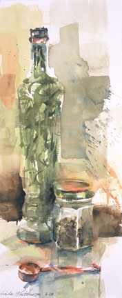
Tarragon Vinegar and Pepper   watercolor   8 x 18.5
Why is it that some paintings seem to paint themselves, while others cause complete exasperation? "Tarragon Vinegar and Pepper" is such a painting. It was started as a demonstration in my watercolor class and almost finished up that evening. Only a few strokes were added later. Having such an experience causes you to think that you might finally have a grasp on the magic of painting. Alas and alack.....one painting later and you wonder if you really are a painter, or perhaps an imposter. I muck around trying to solve the visual puzzles with little relief. Nothing pleases me. What a roller coaster ride!

Wednesday, May 7, 2008

Negative Painting

Beliefs   watercolor   18 x 19.5
Sometimes, especially in watercolor, intricate things are best described by the holes in them, or the space around them. This is especially true for things such as lace and garden fences. (Is there a life metaphor here?) This was the class lesson for "Beliefs". We were studying reliefs, raised surfaces, and how they are described by the light hitting them. I like to call this concept the "to's and the fro's". I paired up this iron garden cross with mineolas which were in season. Using a limited palette always pleases me. I am pleased with the result.

Tuesday, May 6, 2008

Making Time for Art

Strawberry Boat - Overboard   oil/canvas   5 x 7 x 1.5
I get very grumpy when I don't get to paint each day....just ask my husband. Most of my paintings are large and complicated.....I labor over the concept, the forms and the colors that will most succinctly support my ideas. However, there are days when the duties of being a homeowner, a consumer and an art manager(clerical work to support my calling) consume my time. Yesterday was such a day. I had only 2 hours for my creative work. Small paintings fit the bill for these days. Smaller paintings, for me, tend to be just about the subject matter at hand.....the beautiful colors and textures of fruits, vegetables and small things that don't normally catch our attention. Solving problems in a smaller format can help to solve larger ones down the road. Each has its lessons to teach. I am grateful for those 2 hours.

Monday, May 5, 2008

Transparency and Opacity

Summer Brie   watercolor   13.5 x 21
I work in both oils and watercolors. Each provides me with lessons that can be transferred to the other. I was obsessed with these opposing notions of transparency and opacity for years. Watercolor teaches a deftness and economy of stroke AND transparency. Oils provide creamy opacity. I love attempting both in all of my works. It has been said that opacity provides more of a viewpoint for the artist alone(what is).....and that transparency allows a window for the viewer to see more of his/her own viewpoint(what may be). This watercolor was started in my class and finished at home. It is being shipped tomorrow to the "Central Pennsylvania Festival of the Arts" and will hang at the Robeson Gallery at Penn State from June 11 through July 13.

Thursday, May 1, 2008

Animation

Daisy's Legacy   oil/canvas   16 x 20
My favorite paintings are of the human figure. But, from time to time, I paint things around me that make me feel. These peonies were started from my Grandma Daisy's peonies and this time of year they seem to shoot up from the ground seemingly overnight. However, the time it takes to get from the formation of the heads, to the endless stream of ants that eat from the sweetness and help them to open seems to take forever. I always hope for several lovely blooms to be ready for Memorial Day, when my mom and I take the billowy blooms to her grave site. Grandma Daisy didn't have much money and she didn't say much, but her garden was her glory. I thank her for this important lesson. It is difficult to paint flowers. These were painted from life in my studio. I feel that I have succeeded when the flower grouping has an animated gesture, when I really do feel the life within. The power of the peonies is cyclical and teaches me every spring.

Wednesday, April 30, 2008

Stepping out of the Comfort Zone

Eclipsed   oil/canvas   24 x 8 x .5
"The jazz in life is not found in the comfort zone". Wow, do I love this quote! As we muddle through our days, we find comfort in always sitting in the same chair, taking the same route to the grocery, and so on and so on. I think that this saves our energy and that is good. I wear my bib overalls every day to paint.....I like saving my creativity for the canvas. It is only when the status quo consumes every moment of our lives that we become bored and restless. I really do believe that we ought to "shake it up" in the realms that are most interesting to us. "Eclipsed" is such a painting. A few of us painted during the recent lunar eclipse on February 20 on the 3rd floor of a county building in Akron, Ohio. We turned out all of the interior lights and used only LED headbands to paint the nightscape. What a rush! This painting is of The First National Bank Building.....I added the eclipse later, as it was not visible from my viewpoint. As I couldn't see my palette that well, I found that I was much more generous with both the paint and the medium than usual and was pleased with the results. Painting "in the dark" has its benefits. Are there other lessons to be learned here?

Tuesday, April 29, 2008

The subjectivity of Seeing

Mary, Mary   oil/canvas   36 x 24 x 1.5
The varieties of human taste always interest me. I paint with lots of other artists. Each has his/her own way of seeing, of taking in the sight in front of them. Mary was a beautiful model. When she entered the room, I took note of her hair, which had been dyed a kool-aid lime green. That, I thought, would be my "hook", my focal point. Then, as the painting progressed, I thought that her revealing backless dress and the muscles on the back would be my focal area. By the second session, I realized that the thing of interest, to me, was her heel, turned so subtly in those strappy high heels. I wouldn't even had guessed it myself! There, in the left corner, is my center of interest. I guess it is like ice cream..............different people, different flavors. I have always loved rum raisin.

Monday, April 28, 2008

The Power of Negative Space

Breakaway   watercolor   19 x 27
The hardest thing for so many artists, including myself, is the "negative space", that part of the painting that surrounds the thing that we are trying to capture. I have known for a long time that pictures filled with things are a turn-off to me personally. I believe that the power of the picture in total is divided between the things in the picture plane. Therefore, the fewer the things, the more power each possesses. We Americans are full of things....in our homes, in our lives. We are simply losing, in my opinion, the ability to see the power in the negative space.....for me that negative space becomes "what is to be". The L-shaped composition of a sprawling figure on a horizontal picture plane becomes somewhat problematic since there remains a complete rectangle of "nothing".....what is to be. I must admit that I was intimidated by this space, but have become satisfied in the treatment of this space. This painting is of my son....he is a recent college graduate and is weighing all of his options for the future. That unfilled space represents, for me, all that is to come. Very satisfying.

Friday, April 25, 2008

Drawing from the Shoulder

Tricorne   charcoal and pastel on paper   18.5 x 11
As I journey into the land of "what makes my art mine", I try to imprint what has given me a thrill, what marks on the paper sing of expression, of desire more than perfection, of letting loose more than control. These marks or strokes more often originate from the shoulder, where the strokes become stronger and grander and faster. (marks made from the wrist are generally weaker and more perfect, due to the desire to maintain control). The drawing "Tricorne" started as most drawings do when I work from a model. I start by finding the major forms, searching for rhythms and always searching for the "likeness". Yet when I reevaluate the drawing much later, I find that what moves me the most are often errant, searching strokes that speak simply and imply "less" rather than "more". The white calligraphic stroke that describes the ruffled shirt is my favorite. I love energy in the stroke. Let that be a lesson to me. Control is over-rated.