Search This Blog

Monday, May 25, 2009

Seasonal...

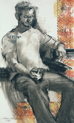
In Their Prime   oil/canvas   16 x 20
My life, as well as my art, is cyclical. The smells, sights, light and sounds of each season influence what I paint and how the work is approached. For the past two weeks, our miniature lilacs have perfumed my studio. Outside on the patio, a hedgerow of peonies has grown so rapidly that we swear we could see them gain several inches in a day. I have painted that grouping several times. These beautiful blooms were given to me by my maternal grandmother Daisy Street. That legacy makes them all the sweeter. Peonies teach us patience as the blooming proceeds ever-so-s-l-o-w-l-y aided by the black ants who eat the wax off of the tightly formed bloom heads. This weekend which is Memorial weekend, several blooms are fully open. My note to myself is to appreciate their beauty and their fragrance in the short time that they are in full bloom. All too soon the petals will be scattered across the brickwork, and their influence only a memory.

Wednesday, May 20, 2009

Mother Love=Art Love

An Accommodating Curve   watercolor/gouache   27 x  14
Being an artist is tough. Being a woman is tough. Being a mother is sometimes tough, but fills us with a love so great, so big, that it can easily spill over into our art-making. I was blessed with three wonderful sons.....I really do believe that my art-making is so much richer from that deep communion. Just as a great writer uses his life experiences to season his writing, we visual artists do the same. As more and more women are making art, I am seeing the vastness of the experiences that women artists have to offer. Our intuition and our emotions play out in our work. Mother's Day, in my opinion, should also be a celebration of our children, and all that they have given to us. Our curves carry groceries and laundry, as well as art supplies. Our curves sustain our children. My love for these organic curves shows in my work. Hip...hip...hooray! Andrew Wyeth said, "One's art goes as far and as deep as one's love goes". "An Accommodating Curve" was painted many years ago.....watercolor over gouache.

Tuesday, May 19, 2009

Graphic Grass

Grass Border...linoleum block print
I am working on a large mixed media painting of a tricycle and wanted to have some simple graphic-looking grass at the bottom. Painting it on resulted in visual confusion. So I carved a small linoleum block to print it on. The marks were made with a 5.0 calligraphy marker that I twisted as I moved upwards from bottom to top, thus making the marks gradually thinner. I found that the negative spaces were as important as the marks themselves here. I wanted the spaces to be intriguing and playful as well. Painting is almost too direct at times.....i.e. one stroke is almost too bold, too important, too direct. Sometimes the printing medium is what I crave.....that secondary application of pigment that doesn't quite cover everything, leaving a bit of background peeking through. Pure bliss. And, I might add, a fun foray into something different.

Monday, May 18, 2009

Saturdays

daisy stamp...carved from eraser
Saturdays are my days to break my weekly routine. Saturdays are for yard work, errands, framing, catching up on details and making small bits of art just for fun....no grand paintings or drawings.....just bits of creative experimentation that may lead to something down the road. IDEAS. This past Saturday, I attended a wonderful two-hour workshop on printing lead by Susan Mencini. Susan lead us through the process of conception, carving and printing from plastic erasers. Pure fun. There were a dozen or so artists present...each one turned out a marvelous stamp. We used Speedball lino-cut tools and juicy water-soluble markers for printing. What a wonderful way to add to Saturday fun. Each exhibit at Summit Artspace offers many such Saturday afternoon forays into creative fun....just a taste, just a bit of what could lead to something bigger. If you have some free Saturday afternoon time please visit: http://www.summitartspace.org/

Thursday, May 14, 2009

Enthusiasm

The word enthusiasm comes from "en theo".....which translates as "God within". I have to agree. Enthusiasm, for me, is defined by an infectious, childlike joy. Ah, if we could only approach our daily work this way! We have the choice to approach our work in this way. The L-brain way tells us to approach our work in progressive steps, always prescribed by "the other", orderly and rule-ridden. This way creates self-doubt and invites containment and criticism, as "someone's" rule has always been broken....ad tedium. If we approach our work with a childlike joy lead by the R-brain, the lotus of control moves to self....we create our own rules, solve our own problems and liberate the creativity within. Tough stuff. Yesterday, I watched a small video with what appears to be an inner-city choir singing "The Eye of The Tiger" by Survivor and lead by their guitar-playing teacher who has enthusiasm to spare. The spirit and lack of inhibition by the students inspired me for the day....the week. 

Wednesday, May 13, 2009

Painters' Post

Tortoise...a small watercolor sketch
Another source of inspiration for me comes in the form of Robert Genn's twice weekly newsletter which is sent to my email box. He is a wonderful writer and touches on subjects that often speak to me. He has composed another site called "Painters' Post" which includes inspirational articles from around the world that may be of interest to painters. My time is limited and valuable so I need to get to the marrow ASAP. Yesterday I read an article by Germaine Greer that piqued my interest. I thought about her ideas the entire day. You can the site at: http://clicks.robertgenn.com/painters_post.php . Today I chose an article for reading that dealt with slowing down.....perfect. Taking things at a snail's pace has its advantages. I become both the tortoise and the hare during my days and weeks. In order to have timeless creative hours, I become a hare with everything else. Laundryvacuuminggroceryshoppingpostofficemealplanningcooking........
..ahhhhhhh..................p*a*i*n*t*i*n*g. Off to work now...................in order to slow down.

Tuesday, May 12, 2009

Dylan-esque

Rock Stah   oil/canvas   30 x 24 x .75
I absolutely love getting twinges of interest from information that flies freely in my direction. Inspiration abounds from the least likely places. Music, lyrics and rhythms are my favorites. My son Nate plays guitar and is a Bob Dylan affectionado.....he reads Dylan's words and studies his music. This past weekend he shared with me an interesting Dylan-fact. It seems that Bob Dylan strives to play each of his songs differently each time.........Whoa............that is profound for me. That makes each song, each work, original each time. He avoids the lull of sameness. Lately, Dylan has been into changing the rhythms of 4/4 songs into triplets. That certainly is a way of spinning off into a fresher "newness"! Thank you Nate! Thank you Bob Dylan!

Friday, May 8, 2009

Equinox

Maiden   mixed/paper   19 x 13.5
I am very mistrustful of words. Dominant cultures have altered meanings and implications throughout time to suit their need for power. Words are used to empower and to diminish. OK. We have to use them to communicate....right? I guess that I appreciate and am more likely to trust those who measure and use fewer words. Visual communication is subjective. It is quiet. The word " pagan" is a perfect example. It used to imply "of the country" or "rustic".....a person who lives his/her life in an intuitive way, according to the seasons. Somehow along the way, the word has been tainted. Spring's renewal of energy is a wonderful feeling. I have been watching the unfurling of our ferns. The unwinding of the frond is unmatched in beauty. Its implications are numerous. Pure rhythm. "Maiden" was drawn with soft pencil. The ferns were printed afterwards.

Wednesday, May 6, 2009

Windows to the Soul

Morning Balcony   watercolor   20 x 10.5
For as long as I can remember, I have ascribed human characteristics to buildings. Maybe everyone does. Maybe I have an overactive imagination. Maybe Disney movies have been permanently cemented in my brain. Fantasia, etc. Brooms that dance and doors that converse. Maybe that explains my fascination with windows, doors and rooftops, second only to my love of painting the human figure. I guess they could be hair, eyes and mouths. Whoaaaa.............whatever. The neighborhoods we live in tend to be fairly homogenous. And the dwellings we live in seem to be regionally homogenous as well. Visiting other areas of our vast country or other countries gives us a welcome new perspective. We discover differences that are beautiful as well as functional. Two of my sons live in San Francisco where the weather is perpetually mild. There are no air-conditioners hanging from windows and no need for storm windows and doors. The beauty of these structures is more apparent, more visible. "Morning Balcony" is just one example. I look forward to doing more.

Tuesday, May 5, 2009

Tension

Precarious Stack of Vintage Bowls   watercolor   12.5 x 9
Tension is definitely an emotion we can all relate to. We can identify tension in sounds and visuals. Tension causes us to pause....at least, that is my take on it. Tension in paintings very often relies on diagonal lines.....those that are momentarily suspended between the vertical (active) and the horizontal (passive, restful). My husband loves photographing the tension of broken tree branches in the forest that have become lodged in the crooks of other trees. We all know that eventually they will fall.....but when? Fences and telephone poles are often more interesting when they stray from the vertical. They become more active and break up the status quo. Robert Genn's twice weekly newsletter of today refers to sterility versus fertility and he lists ways to "shake it up", ways to pull oneself out of the familiar. His list mostly involves ways for the artist to change her/his approach. I would like to add "painting stacks of things" to the list. Stacking is always interesting to me....a piling up of varieties into the grand vertical format. "Precarious Stack of Vintage Bowls" was a lesson from my watercolor class. The values of the white bowls have been exaggerated to bring up the drama and to hold up to the strong dark background. What will happen next? I am involved.

Monday, May 4, 2009

Day Tripping

Wendy Park(Cleveland)  oil/canvas   20 x 16 x .5
Cleveland is an hour's drive from Akron and there are so many places to view and appreciate art. My fellow artist Mina Huang really enjoyed the current exhibition at MOCA...superlight, a digital display and Christian Wulffen's "It is, It is not". Mina is an engineer by day and so appreciated this cutting-edge, technology-based art. These exhibits are in their final week. My work is represented in the annual exhibit at Artist's Archives on the east side in the University Circle area. Fellow artists Mitzi Lai and Trisha Kaman, also members of The Akron Society of Artists, both are represented in this exhibition.
May 1-June 4, 2009
Artists Archives of the Western Reserve Annual May Members Show
1834 E. 123rd Street, Cleveland 44106
Gallery Hours: Wed-Fri 10-4; Sat 12-4
Public Opening: May 1, 6-8:30 pm
For further information, call 216.721.9020 or visit www.artistsarchives.org


Friday, May 1, 2009

Sweet...

Judy Gaiser...a sketch
The other evening at our club critique (Akron Society of Artists), I noticed several artists sketching throughout the long evening. It really is possible to watch and listen and sketch at the same time. It made my heart go pitter-pat. Great stuff. I have found that people, for the most part, return to the same 2 or 3 positions repeatedly. So........it is possible to start a sketch then to pause until that subject returns to that same position. Attentiveness. I have known some artists to go absolutely haywire when the model changes the pose even slightly.....even when a piece of hair falls into another position. The resultant reprimand seems to make the model stiffen. The energy is killed. My preference is to take what the model gives to me freely.....sometimes the later subtle shifting is even better. Staying attentive gives you what you need. The results are rarely perfect but always energetic and honest. Our president Judy Gaiser is one sweet girl!

Thursday, April 30, 2009

Slice of Time

Slice   oil/canvas   4 x 4 x 1.5
Most of the time, I am back and forth between 2 or 3 paintings. Problem solving is difficult work. But putting some distance between you and the work in progress is a great thing......it allows you to see the work with new eyes, in a new way, in a couple of days. This distancing is difficult to pull off, but quite necessary. Often, I am so involved in the work at hand that I can't stand leaving it at the end of the day to return to my "normal" life. Over-involvement is not good in painting, or in life. When this happens, I pull out a tiny, tiny canvas and just paint something at hand. Those small paintings are calming and reaffirming. And they just take a small slice of time!

Wednesday, April 29, 2009

Artist Time

Early...a sketch
Artist time is commonly referred to as "whenever". I'm afraid that there is some truth to that stereotype. I spent at least half of my life being late. After some not-so-nice results from my tardiness, I have resolved to mend my ways. I didn't think about the fact that it was rude to others......I didn't think about the stress that it would cause others. For me, it is the direct result of my tunnel vision. I love living in the present moment, and I seem to be able to experience a bit of flow in whatever-the-present-task. The notion of not concentrating on the immediate is a bit foreign to me. And planning out little blocks of time and limiting my time in each block was abhorrent. Well....here I am....the new me. I now try to adhere to the little blocks of time and try to estimate the time each task will take. And, most importantly, my whole life is organized to try to allow my painting block the maximum of time. O.K. That being said, my fixation with being on time has been overdone. I was an hour early for a meeting in March. Red Dot Project is housed in an old press building in Cleveland....it is constructed a bit like the old 1950's school building. When I realized my error, I sat down on the cement floor near the entry where early spring sun was streaming in. I drew my own shoes and allowed myself the time to really consider all of the shadows and all of the subtleties. It was March 17, as I am wearing my shamrock socks. The session was a treat. However, I was happy to move to a comfortable chair when the meeting started....one hour later.

Tuesday, April 28, 2009

Admiration for calves like bowling balls

Calves like Bowling Balls...a sketch
I am always equipped to sketch wherever I go.....it helps to pass time and, most importantly, it helps me to learn about life. Most of the elite runners at any race have similar body types....compact, slim with no body fat and a kind of "lightness". Heaviness just doesn't go as fast. The George Washington Parkway race was a veritable smorgasbord of body types: old ladies pacing a fast walk, overweight people with their trainers urging them on, kids of all ages, and parents pushing strollers while running. These folks are an inspiration to all. They don't fit the mold, yet that doesn't hold them back. Wow....profound. After the race, I was lucky to see an unlikely runner stretching his legs as he leaned against a railing. His shoulders were oh-so-broad and his calves were the size of bowling balls. He was almost as wide as he was tall. During those brief moments, I loved this man and I loved his effort.

Monday, April 27, 2009

Breakaway

Breakaway   watercolor   19 x 27
This past weekend, my husband and I broke away from our routine to travel to Alexandria, Virginia to watch our son run in The George Washington Parkway 10 K race. Breakaways are important.....as they help you to increase your tunnel vision to take in events and experiences that wouldn't usually come your way. They inspire and they help me to reconsider and reevaluate. I always leave home dragging my feet, however, as my mind and my body prefer to follow the usual path, to stay within the boundaries of "familiar". I witness this phenomenon even in my painting classes, where artists typically sit in the same chair, and observe the class with their comfort zone. We seem to become protective of our space go to great lengths to avoid the uncertain and the unfamiliar. The rewards, however, of breaking away are exponential. Seth had a great race and I was inspired by each of the 7200 runners there who braved the 90-degree heat to prove something to themselves. I am tired this morning but hopeful that some of those visual memories will filter into my subconscious and make my work more human and more genuine. I want to experience something new.

Thursday, April 23, 2009

Copyright

Earlier in my career, I signed on with a print company who asked for exclusive rights as well as the copyrights on the work that I did for them. I was so happy to have work, that I willingly signed on the dotted line......for five years. Granted, the work is schmaltzy......cutesy.....whatever....that is the nature of mass printing. The company was successful and growing. I received a paltry percentage. In fact, 4 of my prints were featured one season in the Spiegel catalogue for $49.95 each. I received less than $100 from that exposure. The company is now bankrupt. My prints are all over the internet, on stitcheries and on puzzles. I have even seen them on the Baghdad Museum website. I receive nothing. I suspect that the income generated from my prints, and the prints of many other artists, is being used to pay off the company's creditors. I certainly sent in all of the claim forms to the courts in that state, but am doubtful that the outcome will represent any positive income for me and my family. So, I guess that the moral of this story is NEVER NEVER EVER GIVE UP YOUR COPYRIGHTS.

Wednesday, April 22, 2009

Relief

Architectural Rosette   watercolor
I guess I am attracted to all-things-handmade, especially things that are carved from wood.....or even those molded in iron.....or things pressed into copper.....or...........let's just say that I like relief work. Painting one of these objects is a wonderful exercise as we learn all about 3-dimensionality on a flat painting surface. Those parts that are closest to the light source, and to us as viewers, will have a lighter treatment. Those parts that receive the least light will be the darkest. And then there are the areas in-between, whose rising and falling make the image believable. Old architectural pieces offer much in the way of painting relief, as do kitchen molds, egg cartons and muffin cups. Hopefully, we will be able to translate what we learn into the topography of the human figure, a still life painting or a landscape. An even more challenging task would be to render some abstract marks using our findings.....to watch them rise and fall from the painting surface. Awesome.

Tuesday, April 21, 2009

William Morris

Daisy Tile   watercolor/gouache   6 x 6
William Morris has been another inspiration for me, especially during the years that I designed greeting cards. The swirling patterns of flower shapes and leaves are both flowing and mathematically designed. The father of the arts-and-crafts movement, he promoted simplicity as a reaction to the overly-ornamented and sugary-sweet decor of Victorianism. He believed that beautiful things were in accordance with nature. Much of his wisdom was borrowed from the Japanese, including his use of restrained color so as not to tire the eye. His designs and fabrics are timeless. William Morris is Wabi Sabi. He found value in the uncomplicated.

Friday, April 17, 2009

Quick Draw

Quick Draw - Laura
This past Wednesday evening, our art club program was a quick draw. We all took turns posing for various gestural drawings for 30 seconds to a couple of minutes. It really was such fun....thanks to Akron Society of Artists programs chair Jana Volkmer! The speed helps to get to the heart of the matter right away....for me, it is the gesture line that holds the pose, that imaginary line, a curve, that mimics the energy of the figure. Lines go this way and that. I don't really strive for accuracy here....just energy. What fun! For this session, I used China markers as they glide so easily across the paper. I was prepared with several, as they wear down rather quickly and are quite the sticky-wick to unravel. Other artists used charcoal pencils and shorty pencils. We used lots of paper as well.....paper well-spent. Working quickly also helps me to work slowly as well....later on in the drawing.

Thursday, April 16, 2009

Ntozake Shange

i tried to love her fiercely   oil/canvas   48 x 24 x 1.5
If we are open to the universe, we can be inspired by our intake of all kinds of ideas: music, books, people, acts of kindness and events. Those small inspiration-bites hit me like a brick....make no mistake about it.....my right brain underlines, italicizes, and makes bold any notion that speaks to me personally. When my children were smaller, I was fortunate to complete one or two paintings during a calendar year. I read inspirational biographies of women like Alva Myrdal whose diplomatic career took off after child-rearing. Such is poetry of Ntozake Shange, an American poet who speaks to women and African-American women in particular. At a time when I was struggling so very much (more than now), trying to begin a career after my children were in school, I read her words: "i found god in myself/ and i loved her; i loved her fiercely". I needed empowerment. I needed to love myself. I needed to hear the words of Ntozake Shange. The Artists Archives of the Western Reserve Annual May Members Show opens May 1 with a reception from 6-8:30 pm and runs through June 4. The gallery is free and open to the public. Gallery hours are: W, Th and F from 10-4 and Sat from 12-4. The Artists Archives is located at E. 123rd Street in Cleveland in the same neighborhood as Cleveland Institute of Art.

Tuesday, April 14, 2009

Wabi Sabi

Self-Taught   watercolor   12.25 x 9.25
One thing leads to another....and so goes my reading which inspires my thoughts which, I believe, deepens my work. Robert Genn's newsletters are a great source. Recently I was introduced to the Japanese notion of wabi sabi through The Tea Collection , where my daughter-in-law Laura is a designer. The books are piled up on my reading table ready to ingest. I guess I have always leaned toward these notions without realizing it. Wabi Sabi is a complex idea that celebrates the richness of imperfection: nothing lasts, nothing is finished, and nothing is perfect. It is about achieving a balance between action and stillness. These thoughts originated long ago when the tea ceremony evolved from a status-ridden and lush event to a more simplistic one, nurtured by accessories that were available to all people. Wabi Sabi is autumn. Wabi Sabi is a chosen non-materialistic way to live....a poverty of sorts that distills complexities into essences. For me, very complex, yet oh-so-meaningful. The lessons are poignant. The lessons still anxieties. Wabi Sabi.

Monday, April 13, 2009

Transplanted

Degrees of Ripeness   oil/canvas   30 x 10 x .5
We had a beautiful holiday weekend that included visits with siblings and nieces and nephews that we rarely see....our family has been scattered across the country....in California, Florida, Louisiana, Missouri, North Carolina, Ohio, Texas and Virginia. I don't that is so unusual these days. We share history with these relatives, so it is always wonderful to touch base and find out where life has been taking them. "Degrees of Ripeness" will be going home with my wonderful sister-in-law Ann Hutchinson Jenkins. She recently lost a pet of many years and I think that she was able to relate to the chaos I felt as I painted this work in a mid-July heat wave in my garden last year. I was definitely trying to make some sense of things. And.....as I also found out this weekend.....tomatoes don't grow well in Louisiana, her home, as they crave the cool nights and warm days of other climates. I am happy that my painting will find a home in her kitchen and will be a bit of a connection between us. Paintings are like children....we are always relieved when they find great homes.

Friday, April 10, 2009

Spring Equinox

Easter Basket   watercolor   12 x 9.5
Seasonal flow is reflected in my work, and probably in the work of most artists. I am stimulated by what I see around me and how I feel. We are lucky here in Northeast Ohio as we are treated to a veritable smorgasbord of weather and temperature conditions, each sliding into the next without too many drastic changes. A new season brings a new way of feeling, dressing, traveling and cooking. Plus, the seasonal changes allow for a multitude of still life subjects. I cannot conceive of painting a summer scene in the winter....it just won't happen. For me, any unrealized seasonal paintings will simply have to be put off until the next year. I enjoy the flow of it all. For our last painting session in my Kent Community Education class, we painted Easter baskets. We had all manner of exciting elements, as participants enthusiastically contributed from their collections. I like the light going through the jelly beans.....makes them more magical. The foil wrappings on chocolates are so beautiful to me....the folds as well as the patterns. Our back yard this time of year is usually foggy in the early morning....our children spent many Easter mornings searching for eggs in the fog in their pajamas. This memory triggered the memory of a wonderful watercolor artist Catherine Anderson  whose mystical watercolor landscapes are achieved by multiple subtle washes of color. Her work gives me that "Easter feeling".

Thursday, April 9, 2009

'tis the season

Bunny Girl   watercolor/gouache   13 x 8
'Tis the season of the rabbit. I love them. What's not to love? They are soft and fluffy. They are herbivores. They don't bother anyone. They are gentle. To me, they represent the yin, the feminine side of nature. "Bunny Girl" was painted oh-so-long-ago but remains one of my favorites and I really don't know why....it just speaks to my soul. This young girl, whose name I have forgotten, is holding the rabbit in such a maternal way, a loving way, the way in which I wish we would all treat each other. My watercolors range from expressive to dark to strong to mistaken to gentle. I guess watercolor speaks softly so well. I really do love rabbits. Especially the chocolate ones.

Wednesday, April 8, 2009

Just Drawing......Not

Centrifuge   conte crayon   26 x 19
Tonight's meeting at The Akron Society of Artists is a program where all artists bring drawings to share.....it's called "Just Drawings". Drawings are exciting, bold (for the most part), and devoid of unnecessary distractions such as color and texture. As a result, they speak simply and honestly. For me, drawings often have more heart and soul than the paintings that evolve from them. Draw, draw, draw. And, since we often treat drawings as a "practice" art, a lesser art, we are often freer to experiment with them. A winning combination. I have lots of awesome drawing tools, and have even set up a different art box in which to house them. My favorite pencils are: the shorty (after years of being unable to get replacement leads, my friend Tom Mullins gave me some from his secret stash); an extremely wide one with a wooden barrel brought from Germany by my friend Shirley Blake; and the newest, another wide from Duluth Trading Company with a metal barrel, a gift from my friend Susan Mencini. Add to that: conte crayons, charcoals, china markers (thank you Sally Heston), and vine charcoal, the medium of choice of my idol Zhoaming Wu. Just Drawing? I think not.

Tuesday, April 7, 2009

Learning to Love Brown

Jennifer   conte crayon/pastel   19.5 x 25.5
If you asked me a year ago my least favorite color, I would have said brown. I am not sure why......only that I have had the same response my whole life. The same for seafood....I just don't like it. Although, I believe that we are all entitled to our likes and dislikes (after all, that is what makes us individuals), I don't think it hurts to occasionally re-test our beliefs. They change. We change. When I was a kid, all of the days of the week had colors - that is how I thought of them. Saturday is brown.....well, that is a good thing....right? Well, I am starting to enjoy brown....especially in artwork. Thanks to Conte and Winsor and Newton. OK. But I still feel uncomfortable wearing it.

Monday, April 6, 2009

Permanent Collection

Blink....pen and ink
tattoos


Serious artists have a portion of their resumes dedicated to permanent collections. It goes without saying that there is prestige associated with which institutions, businesses and individual collectors appear under this category. But what about tattoos? Pretty permanent. Pretty serious. I mentioned a while ago that I was doing line-work for a couple of tattoos....one for a friend Zach and one for my son Nate. Zach chose a meaningful quote for his. The calligraphy was rendered using a copperplate nib on fairly rough paper. The quote was then blown up in size in order to increase the imperfect and aged quality of the writing. That blow-up was then reduced in size as a template for the tattoo artist. Nate chose an owl named "Blink" that resides at Quail Hollow in Hartville, Ohio. I worked from a photograph and worked many editions in order to get the line-work just right....it was difficult as just a few changes seemed to alter the overall appearance in surprisingly striking ways. The owners of the tattoos seemed to be much more relaxed than me. At any rate....the art lives on.

Friday, April 3, 2009

Values tell the Story

Sand Dollar, Starfish, and a Stone with a Hole in It   watercolor   6.75 x 8
We can easily use values to help purvey a mood. Values that all hover toward the lighter end of the scale emit "lightness", romanticism and a lack of seriousness. Those are my interpretations. Beach condominiums are filled with prints of such artwork. Of course, vacationers are vacationing FROM seriousness and responsibility, so these pictures work quite well. The mood is set for lightness and fun. Also, there is so much light in the South and at the beach, that a higher drama picture with darker values is simply not possible. Light is everywhere. I find that most watercolor painting students love these kinds of paintings. I think that these works represent the quintessential watercolor in so many ways. It also could be that these very students leave their responsibilities at home and at work and want to have fun at painting class. O.K. I am all for that. I much prefer works that convey both darkness and light and a resultant feeling of the interlacing of both the darkness and the light, the combination of which makes life so ripe and so genuine. But I guess that it doesn't hurt to leave the responsibility at home now and then.

Thursday, April 2, 2009

And speaking of brown.....and coffee...and ink...and Wallace Stevens

Oranges and Wallace Stevens
This morning I awoke at 5:30 am and there was no possibility of returning to the sleep. So I brewed a big pot of coffee and enjoyed more of "All Over Coffee" by Paul Madonna. What a poet! What an illustrator! All of the drawings of San Francisco surrounds and neighborhoods are done in sepia ink. They are enchanting. He is a perceptive and poetic artist.....how often the two seem to reside! He deftly explores and describes the human condition and, in doing so, helps me to accept my own humanity. Paul Madonna, his words, his thoughts and his beautiful brown drawings have inspired me!
The browns are all there for us to love...the umbers, the sepias, the siennas and the coffee.....they seem to bring us so close to the earth. I need to break out my bottle of sepia ink and my new sumi brush.

Wednesday, April 1, 2009

Between Drawing and Painting

Twosome   watercolor   14 x 10
I have found that many people who sign up for painting classes want to skip the drawing part. Too bad. Most of the errors that occur during painting are the result of drawing errors. I guess that drawing doesn't seem as fun.....what with no colors to choose from and no medium. I don't feel that way at all, as both drawing and painting involve visual problem solving....I am indeed in love with the process. It is THE TIME SPENT IN CREATING that spins my fan. There is always a half-step, a compromise, so to speak, between the two. Painting with one color allows the artist to experience the medium and solve value problems, without the extremely complex notion of color. After all, it really is value that tells the tale. I have found that the browns work extremely well as their built-in value property is quite dark, thereby having the capabilities of spanning the entire value scale. Not only that, it is pure unadulterated fun. Try it.....you'll like it.

Tuesday, March 31, 2009

Critique

The Red Shoes   watercolor/gouache   25 x 14
Last week, I was invited to critique work at our club meeting - The Akron Society of Artists. It is an exciting event and I can rarely sleep afterward. To be surrounded by so many people of like mind is just the best......people who are stimulated by the many ways of visually expressing the world around us. Thomas Edison said "I have friends in overalls whose friendship I would not swap for the favor of the kings of the world". This is how I feel about my painter friends. Of course, some painters leave the meeting elated after having received positive affirmation from their peers. And.....some are discouraged and disappointed. We have all experienced a little of both. For me, the goal is always to be able to self-critique as much as possible, so that the visual problem-solving is somewhat resolved before the painting is presented. I took the painting "The Red Shoes" to critique many years ago and will never forget what the critique-leader said (do we ever?).....that he liked the painting but wasn't sure about the red shoes. Well, for me, the whole point of the painting was indeed the red shoes, and the character of the person who dares to wear them! Definitely my son Nate! I this case, I ignored the comment and have continued to enjoy the painting.....and especially the red shoes.

Monday, March 30, 2009

Birthday

Independent   pastel/paper   20 x 13
Today is my son's birthday. My husband and I are excited to give him a call and have been trying to figure out the best time to do it as he lives three time zones away. I credit my children for giving me the depth of love that it takes to paint - to feel so deeply that it almost hurts, and to risk all for what you believe in. In "Independent" my son Nate posed for my Kent watercolor class. He actually fell asleep during the pose! (oh that I could relax so well!) The watercolor didn't work out so well and then transformed itself into a pastel. A morphing so to speak. Commitment. Thomas Edison said: "Nearly every man who develops an idea works at it up to the point where it looks impossible, and then gets discouraged. That's not the place to become discouraged." Thanks, Tom. I needed that.

Friday, March 27, 2009

When Things Go Awry.............

Dappled   oil/canvas   30 x 40 x 1.5
When I was 12 or so, all I thought about was horses. I drew them continually. I thought that I could draw them blindfolded. I even dressed like Lori Martin, the young star of the television show "National Velvet". I now live in a semi-rural community where horses are often seen grazing in the late afternoon sun. So, I thought that my painting of a grazing horse would be a shoe-in (no pun intended). WRONG. The painting was begun in November with all of the preparatory sketches drawn beforehand. This painting has since evolved at least a half of a dozen times. Each time I think I have a handle on making this horse my very own, the visuals go awry, the forms are either hugely boring or refusing to be broken up in a pleasing way. And so it goes. I will not give up, but have mixed in a few other paintings to dissolve my frustration. Today I will go at it again. I will show up for work. However, this horse is so shy that he may never make an appearance.

Thursday, March 26, 2009

Hi-Lo Techie

Airwaves   mixed on paper   34 x 20.5
I believe that I am a high-low techie. As do most artists, I work in solitary surrounds and depend on my computer for communication, applications to exhibits, organizing my works and trying to sell paintings. I have learned to use my computer on a "need to know" basis and feel comfortable with most transactions. Just when I reach a point of feeling smug and safe, the computer fritzes out and I feel that a family member has been taken seriously ill and is in the intensive care unit....yesterday was such a day. The computer doctor was here and my husband would come out to the waiting room from time to time to keep me informed of the progress. It was truly tense. Has the disease spread or will we be recovering? If so, will we be in recuperation for a while? Sad but true. This techie stuff is starting to compete with my creative time. If I followed all suggestions that artists really "need to do", I would have no time left to paint. I have learned to lasso the computer time and then let it go.....its demands are neverending. Personally, I would rather have a paintbrush as an appendage than a computer. By the way, the computer is fine. We are the ones who had to take the aspirins.

Tuesday, March 24, 2009

Add/Subtract

Der Lehrer   charcoal/pastel   36 x 22
Every artist has his or her own process. Mine involves a putting on and a taking off of pigment. Sometimes, I "destroy" (i.e. smear, join, neutralize, lessen the importance of) huge passages. I don't believe that any of the strokes is too precious to be replaced. Actually, that is quite a complex notion that literally keeps me spinning. Sometimes the take-aways are more pleasing than the add-ons. My eraser as well as blending stumps are so very helpful in charcoal drawings, as they become my weapons of destruction. (all done in a very peaceful way). "Der Lehrer" is an example of this process. John works at The College of Wooster. It is a very good thing that I did not become an accountant......

Monday, March 23, 2009

Erasers

Erasers are great fun.....and, of course, saviors. In my bag I always carry my pocket-sized sketchbook and a small variety of tools. And ALWAYS my friend the kneaded eraser. My method of working involves subtraction as well as addition and I often appreciate the marks made by the skimming-across-of-the-eraser, as much as the ones originally laid down by the pencil. As often as not, I preach to beginning artists to forego the eraser while appreciating all of the marks laid in, even the erroneous flyaway ones. After all, those marks can be every bit as beautiful as those "more correct" ones. So, on a recent encounter with my sketchbook, why did I feel a sense of panic when I realized that my trusty "kneaded" was lost from my bag? Wow..........I will have to practice what I preach! That day I used a roller pen....not my favorite, yet a new experience. It seems that these drawings more easily tip the scales to those nasty value judgements "bad" or "good", while erasured drawings can more gradually ease themselves into acceptibility. I was happy with this result, the one of 3 that day, but will admit to putting another kneaded eraser into my bag as soon as I returned home. Oh, that comfort zone is so difficult to leave!

Friday, March 20, 2009

High Drama

Early One Lemon Morning   watercolor/gouache   12.5 x 19.5
Paintings are like great music.....they can evoke different moods by the way in which an artist "plays" the value scales. The arrival of Spring and more sunlight allow for drama to unfold in the visual. Strong light (from one light source) creates strong shadow areas. Those visuals that utilize both ends of the value scale spectrum are indeed dramatic in mood. I liken them to a musician who plays loud feverish passages in combination with softer sound passages for the same effect. It definitely captures our attention. "Early one Lemon Morning" was painted many years ago from photos that I took this time of year, as the amount and quality of light entering our dining room window changed dramatically from what we had been seeing during the winter. At that time of my life, I more appreciated the dramatic than the sublime in my work. Dark, dark shadows. Sparkling lights. Not so much middle ground. More easily read from a distance. This painting is in the collection of The Parkersburg Art Center (WV).

Wednesday, March 18, 2009

Teacher/Student

A Jubilant Mr. Watt   watercolor   28 x 20
"My right hand is being held by someone who knows more than I, and I am the student. My left hand is being held by someone who knows less than I, and I am the teacher". I don't know who authored this quote, but I can't agree more.....for me, the notion of education is circular. Experience doesn't mean much if we can't approach new works with the eyes of a beginner. Repetition of past success leads only to life-in-a rut. My friend Pat Sargent retired from an outstanding career in arts education with the Akron Public Schools. She is a firm believer in educating yourself, in the search for self-knowledge. Formal education is indeed a mixed bag, as one is subjecting herself to the value systems of the teacher. Following one's own path allows the artist to accept some notions, and to reject others. The quest is the thing. And I believe that creative people are more motivated by learning than by money. I am inspired by teachers such as Pat Sargent and by Mr. Watt, the teacher of rocketeers.

Tuesday, March 17, 2009

Look to the skies

Mr. Watt's Rocket Day - The Spectators   watercolor   26 x 18 
It is an amazingly sunny and warm early Spring day here in northeast Ohio. Actually, we have more cloudy days here than just about anywhere else in the country. So, when it is beautiful, people really get excited! This is the time of year that Mr. Watt would introduce rocketry to his fifth grade students. And, on a day just like today, the rockets would be launched. Seeing my painting of the crowd pleases me.....I like the way the group of students plus teacher works and breathes as a single organism. It excites me. Perhaps it is because my children were the direct benefactors of Mr. Watt's enthusiasm. Perhaps it is because the scene evokes such wonderful memories for me. And perhaps it awakens the child in me, the one who would like to send a rocket soaring.

Monday, March 16, 2009

Everyone's a Sprinter

Rabbit Study   pencil/conte crayon   10 x 13
My sons' high school track coach used to say, "Yeh, everyone's a sprinter". What he meant by that is that given the choice, most track athletes consider themselves to be sprinters, which involves training, yes, but is often the by-product of quick-genes. A very short race....then it's over. A minority of runners want to subject themselves to the torturous training and energy output of distance running. It's hard, time-consuming and is commanded by self-discipline. I feel the same about drawing. It seems that most student artists want to paint, and just forego the discipline that drawing provides. Most of the problems I see in watercolor paintings are actually the underlying drawing errors. Many years ago, I knew I was going to be called upon to paint rabbits. Besides, I love rabbits. I took a trip to the pet store at the mall to shoot photos as reference material as I had none, and the wild rabbits in my yard just wouldn't hold still. (I got the permission of the manager first). "Rabbit Study" was an arduous pencil study that took a week but it was invaluable for subsequent paintings. I will admit that I am guilty as the next person of not fully preparing for a painting by studies. Let that be a lesson to me.

Friday, March 13, 2009

Relationships

Kallie and Elmo   watercolor/gouache   16.5 x 10
It doesn't take a genius to understand that the more relationships one has, the more complex life is. Likewise with painting. The more subjects in the painting, the more complex it is, and the harder it is to achieve the gestalt, the higher order. It is indeed tempting to render all of the subjects at hand in all of their glorious detail. But I am a reductionist. I am trying to distill what is given to me into its absolute essence, that which I can savor and remember. In "Kallie and Elmo", the given is the relationship of a young girl and her puppy. I have come to the conclusion that the relationship of the two must be a higher priority than either Kallie or the puppy individually. (i.e. the taste of the souffle being greater than the sum of all of the ingredients) It definitely takes some restraint. I have some very bad still life paintings from the summer where each artist participant was asked to contribute one thing to the still life painting. The result: cacophony. You know what they say about experience? You know it's a mistake when you recognize it as such....... the second time around. I remember this painting in particular at is was one of the rare ones that seemed to paint itself.....that hardly ever happens. I am certain that Kallie is a beautiful young woman now.

Thursday, March 12, 2009

Format

Long Tall Amy   watercolor   19.5 x 10
The planning of a painting is a particularly exciting event! Among the decisions we have to make, format is one of the most important. There are also psychological reasons why one way may be better than another. Horizontal formats mimic the sleep position and are restful, peaceful and non-stressing. Vertical formats are more energetic and lively. A diagonal subject on either conduces a bit of anxiety as we mentally determine which way that subject will fall and reposition itself. Very exciting. I guess that I prefer a vertical format, probably because I enjoy painting the human figure. Even my landscapes are likely to be vertical. Today I am painting a beautiful sleeping cat in a horizontal format. Because I like to overstate my preferences, I usually prefer verticals and horizontals that go beyond the standard rectangle sizes....i.e. twice as high as wide, or twice as wide as tall. "Long Tall Amy" is a painting of a tall thin young girl. Even though she is seated, I hope to provide evidence for her beautiful aesthetically pleasing height by using an extreme vertical format.

Wednesday, March 11, 2009

Making something out of Nothing

Lapin au Jardin   watercolor/mixed   10 x 16
As the mother of three sons, I became quite adept, come dinner hour, at making something out of nothing. And my three friends, with a total of 10 sons became likewise skilled. Boy oh boy oh boy.
In making art, I have become a fan of the same pursuit. You just need to start with a "spark". In my paintings, I often start with a free errant stroke that will jump-start my imagination and keep me out of the "itty bitties". But, I believe you have to start with a given. In watercolor class last week, we tried this little trick: A heavy wash of watercolor is placed somewhat strategically on the paper. Wadded up sheets of plastic wrap are placed on the surface. Heavy books are placed on the top and the paper is left to dry for a day. (don't peek!) When the plastic wrap is removed, graceful textured mottling is left on the paper.....those marks can become anything you want them to be! In "Lapin au Jardin", the border area was worked out of this technique. Gardens are chaotic. So is life with lots of boys.

Tuesday, March 10, 2009

Happiness

Elderly Woman in Union Square...a sketch
Happiness is somewhat elusive. We still try to chase it actively by aggressive pursuits such as buying, controlling and overcrowding our schedules. For me, happiness comes in little unexpected twinkles, often when I least expect it. A few years back, I was sitting in Union Square on a bench enjoying the day with my sketchbook at the ready. A caregiver subsequently sat next to me with her elderly charge in a wheelchair. As the caregiver did not speak English, we communicated by body language, and soon I was looking into the eyes of this beautiful old woman who nodded off now and then, with her head dropping to her chest. She and I took a break. As she shifted back into an alert stage, we worked again. I don't know if she knew what I was doing. But looking into the dignified eyes of this woman definitely qualified as a "happy moment" for me. Several moments in fact. This drawing session was the most memorable thing that I did that day, and still makes me happy after many years.

Monday, March 9, 2009

My favorite color always ends in -ish

Pinkish-Greenish
Fellow artist Barbara Gillette and I were relieved the other day to find out that neither of us prefers to use commercial names for colors. She has her pastels divided into two piles: one warm and the other cool. It is remarkable how often observers of painting demonstrations are concerned about which exact color the artist is using. Observers can then be seen busily recording this information in their notebooks. What a sticky wick. Naming and categorizing is a function of the L-brain, that part of the brain that cautions us against using our intuitive brain. I believe that the more time we spend in the L-brain, the more we debilitate the creative decisions that we alone can make. As for me, my favorite colors have names like bluish-brownish-pinkish. And I am rarely on time.

Friday, March 6, 2009

Color Temperature

Sylvia   watercolor/watercolor pencil on paper   18 x 9
Color temperature is more important to me than the colors themselves. While in college, I read of a primitive tribe somewhere (?) where there were only two words describing colors. My guess is that one word described warm tones, and the other cool. Using local color to describe subjects often results in cacophony, the resultant image resembling a stained glass window where color fragments attention and loses power. Of course, only my personal opinion. Two colors: tending towards blue and tending towards yellow. Cool. Simple. Of course, in my own recipe, one must be dominant in order to avoid conflict. My own recipe is to strive toward harmonic relationships. That soothes my soul. I hope that Sylvia is doing well. "Sylvia" is being offered through Masters' Portfolio in Chicago.

Thursday, March 5, 2009

Getting it Right

Onionskin   watercolor/gouache   20.5 x 13
Each time I look over past paintings, I am reminded of the lessons that they provided me. "Onionskin" was painted many years ago. This young woman appeared to be tough as nails. After all, she had not had an easy life. After the 3 sessions, I was very disappointed with the work. I thought it should be softer. So.........I painted it again. And, guess what? The second painting looked very much like the first one. I have found over the years that the repeated painting of a subject with the intent to improve it, usually falls short. Different mistakes are made. Different areas are weak. Morayo taught me about commitment to the painting and accepting its strengths along with its weaknesses. And.....ten years down the road, those small differences usually don't matter. I hope that Morayo is doing well.

Wednesday, March 4, 2009

and speaking of hanging on with a toe-hold

Precipice Tree...a watercolor sketch
That precipice tree that I featured yesterday really got me to thinking.....about the edginess I feel with traditional realism, yet all-the-while clinging to traditional icons of realism, notably the human figure. I guess I use the subject to spin off into my own world. Although there is much abstraction in painting that I admire, it lacks the emotional connection that I need. In thinking about my goals, I realized that there are other artists who "destroy" the reality in its completeness and make it their very own. In doing so, they combine the realism with an abstract quality. I love it! I have previously mentioned Alex Kanevsky, educated in both Lithuania and at the Pennsylvania Academy of Fine Arts in Philadelphia. Another painter whose work I admire very much is Bruce Samuelson, teacher at the Academy and noted painter. Wow.....also love Jenny Saville. They have each inspired me to keep looking beyond.....................

Monday, March 2, 2009

Rhythm of the Pine

Pine   watercolor   9.5 x 7
I have relented. We are painting landscapes in watercolor class. Most painters love them. I never have. When I first began painting in watercolor, the medium was fully represented by rustic barns, ramshackle buildings and marine settings. These subjects became kitsch-y to me. But....back by popular demand....landscapes! As a result, I have been studying trees. Lucky for me, my husband is a tree-hugger and we have vast quantities of tree photographs stored up. On "tree night" we painted a variety of trees. Each variety has its own posture, its own rhythm. Branch formation on a pine tree dances in a figure-8 formation. My six-year-old brain remembered only the color of the branches and the overall shape of the tree, an approximate triangle. I was happy to draw the conclusion......

Friday, February 27, 2009

Can't see the forest for the trees

Landscape preparation drawing
Where did all of these truisms come from? Probably from someone who is highly perceptive. When I return from my evening watercolor classes, I am usually flooded with feelings. If I feel that most of the artists have been successful that evening, I am rewarded with joy. Sometimes the feelings cause me to question how I have approached a subject....or, more importantly....how can I improve upon that approach the next time? Landscape paintings are popular....they make us feel good in a rapidly shrinking world. In fact, noted landscape painter Ann Kah recently remarked how her canyon painting had been manipulated as she was unable to stand back far enough to get a real sense of distance. Wow! That is so true.....if we move back far enough to gain distance, we are always bumping into something else..........profound. (kind of like shopping at Marc's) And so it follows that we sometimes lose sight of the forest for the trees. In all paintings, BIG FORMS ARE MORE IMPORTANT THAN SMALL ONES. So, the gesture of the grouping of trees is more important than the trees themselves. It is indeed possible to unite an already-painted grouping of trees that have been described too individually. Somewhere along the learning curve, however, an artist is able to see the grouping of trees as a viable form, then will work to separate the forms in a later pass. Both ways work, but the later, to me, indicates a more sophisticated way of seeing. Perhaps that just takes time. In this sketch, I have indicated the dark areas negatively, which are the spaces between the trees.